css3 - css flex 子元素居中
高洛峰
高洛峰 2017-04-17 11:55:14
0
3
729

明显黄色小标标没有在中间

<style>
    .box1 {
        display: flex;
        width: 300px;
        height:300px;
        background: #dedede;
        border-radius: 5px;
        padding: 10px;
        margin: 10px;
    }

    .item1 {
        width: 50px;
        height: 50px;
        background: orange;
        border-radius: 3px;
    }
    .item1:nth-child(2) {
        align-self: center;
    }
</style>

<p class="box1">
    <span class="item1"></span>
    <span class="item1"></span>
</p>

我怎么换方向 怎么调都没有真正的居中,怎么去布局它呢?

高洛峰
高洛峰

拥有18年软件开发和IT教学经验。曾任多家上市公司技术总监、架构师、项目经理、高级软件工程师等职务。 网络人气名人讲师,...

reply all(3)
洪涛

You can check the manual first. align-self: center means that the flexbox element is centered on the cross axis (vertical axis) of the row.

Horizontally centered is justify-content:center

==================Updated below==========================

justify-content:center is applied on the container. If you want to implement one at the beginning and one in the middle, then implement it yourself.
For example, on the default container, justify-content:flex-start and then

.item1:nth-child(2) {
      margin-left: calc(50% - 75px); /* 75px  是第一个盒子的宽度加上自身宽度的一半 */
}
左手右手慢动作

Basically copied from books and tutorials, you can see which one suits you.

1

.flex-container {
  padding: 0;
  margin: 0;
  list-style: none;

   /* 定义流动方向,包装项目
   *记住这是相同的:
   * flex-direction:row;
   * flex-wrap:wrap;
   */
  
  display: -webkit-box;
  display: -moz-box;
  display: -ms-flexbox;
  display: -webkit-flex;
  display: flex;
  
   /* 分配剩余空间 */
  -webkit-flex-flow: row wrap;
  justify-content: space-around; 
}

.flex-item {
  background: black;
  padding: 2px;
  width: 100px;
  height: 100px;
  margin-top: 10px;
}

2

HTML:

<p class="flex-container">
    <p></p>
    <p></p>
    <p></p>
 </p>

CSS:

* {
    margin: 0;
    padding: 0;
}

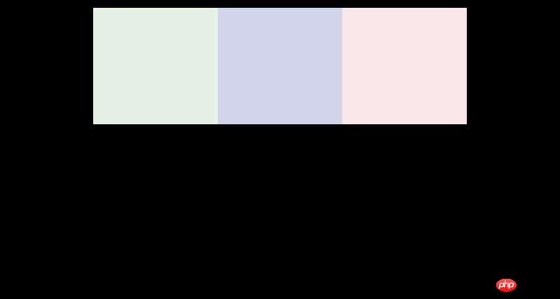
.flex-container {
    width: 960px;
    margin: 20px auto;
    min-height: 300px;
    font-weight: bold;
    display: -webkit-flex;
    display: flex;
    -webkit-flex-flow: row nowrap;
    flex-flow: row nowrap;
    -webkit-justify-content: space-around;
    justify-content: space-around;
    -webkit-align-items: stretch;
    align-items: stretch
}

.flex-container>p {
    padding: 10px
}

.flex-container>p:nth-child(1) {
    background-color: #e4f1e4;
    -webkit-flex: 1;
    flex: 1
}

.flex-container>p:nth-child(2) {
    background-color: #d2d4eb;
    -webkit-flex: 1;
    flex: 1
}

.flex-container>p:nth-child(3) {
    background-color: #f9e7e9;
    -webkit-flex: 1;
    flex: 1
}
左手右手慢动作

I changed the code of the questioner, but I don’t know if the questioner wanted this effect

    <style>
        .box1 {
            display: flex;
            width: 300px;
            height:300px;
            background: #dedede;
            border-radius: 5px;
            padding: 10px;
            margin: 10px;
            justify-content:center;
        }
    
        .item1 {
            width: 50px;
            height: 50px;
            background: orange;
            border-radius: 3px;
        }
        .item1{
            align-self: center;
        }
    </style>
    
    <p class="box1">
        <span class="item1"></span>
    </p>
Latest Downloads
More>
Web Effects
Website Source Code
Website Materials
Front End Template
About us Disclaimer Sitemap
php.cn:Public welfare online PHP training,Help PHP learners grow quickly!