
加了<meta name="viewport" content="width=device-width,initial-scale=1">
<table class="features">
            <tbody>
                <tr>
                    <th style="width: 15%;">
                        Features
                    </th>
                    <th style="width: 15%;">
                        Express<br>
                        Windows VPS
                    </th>
                    <th style="width: 15%;">
                        Basic<br>
                        Windows VPS
                    </th>
                    <th style="width: 15%;">
                        Professional<br>
                        Windows VPS
                    </th>
                    <th style="width: 15%;">
                        Advanced<br>
                        Windows VPS
                    </th>
                    <th>
                        Remarks on Features
                    </th>
                </tr>
            </tbody>
        </table>
.features {
width: 80%;
margin: 0 auto;
}
.features tbody{
width: 100%;
}
.features th{
background-color: #373d41;
color: #fff;
font-weight: 400;
}
@media screen and (max-width: 768px) {
.features {
width: 100%;
margin: 0;
}
}Pc上没问题:
手机上就超出了: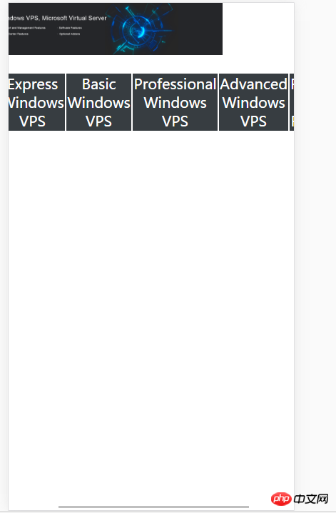
表格上面那张图片是设置为宽度100%的,而且底部出现了横向的滚动条。
要怎么才能让表格全部出现在屏幕里,不要滚动条。


![[Web front-end] Node.js quick start](https://img.php.cn/upload/course/000/000/067/662b5d34ba7c0227.png)


The elements in the table will be stretched by the content and cannot be smaller than the content size, so the set width will be invalid.

Add this style table-layout:fixed;
but there will be a problem, that is, the text in the table will overlap.
Or you can modify the font size according to the multimedia query. Or change the display format of the internal text in conjunction with other styles.
<meta name="viewport" content="width=device-width, initial-scale=1">
Have you added viewport meta?
Percentage is only relative to the parent element, vw is the "relative width" you think of.