84669 person learning
152542 person learning
20005 person learning
5487 person learning
7821 person learning
359900 person learning
3350 person learning
180660 person learning
48569 person learning
18603 person learning
40936 person learning
1549 person learning
1183 person learning
32909 person learning
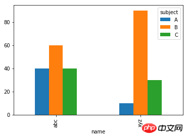
How to draw a bar chart with the name as the abscissa and the score as the ordinate?
Try it
df.pivot('name', 'subject', 'score').plot.bar()
The basic pandas visualization principle is to use pivot or melt to create the table format required for charting.
The following is the code I ran (Jupyter Notebook)
% matplotlib inline
data = [ {"name":"abc", "subject":"A", "score":40}, {"name":"abc", "subject":"B", "score":60}, {"name":"abc", "subject":"C", "score":40},
        {"name":"xyz", "subject":"A", "score":10}, {"name":"xyz", "subject":"B", "score":90}, {"name":"xyz", "subject":"C", "score":30}]
df = pd.DataFrame(data)
df.pivot('name', 'subject', 'score').plot.bar()
Result:
Try it
The basic pandas visualization principle is to use pivot or melt to create the table format required for charting.
The following is the code I ran (Jupyter Notebook)
Result:
