

Course Elementary 6953
Course Introduction:Draw a beautiful clock with canvas. Pictures are not included. By studying this course, you can re-master some geometric knowledge. Even if you have not learned canvas, you can quickly learn how to draw a beautiful clock, because I Will give a detailed introduction to the canvas api used

Course Elementary 10464
Course Introduction:The 13th online training class of php Chinese website officially started last night (2020.9.28)~~! The first 3 days of the course are free and open to the public, welcome to study! To register, please contact QQ27220243 (Teacher Zhong) or go to: //m.sbmmt.com/k.html

Course Advanced 14822
Course Introduction:"PHP+AJAX Real-time Table Editing Video Tutorial" introduces the basics of the knowledge used and the display of the work, and then introduces the specific operation methods.

Course Intermediate 13409
Course Introduction:This course will use short and concise language to develop a mall in a modular manner to facilitate code reuse. There is no need to spend a lot of time learning other unrelated functions to implement one function. At the same time, all courses are combined into one The complete shopping mall project is very suitable for students to practice.
How to make borders for columns in table?
2024-01-16 19:25:40 0 2 359
Make a <select> method for selecting drawing chart files
2023-08-20 10:08:18 0 1 484
Design an HTML table based on the provided image
2023-09-14 21:34:49 0 1 407
2017-05-16 13:28:36 0 2 1117
Implement table effect in web front-end page, this table is editable
2018-05-07 15:08:24 0 1 2443

Course Introduction:Sometimes we draw bar charts, line charts, Gantt charts, pie charts and other graphics in Excel tables to better show changes in data. But there are still many friends who don’t know how to draw it. In this tutorial, the editor will show you how to make a line chart from Excel table data. If you are interested, don’t miss it! Operation method 1. Open the Excel data table. 2. Select all table contents, and then click Insert - Line Chart on the menu bar. 3. Select a line chart you like and click on it. 4. Then, a line chart with consistent data will be automatically generated in the Excel table.
2024-08-27 comment 0 794

Course Introduction:Excel tables are software that many users use in their daily work. Various data are filled in the forms. Many users want to draw charts to display data, but don’t know how to make them. To address this problem, today’s software tutorial is here The majority of users have shared two solutions. Let’s take a look at the detailed steps. Excel drawing data chart tutorial 1. Generate function graph. Open the data through Microsoft 365 Excel, then select all the data, click Insert on the top menu bar, find the chart area on the toolbar, click on the recommended chart, you can open the settings window (Figure 2). First, we can directly select the recommended icon on the left, preview the rendering on the right, and click OK to insert it into the table. Apart from
2024-08-30 comment 0 670

Course Introduction:When we use WPS to process data, we often need to use a three-line table. So do you know how to draw a three-line table? The three-line table cancels all the vertical lines and the horizontal lines in the middle of the ordinary table, leaving only the horizontal lines above and below the table and the bottom horizontal line. Let's take a look at the specific production tutorial. Production tutorial: First, we select the area where we want to draw the three-line table, and then right-click the menu and select [Format Cells]. Then we select [Border Settings], select the line style as bold, and then turn on the upper and lower borders. After clicking OK, we select the first row again, enter the border settings again, and turn on the lower border inside. Finally click OK and our three-line table is completed.
2024-08-28 comment 0 1029
Course Introduction:This article mainly introduces the method of drawing color-filled rectangles through tables using javascript, and involves techniques related to javascript operating tables and styles. Friends in need can refer to the following
2016-05-16 comment 0 1239
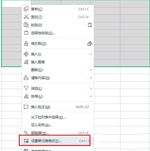
Course Introduction:As a commonly used office software, WPS can meet the various needs of users. Once mastered, it can also improve work efficiency. When using WPS tables to process data, you often need to draw a three-line table. So how to achieve this operation? Let’s share the setting method below. Setting method 1. First, we select the area where we want to draw the three-line table, and then right-click the menu and select [Format Cells]. 2. Select [Border Settings], select the line style as bold, and then turn on the upper and lower borders. 3. After clicking OK, we select the first row again, enter the border settings again, and turn on the lower border inside. 4. Finally click OK, and the three-line table is completed.
2024-07-24 comment 0 969