

CourseIntermediate4441
Course Introduction:There are two main purposes for studying this course: 1. Visual panel layout adapts to the screen 2. Use ECharts to realize histogram display Core Technology: -Based on flexible.js + rem smart large screen adaptation - VScode cssrem plug-in - Flex layout - Less to use - Based on ECharts data visualization display - ECharts histogram data settings - ECharts map introduction

CourseElementary20713
Course Introduction:Use PDO mode (PHP data object) to connect and select databases (unified operation of various databases), execute SQL statements and process result sets

CourseElementary1790
Course Introduction:Python visualization video series using matplotlib, seaborn, pyecharts, combined with real data sets; this video is reproduced from Bilibili: BV1gz411v7F5

CourseIntermediate8096
Course Introduction:Many programmers who have worked for many years still have a very basic understanding of databases. They are confused as soon as they go out for interviews. They don’t understand basic SQL statements, more complex SQL queries, and SQL statement optimization. They don’t even know how to use them. Redis improves system performance and can withstand tens of millions of concurrencies. This set of courses will help you thoroughly understand MySQL locks, execution plans, indexes, MVCC & Redis transactions, cache, breakdown, penetration, avalanche, warm-up, etc., and you can complete all database interviews in one set!

CourseAdvanced10268
Course Introduction:SSDB is a high-performance NoSQL database developed in C/C++ language. It supports KV, list, map(hash), zset(sorted set), qlist(queue) and other data structures. It is used to replace or cooperate with Redis to store billion-level lists. The data.
Where are the codes for the conn.php and functions.php files?
2018-04-12 17:39:53 0 2 1768
2018-12-22 13:07:35 0 0 1143
2020-04-24 10:41:44 0 2 1073

Course Introduction:Guide to C# Data Grid View. Here we discuss the examples of how a data grid view can be loaded and exported from the SQL database or an excel file.
2024-09-03 comment 0259

Course Introduction:Guide to Dataset in HTML. Here we discuss the Examples of Dataset in HTML along with the Specifications and comments in detail.
2024-09-04 comment 0175
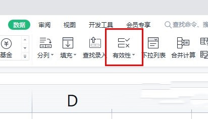
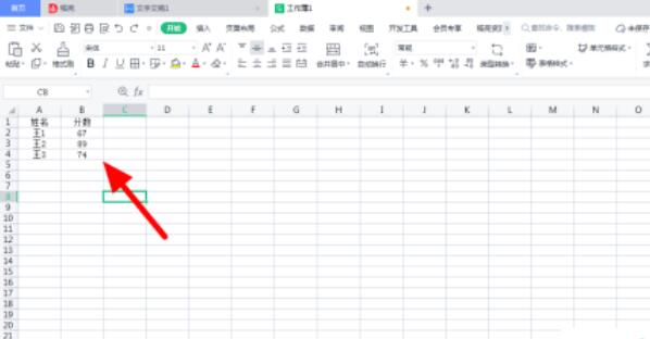
Course Introduction:How to set data validity in WPS form? WPS is a very convenient and practical office software, but when users use forms to enter data, they will find that a data needs to be formatted, which makes users' office work very troublesome. Next, let this site carefully introduce to users the method of setting data validity in WPS tables. Method for setting data validity in WPS form 1. First select the area where data needs to be filled in, and click the "Data" - "Validity" button in the upper menu bar. 2. The data validity dialog box will pop up, where you can set the data. For example, choose to allow integers, between the minimum value 0 and the maximum value 300. 3. In the error warning area, you can choose the style and warning content displayed when invalid data is entered.
2024-08-28 comment 0689
Course Introduction:How to highlight specific data using conditional formatting in Excel? Excel is one of the most commonly used data processing tools nowadays. Some users want to know how to highlight data through conditional formatting. For example, if the value is greater than a certain value, it will be displayed in red, and the others will be in another color. Next, I will introduce to you the specific details. Method steps. Setting method 1. First open the Excel document on the computer, and then select the cell data according to the arrow in the figure below. 2. Find and click the [Conditional Formatting] icon as pointed by the arrow in the picture below. 3. In the expanded drop-down list, click the [Highlight Rule] option as pointed by the arrow in the figure below. 4. Set rules according to needs. According to the arrow in the picture below, the editor takes [greater than] as an example. 5. In the pop-up window,
2024-08-26 comment 0853

Course Introduction:Sometimes we draw bar charts, line charts, Gantt charts, pie charts and other graphics in Excel tables to better show changes in data. But there are still many friends who don’t know how to draw it. In this tutorial, the editor will show you how to make a line chart from Excel table data. If you are interested, don’t miss it! Operation method 1. Open the Excel data table. 2. Select all table contents, and then click Insert - Line Chart on the menu bar. 3. Select a line chart you like and click on it. 4. Then, a line chart with consistent data will be automatically generated in the Excel table.
2024-08-27 comment 0761