Found a total of 10000 related content

How to make a responsive slideshow player using HTML, CSS and jQuery
Article Introduction:How to make a responsive slideshow player using HTML, CSS and jQuery In today's web design, slideshow players are one of the most common and popular elements. The slideshow player can display pictures and text with exquisite animation effects, giving users a more attractive visual experience. This article will introduce how to use HTML, CSS and jQuery to create a responsive slideshow player, and provide specific code examples. Step 1: Create HTML Structure First, we need to create HTML structure
2023-10-24
comment 0
769
HTML5 SVG响应式路径过渡动画幻灯片特效
Article Introduction:这是一款基于HTML5 SVG制作的路径过渡动画幻灯片特效。该幻灯片特效使用SVG路径来剪裁幻灯片中的图片,制作出幻灯片切换时不规则的图形变换效果。,。
2016-05-17
comment 0
1541

Specific tutorial on adding animation switching effects to PPT slides
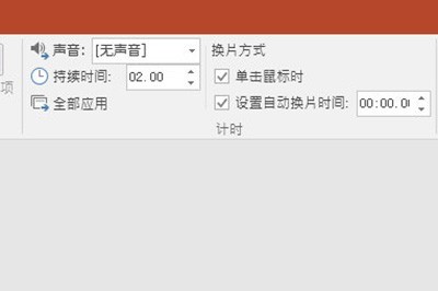
Article Introduction:1. For office 2007 and above, you can find the slide transition in the animation menu. For office 2003, you can find the slide show in the slide show menu. 2. The slide switching is unified into the animation menu. First, select the slide to be set, and it will change color after selection. 3. Select the corresponding function directly in the toolbar above. The left side is the switching effect, and the right side is the switching option. For example: switch speed, switch sound. 4. If you want to set the effect for all slides, it is very simple. Set the effect for one slide and click Apply to All above. 5. To change slides, click the mouse. Just click Settings. 6. The slide switching effect only displays one line in the picture above. In fact, there are rich effects in it. Click the button in the picture below, the red part.
2024-03-26
comment 0
1281

Specific operations for setting animation playback and film changing methods in ppt2013
Article Introduction:Open the ppt software and enter the main interface. The example in this article contains 3 slides. Click [Switch] on the menu bar. You can see that there are various switching modes, just choose the one you like. In this example, select [Louvres]. On the menu bar, you can see the [Change Mode] column. The default is [When the mouse is clicked] to switch slides. Because this article wants to achieve the purpose of automatic loop playback, this option is not selected. Click [Set automatic slide change time] and adjust the corresponding time. At this time, you can switch to the next slide at a certain interval; there is a [Duration] on the left, you can set the time required for the slide switching process. After the settings are completed, click [Apply to All] to apply the effect to all slides. Next, set up the automatic playback of the slideshow.
2024-04-17
comment 0
530

What are the three slide show methods?
Article Introduction:There are three ways to show slides: 1. "Speaker Show". The speaker has full control during the entire show. 2. "Audience self-browsing" is a type of show that allows the audience to watch the slides by themselves. 3. "Browse in the booth". During the screening process, except that the mouse cursor is reserved for selecting screen objects for screening, all other functions will be disabled.
2021-06-11
comment 0
104928

How to make random roll call in PPT_It can be done in just a few simple steps
Article Introduction:First, we open PPT, create a new slide, and enter names in the slides on each page. After the first slide, click [Switch] above. In the slide change mode, check Set automatic slide change time, set the time to 0 seconds, and then click Apply to all. Then click [Slide Show] - [Set Slide Show] above, and check [Loop show, press ESC to terminate]. After confirmation, we start the show, and the rotation of names will begin on the screen. We press the number key 1 to pause and extract the names, and press the space bar to continue the rotation. Isn't it very simple? After mastering this technique, it will be very easy to take roll call in class. This method is okay for temporary use. The main disadvantage is that filling in the name will be a bit troublesome, but you can use E
2024-04-24
comment 0
829


Tips for implementing responsive waterfall flow card layout using CSS
Article Introduction:Tips for using CSS to implement responsive waterfall flow card layout, specific code examples are required. In today's era of widespread mobile devices, responsive design has become one of the essential elements of modern websites. As a popular layout method, responsive waterfall flow card layout can achieve smooth display effects on different screen sizes. This article will introduce how to use CSS to implement a responsive waterfall flow card layout, and attach specific code examples. First, we need to clarify the characteristics of the waterfall flow card layout. Waterfall layout divides and arranges cards according to the number of columns
2023-11-21
comment 0
1382

Thor ZERO 2024 gaming notebook new configuration is on sale: i9-14900HX + RTX4080 for 14,999 yuan
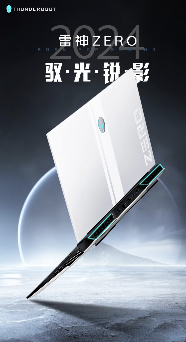
Article Introduction:According to news from this site on May 27, the Thor ZERO 2024 Phantom gaming notebook "i9-14900HX+RTX4080+32GBRAM+1TB" configuration model will be on sale on JD.com at 10 o'clock today, priced at 14,999 yuan. According to the official introduction, this notebook adopts the "Qise" design language, is equipped with surround lights, has a 16-inch screen with a resolution of 2560x1600, a refresh rate of 240Hz, a screen brightness of 500 nits, a contrast ratio of 1200:1, a response speed of 5ms, and coverage of 100% sRGB. Color gamut space. In addition, this notebook supports independent graphics output, mixed output, and integrated graphics modes. It is equipped with "Wind Tunnel Cooling Architecture 4.0", has four heat pipes, 245 0.15mm fins, and supports "one-click power-up".
2024-06-09
comment 0
1080
Thor ZERO 2024 gaming notebook new configuration released: i9-14900HX + RTX 4060 + 16GB + 1TB, priced at 9,999 yuan
Article Introduction:According to news from this site on January 16, Raytheon today launched the i9-14900HX+RTX4060+16GBRAM+1TB configuration model on JD.com for the ZERO2024 Phantom gaming notebook, with a "500 yuan off for purchases over 9,999 yuan" discount, and you can get it for 9,999 yuan. According to the official introduction, this notebook adopts the "Qise" design language, is equipped with surround lights, has a 16-inch screen with a resolution of 2560x1600, a refresh rate of 240Hz, a screen brightness of 500 nits, a contrast ratio of 1200:1, a response speed of 5ms, and coverage of 100% sRGB. Color gamut space. In addition, this notebook supports independent graphics output, mixed output, and integrated graphics modes. It is equipped with "Wind Tunnel Cooling Architecture 4.0" and has four heat pipes and 245 0.15mm chips.
2024-01-16
comment 0
1179

jQuery plug-in bxSlider implements responsive focus map_jquery
Article Introduction:Features of bxSlider 1. Fully responds to various devices and adapts to various screens; 2. Supports multiple sliding modes, horizontal, vertical and fade-in and fade-out effects; 3. Supports pictures, videos and any html content; 4. Supports touch sliding; 5. Supports Firefox, Chrome, Safari, iOS, Android, IE7. Let’s discuss it in detail below.
2016-05-16
comment 0
1242

How to use Vue to implement image preview effects
Article Introduction:How to use Vue to implement image preview effects Introduction: In modern web design, image preview effects have become a common requirement. Through image preview, the user experience can be improved and users can have a more comprehensive understanding of the image content. As a popular front-end framework, Vue provides a wealth of components and responsive data processing capabilities, which is very suitable for implementing image preview effects. This article will introduce how to use Vue to implement a simple image preview effect and provide corresponding code examples. Step 1: Create a Vue component First, we
2023-09-19
comment 0
1098

Learn CSS3 flexbox skills, how to achieve equal height arrangement of web page images?
Article Introduction:Learn CSS3 flexbox skills, how to achieve equal height arrangement of web page images? In web design, we often encounter situations where pictures need to be arranged at equal heights. The traditional method is to set a fixed height for each image, but this is not only cumbersome but also inflexible. Especially in responsive design, the height of the image may be different under different device sizes. The flexbox layout in CSS3 provides a simpler and more effective solution. 1. Introduction to flexbox Flexbox layout is CSS3
2023-09-09
comment 0
715

CSS3 tips: achieve horizontally centered fit-content effect
Article Introduction:CSS3 Tips: Achieve Horizontally Centered Fit-Content Effect In web development, horizontal centering is a common layout requirement. Especially in responsive design, we often need to center elements horizontally to adapt to different screen sizes. This article will introduce a method to use CSS3 techniques to achieve a horizontally centered fit-content effect. In the traditional horizontally centered layout, we often use the margin attribute to move the element to the left or right by half the width to achieve horizontal centering. However, in some special
2023-09-09
comment 0
1297

How to quickly import PPT images in batches
Article Introduction:(1) Click [Insert]-[Album] in the menu bar, and select the [New Album] command in the pop-up drop-down menu. (2) Open the [Album] dialog box, select the source of the inserted pictures from [File/Disk], press Ctrl+A, select all the pictures you want to insert, click the [Insert] button, return to the [Album] dialog box, Note: After adding pictures in the [Album] dialog box, you can also adjust the picture position, picture display mode, picture layout, photo frame shape, theme and other parameters. You can set them according to your needs. Among them, the [Picture Layout] drop-down list contains four options that are particularly important, reflecting the layout style of the picture after it is imported into PPT, as shown in the figure: Specific meaning: Adapt to slide layout: This is the default layout, the picture will be enlarged in equal proportions, the maximum of account
2024-04-17
comment 0
865

What is html5 responsive layout
Article Introduction:HTML5 responsive layout is a web design method based on HTML5 and CSS3 technology, which enables web pages to automatically adjust layout and display effects according to the screen size and resolution of different devices, adapting to browsing on various terminal devices. Through technical means such as elastic grid layout, media query, elastic pictures and media, breakpoints and progressive enhancement, the adaptive layout and display effect of web pages on different devices are realized. It has the ability to adapt to different devices and improve usability and accessibility. , saving time and cost, supporting search engine optimization and other advantages, it is an important practice in modern web design.
2023-10-18
comment 0
2044

BenQ officially announces EX321UX 31.5-inch flagship monitor to be released in May, 4K 144Hz Mini-LED
Article Introduction:According to news from this site on February 23, BenQ officially announced today a flagship monitor model named "EX321UX", featuring "4K144Hz Mini-LED", which will be officially released in May. The price has not yet been announced. ▲Image source BenQ official press release According to reports, this monitor is equipped with a 31.5-inch 3840x2160 resolution 144Hz Mini-LED screen, has 1152 backlight partitions, a peak brightness of 1000 nits, a response speed of 1ms, supports 10-Bit color depth, and covers 100% DCI-P3 color gamut. In addition, this monitor supports Dolby Atmos and DTS:X7.1 channel audio output, the stand is multi-directionally adjustable, and has RGB lighting effects. In terms of interface, this website noticed that the display
2024-02-24
comment 0
1142

Xiaomi mobile phone function guide (discover all the functions and skills of Xiaomi mobile phone, and learn more about the wonderful uses of Xiaomi mobile phone)
Article Introduction:Xiaomi mobile phones are popular for their beautiful appearance and excellent performance, and they also have many practical functions and tricks. This article will introduce all the functions of Xiaomi mobile phones to help users better use and experience this smartphone brand. 1. System function optimization - stable and smooth experience 1. Background cleaning and application management: Improve system speed and response efficiency, and learn how to optimize the background operation of the mobile phone system. 2. Intelligent adjustment of screen brightness: Save power and protect your eyes. Teach you how to automatically adjust screen brightness. 2. Photography and camera skills - recording beautiful moments 3. Practical camera modes: such as panoramic shooting, night scene mode, etc. Introduce the unique camera mode of Xiaomi mobile phones to improve the camera effect. 4. Camera settings and parameter adjustment: to obtain better photo effects, teach
2024-02-02
comment 0
1489

What can html5 be used for?
Article Introduction:HTML5 introduces new features to revolutionize the web experience: Responsive design: Automatically adjust the website to fit various device screen sizes. Multimedia support: Directly embed video, audio, motion graphics and photorealistic 3D scenes. Offline browsing: Allows web applications to run when there is no network connection. Form enhancement: Provides new form control types and form validation to ensure data validity. Geolocation: Allows access to users' geographical location data to implement location-based services. Security enhancements: Protect web applications from attacks with encryption, CSRF protection, and CSP.
2024-04-05
comment 0
788

