
Matplotlib is Python's most famous drawing library. This article shares with you examples of how to use matplotlib+numpy to draw a variety of drawings, including filled plots, scatter plots, and bar plots. , contour plots, bitmaps and 3D diagrams, friends in need can refer to them. Let’s take a look together.
Preface
matplotlib is Python’s most famous drawing library. It provides a set of commands similar to matlabAPI, very suitable for interactive mapping. This article will analyze several graphs supported in matplot and commonly used in analysis in the form of examples. These include fill plots, scatter plots, bar plots, contour plots, dot plots and 3D plots. Let’s take a look at the detailed introduction:
1. Filling diagram
Reference code
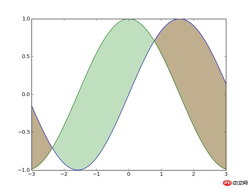
from matplotlib.pyplot import * x=linspace(-3,3,100) y1=np.sin(x) y2=np.cos(x) fill_between(x,y1,y2,where=(y1>=y2),color='red',alpha=0.25) fill_between(x,y1,y2,where=(y<>y2),color='green',alpha=0.25) plot(x,y1) plot(x,y2) show()
Brief analysis
Thefill_betweenfunctionis mainly used here. This function is easy to understand. It is to pass in thearrayof the x-axis and the two y-axis arrays that need to be filled; then pass in the filled range and usewhere=to determine the filled area. ; Finally, you can add fill color, transparency and other modified parameters.
Of course thefill_betweenfunction has more advanced usage, see fill_between usage or help documentation for details.
Rendering
## 2. Scatter plots
Reference code
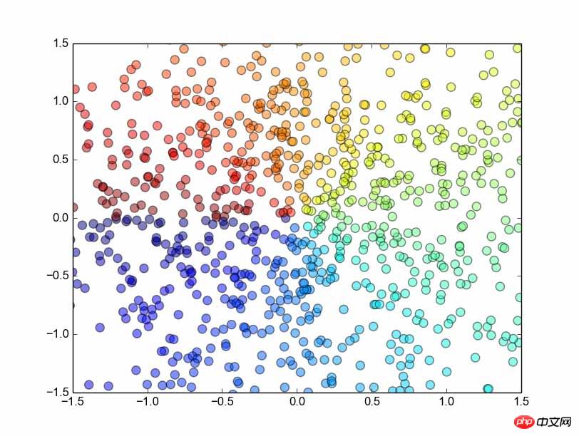
from matplotlib.pyplot import * n = 1024 X = np.random.normal(0,1,n) Y = np.random.normal(0,1,n) T = np.arctan2(Y,X) scatter(X,Y, s=75, c=T, alpha=.5) xlim(-1.5,1.5) ylim(-1.5,1.5) show()
Brief analysis
First introduce Numpy'snormalfunction, obviously, this is a function that generates a normal distribution. This function accepts three parameters, which represent the mean, standard deviation, and length of the generated array respectively. Very easy to remember.
arctan2function. This function accepts two parameters, representing the y array and the x array respectively, and then returns the correspondingarctan(y/x)value. , the result is in radians.
scattermethod of drawing a scatter plot is used. First, of course, the x and y arrays are passed in, and then the s parameter represents scale, which is the size of the scatter points; the c parameter represents color , what I passed him was an array divided according to the angle, which corresponds to the color of each point (although I don’t know how it corresponds, but it seems to be a relative conversion based on other elements in the array, which is not important here. , anyway, just assign the same value to the same color); the last is thealphaparameter, which represents the transparency of the point.
scatterfunction, please refer to the official document scatter function or help document.
Rendering
##3. Bar plots
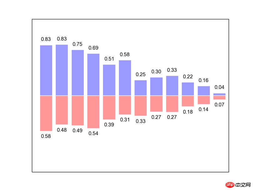
from matplotlib.pyplot import * n = 12 X = np.arange(n) Y1 = (1-X/float(n)) * np.random.uniform(0.5,1.0,n) Y2 = (1-X/float(n)) * np.random.uniform(0.5,1.0,n) bar(X, +Y1, facecolor='#9999ff', edgecolor='white') bar(X, -Y2, facecolor='#ff9999', edgecolor='white') for x,y in zip(X,Y1): text(x+0.4, y+0.05, '%.2f' % y, ha='center', va= 'bottom') for x,y in zip(X,Y2): text(x+0.4, -y-0.05, '%.2f' % y, ha='center', va= 'top') xlim(-.5,n) xticks([]) ylim(-1.25,+1.25) yticks([]) show()
Be careful to do it manually Import the pylab package, otherwise bar will not be found. . .
First use numpy's
arangefunction to generate an array of [0,1,2,…,n]. (You can also use linspace)Secondly, use numpy's
function to generate a uniformly distributed array, passing in three parameters representing the lower bound, upper bound and array length respectively. And use this array to generate the data that needs to be displayed.Then comes the use of the bar function. The basic usage is similar to the previous plot and scatter. The horizontal and vertical coordinates and some decorative parameters are passed in.
Then we need to use
forloopto display numbers for the histogram: use python'szipfunction to pair X and Y1 and merge them Loop through to get the position of each data, and then use thetextfunction to display astringat that position (pay attention to the detailed adjustment of the position). text passes in the horizontal and vertical coordinates, the string to be displayed, thehaparameter specifies the horizontal alignment, and the va parameter specifies the vertical alignment.Finally adjust the coordinate range and cancel the scale on the horizontal and vertical coordinates to keep it beautiful.
As for the specific usage of the
barfunction, please refer to the bar function usage or the help document.
Reference Code
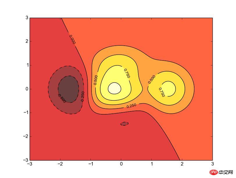
from matplotlib.pyplot import * def f(x,y): return (1-x/2+x**5+y**3)*np.exp(-x**2-y**2) n = 256 x = np.linspace(-3,3,n) y = np.linspace(-3,3,n) X,Y = np.meshgrid(x,y) contourf(X, Y, f(X,Y), 8, alpha=.75, cmap=cm.hot) C = contour(X, Y, f(X,Y), 8, colors='black', linewidth=.5) clabel(C, inline=1, fontsize=10) show()
简要分析
首先要明确等高线图是一个三维立体图,所以我们要建立一个二元函数f,值由两个参数控制,(注意,这两个参数都应该是矩阵)。
然后我们需要用numpy的meshgrid函数生成一个三维网格,即,x轴由第一个参数指定,y轴由第二个参数指定。并返回两个增维后的矩阵,今后就用这两个矩阵来生成图像。
接着就用到coutourf函数了,所谓contourf,大概就是contour fill的意思吧,只填充,不描边;这个函数主要是接受三个参数,分别是之前生成的x、y矩阵和函数值;接着是一个整数,大概就是表示等高线的密度了,有默认值;然后就是透明度和配色问题了,cmap的配色方案这里不多研究。
随后就是contour函数了,很明显,这个函数是用来描线的。用法可以类似的推出来,不解释了,需要注意的是他返回一个对象,这个对象一般要保留下来个供后续的加工细化。
最后就是用clabel函数来在等高线图上表示高度了,传入之前的那个contour对象;然后是inline属性,这个表示是否清除数字下面的那条线,为了美观当然是清除了,而且默认的也是1;再就是指定线的宽度了,不解释,。
效果图
五、点阵图
参考代码
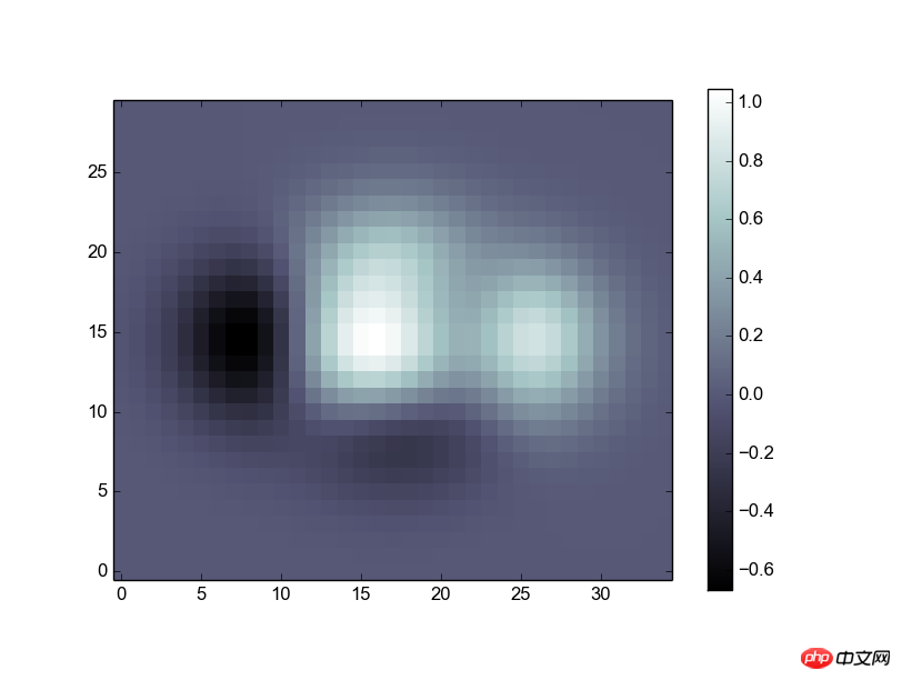
from matplotlib.pyplot import * def f(x,y): return (1-x/2+x**5+y**3)*np.exp(-x**2-y**2) n = 10 x = np.linspace(-3,3,3.5*n) y = np.linspace(-3,3,3.0*n) X,Y = np.meshgrid(x,y) Z = f(X,Y) imshow(Z,interpolation='nearest', cmap='bone', origin='lower') colorbar(shrink=.92) show()
简要分析
这段代码的目的就是将一个矩阵直接转换为一张像照片一样的图,完整的进行显示。
前面的代码就是生成一个矩阵Z,不作解释。
接着用到了imshow函数,传人Z就可以显示出一个二维的图像了,图像的颜色是根据元素的值进行的自适应调整,后面接了一些修饰性的参数,比如配色方案(cmap),零点位置(origin)。
最后用colorbar显示一个色条,可以不传参数,这里传进去shrink参数用来调节他的长度。
效果图
六、3D图
参考代码
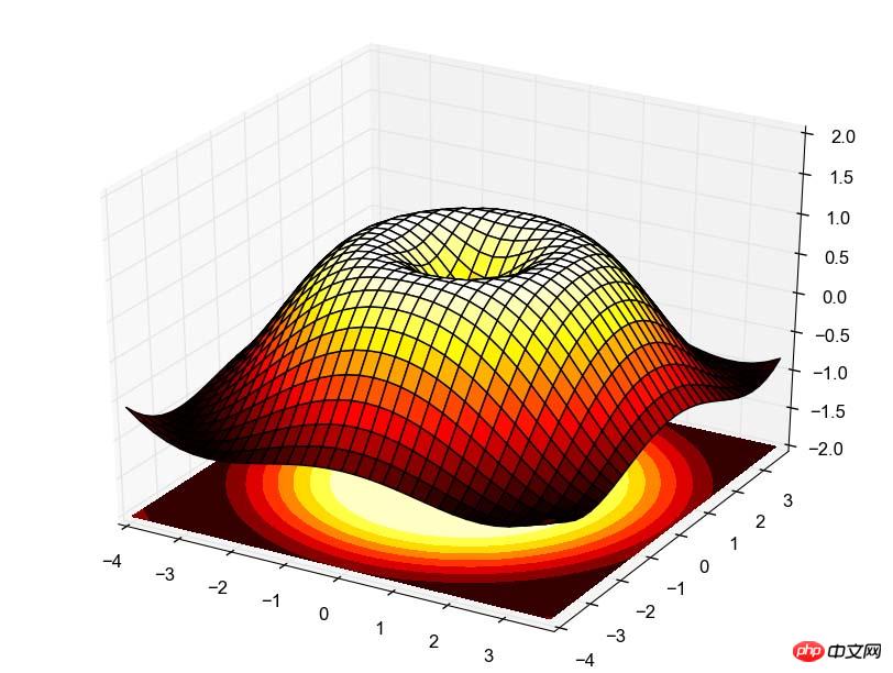
import numpy as np from pylab import * from mpl_toolkits.mplot3d import Axes3D fig = figure() ax = Axes3D(fig) X = np.arange(-4, 4, 0.25) Y = np.arange(-4, 4, 0.25) X, Y = np.meshgrid(X, Y) R = np.sqrt(X**2 + Y**2) Z = np.sin(R) ax.plot_surface(X, Y, Z, rstride=1, cstride=1, cmap=plt.cm.hot) ax.contourf(X, Y, Z, zdir='z', offset=-2, cmap=plt.cm.hot) ax.set_zlim(-2,2) show()
简要分析
有点麻烦,需要用到的时候再说吧,不过原理也很简单,跟等高线图类似,先画图再描线,最后设置高度,都是一回事。
效果图
总结
【相关推荐】
The above is the detailed content of Introduction to the method of drawing using the drawing library in python. For more information, please follow other related articles on the PHP Chinese website!


