


Photoshop制作的一个漂亮的蓝色水滴

水滴的制作难点主要是水滴的立体感和光感。制作的时候先做出水滴的大致明暗关系,然后多用几个图层逐步加强暗部层次。最后加上高光区域即可。
最终效果 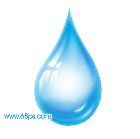
1、新建一个600 * 600像素的文件,背景填充白色。新建一个图层,用钢笔工具勾出水滴的轮廓,转为选区如图1。 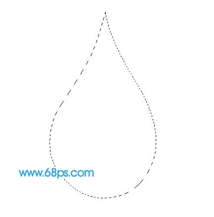
<图1> 2、选择渐变工具,颜色设置如图2,拉出图3所示的径向渐变。 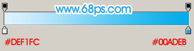
<图2> 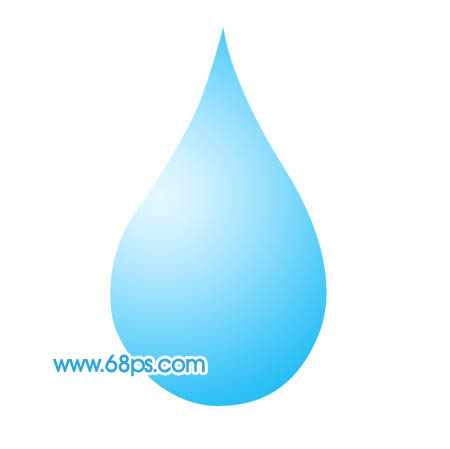
<图3>
3、新建一个图层,用钢笔勾出图4所示的选区,拉上图5所示的径向渐变,效果如图6。 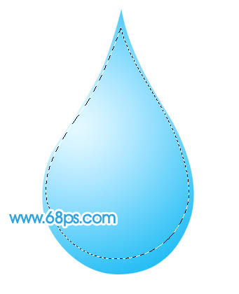
<图4> 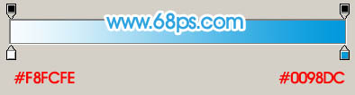
<图5> 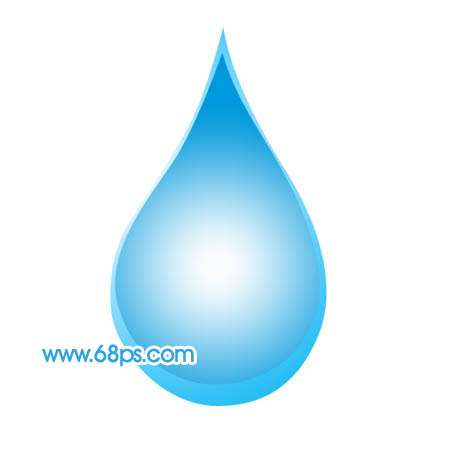
<图6> 4、执行:滤镜 > 模糊 > 高斯模糊,数值为5,确定后删除多出部分,效果如下图。 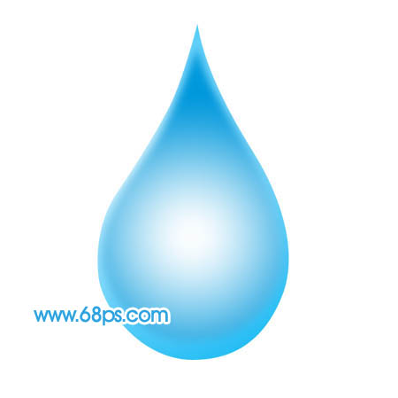
<图7>
5、新建一个图层,用钢笔勾出下图所示的选区,拉上图9所示的线性渐变。然后取消选区,再执行:滤镜 > 模糊 > 高斯模糊,数值为5,效果如图10。 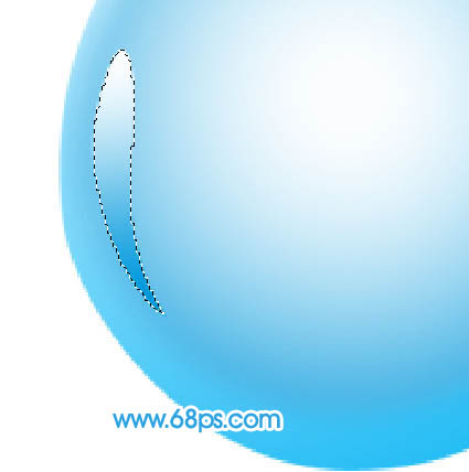
<图8>
<图9> 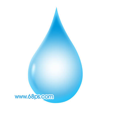
<图10> 6、新建一个图层,用钢笔勾出图11所示的选区,按Ctrl + Alt + D 羽化8个像素,选择渐变工具,颜色设置如图12,拉出图13所示的径向渐变。 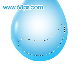
<图11> 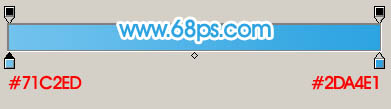
<图12> 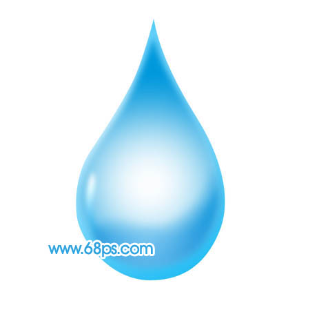
<图13>

Hot AI Tools

Undress AI Tool
Undress images for free

Undresser.AI Undress
AI-powered app for creating realistic nude photos

AI Clothes Remover
Online AI tool for removing clothes from photos.

Clothoff.io
AI clothes remover

Video Face Swap
Swap faces in any video effortlessly with our completely free AI face swap tool!

Hot Article
Hot Tools

Notepad++7.3.1
Easy-to-use and free code editor

SublimeText3 Chinese version
Chinese version, very easy to use

Zend Studio 13.0.1
Powerful PHP integrated development environment

Dreamweaver CS6
Visual web development tools

SublimeText3 Mac version
God-level code editing software (SublimeText3)
Hot Topics


 What are some common keyboard shortcuts that can significantly speed up a Photoshop workflow?
Jul 07, 2025 am 12:17 AM
What are some common keyboard shortcuts that can significantly speed up a Photoshop workflow?
Jul 07, 2025 am 12:17 AM
Mastering Photoshop shortcut keys can significantly improve work efficiency. 1. Zoom and Navigation: Z key activates the zoom tool, Space bar Drag the quick pan canvas, double-click Z key to adapt the image to the window size, Ctrl/Cmd/-adjust the zoom level; 2. Layer management: Ctrl Shift N creates a new layer, Ctrl G group, Ctrl E merges layers, Shift [or] moves the layer level, Ctrl Click on the layer thumbnail to quickly select content; 3. Select and brush adjustment: M and L to switch rectangular marquee and lasso tools respectively, Shift adds/Alt to subtract selections, [or] adjusts the brush size, Shift [or] adjusts the hardness, so as to achieve efficient editing and smooth operation.
 How to restore an old photograph in Photoshop
Jul 12, 2025 am 12:40 AM
How to restore an old photograph in Photoshop
Jul 12, 2025 am 12:40 AM
Repairing old photos can be achieved through key steps in Photoshop. The first is scanning and preliminary adjustment, including high-resolution scanning, cropping images, rotation correction and brightness/contrast adjustment; the second is to remove scratches and stains, use the imitation stamp tool to deal with large-area damage, repair tools to deal with small scratches, and pay attention to low transparency overlay and layering operations; the third is optional coloring and color tuning, and use the "hue/saturation" adjustment layer to increase retro tone; the last is to polish and output, check details, adjust sharpness, confirm resolution and select a suitable format to save. The entire process requires patience and meticulousness, especially when dealing with key parts such as the facial features of the characters.
 How to create a custom gradient in Photoshop
Jul 07, 2025 am 12:24 AM
How to create a custom gradient in Photoshop
Jul 07, 2025 am 12:24 AM
The key to creating a custom gradient in Photoshop is to master the use of the gradient editor. 1. First select the gradient tool (shortcut key G), click the top preview bar to open the "Gradge Editor"; 2. Click "New" in the editor to start customization, and you can also modify the style in the built-in gradient library; 3. Set color transition by adding, deleting and dragging the color slider, and double-clicking the slider to select specific colors; 4. Adjust the opacity stop point to control the transparency changes, click the diamond icon to add the transparency node; 5. Select linear, radial and other types in the gradient tool options to match design needs, and you can get started quickly after you are proficient.
 What are the key differences between Layer Masks and Vector Masks, and when should each be used?
Jul 16, 2025 am 12:03 AM
What are the key differences between Layer Masks and Vector Masks, and when should each be used?
Jul 16, 2025 am 12:03 AM
LayerMasks and VectorMasks are used in Photoshop with similar uses but different principles. LayerMasks is based on pixels and uses grayscale values to control the display and hiding of layer areas. It is suitable for photo detail editing, soft transition effects and fine brush adjustments, but zooming in may lead to jagging; VectorMasks is based on vector paths and shapes, and has resolution irrelevant resolution. It is suitable for graphics that require clear edges such as logos, icons or text frames, and can be scaled losslessly; the selection is based on the content type (photo or graphics), whether the size needs to be greatly adjusted, and the required edge effects (soft or sharp), and sometimes combined use can give full play to their respective advantages.
 What is the difference between raster and vector graphics within Photoshop?
Jul 04, 2025 am 12:18 AM
What is the difference between raster and vector graphics within Photoshop?
Jul 04, 2025 am 12:18 AM
Raster and vector graphics have different uses in Photoshop, and understanding their differences can help design decisions. Raster graphics are made of pixels and are suitable for photos and complex textures, but the scaling will blur; Vector graphics are based on mathematical formulas and can be scalable without loss, suitable for logos, icons and clear line art. Use the shape tool in Photoshop or importing EPS/PDF files to create Vector graphics, but loses scalability once rasterized. Using Raster includes editing photos, applying filters, or creating textured artworks; using Vector includes designing logos that need to be scaled, adding clear text or shapes. Both can coexist in the same file, but need to be cleared
 How can vector shapes be created and manipulated in Photoshop?
Jul 14, 2025 am 12:01 AM
How can vector shapes be created and manipulated in Photoshop?
Jul 14, 2025 am 12:01 AM
TocreateandmanipulatevectorshapesinPhotoshop,usetheShapeToolstodrawvectorpathsonshapelayers,editanchorpointswiththeDirectSelectionTool,combineorsubtractshapesusingpathoperations,andrasterizewhennecessary.First,selectthedesiredshapetool—Rectangle,Elli
 How to select a specific color range in Photoshop
Jul 12, 2025 am 12:37 AM
How to select a specific color range in Photoshop
Jul 12, 2025 am 12:37 AM
ToselectaspecificcolorrangeinPhotoshop,usetheColorRangetool.1.GotoSelect>ColorRangeandclicktheeyedropperonthedesiredcolor.2.AdjusttheFuzzinessslidertocontrolselectionbreadth.3.AddmoresampleswithShift-clicks.4.EnableLocalizedColorClustersforcomplex
 What are artboards in Photoshop
Jul 14, 2025 am 12:04 AM
What are artboards in Photoshop
Jul 14, 2025 am 12:04 AM
AnartboardinPhotoshopisamovable,resizablecontainerthatactsasanindividualcanvaswithinasingledocument.Itallowsdesignerstocreatemultiplelayoutsordesignvariationssidebyside,eachwithitsownsizeandcontent.Artboardsareidealforweblayouts,appscreens,banners,an
