

[Introduction] Once you decide to build a website, you should have developed design standards. What do you think should be done next? test! I use the word testing to test how well your website responds to different screen and browser sizes. Testing is an important step in the responsive web design process. If you understand...
Once you decide to build a website you should already have design standards in place. What do you think should be done next? test! I use the word “test” to test how well your website responds to different screens and browser sizes. Testing is an important step in the responsive web design process. If you know what I’m talking about you need to make your website look good on any type of device.
In today's world, technological advancements and tools have brought users beyond the confines of a laptop or desktop using the web. This is helped by the blazing data speeds offered by telcos. This leaves designers to ensure that the website works well on a variety of devices.
Fortunately, this is not a big problem. There are many good free responsive web design testing tools available online that can help you check whether your website design is user-friendly and responsive to various devices. The website should be user-friendly and responsive on various devices available. Creating a responsive/multi-device compatible website design that is smart, flexible, and consistent with the regular web experience will surely lead to success.

Listed below are some great tools and resources that can help you design a website that works across different device sizes and operating systems. No coding knowledge is required to test a responsive site using the tools and resources listed below.
The best free responsive web design testing tool
The responsive design bookmark is a convenient tool for responsive design testing. You just drag the bookmark on the bookmarks bar and it will be applied to your browser. How it works: First, a virtual keyboard is triggered to check how much space the user has when entering data. Trigger CSS refresh later.
When you save a CSS file, the changes take effect immediately, without the need to refresh the browser you are working in. Finally, close the bookmark and return to the current page. This lets you preview the current page in a size that fits the width of your tablet or smartphone screen.
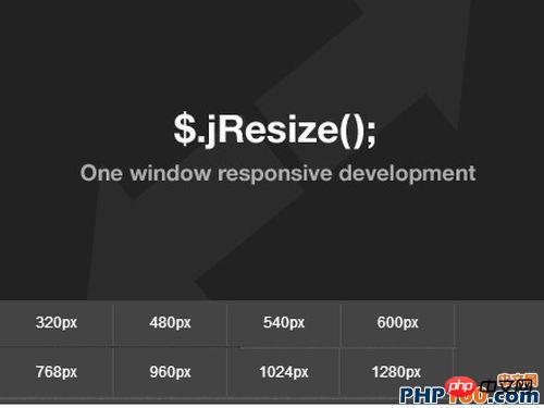
jResize is a responsive web development tool integrated in jQuery to assist responsive development projects. Frames are embedded into web pages at different widths. So, it's easy to adjust your HTML in the browser. All you have to do is download this cool tool and the dimensions will change when you click on the width you want.
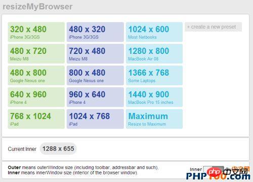
resizeMyBrowser is a responsive web design tool that allows you to select the browser size you want to test. Users can choose from 15 different preset sizes or enter custom sizes.
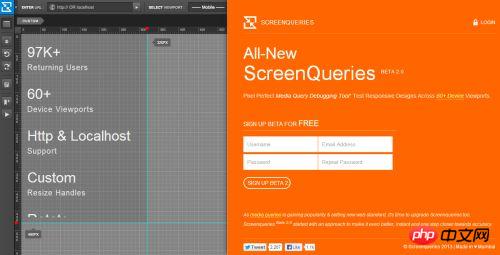
Screenqueri.es is a perfect pixel-level responsive design testing tool that allows you to test the screen in 30 different Test your design on a device or in a custom resolution window.
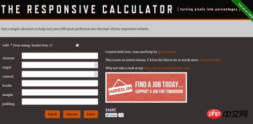
The Response Calculator is a tool that facilitates designers to convert pixels to 100% in a given situation. It helps you perfectly fit PSD pixels into your website. Just simply click on your needs.
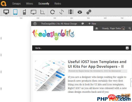
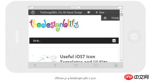
Screenfly by QuirkTools is an online digital device simulation tool that allows users to preview their responsive designs in different devices Website, such as desktop, tablet, mobile phone or TV. It is easy to use and as mentioned before gives you a variety of options like viewing on different sizes of desktop computer monitors and virtual TV screens. Additionally it has options to enable or disable scrolling or rotating the display.
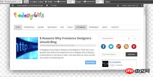
Responsinator is a cool tool, an online website that allows you to preview your web pages on smartphones and tablets in portrait and landscape modes. In addition, Responsinator can give you a realistic experience of browsing your website on different screens. Just enter the URL and preview on iPhone, iPad, Kindle and other Android phones.
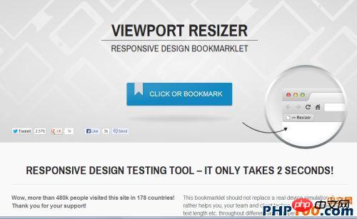
Viewport resizer is a browser-based tool that allows users to test the responsiveness of any website. Users only need to save the bookmark, visit the page they want to test, click on the created bookmark and check how the page performs on all types of screen resolutions.
This is a simple and useful tool that asks you to enter the URL of the site or page you want to test and then select your The device you want to test.
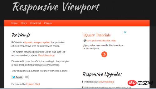
Developed by Edward Cant, ReView is a dynamic windowing system that provides an effective responsive web view choose. Users can choose to enter and exit responsive design states.
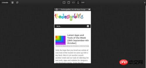
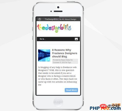
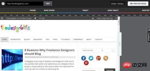
Designmodo Responsive Test As the name suggests, this is a responsive website testing tool that can help you in a large number of Test website testing in screen sizes. Simply type the URL to select a device type or enter a custom size. The image below shows a responsive test of our website.
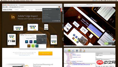
Adobe Edge Inspect CC allows you to preview and inspect your web design on various devices. It has many features such as synchronous browsing, remote inspection, screenshots, edge detection, scalability and so on.
It is a cool online portal or tool that you can use to test your responsive website design. It lets you adjust your website pixel by pixel. This feature allows you to set breakpoints and test how CSS media works on your site.
DimensionsApp is an online emulator for mobile phones and tablets, which can help you operate on devices such as tablets, wide screen devices, mobile phones Test the responsiveness of your website across many devices. Just enter your blog's URL and click on the names of the various devices to see how it will look.
In addition to the tools listed above, do you have any favorite free responsive web design tools? If so, please share it quickly.
Related tool recommendations:
A very useful JavaScript development tool: WebStorm Mac version
Time-saving browser synchronization Test tool: browser-sync-master
php Chinese website toolbox: php development tools free download
The above is the detailed content of 14 Free Responsive Web Testing Tools. For more information, please follow other related articles on the PHP Chinese website!


![[Web front-end] Node.js quick start](https://img.php.cn/upload/course/000/000/067/662b5d34ba7c0227.png)


