
這次帶給大家Echarts實現動態變色長條圖,Echarts實現動態變色長條圖的注意事項有哪些,下面就是實戰案例,一起來看一下。
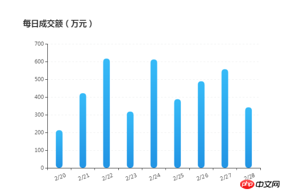
效果圖:
<!DOCTYPE html>
<html>
<head>
<metacharset="utf-8">
<title>ECharts柱状图</title>
</head>
<body>
<!-- 为ECharts准备一个具备大小(宽高)的Dom -->
<pid="container"style="width: 600px;height:400px; margin: 100px auto 20px;"></p>
<scripttypet="text/javascript"src="http://libs.baidu.com/jquery/1.9.1/jquery.min.js"></script>
<scripttype="text/javascript"src="http://echarts.baidu.com/gallery/vendors/echarts/echarts-all-3.js"></script>
<scripttype="text/javascript">
var dom = document.getElementById("container");
var myChart = echarts.init(dom);
option = null;
var xAxisData = [];
var data = [];
for (var i = 20; i <29; i++) {
xAxisData.push('2' +'/'+ i);
data.push(Math.round(Math.random() * 500) + 200);
}
// 初始 option
option = {
title: {
text: '每日成交额(万元)'
},
tooltip: {
trigger: 'axis',
borderColor: '#636F7F',
borderWidth : 1,
backgroundColor : 'rgba(99,111,127,1)',
textStyle:{
color : '#ffffff',
// fontWeight : 'bold',
fontSize : 14,
},
transitionDuration : 0.6,
formatter: '{b0}<br />{c0}(万元)',
axisPointer :{
type : 'line',
lineStyle : {
color : '#05F41E',
width : 1,
type : 'solid',
},
},
// axisPointer : { // 坐标轴指示器,坐标轴触发有效
// type : 'shadow', // 默认为直线,可选为:'line' | 'shadow'
// shadowStyle :{
// color : '#D6EAFA',
// opacity : 0.5,
// }
// },
},
calculable : true,
xAxis: {
data: xAxisData.map(function(x){
return x;
}),
axisLabel: {
textStyle: {
color: '#333',
align : 'center',
baseline : 'top'
},
rotate : 20,
margin : 15,
},
},
yAxis: {
// 横向标线 默认为TRUE
splitLine: {
show: true,
},
axisLabel: {
textStyle: {
color: '#333'
}
},
type : 'value',
boundaryGap : false,
// 分隔线线的类型
splitLine: {
show: true,
lineStyle :{
color : '#EFF0F0',
type : 'dashed',
}
}
},
series: {
type: 'bar',
data: data,
barWidth: 15,
itemStyle: {
normal: {
barBorderRadius: 20,
color: new echarts.graphic.LinearGradient(0, 0, 0, 1, [{
offset: 0,
color: '#37BBF8'
}, {
offset: 1,
color: '#2294E4'
}]),
// shadowColor: 'rgba(35,149,229,0.8)',
// shadowBlur: 20,
areaStyle: {type: 'default'}
}
}
},
};
if (option && typeof option === "object") {
myChart.setOption(option, true);
}
</script>
</body>
</html>相信看了本文案例你已經掌握了方法,更多精彩請關注php中文網其它相關文章!
推薦閱讀:
#以上是Echarts實現動態變色長條圖的詳細內容。更多資訊請關注PHP中文網其他相關文章!