
Home > Article > WeChat Applet > WeChat applet login page: CSS realizes animated cloud floating

In 2017, the front-end became popular. WeChat mini-programs, weex, reactnative, and even Alipay also launched mini-programs. I always feel that this is the rhythm of native destruction, and I am also taking advantage of it. In case of a wave of cars.
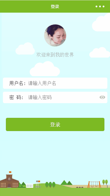
WeChat applet animation
When I saw this background image At that time, the obsessive-compulsive disorder came immediately. Why didn't the clouds move? So a wave of tossing began.
animation attribute is an abbreviated attribute, used to set six animation attributes:
Value Description
animation-name Specifies the need The name of the keyframe bound to the selector. .
animation-duration specifies the time it takes to complete the animation, in seconds or milliseconds.
animation-timing-function Specifies the speed curve of animation.
animation-delay Specifies the delay before the animation starts.
animation-iteration-count Specifies the number of times the animation should be played.
animation-direction Specifies whether the animation should be played in reverse in turn.
. This article mainly uses two.
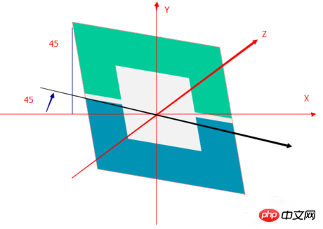
translate3d(x,y,z) defines 3D scaling transformation.
rotate3d(x,y,z,angle) Define 3D rotation.
translate3d(1,1,0)
You can understand it as (left and right, up and down, size) changes.
rotate3d(1,1,0,45deg)
.cloud {
position: absolute;
z-index: 3;
width:99px;height:64px; top: 0;
right: 0;
bottom: 0;
animation: cloud 5s linear infinite;
}
@keyframes cloud {
from {
transform: translate3d(-125rpx, 0, 0);
}
to {
transform: translate3d(180rpx, 0, 0);
}
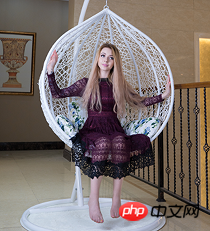
} Among them, rpx is a unique attribute of WeChat and is not affected by the screen size, similar to the dp unit in Android. Keyframes move at a constant speed. From the css, you can see that only the left and right directions are changed. 2. I originally wanted to add a hanging basket to the avatar to make it swing like a swing, but it didn't work. I just made a random animation of floating around.
@keyframes pic {
  0% {
    transform: translate3d(0, 20rpx, 0) rotate(-15deg);
  }
  15% {
    transform: translate3d(0, 0rpx, 0) rotate(25deg);
  }
  36% {
    transform: translate3d(0, -20rpx, 0) rotate(-20deg);
  }
  50% {
    transform: translate3d(0, -10rpx, 0) rotate(15deg);
  }
  68% {
    transform: translate3d(0, 10rpx, 0) rotate(-25deg);
  }
  85% {
    transform: translate3d(0, 15rpx, 0) rotate(15deg);
  }
  100% {
    transform: translate3d(0, 20rpx, 0) rotate(-15deg);
  }
}
I didn’t expect that keyframes not only support from to but also percentage, which is good. Here, as long as you control the hierarchical relationship, animation duration, and transparency, you can achieve cloud floating. SummaryI have to say that CSS still has a lot of animations and special effects. Adding a little animation to the WeChat applet can make the page more beautiful. Of course, more complex animations can only be updated when given the opportunity. The above is the detailed content of WeChat applet login page: CSS realizes animated cloud floating. For more information, please follow other related articles on the PHP Chinese website!