
Home > Article > WeChat Applet > Detailed graphic and text explanation of the floating cloud animation effect on the login page using WeChat applet

It goes without saying that WeChat mini programs are currently very popular. Recently, I used my spare time to use a mini program to achieve a dynamic login page effect. Therefore, the following article mainly introduces you to the use of WeChat mini programs to realize cloud floating login page. Relevant information on animation effects, friends in need can refer to it, let’s take a look below.
Preface
In 2017, the front-end became popular, WeChat mini-programs, weex, reactnative, and even Alipay also launched mini-programs. Program, I always feel that this is the rhythm of the original destruction, I will also take advantage of the heat to get on board in case of a wave.
Last rendering (GIF animation)
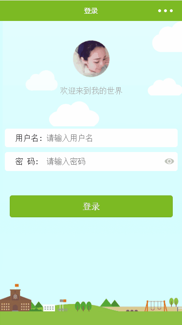
When I saw this background picture, I immediately felt obsessive-compulsive disorder I wondered why the clouds didn't move, so a wave of trouble began.
Knowledge points
Understanding animation
animation Property is a shorthand property for setting six animation properties:
| Value | Description |
| animation-name | Specifies the keyframe name that needs to be bound to the selector |
| animation-duration | Specifies the time it takes to complete the animation, Measured in seconds or milliseconds |
| animation-timing-function | Specifies the speed curve of the animation |
| animation-delay | Specifies the delay before the animation starts |
| animation-iteration-count | Specifies the number of times the animation should play |
| animation-direction | Specifies whether animation should be played in reverse in turn |
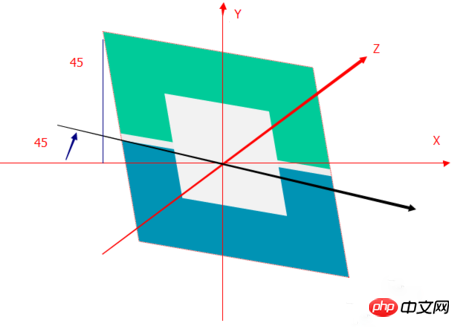
Get to know There are many methods to translate
. This article mainly uses two.
translate3d(x,y,z)Define 3D scaling transformation.
rotate3d(x,y,z,angle) Define 3D rotation.
translate3d(1,1,0)
You can understand it as (left and right, up and down, size) changes.
rotate3d(1,1,0,45deg)
##Implementation
.cloud {
 position: absolute;
 z-index: 3;
 width:99px;height:64px; top: 0;
 right: 0;
 bottom: 0;
 animation: cloud 5s linear infinite;
}

@keyframes cloud {
 from {
 transform: translate3d(-125rpx, 0, 0);
 }

 to {
 transform: translate3d(180rpx, 0, 0);
 }
}
Among them, rpx is a unique attribute of WeChat and is not affected by the screen size, similar to the dp unit in Android. Keyframes move at a constant speed. From the css, you can see that only the left and right directions are changed. 
@keyframes pic {
 0% {
 transform: translate3d(0, 20rpx, 0) rotate(-15deg);
 }
 15% {
 transform: translate3d(0, 0rpx, 0) rotate(25deg);
 }
 36% {
 transform: translate3d(0, -20rpx, 0) rotate(-20deg);
 }
 50% {
 transform: translate3d(0, -10rpx, 0) rotate(15deg);
 }
 68% {
 transform: translate3d(0, 10rpx, 0) rotate(-25deg);
 }
 85% {
 transform: translate3d(0, 15rpx, 0) rotate(15deg);
 }
 100% {
 transform: translate3d(0, 20rpx, 0) rotate(-15deg);
 }
}
I didn’t expect that keyframes not only support from to but also percentage, which is good. Here, as long as you control the hierarchical relationship, animation duration, and transparency, you can achieve cloud floating.
Summary
I have to say that CSS still has a lot of animations and a lot of special effects. Adding a little animation to the WeChat applet can make the page a little bit lighter. beauty point of view. Of course, more complex animations can only beupdated when given the opportunity.
The above is the detailed content of Detailed graphic and text explanation of the floating cloud animation effect on the login page using WeChat applet. For more information, please follow other related articles on the PHP Chinese website!