form input binding
Table of contents
- ##Use v-model on the component
##Basic usage
You can usev The -model
directive creates two-way data bindings on the form<input>
, <textarea>, and <select> elements. It automatically chooses the correct method to update the element based on the control type. Although somewhat magical, v-model is essentially just syntactic sugar. It is responsible for listening to user input events to update data and perform some special processing for some extreme scenarios.
v-model
value,
Internally uses different attributes and throws different events for different input elements:checked,selectedof all form elements. The initial value of the attribute always uses the data of the Vue instance as the data source. You should declare the initial value via JavaScript in the component'sdataoption.v-model
text and The textarea element uses the
- attribute and the
- input
event;
checkedcheckbox and radio use the attribute and - change
Event;
valueselect field will have as prop and - change
as event.
For languages that require the use of input method (such as Chinese, Japanese, Korean, etc.), you will find that
v-modelwill not The input method is updated during the process of combining text. If you also want to handle this process, please use theinputevent.
##Text
<input v-model="message" placeholder="edit me">
<p>Message is: {{ message }}</p>
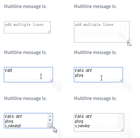
Multi-line text
<span>Multiline message is:</span>
<p style="white-space: pre-line;">{{ message }}</p>
<br>
<textarea v-model="message" placeholder="add multiple lines"></textarea>
Interpolation in text area (< textarea>{{text}}</textarea>
) will not take effect, usev-modelinstead.
Checkbox
Single checkbox, bound to a boolean value:<input type="checkbox" id="checkbox" v-model="checked">
<label for="checkbox">{{ checked }}</label>
<div id='example-3'>
  <input type="checkbox" id="jack" value="Jack" v-model="checkedNames">
  <label for="jack">Jack</label>
  <input type="checkbox" id="john" value="John" v-model="checkedNames">
  <label for="john">John</label>
  <input type="checkbox" id="mike" value="Mike" v-model="checkedNames">
  <label for="mike">Mike</label>
  <br>
  <span>Checked names: {{ checkedNames }}</span>
</div>
new Vue({
el: '#example-3',
data: {
checkedNames: []
}
})
<div id="example-4">
  <input type="radio" id="one" value="One" v-model="picked">
  <label for="one">One</label>
  <br>
  <input type="radio" id="two" value="Two" v-model="picked">
  <label for="two">Two</label>
  <br>
  <span>Picked: {{ picked }}</span>
</div>
new Vue({
el: '#example-4',
data: {
picked: ''
}
})
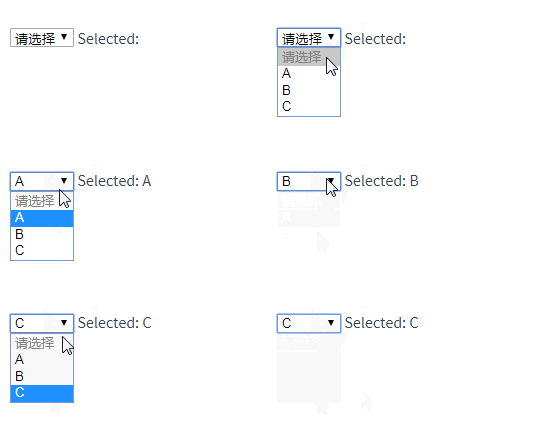
## When selecting box single selection:
<div id="example-5">
  <select v-model="selected">
    <option disabled value="">请选择</option>
    <option>A</option>
    <option>B</option>
    <option>C</option>
  </select>
  <span>Selected: {{ selected }}</span>
</div>
new Vue({
el: '...',
data: {
selected: ''
}
})
v-modelexpression The initial value fails to match any option, and the
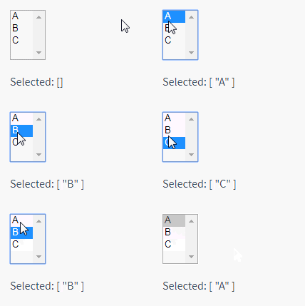
When multiple selections (bound to an array):<select>element will be rendered in the "unselected" state. In iOS, this prevents the user from selecting the first option. Because in this case, iOS will not trigger the change event. Therefore, it is more recommended to provide a disabled option with an empty value like above.
<div id="example-6">
  <select v-model="selected" multiple style="width: 50px;">
    <option>A</option>
    <option>B</option>
    <option>C</option>
  </select>
  <br>
  <span>Selected: {{ selected }}</span>
</div>
new Vue({
el: '#example-6',
data: {
selected: []
}
}) Dynamic options rendered with
:<select v-model="selected">
<option v-for="option in options" v-bind:value="option.value">
{{ option.text }}
</option>
</select>
<span>Selected: {{ selected }}</span>rrree

Value binding
For radio button, check box and select box options, v-model The bound value is usually a static string (it can also be a Boolean value for check boxes):
new Vue({
  el: '...',
  data: {
    selected: 'A',
    options: [
      { text: 'One', value: 'A' },
      { text: 'Two', value: 'B' },
      { text: 'Three', value: 'C' }
    ]
  }
})
But sometimes we may want to bind the value to a dynamic property of the Vue instance, in which case we can use v-bind is implemented, and the value of this attribute may not be a string.
Checkbox
<!-- 当选中时,`picked` 为字符串 "a" -->
<input type="radio" v-model="picked" value="a">

<!-- `toggle` 为 true 或 false -->
<input type="checkbox" v-model="toggle">

<!-- 当选中第一个选项时,`selected` 为字符串 "abc" -->
<select v-model="selected">
  <option value="abc">ABC</option>
</select>
rrree
Here
true-value## The # andfalse-valueattributes do not affect thevalueattribute of the input control, because the browser does not include unchecked checkboxes when submitting the form. If you want to ensure that one of two values in the form is submitted (such as "yes" or "no"), use radio buttons instead.
<input
  type="checkbox"
  v-model="toggle"
  true-value="yes"
  false-value="no"
>
// 当选中时
vm.toggle === 'yes'
// 当没有选中时
vm.toggle === 'no'
Select Box options
<input type="radio" v-model="pick" v-bind:value="a">
// 当选中时
vm.pick === vm.a
Modifier
.lazy
v-model is triggered every time the input event Then synchronize the value of the input box with the data (except when the above input method combines text). You can add the lazy modifier to switch to using the change event for synchronization:
<select v-model="selected">
    <!-- 内联对象字面量 -->
  <option v-bind:value="{ number: 123 }">123</option>
</select>
.number
number# to v-model ## Modifiers: // 当选中时
typeof vm.selected // => 'object'
vm.selected.number // => 123
. If the value cannot be parsed by parseFloat(), the original value will be returned.
##.trimIf you want to automatically filter the leading and trailing blanks entered by the user Characters, you can add trim
v-model:
<!-- 在“change”时而非“input”时更新 -->
<input v-model.lazy="msg" >
v-model
#If you are not familiar with Vue components, you can skip this for now.
HTML native input element types do not always meet the needs. Fortunately, Vue’s component system allows you to create reusable input components with fully customized behavior. These input components can even be used with v-model! To learn more, see Custom Input Components in the Components Guide.


