
Home > Article > Backend Development > Learn how to use Matplotlib data visualization

Data display, that is, data visualization, is the fifth step of data analysis. Most people are more sensitive to graphics than numbers. , a good way of displaying data allows people to quickly discover problems or patterns and find the value hidden behind the data.
Matplotlib is a commonly used 2D drawing library in Python. It can easily visualize data and create beautiful charts. The Matplotlib module is very large, and one of the most commonly used submodules is pyplot. Usually import it in the following way:
import matplotlib.pyplot as plt
Because it is often used in programs, it is named matplotlib.pyplot. Alias plt to reduce a lot of repeated code
The most basic drawing method in pyplot is to draw with points, that is, the coordinates of each point are given , pyplot will draw these points in the coordinate system and connect these points with lines. Taking the sine function as an example, use pyplot to draw the image:
Code segment 1:
 import numpy as np
 import matplotlib.pyplot as plt

 x = np.arange(0,2*np.pi,0.1) #生成一个0到2pi、步长为0.1的数组x
 y = np.sin(x) #将x的值传入正弦函数,得到对应的值存入数组y
 plt.plot(x,y) #传入plt.plot(),将x,y转换成对应坐标。
 plt.show() #显示图像
The above program draws the following image:
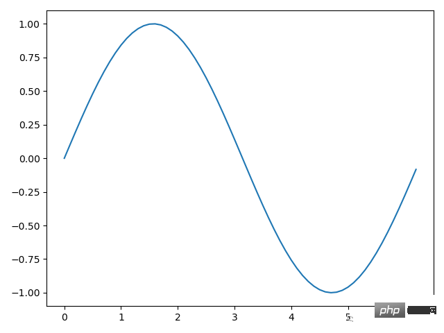
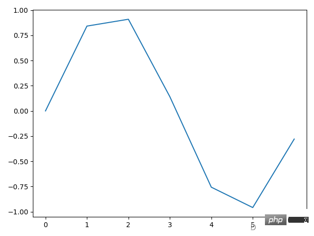
Note: The step size of x is chosen to be 0.1 in order to make the interval between each point smaller and make the image closer to the real situation. Otherwise, if the step size If it is too large, it will become a polyline. If the step size is 1, it will become the following situation:
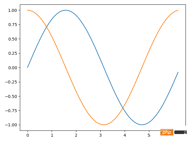
In addition to the np.sin() method, there is also np in numpy. cos(), np.tan() and other methods for calculating trigonometric functions. Of the above methods, the most important is the plt.plot() method. The plt.plot() method can receive any logarithm of x and y. It will draw these images on one picture, such as the original sine To add a cosine image to the image, you can write it like this:
 import numpy as np
 import matplotlib.pyplot as plt

 x = np.arange(0,2*np.pi,0.1) #生成一个0到2pi,步长为0.1的数组x
 y1 = np.sin(x) #将x的值传入正弦函数,得到对应的值存入数组y1
 y2 = np.cos(x) #将x的值传入余弦函数,得到对应的值存入数组y1
 plt.plot(x,y1,x,y2) #传入plt.plot(),将(x,y1)、(x,y2)转换成对应坐标。
 plt.show() #显示图像
The above programs share the same x. Of course, you can also redefine a new x. The final image is as follows:
Code segment 2 uses the plt.plot() method once to directly convert two numbers into corresponding coordinates. Of course, it can also be called twice. The following two lines of code and the 7th line of code above are equivalent.
 plt.plot(x,y1)
 plt.plot(x,y2)
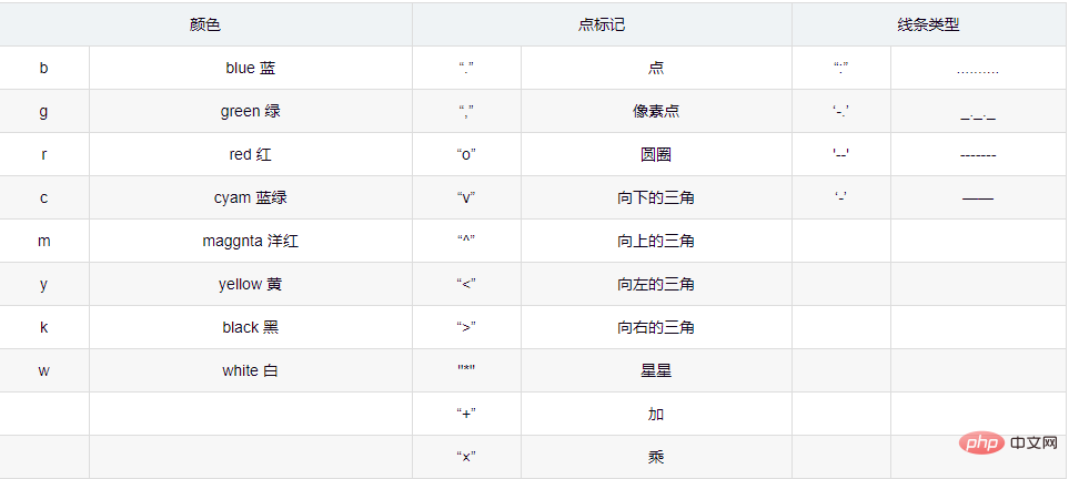
For each pair of x and y, there is an optional formatting parameter that specifies the line color, point label, and line type.
Code segment 3:
 import numpy as np
 import matplotlib.pyplot as plt

 x = np.arange(0,2*np.pi,0.1) #生成一个0到2pi,步长为0.1的数组x
 y1 = np.sin(x) #将x的值传入正弦函数,得到对应的值存入数组y1
 y2 = np.cos(x) #将x的值传入余弦函数,得到对应的值存入数组y1
 plt.plot(x,y1,'ro--',x,y2,'b*-.') #将(x,y1)、(x,y2)转换成对应坐标,并选用格式化参数
 plt.show() #显示图像
After passing in the formatting parameters of code segment 2, the final image looks like this:
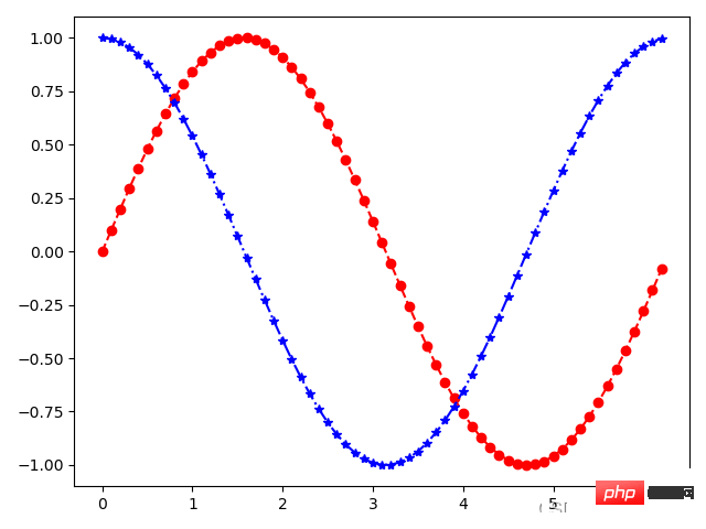
Take the parameter 'ro--' as an example. It is divided into three parts: r represents red (red), o represents the dot mark at the coordinate point, -- represents dotted line. 'ro--' Generally speaking, the lines are dotted lines and the coordinate points are marked as dots. These three parts of the format parameters are all optional, that is, it is also possible to pass in part, and there is no order requirement.
The commonly used selections and meanings of the format parameters are as shown in the following table:
We make decisions through data analysis, so use appropriate charts It is crucial to accurately represent the data. In actual use, we will use dozens of various charts. They can be divided into five types according to the purpose of data display, namely: trend, comparison, composition, distribution and connection.
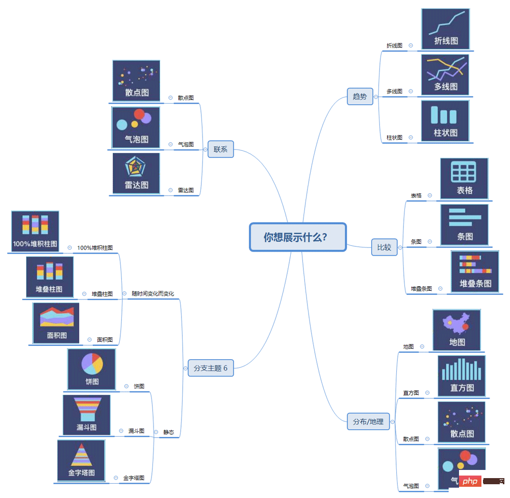
Trend: The most common time series relationship, concerned with how the data changes over time, the icons in the trend can It intuitively reflects the annual, monthly, and daily change trends, whether they are increasing, decreasing, fluctuating up and down, or basically unchanged. The most common one is the line chart, which can well express the trend of indicators over time.
Composition: Mainly focus on the proportion of each part as a whole, if the reverse analysis target is such as "share", "percentage", etc. A type of chart that shows relationships, most commonly a pie chart.
Comparison: You can display the order of a certain dimension and analyze whether the comparison between certain dimensions is similar, or "greater than" or "less than", for example Analyze the height difference between boys and girls.
Distribution: When you care about the frequency and distribution of the data set, for example, based on geographical location data, use maps to display different distribution characteristics. The more commonly used charts include maps, histograms, and scatter plots.
联系:主要查看两个变量之间是否表达出我们所要证明的相关关系,比如预期销售额可能随着优惠折扣的增长而增长,常用于表打“与......有关”、“随......而增长”、“随......而不同”等维度的关系。
在进行数据可视化时,要先明确分析的目标,再来选择五种合适的分类,最后选择某个分类里合适的图表类型。
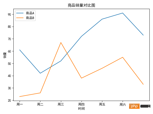
其实在前面已经用过折线图了,就是使用 plot.plot() 方法。之前我们传入的时x和y坐标点,而折线图的 x 和 y 分别是时间点和对应的数据,下面以两个商品的销量走势为例:
import numpy as np
import matplotlib.pyplot as plt

x = ['周一','周二','周三','周四','周五','周六','周日']
y1 = [61,42,52,72,86,91,73]
y2 = [23,26,67,38,46,55,33]
#传入label参数
plt.rcParams['font.family'] = ['SimHei'] #设置字体防止乱码
plt.plot(x, y1, label='商品A') #增加折线图例“商品A”
plt.plot(x, y2, label='商品B') #增加折线图例“商品B”
#设置x轴标签
plt.xlabel('时间')
plt.ylabel('销量')
#设置图表标题
plt.title('商品销量对比图')
#显示图例、图像
plt.legend(loc='best') #显示图例,并设置在“最佳位置”
plt.show()
得到的图像如下图所示:
因为上图中有中文,所以通过 plt.rcParams['font.family'] = ['SimHei'] 来设置中文字体来防止乱码,如果想设置其他字体只需将 SimHei(黑体)替换成相应的名称即可。通过一下代码获得,自己编译器所在环境安装的字体:
import matplotlib.font_manager as fm
for font in fm.fontManager.ttflist:
    print(font.name)
图例位置是一个可选参数,默认 matplotlib 会自动选择合适位置,也可以指定其他位置。
具体的如下表所示:
plt.legend() 方法的 loc 参数选择 参数含义参数含义best最佳位置center居中upper right右上角center right靠右居中upper left左上角center left靠左居中lower left左下角lower center靠下居中lower right右下角upper center靠上居中
柱状图描述的是分类数据,展示的是每一类的数量。柱状图分为很多种,有普通柱状图、堆叠柱状图、分组柱状图等。
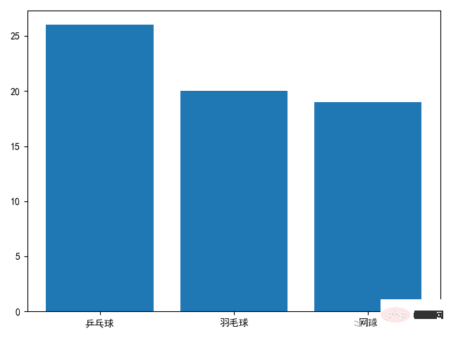
普通柱状图调用 plt.bar() 方式实现。我们至少需要传入两个参数,第一个参数是 x 轴上刻度的标签序列(列表、元组、数组等),第二个参数用于指定每个柱子的高度,也就是具体的数据。下面以一个班级体育课选课的情况为例:
import matplotlib.font_manager as fm
for font in fm.fontManager.ttflist:
    print(font.name)
得到如下图像:
plt.bar() 前两个参数是必选的,当然还有一些可选参数,常用的有 width 和 color ,分别是用于设置柱子的宽度(默认0.8)和颜色。比如我们将柱子宽度改成0.6,将柱子的颜色设成好看的天蓝色只需将 plt.bar() 改为 plt.bar(names, nums, width=0.6, color='skyblue') 即可。之前在折线图部分用到的 plt.xlabel() 、plt.ylabel() 、plt.title() 和 plt.legend() 方法都是通用方法,并不局限于一种图表,所有的图表都适用。
柱状图能直观地展现出不同数据上的差异,但有时候我们需要进一步分析数据的分布,比如每门选修课的男女比例,这时就需要用到堆叠柱状图。
下面就是进一步分析每一门选修课中男女比例为例编写程序:
import numpy as np
import matplotlib.pyplot as plt

plt.rcParams['font.family'] = ['SimHei'] #设置字体防止乱码
name = ['乒乓球','羽毛球','网球']
nums_boy = [16,5,11]
nums_girl = [10,15,8]

plt.bar(name, nums_boy, width=0.6, color='skyblue', label='男')
plt.bar(name, nums_girl, bottom=nums_boy, width=0.6, color='pink', label='女')
plt.legend()
plt.show()
最终得到图像:
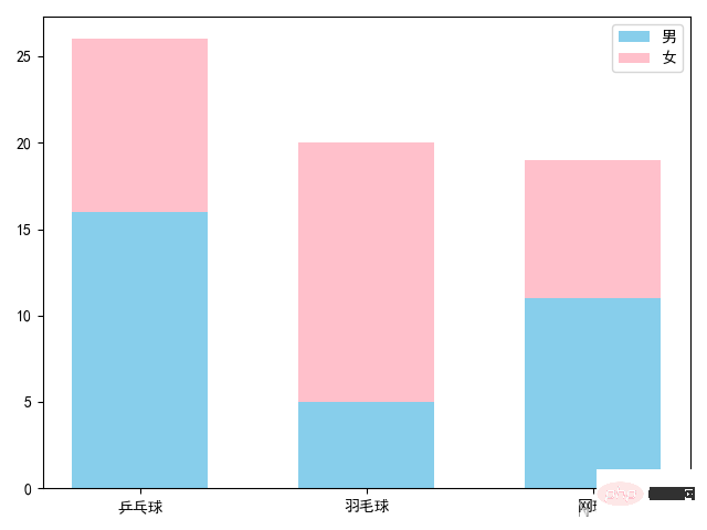
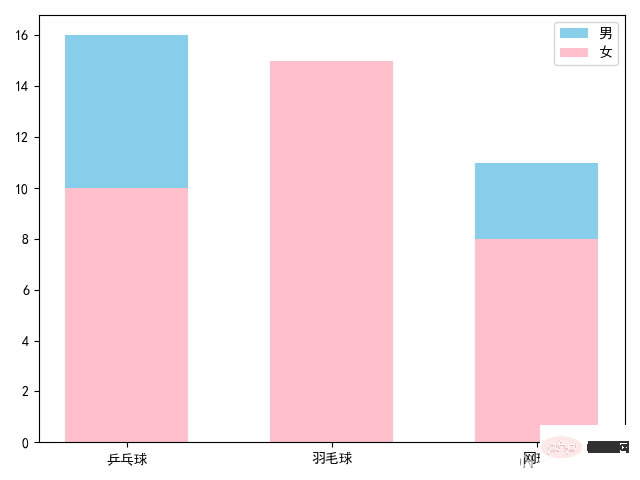
上面的代码和普通柱状图相比,多调用了一次,plt.bar() 方法,并传入了 bottom 参数,每调用一次 plt.bar() 方法都会画出对应的柱状图,而 bottom 参数作用就是控制柱状图低端的位置。我们将前一个柱状图的高度传进去,这样就形成了堆叠柱状图。而如果没有 bottom 参数,后面的图形会盖在原来的图形之上,
就像下面这样:
分组柱状图经常用于不同组间数据的比较,这些组都包含了相同分类的数据。
先来看一下效果图:
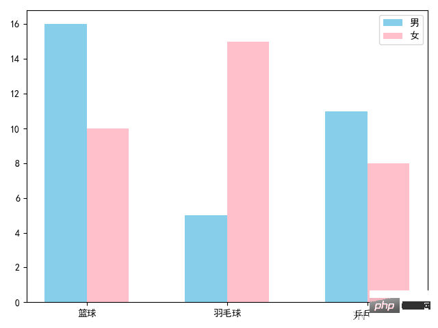
绘制上图的代码如下:
import numpy as np
import matplotlib.pyplot as plt

x = np.arange(3)
width = 0.3

names = ['篮球', '羽毛球', '乒乓球']
nums_boy = [16, 5, 11]
nums_girl = [10, 15, 8]
plt.rcParams['font.family'] = ['SimHei'] #设置字体防止乱码
plt.bar(x - width / 2, nums_boy, width=width, color='skyblue', label='男')
plt.bar(x + width / 2, nums_girl, width=width, color='pink', label='女')
plt.xticks(x, names)
plt.legend()
plt.show()
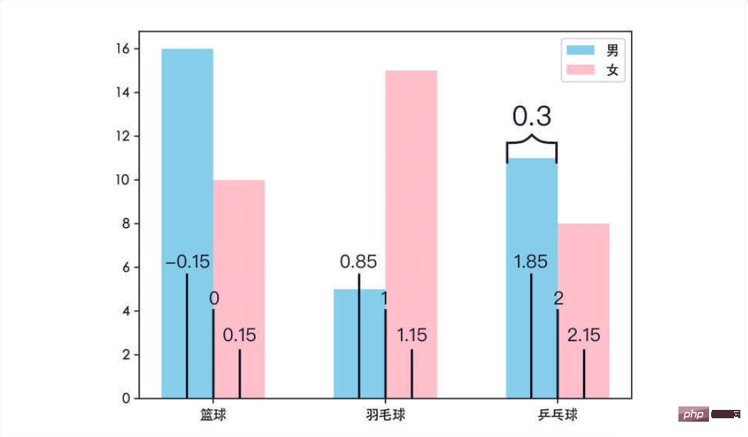
这次的方法和之前有些不同,首先使用 np.arange(3) 方法创建了一个数组 x ,值为[0,1,2]。并定义了一个变量 width 用于指定柱子的宽度。在调用 plt.bar() 时,第一个参数不再是刻度线上的标签,而是对应的刻度。以[0,1,2]为基准,分别加上或减去柱子的宽度得到[-0.15,0.85,1,85]和[0.15,1.15,2.15],这些刻度将分别作为两组柱子的中点,并且柱子的宽度为0.3。
因为传入的是刻度,而不是刻度的标签。所以调用 plt.xticks() 方法来将 x 轴上刻度改为对应的标签,该方法第一个参数时要改的刻度序列,第二个参数时与之对于的标签序列。同理,使用plt.yticks() 方法来更改y轴上刻度的标签。
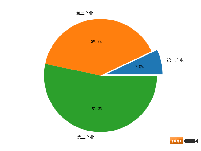
饼图广泛地应用在各个领域,用于表示不同分类的占比情况,通过弧度大小来对比各种分类。饼图通过将一个圆饼按照分类的占比划分成多个区块,整个圆饼代表数据的总量,每个区块(圆弧)表示该分类占总体的比例大小,所有区块(圆弧)的加和等于100%。
饼图的绘制很简单,只需要传入数据和对于的标签给 plt.pie() 方法即可。以2018年国内生产总值(GDP)三大产业的占比为例,可以画出这样的饼图:
绘制上图的代码如下:
import matplotlib.pyplot as plt

plt.rcParams['font.family'] = ['SimHei'] #设置字体防止乱码
data = [64745.2, 364835.2, 489700.8]
labels = ['第一产业', '第二产业', '第三产业']
explode = (0.1, 0, 0)
plt.pie(data, explode=explode, labels=labels,autopct='%0.1f%%')
plt.show()
plt.pie() 方法的第一个参数是绘图需要的数据;参数 explode 是可选参数,用于突出显示某一区块,默认数值都是0,数值越大,区块抽离越明显;参数 lables 是数据对应的标签;参数 autopct 则给饼图自动添加百分比显示。
参数 autopct 的格式用到了字符串格式化输出的知识,代码中 '%0.1f%%' 可以分成两部分。一部分是 %0.1f 表示保留一位小数,同理 %0.2f 表示保留两位小数;另一部分是 %% ,它表示输出一个 %,因为% 在字符串格式化输出中有特殊的含义,所以想要输出 % 就得写成 %% 。所以,'%0.1f%%' 的含义是保留一位小数的百分数,例如:66.6%。
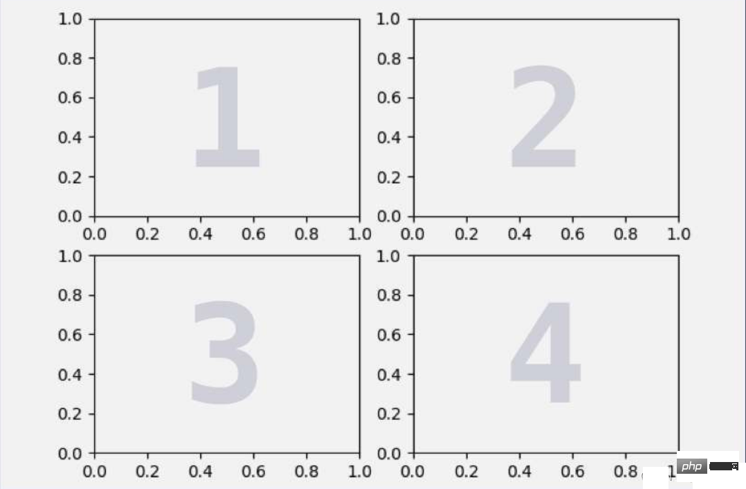
Matplotlib 提供了子图的概念,通过使用子图,可以在一张图里绘制多个图表。在 matplotlib 中,调用 plt.subplot() 方法来添加子图。plt.subplot() 方法的前两个参数分别是子图的行数和列数,第三个参数是子图的序号(从1开始)。
ax1 = plt.subplot(2, 2, 1)
ax2 = plt.subplot(2, 2, 2)
ax3 = plt.subplot(2, 2, 3)
ax4 = plt.subplot(2, 2, 4)
plt.subplot(2,2,1) 的作用是生成一个两行两列的子图,并选择其中序号为1的子图,所以上面四行代码将一张图分成了4个子图,并用1、2、3、4来选择对应的子图。
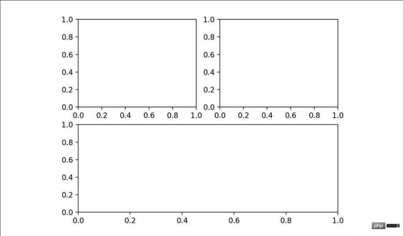
我们也可以绘制不规则的子图,比如上面两张子图,下面一张子图。
方法如下:
ax1 = plt.subplot(2, 2, 1)
ax2 = plt.subplot(2, 2, 2)
ax3 = plt.subplot(2, 1, 2)
之所以第三行代码是 plt.subplot(2, 1, 2) ,因为子图序号是独立的,与之前创建的子图没有关系。plt.subplot(2, 2, 1) 选择并展示了2*2的子图中的第一个。plt.subplot(2, 2, 2) 选择并展示了2*2的子图中的第二个,它们两个合起来占了2*2子图的第一行。而 plt.subplot(2, 1, 2) 则是生成了两行一列的子图,并选择了第二行。即占满第二行的子图,正好填补了之前2*2子图第二行剩下的空间,因此生成的图表是这样的:
图表的框架画好了,就可以往里面填充图像了,之前调用的是 plt 上的方法绘图,只要将其改成 plt.subplot() 方法的返回值上调用相应的方法绘图即可。
举个栗子,下面是在一张图上绘制了 sin、cos 和 tan 三个函数的图像的代码:
import numpy as np
import matplotlib.pyplot as plt

plt.rcParams['font.family'] = ['SimHei'] #设置字体防止乱码

x = np.arange(0, 2 * np.pi, 0.1)

plt.suptitle('三角函数可视化')
ax1 = plt.subplot(2,2,1)
ax1.set_title('sin函数')
y1 = np.sin(x)
ax1.plot(x,y1)

ax2 = plt.subplot(2,2,2)
ax2.set_title('cos函数')
y2 = np.cos(x)
ax2.plot(x,y2)

ax3 = plt.subplot(2,1,2)
ax3.set_title('tan函数')
y3 = np.tan(x)
ax3.plot(x,y3)

plt.show()
得到的图像是:
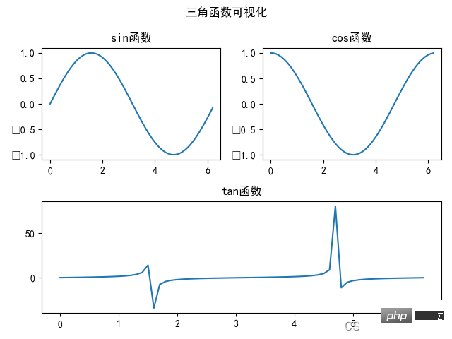
上面程序中,使用 set_title() 方法为每个子图设置单独的标题。需要注意的是,如果想要给带有子图的图表设置总的标题的话,不是使用的 plt.titie() 方法,而是通过 plt.suptitile() 方法来设置带有子图的图表标题。
The above is the detailed content of Learn how to use Matplotlib data visualization. For more information, please follow other related articles on the PHP Chinese website!