
Home > Article > Backend Development > Use Python to draw cool gif animations that amaze everyone


In a previous article, the editor shared how to use gif## in Python #Module to makegifformat charts, is awesome, use Python to draw dynamic visualization charts, and save them in gif format. Today I will introduce it to you. A new method of making
format charts, calling the relevant modules of matplotlib, the steps and methods are also quite simple and easy to understand. .
module, through The following line of code can directly download import bokeh
bokeh.sampledata.download()
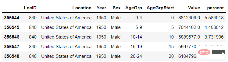
from bokeh.sampledata.population import data
import numpy as np

data = filter_loc('United States of America')
data.head()
output
 ##First draw several static charts
import seaborn as sns
import matplotlib.pyplot as plt
import matplotlib.patheffects as fx
# 绘制图表的函数
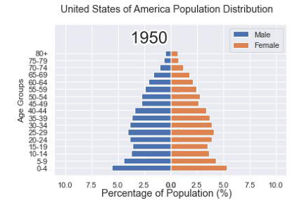
def make_plot(year):
# 根据年份来筛选出数据
df = data[data.Year == year]
# 制作图表
fig, (ax1, ax2) = plt.subplots(1, 2, sharey = True)
ax1.invert_xaxis()
fig.subplots_adjust(wspace = 0)
ax1.barh(df[df.Sex == 'Male'].AgeGrp, df[df.Sex == 'Male'].percent, label = 'Male')
ax2.barh(df[df.Sex == 'Female'].AgeGrp, df[df.Sex == 'Female'].percent, label = 'Female', color = 'C1')
country = df.Location.iloc[0]
if country == 'United States of America': country == 'US'
fig.suptitle(f'......')
fig.supxlabel('......')
fig.legend(bbox_to_anchor = (0.9, 0.88), loc = 'upper right')
ax1.set_ylabel('Age Groups')
return fig
output
gif
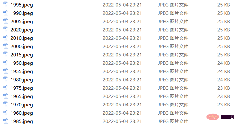
format. The code is as followsyears = [i for i in set(data.Year) if i < 2022]
years.sort()
for year in years:
fig = make_plot(year)
fig.savefig(f'{year}.jpeg',bbox_inches = 'tight')
 output
 Maybe after seeing this, some people will find the method mentioned above a little troublesome. After all, we Dozens of static charts need to be generated first. If the computer disk space is a little tight, or there is no such place to store these dozens of charts. So you will wonder if it can be done in one step. Of course it is possible. For example, if we plan to draw the distribution of population proportions at different ages from 1950 to 2020, the first step is to draw the distribution of population proportions at different ages in 1950, which is the starting year. Chart, the code is as follows
import matplotlib.animation as animation
fig, ax = plt.subplots()
ims = []

for year in years:
    im = ax.imshow(plt.imread(f'{year}.jpeg'), animated = True)
    ims.append([im])

ani = animation.ArtistAnimation(fig, ims, interval=600)
ani.save('us_population.gif')
def run(year):
    # 通过年份来筛选出数据
    df = data[data.Year == year]
    # 针对不同地性别来绘制
    total_pop = df.Value.sum()
    df['percent'] = df.Value / total_pop * 100
    male.remove()
    y_pos = [i for i in range(len(df[df.Sex == 'Male']))]
    male.patches = ax1.barh(y_pos, df[df.Sex == 'Male'].percent, label = 'Male',
                     color = 'C0', tick_label = df[df.Sex == 'Male'].AgeGrp)
    female.remove()
    female.patches = ax2.barh(y_pos, df[df.Sex == 'Female'].percent, label = 'Female',

                 color = 'C1', tick_label = df[df.Sex == 'Female'].AgeGrp)

    text.set_text(year)
    return male#, female
然后我们调用animation.FuncAnimation()方法,
ani = animation.FuncAnimation(fig, run, years, blit = True, repeat = True,
                              interval = 600)
ani.save('文件名.gif')
output
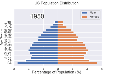
这样就可以一步到位生成gif格式的图表,避免生成数十张繁多地静态图片了。
gif动图放置在一张大图当中
最后我们可以将若干张gif动图放置在一张大的图表当中,代码如下
import matplotlib.animation as animation

# 创建一个新的画布
fig, (ax, ax2, ax3) = plt.subplots(1, 3, figsize = (10, 3))

ims = []
for year in years:
    im = ax.imshow(plt.imread(f'文件1{year}.jpeg'), animated = True)
    im2 = ax2.imshow(plt.imread(f'文件2{year}.jpeg'), animated = True)
    im3 = ax3.imshow(plt.imread(f'文件3{year}.jpeg'), animated = True)
    ims.append([im, im2, im3])

ani = animation.ArtistAnimation(fig, ims, interval=600)
ani.save('comparison.gif')
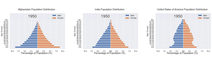
output
The above is the detailed content of Use Python to draw cool gif animations that amaze everyone. For more information, please follow other related articles on the PHP Chinese website!