
Home > Article > Backend Development > Share good examples for learning Python data visualization!


Hello everyone, I am Brother J. (Book at the end of the article)
Data visualization refers to the use of graphics or tables to present data. Charts can clearly present the nature of data and the relationships between data or attributes, making it easy for people to interpret the chart. Through the Exploratory Graph, users can understand the characteristics of the data, find trends in the data, and lower the threshold for understanding the data.
This chapter mainly uses Pandas to draw graphics instead of using the Matplotlib module. In fact, Pandas has integrated Matplotlib's drawing method into DataFrame. Therefore, in practical applications, users do not need to directly reference Matplotlib to complete the drawing work.
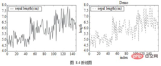
Line chart is the most basic chart, which can be used to present the relationship between continuous data in different fields. The plot.line() method is used to draw a line chart, and parameters such as color and shape can be set. In terms of use, the method of drawing the split line diagram completely inherits the usage of Matplotlib, so the program must also call plt.show() at the end to generate the diagram, as shown in Figure 8.4.
df_iris[['sepal length (cm)']].plot.line()
plt.show()
ax = df[['sepal length (cm)']].plot.line(color='green',title="Demo",style='--')
ax.set(xlabel="index", ylabel="length")
plt.show()
Scatter Chart is used to view the relationship between discrete data in different fields. Scatter plots are drawn using df.plot.scatter(), as shown in Figure 8.5.
df = df_iris
df.plot.scatter(x='sepal length (cm)', y='sepal width (cm)')
from matplotlib import cm
cmap = cm.get_cmap('Spectral')
df.plot.scatter(x='sepal length (cm)',
y='sepal width (cm)',
s=df[['petal length (cm)']]*20,
c=df['target'],
cmap=cmap,
title='different circle size by petal length (cm)')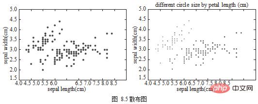
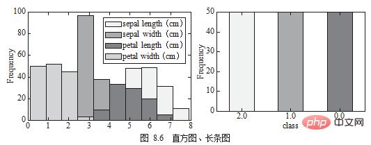
Histogram Chart is usually used in the same column to show the distribution of continuous data. Another chart similar to the histogram is the Bar Chart, which is used to view the same column, as shown in Figure 8.6.
df[['sepal length (cm)', 'sepal width (cm)', 'petal length (cm)','petal width (cm)']].plot.hist()
2 df.target.value_counts().plot.bar()
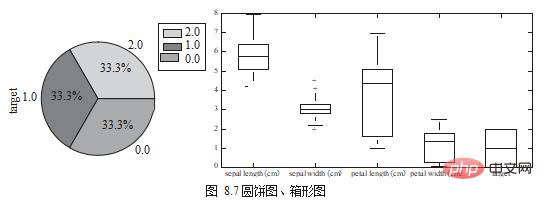
Pie Chart can be used to view the proportion of each category in the same column. Proportion, and box chart (Box Chart) is used to view the same field or compare the distribution differences of data in different fields, as shown in Figure 8.7.
df.target.value_counts().plot.pie(legend=True)
df.boxplot(column=['target'],figsize=(10,5))
This section uses two real data sets to actually demonstrate several methods of data exploration.
In the American Community Survey, approximately 3.5 million households are asked each year detailed information about who they are and how they live. question. The survey covers a number of topics including ancestry, education, work, transport, internet use and residence.
Data source: https://www.kaggle.com/census/2013-american-community-survey.
Data name: 2013 American Community Survey.
First observe the appearance and characteristics of the data, as well as the meaning, type and scope of each field.
# 读取数据
df = pd.read_csv("./ss13husa.csv")
# 栏位种类数量
df.shape
# (756065,231)
# 栏位数值范围
df.describe()
First connect the two ss13pusa.csv. This data contains a total of 300,000 pieces of data and 3 fields: SCHL (School Level), PINCP (Income) and ESR ( Work Status).
pusa = pd.read_csv("ss13pusa.csv") pusb = pd.read_csv("ss13pusb.csv")
# 串接两份数据
col = ['SCHL','PINCP','ESR']
df['ac_survey'] = pd.concat([pusa[col],pusb[col],axis=0)
Group the data according to academic qualifications, observe the proportion of numbers with different academic qualifications, and then calculate their average income.
group = df['ac_survey'].groupby(by=['SCHL']) print('学历分布:' + group.size())
group = ac_survey.groupby(by=['SCHL']) print('平均收入:' +group.mean())The Boston House Price Dataset contains information about housing in the Boston area, including 506 data samples and 13 feature dimensions.
Data source: https://archive.ics.uci.edu/ml/machine-learning-databases/housing/.
Data name: Boston House Price Dataset.
First observe the appearance and characteristics of the data, as well as the meaning, type and scope of each field.
The distribution of house prices (MEDV) can be drawn in the form of a histogram, as shown in Figure 8.8.
df = pd.read_csv("./housing.data")
# 栏位种类数量
df.shape
# (506, 14)
#栏位数值范围df.describe()
import matplotlib.pyplot as plt
df[['MEDV']].plot.hist()
plt.show()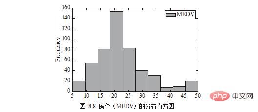
Note: The English in the picture corresponds to the names specified by the author in the code or data. In practice, readers can replace them with the words they need.
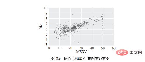
The next thing you need to know is which dimensions are obviously related to "house prices". First observe it using a scatter diagram, as shown in Figure 8.9.
# draw scatter chart
df.plot.scatter(x='MEDV', y='RM') .
plt.show()
最后,计算相关系数并用聚类热图(Heatmap)来进行视觉呈现,如图 8.10 所示。
# compute pearson correlation
corr = df.corr()
# drawheatmap
import seaborn as sns
corr = df.corr()
sns.heatmap(corr)
plt.show()
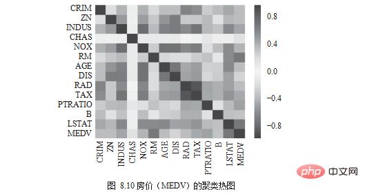
颜色为红色,表示正向关系;颜色为蓝色,表示负向关系;颜色为白色,表示没有关系。RM 与房价关联度偏向红色,为正向关系;LSTAT、PTRATIO 与房价关联度偏向深蓝, 为负向关系;CRIM、RAD、AGE 与房价关联度偏向白色,为没有关系。
声明:本文选自清华大学出版社的《深入浅出python数据分析》一书,略有修改,经出版社授权刊登于此。
The above is the detailed content of Share good examples for learning Python data visualization!. For more information, please follow other related articles on the PHP Chinese website!