Home > Article > Backend Development > Detailed explanation of Python's Seaborn (data visualization)

This article brings you relevant knowledge about python, which mainly introduces related issues about Seaborn, including scatter plots, line charts, bar charts, etc. for data visualization processing Let’s take a look at the content below, I hope it will be helpful to everyone.

Recommended learning: python video tutorial
Installation:
pip install seaborn
##Import:
import seaborn as sns
Before we officially start, we first use the following code to prepare a set of data for convenience Demonstrate use.
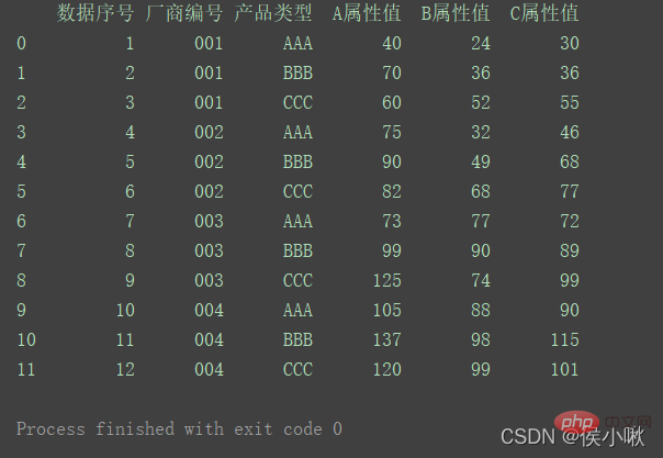
import pandas as pdimport numpy as npimport matplotlib.pyplot as pltimport seaborn as snspd.set_option('display.unicode.east_asian_width', True)df1 = pd.DataFrame( {'数据序号': [1, 2, 3, 4, 5, 6, 7, 8, 9, 10, 11, 12], '厂商编号': ['001', '001', '001', '002', '002', '002', '003', '003', '003', '004', '004', '004'], '产品类型': ['AAA', 'BBB', 'CCC', 'AAA', 'BBB', 'CCC', 'AAA', 'BBB', 'CCC', 'AAA', 'BBB', 'CCC'], 'A属性值': [40, 70, 60, 75, 90, 82, 73, 99, 125, 105, 137, 120], 'B属性值': [24, 36, 52, 32, 49, 68, 77, 90, 74, 88, 98, 99], 'C属性值': [30, 36, 55, 46, 68, 77, 72, 89, 99, 90, 115, 101] })print(df1)
Generate a set of data as follows:
ONE posit Border3.1 Set the background style
sns.set_style()
The background styles that can be selected are:whitegrid white grid
dark gray background
## sns.set_style(“ticks”)
Where sns.set() means using a custom style. If no parameters are passed in, the default is gray. Grid background style. If there is no set() or set_style(), the background will be white.
A possible bug: the "ticks" style is invalid for images drawn using the relplot() method.
3.3 Others
The seaborn library is encapsulated based on the matplotlib library, and its encapsulated style can make our drawing work more convenient. The commonly used statements in the matplotlib library are still valid when using the seaborn library.
About setting other style-related properties, such as fonts, one detail to note is that these codes must be written after sns.set_style() to be effective. For example, the code to set the font to bold (to avoid Chinese garbled characters):
If the style is set behind it, the set font will override the set style, thus generating a warning. The same goes for other attributes.
3.2 Border control
sns.despine() method
# 移除顶部和右部边框,只保留左边框和下边框sns.despine()# 使两个坐标轴相隔一段距离(以10长度为例)sns.despine(offet=10,trim=True)# 移除左边框sns.despine(left=True)# 移除指定边框 (以只保留底部边框为例)sns.despine(fig=None, ax=None, top=True, right=True, left=True, bottom=False, offset=None, trim=False)
4 . Draw a scatter plot
Use the seaborn library to draw a scatter plot. You can use the replot() method or the scatter() method.The parameter kind of the replot method defaults to 'scatter', which means drawing a scatter plot.① Draw a scatter plot of the A attribute value and data sequence number, red scatter points, gray grid, keep the left , lower borderThe hue parameter indicates that in this dimension, it is distinguished by color
sns.set_style('darkgrid') plt.rcParams['font.sans-serif'] = ['SimHei']
sns.relplot(x='data serial number', y='A attribute value', data=df1, color='red') plt.show()
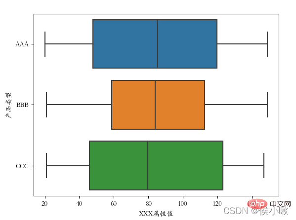
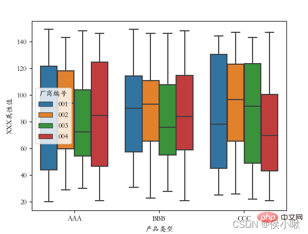
② Draw a scatter plot for the A attribute value and data sequence number. The scatter points display different colors according to different product types. sns.set_style('whitegrid') ③Plot the values of the three fields A attribute, B attribute, and C attribute on the same graph in different styles (draw a scatter plot). The x-axis data is [0,2,4 ,6,8…] ##sns.set_style('ticks') plt.rcParams['font.sans-serif'] = ['STKAITI'] ① Requirements: Draw a line chart of A attribute value and data serial number, sns.relplot (x='data serial number', y='A attribute value', hue='product type', data=df1, kind='line') plt.title("Draw a line chart", fontsize=18) df2 = df1.copy() plt.title(“Draw a line chart”, fontsize=18) plt.xlabel('num', fontsize=18) ## Horizontal multiple subgraph col ##sns.set_style('darkgrid') plt.rcParams['font.sans-serif'] = [ 'STKAITI'] ##sns.set_style('darkgrid') sns.relplot(data=df1, x="A attribute value", y="B attribute value", kind="line", row="Manufacturer number") plt.subplots_adjust(left=0.15, right= 0.9, bottom=0.1, top=0.95) sns.set_style('darkgrid') plt.rcParams['font.sans-serif'] = ['STKAITI'] plt.xlabel('num', fontsize=18) plt.ylabel('A attribute value', fontsize=16) df2.index = list(range(0, len(df2)*2, 2)) plt.ylabel('A attribute value', fontsize=16) plt.subplots_adjust(left=0.15, right=0.9, bottom=0.1, top=0.9) sns.set_style('darkgrid') plt.rcParams['font.sans-serif'] = ['STKAITI'] sns.displot(data =df1[['C attribute value']], bins=6, rug=True, kde=True) plt.title("Histogram", fontsize =18) plt.show() ##The barplot() method is used to draw the bar chart sns.set_style('darkgrid') ˆ ˆ ˆ ˆ ˜ . Use col_wrap to control the number of sub-pictures in each row; Use size to control the height of sub-pictures; plt.subplots_adjust (left=0.15, right=0.9, bottom=0.15, top=0.9) plt.show() plt.subplots_adjust(left=0.15, right=0.9 , bottom=0.15, top=0.9) plt.show() The sns.jointplot() method is used when drawing the marginal kernel density map. The parameter kind should be "kde". When using this method, the dark style is used by default. It is not recommended to add other styles manually, otherwise the image may not display properly. sns.jointplot(x=df1["A attribute value"] , y=df1["B attribute value"], kind="kde", space=0) plt.show() ∣ ∣ ∣ ∣ ∣ notch indicates whether the middle cabinet displays a gap, and the default False does not display it. Y = np.random.randint(20, 150, 360) df2 = pd.DataFrame( {'Manufacturer number': ['001', '001', '001' , '002', '002', '002', '003', '003', '003', '004', '004', '004'] * 30, } ) After generation, start drawing the box plot: ##plt.rcParams['font.sans-serif'] = ['STKAITI'] sns.boxplot(x='product type', y='XXX attribute value', data=df2) ˆ ˆ ˆ ˆ After exchanging x and y-axis data: ˆ plt.rcParams[' font.sans-serif'] = ['STKAITI'] sns.boxplot(y='product type', x='XXX attribute value', data=df2) You can see that the direction of the box plot has also changed Use the manufacturer number as a classification field: sns.boxplot (x='product type', y='XXX attribute value', data=df2, hue="manufacturer number") plt.show() sns.violinplot(x='XXX attribute value', y='product type', data=df2) plt.show() plt.show() Take the Shuangseqiu winning number data as an example to draw a heat map. The data here is random. Number generation. import matplotlib.pyplot as plt s2 = np.random.randint(0, 200, 33) s3 = np.random.randint(0, 200, 33) s4 = np.random.randint(0, 200 , 33) s7 = np.random.randint(0, 200, 33) data = pd.DataFrame(
White grid, left and bottom borders:
plt.rcParams['font.sans-serif'] = ['SimHei']
sns.relplot(x=' Data serial number', y='A attribute value', hue='product type', data=df1)
plt.show()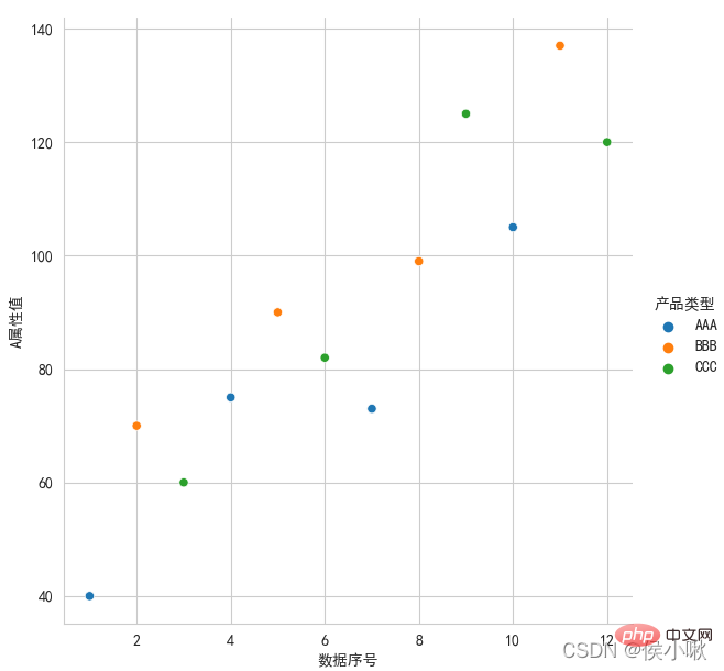
ticks style (frame lines in all four directions are required), the font uses italics
plicity Use the replot() method or the lineplot() method.
df2 = df1.copy()
df2.index = list(range(0, len(df2)*2, 2 ))
dfs = [df2['A attribute value'], df2['B attribute value'], df2['C attribute value']]
sns.scatterplot(data=dfs)
plt .show()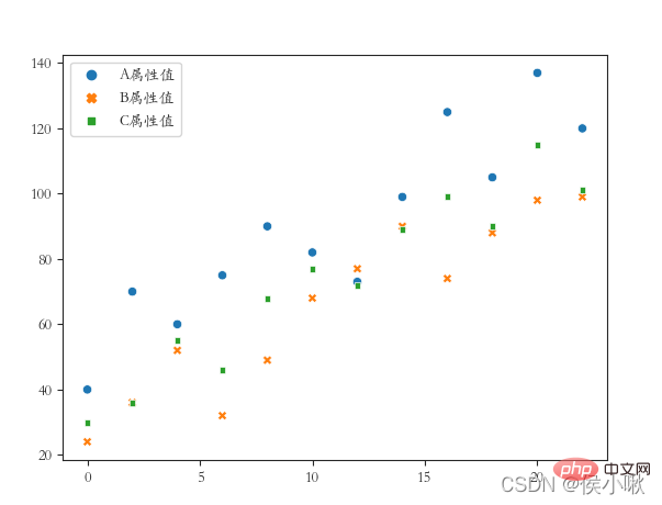
sns.replot() draws a scatter chart by default. To draw a line chart, just change the kind parameter to "line" . and The distance between the coordinate system and the edge of the canvas (the distance is set because the font is not fully displayed):
##sns.set(rc={'font.sans-serif ': "STKAITI"})
sns.relplot(x='data serial number', y='A attribute value', data=df1, color='purple', kind='line')
plt. title("Draw a line chart", fontsize=18)
plt.xlabel('num', fontsize=18) plt.ylabel('A attribute value', fontsize=16) plt.subplots_adjust (left=0.15, right=0.9, bottom=0.1, top=0.9)
② Requirements: Draw A attribute polylines for different product types (three lines in one picture), whitegrid style, italic font. 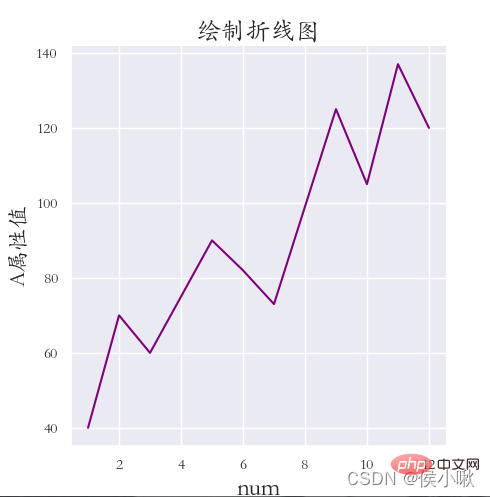
plt.rcParams['font.sans-serif'] = ['STKAITI']
plt.xlabel('num', fontsize=18) plt.ylabel('A attribute value', fontsize=16) plt.show()
plt.rcParams['font.sans-serif'] = ['STKAITI']
ˆ ˆ ˆ ˆ ˆ ˆ The values of the three fields A, B, and C are drawn in different styles on the same chart (drawing a line chart). The x-axis data is [0,2,4,6,8…]
◆ darkkgrid style (Frame lines in all four directions must be included), use italics for fonts, and add x-axis labels, y-axis labels and titles. The edge distance is appropriate. 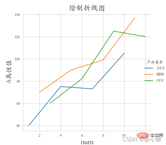 df2.index = list(range(0, len(df2)*2, 2))
sns.relplot(data=dfs, kind=“line”)
plt.ylabel('A attribute value', fontsize=16) plt.subplots_adjust(left=0.15, right=0.9, bottom=0.1, top= 0.9)
plt.show() ∣ ∣ ∣ ∣ posit
sns.relplot(data=df1, x="A attribute value", y="B attribute value", kind="line", col="manufacturer number")
plt.subplots_adjust (left=0.05, right=0.95, bottom=0.1, top=0.9)
plt.show()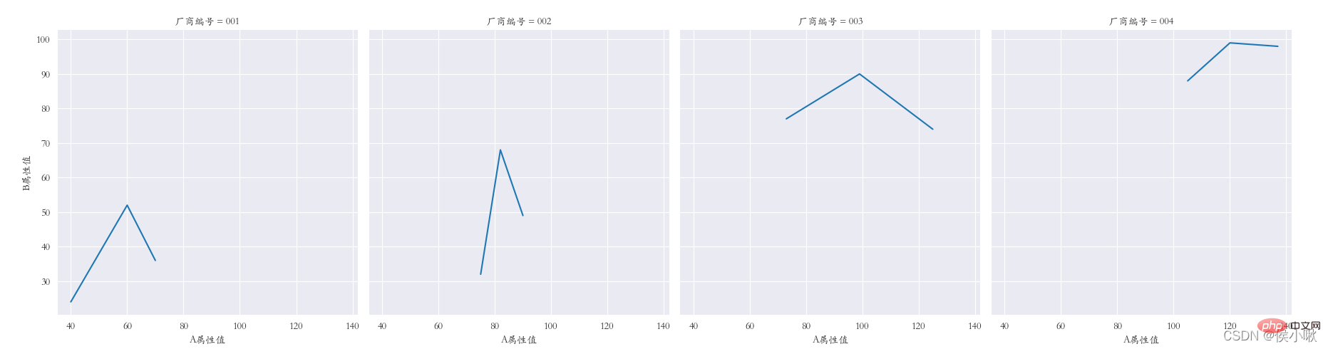
plt.rcParams['font.sans-serif'] = ['STKAITI']
##5.2 Use the lineplot() method
plt.show()
## ˆ ˆ ˆ ˆ ˆ ˆ ˆ 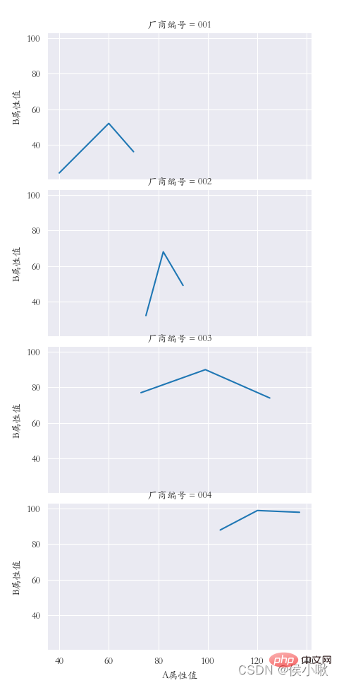
plt.title("Draw a line chart", fontsize=18)
df2 = df1.copy()
plt.subplots_adjust(left=0.15, right=0.9, bottom=0.1, top=0.9)
plt.show()
## ONE posit
##sns.set_style('darkgrid')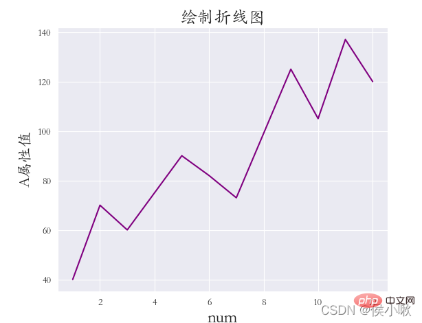 dfs = [df2['A attribute value'], df2['B attribute value'], df2[' C attribute value']]
plt.title("Draw a line chart", fontsize=18) plt.xlabel('num', fontsize=18)
plt.show()
ˆ ˆ ˆ ˆ
6. Drawing the histogram displot()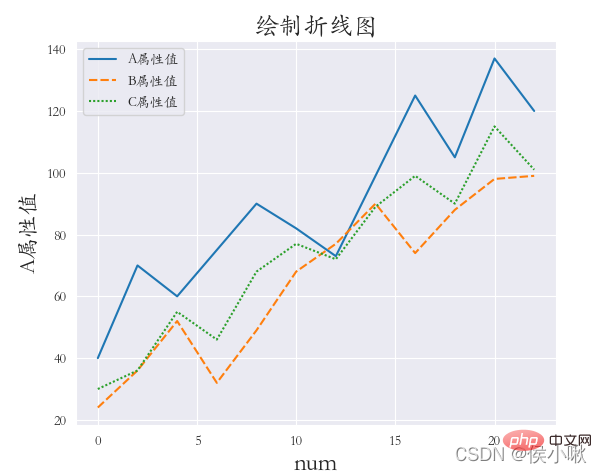
rug=True indicates that small thin bars of observation are displayed on the x-axis kde=True indicates that the kernel density curve is displayed
plt.title("Histogram", fontsize=18)
plt.xlabel('C attribute value', fontsize=18) plt.ylabel('quantity', fontsize=16) plt. show()
sns.displot(Y, bins=9, rug=True, kde=True)
ˆ ˆ ˆ ˆ ˜
#sns.set_style('darkgrid')
plt.rcParams['font.sans-serif'] = ['STKAITI'] np.random.seed (13)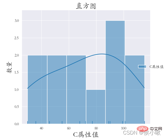 plt.xlabel('C attribute value', fontsize=18)
plt.subplots_adjust(left=0.15, right=0.9, bottom=0.1, top=0.9) ˆ ˆ ˆ ˆ ˆ ˜
The product type field data is used as the x-axis data, and the A attribute value data is used as the y-axis data. Classify according to different manufacturer number fields.
details as follows:
plt.rcParams['font.sans-serif'] = ['STKAITI']
sns.barplot(x="Product Type ", y='A attribute value', hue="Manufacturer number", data=df1)
plt.title("Bar chart", fontsize=18)
plt.xlabel('Product type', fontsize=18)
plt.ylabel('quantity', fontsize=16)
plt.subplots_adjust(left=0.15, right=0.9, bottom=0.15, top=0.9)
plt.show() 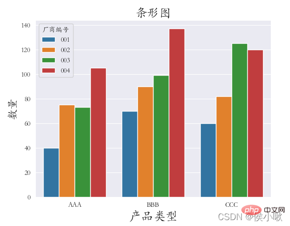 The main parameters are x, y, data. Represents x-axis data, y-axis data and data set data respectively.
In addition, as mentioned above, you can also specify categorical variables through hue; Specify column categorical variables through col to draw horizontal multiple subgraphs;
Specify row categorical variables through row , to draw vertical multiple sub-pictures;
Use markers to control the shape of points.
Let's perform linear regression on the X attribute value and Y attribute value. The code is as follows:
sns.set_style('darkgrid')
plt. rcParams['font.sans-serif'] = ['STKAITI']
sns.lmplot(x="A attribute value", y='B attribute value', data=df1) plt.title( "Linear regression model", fontsize=18) plt.ylabel('B attribute value', fontsize=16)
ˆ ˆ ˆ ˆ ˆ ˆ 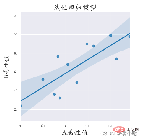
Drawing the sum density map can make us more intuitive can clearly see the distribution characteristics of the sample data. The method used to draw kernel density plots is the kdeplot() method.
Draw a kernel density map for the A attribute value and B attribute value. Set shade to True to display the surrounding shadow, otherwise only lines.
sns.set_style('darkgrid')
plt.rcParams['font.sans-serif'] = ['STKAITI']
sns.kdeplot (df1["A attribute value"], shade=True, data=df1, color='r') sns.kdeplot(df1["B attribute value"], shade=True, data=df1, color= 'g') plt.xlabel('Value', fontsize=18)
ˆ ˆ ˆ ˆ ˆ
9.2 Marginal kernel density map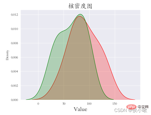
plt.rcParams['font.sans-serif'] = ['STKAITI']
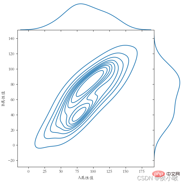
The basic parameters are x, y, data. In addition, there can also be hue indicating the classification field
width can adjust the width of the cabinet
In view of the fact that the previous data is not large enough to display, another set of data is generated here: 'XXX attribute value': Y
plt.show()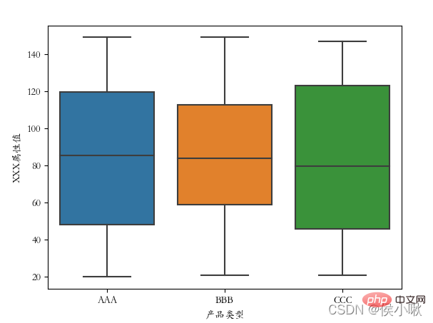
plt.show()
##plt.rcParams['font.sans-serif'] = ['STKAITI']
##  11. Draw a violin plot violinplot()
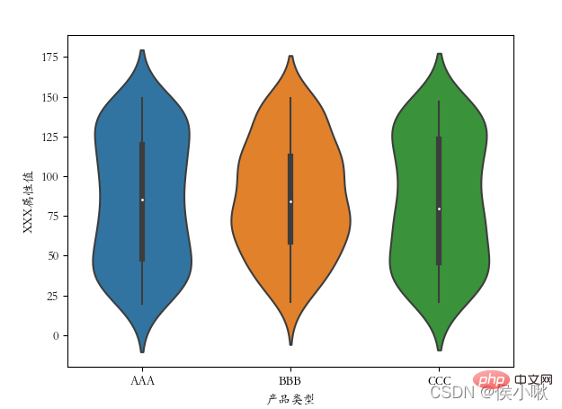
The violin plot combines the features of box plots and kernel density plots to display the distribution shape of the data.
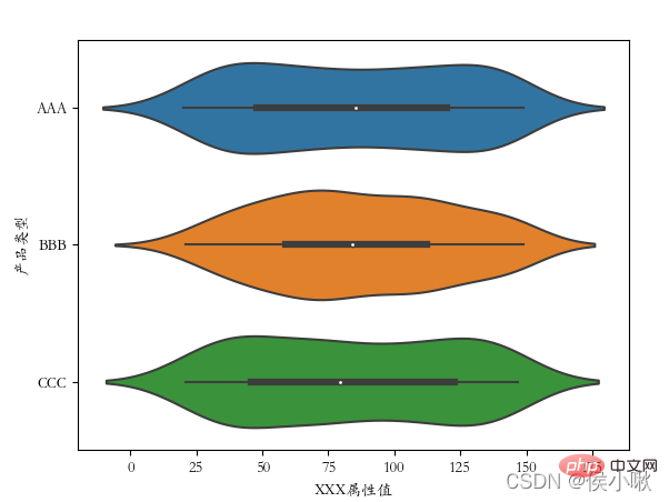
Use the violinplot() method to draw a violin plot. sns.violinplot(x='Product Type', y=' The ['font.sans-serif'] = ['STKAITI']
#plt.rcParams['font.sans-serif'] = ['STKAITI'] sns.violinplot(x='product type', y='XXX attribute value', data=df2, hue="manufacturer number")
import pandas as pd import seaborn as sns
sns.set() plt .figure(figsize=(6,6)) plt.rcParams['font.sans-serif'] = ['STKAITI']
s1 = np.random.randint(0, 200, 33) s6 = np.random.randint(0, 200, 33)
{'一': s1,
'二': s2,
'三': s3,
'四':s4,
'五':s5,
'六':s6,
'七':s7
}
)
plt.title('Double Color Ball Heat Map')
sns.heatmap(data, annot=True, fmt='d', lw=0.5)
plt.xlabel('Winning Number Digits')
plt.ylabel('Double Color Ball Number')
x = ['1st position', '2nd position', '3rd position', '4th position', '5th position', '6th position', '7th position']
plt.xticks(range(0, 7, 1), x, ha='left')
plt.show()
##
Recommended learning:
python video tutorial
The above is the detailed content of Detailed explanation of Python's Seaborn (data visualization). For more information, please follow other related articles on the PHP Chinese website!