
Home > Article > Web Front-end > About JavaScript plug-in Tab effect sharing

I studied how to write JavaScript plug-ins, and today I will record a small plug-in I wrote. This article mainly introduces the JavaScript plug-in Tab effect in detail. It has certain reference value. Interested friends can refer to it. I hope it can help you.
This article introduces the basic usage, implemented functions and code of this plug-in.
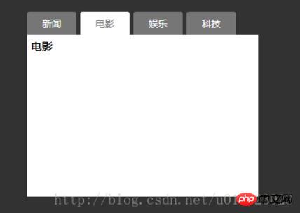
First, let’s take a look at the final effect:
This is an ordinary Tab plug-in. Let’s talk about its implementation below. What functions:
1. Support different mouse events to trigger tab switching effects;
2. Support the configuration of different switching effects, such as fade in and fade out/direct switching;
3. Support the default display number Configuration of each tab;
4. Support the automatic switching effect of tabs.
The example is very simple, and the knowledge required includes:
1. Basic knowledge of html and css;
2. Understanding of keywords such as this, prototype, new, etc.
In short, it is to display different effects through parameter configuration.
Let’s take a look at how to use it first:
1. $(".js-tab").etab();
2. $(".js-tab") .etab({
triggerType: "click",
. ##3、Tab.init( $(".js-tab"));
This plug-in supports several different initialization methods, and the code is very simple, similar to how to use the BootStrap plug-in. Here is the complete code:
index.html
Tab选项卡
.tab {
 width: 300px;
}

.tab .tab-nav {
 height: 30px;
}

.tab .tab-nav li {
 float: left;
 margin-right:5px;
 background-color:#767676;
 border-radius:3px 3px 0 0;
}

.tab .tab-nav li a{
 display:block;
 height:30px;
 padding:0 20px;
 color: white;
 line-height:30px;
 text-decoration: none;
}

.tab .tab-nav .active {
 background-color: #fff;

}

.tab .tab-nav .active a{
 color: #777;
}

.tab .content-wrap{
 background-color: white;
 padding:5px;
 height:200px
}

.tab .content-wrap .content-item {
 position:absolute;
 height: 200px;
 display: none;
}

.tab .content-wrap .current {
 height: 200px;
 display: block;
}
Finally list the plug-in code Come out, very detailed comments have been written in the code: /**
* Created by Wu.lin on 2017/11/12.
*/
(function($){
var Tab = function(tab, _params) {
var _this = this;
//保存单个Tab组件
this.tab = tab;
this.params = _params;
//默认配置参数
this.config = {
//用来定义鼠标的出发类型 "click"/mouseover
"triggerType": "mouseover",
//用来定义内容切换效果,直接切换/淡入淡出
"effect": "default",
//默认展示第几个Tab
"invoke": "1",
//用来定义Tab是否自动切换,当指定了事件间隔,就表示自动切换,并指定了切换间隔
"auto": false
};
//如果配置参数存在,就扩展默认的配置参数
if(this.params){
$.extend(this.config, this.params);
}
//保存Tab标签列表,以及对应的内容列表
this.tabItem = this.tab.find("ul.tab-nav li");
this.contentItem = this.tab.find("p.content-wrap .content-item");
//保存配置参数
var config = this.config;
if(config.triggerType === "click") {
this.tabItem.bind(config.triggerType, function() {
_this.invoke($(this));
});
} else {
this.tabItem.mouseover(function(){
_this.invoke($(this));
});
}
//自动切换功能
if(config.auto) {
this.timmer = null;
//计数器
this.loop = 0;
this.autoPlay();
this.tab.hover(function() {
window.clearInterval(_this.timmer);
}, function() {
_this.autoPlay();
});
}
//设置默认显示第几个Tab
if(config.invoke > 1) {
this.invoke(this.tabItem.eq(config.invoke - 1));
}
};
Tab.prototype = {
//事件驱动函数
invoke: function(currentTab) {
/**
* 1、执行Tab选中状态,当前选中Tab加上Active,
* 2、切换对应Tab内容,根据配置参数effect参数default|fade
*/
var index = currentTab.index();
var conItem = this.contentItem;
//Tab切换
currentTab.addClass("active").siblings().removeClass("active");
//内容区域切换
var effect = this.config.effect;
if(effect === "fade") {
conItem.eq(index).fadeIn().siblings().fadeOut();
} else {
conItem.eq(index).addClass("current").siblings().removeClass("current");
}
//注意,如果配置了自动切换,记得把当前的loop值设置为当前的Tab的index
if(this.config.auto) {
this.loop = index;
}
},
//自动间隔切换
autoPlay: function() {
var _this_ = this,
tabItems = this.tabItem, //临时保存Tab列表
tabLength = tabItems.size(),
config = this.config;
this.timmer = window.setInterval(function() {
_this_.loop++;
if(_this_.loop >= tabLength) {
_this_.loop = 0;
}
tabItems.eq(_this_.loop).trigger(config.triggerType);
}, config.auto);
}
};
Tab.init = function(tabs) {
var _this_ = this;
tabs.each(function() {
new _this_($(this));
});
// var tab = new Tab($(".js-tab").eq(0));
};
//注册成JQuery方法
$.fn.extend({
etab: function(_param) {
this.each(function () {
new Tab($(this), _param);
});
return this;
}
});
window.Tab = Tab;
})(jQuery); It seems that it is very simple, let’s try it together!
Related recommendations:
JS sample code to implement Tab switching effect
Use pure CSS3 to implement tab tab Switching example
How to make this tab effect_html/css_WEB-ITnose
The above is the detailed content of About JavaScript plug-in Tab effect sharing. For more information, please follow other related articles on the PHP Chinese website!