Home  >  Article  >  Web Front-end  >  Adaptation problem of H5 page display on iPhoneX

Adaptation problem of H5 page display on iPhoneX

php中世界最好的语言
php中世界最好的语言Original
2018-03-27 14:21:475506browse

This time I will bring you the adaptation problem of H5 page display on iPhoneX. What are the precautions for adapting H5 page display on iPhoneX? Here is a practical case, let’s take a look.

1. Introduction to iPhoneX

Screen size

The outline of the development dimensions of the iPhone series that we are familiar with is as follows:

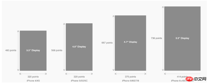
△ The development size of each iPhone model

is converted into the well-known pixel size:

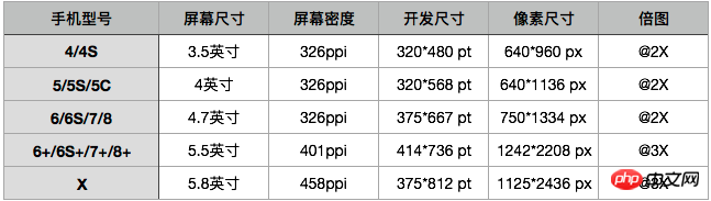
△ The multi-dimensional size of each model

The magnification chart is actually the magnification relationship between the pixel size and the development size, but this is only an external manifestation. The core influencing factor of magnification is PPI (DPI). Understanding the relationship between screen density and various sizes will help us deeply understand the concept of magnification: "Learn the basics! DPI Guide Tailored for Designers"

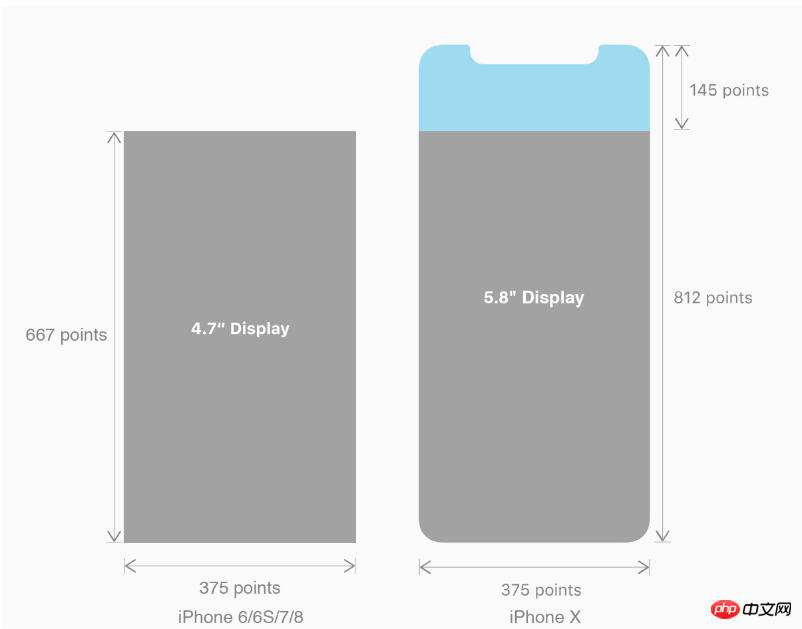
In this upgrade, the screen size and resolution of iPhone8 have inherited the fine traditions of iPhone6 ​​and later;

However, iPhone The size, resolution, and even shape have all undergone major changes. Let’s take the iPhone 8 as a reference to see how we should consider the adaptation of the iPhone X.

Let’s take a look at the changes in the size of iPhone X:

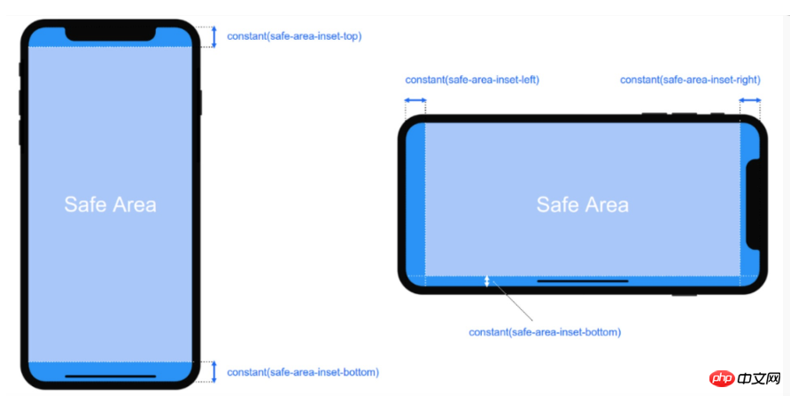
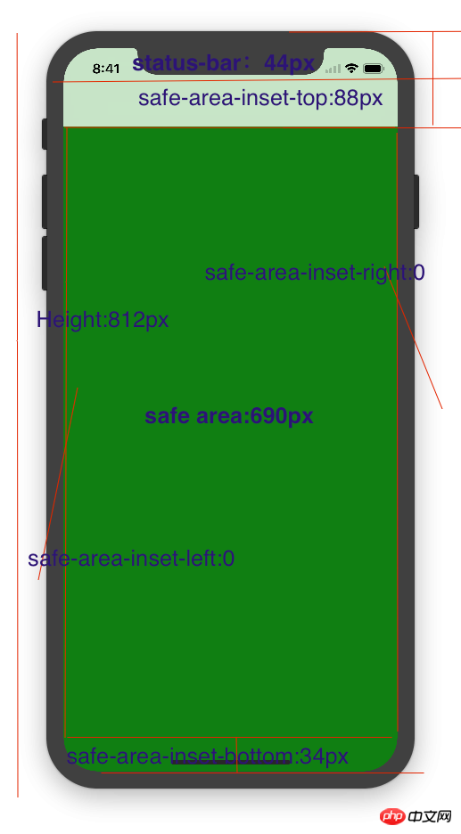
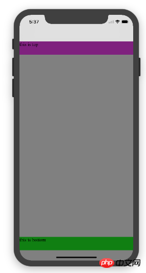
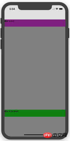
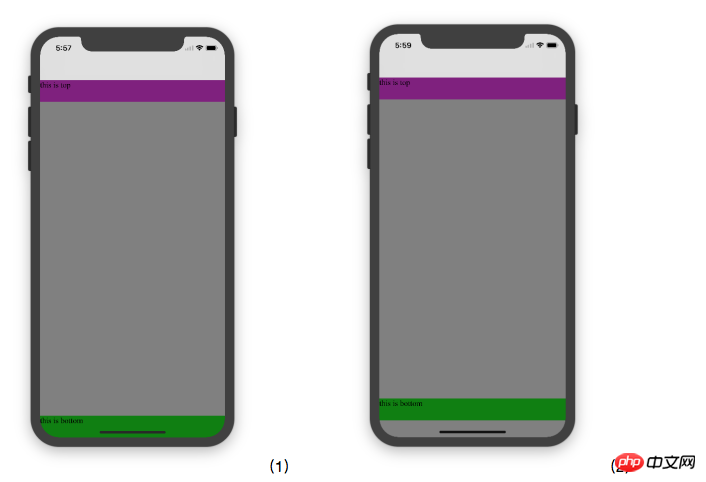
2. iPhoneX adaptation---safe area (safe area)

Apple’s opinion on the design layout of iPhone X is as follows:

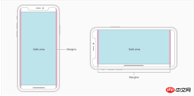
The core content should be in Safe The area ensures that it will not be obscured by the device's rounded corners (corners), sensor housing (sensor housing, full bangs), and the Home Indicator at the bottom. That is to say, the content we design to display should be within the safe area as much as possible;

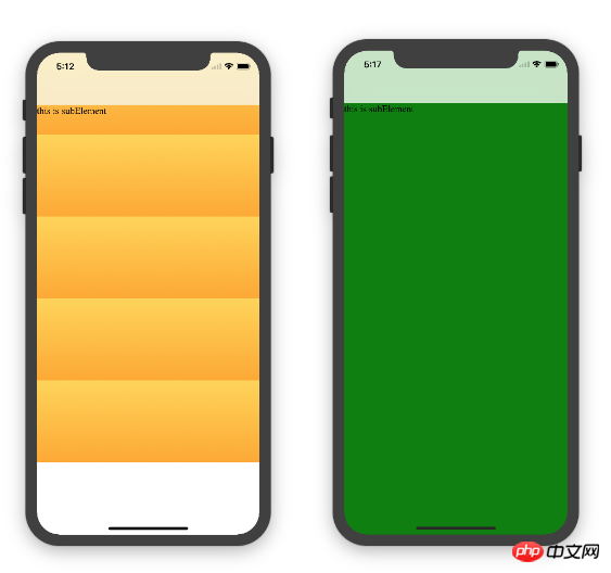
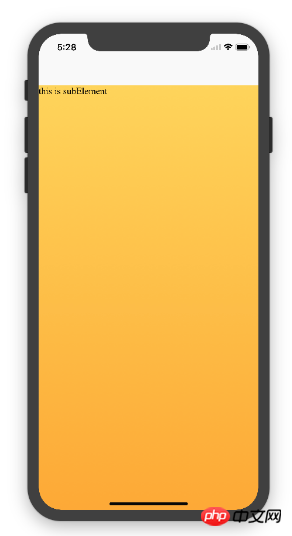
3. iPhoneX adaptation---Adaptation scheme viewport-fit 3.1 PhoneX adaptation uses the meta tag of viewport-fit as the adaptation solution in iOS 11; the default value of viewport-fit is auto.

The value of viewport-fit is as follows:

##                                                     coverviewport-fit:cover, the page content fills the screen

Viewport-fit meta tag setting (when cover)

3.2 css constant() function and safe-area-inset-top &safe-area-inset-left &safe-area-inset-right &safe- Introduction to area-inset-bottom

As shown above, WebKit in iOS 11 includes a new CSS function constant(), and a set of four predefined The constants: safe-area-inset-left, safe-area-inset-right, safe-area-inset-top and safe-area-inset-bottom. When combined together, allows styles to reference the size of each aspect's safe area.

3.1 When we set viewport-fit:contain, which is the default time; set safe-area-inset-left, safe-area-inset-right, safe-area-inset-top and safe- Parameters such as area-inset-bottom have no effect.

3.2 When we set viewport-fit:cover: set as follows

body {
    padding-top: constant(safe-area-inset-top);   //为导航栏+状态栏的高度 88px            
    padding-left: constant(safe-area-inset-left);   //如果未竖屏时为0                
    padding-right: constant(safe-area-inset-right); //如果未竖屏时为0                
    padding-bottom: constant(safe-area-inset-bottom);//为底下圆弧的高度 34px       
}

4. iPhoneX adaptation---height statistics

viewport-fit:cover + navigation bar


##5. iPhoneX adaptation---Media query

Note that the height used here is 690px (safe area height), not 812px;

@media only screen and (width: 375px) and (height: 690px){
    body {
        background: blue;
    }
}

6.iphoneX viewport-fit

Summary of the problem

1. About iphoneX page using gradient color; if viewport-fit:cover;

1.1 in settings There is no difference between the background color of monochrome and gradient color. If it is monochrome, it will fill the entire screen. If a gradient color is set, it will only be rendered at the height of the child element; and the height of the page is only 690px, and padding- is used above. top:88px;


body is fixed to:

this is subElement

1. Single color:

* {
           padding: 0;
           margin: 0;        
       }        
       body {
           background:green;
           padding-top: constant(safe-area-inset-top); //88px            
           /*padding-left: constant(safe-area-inset-left);*/            
           /*padding-right: constant(safe-area-inset-right);*/            
           /*padding-bottom: constant(safe-area-inset-bottom);*/        
       }
2. Gradient color

* {
           padding: 0;
           margin: 0;
       }
       body {
           background:-webkit-gradient(linear, 0 0, 0 bottom, from(#ffd54f), to(#ffaa22));
           padding-top: constant(safe-area-inset-top); //88px
           /*padding-left: constant(safe-area-inset-left);*/
           /*padding-right: constant(safe-area-inset-right);*/
           /*padding-bottom: constant(safe-area-inset-bottom);*/
       }
Solution to using gradient color to still fill the entire screen; CSS settings are as follows


   Designing Websites for iPhone X: Respecting the safe areas
   

this is subElement

2. The page element uses fixed positioning adaptation: {position: fixed;}

2.1 When the child element page is fixed at the bottom; when using viewport-fit:contain; you can see that bottom:0 will only be displayed in the safe area;


   Designing Websites for iPhone X: Respecting the safe areas


this is top


this is bottom

2.1 When the child element page is fixed at the bottom; when using viewport-fit:cover; you can see that bottom:0 will only be displayed in the safe area;

Add html,body {width:100%;heigth:100%}

Figure 1:

* {
           padding: 0;
           margin: 0;
       }
       html,body {
           height: 100%;
       }
       body {
           background: grey;
           padding-top: constant(safe-area-inset-top);
           padding-left: constant(safe-area-inset-left);
           padding-right: constant(safe-area-inset-right);
           padding-bottom: constant(safe-area-inset-bottom);
       }
       .top {
           width: 100%;
           height: 44px;
           background: purple;
       }
       .bottom {
           position: fixed;
           bottom: 0;
           left: 0;
           right: 0;
           height: 44px;
           color: black;
           background: green;
       }
Figure 2:

* {
           padding: 0;
           margin: 0;
       }
       html,body {
           height: 100%;
       }
       body {
           background: grey;
           padding-top: constant(safe-area-inset-top);
           padding-left: constant(safe-area-inset-left);
           padding-right: constant(safe-area-inset-right);
           /*padding-bottom: constant(safe-area-inset-bottom);*/
       }
       .top {
           width: 100%;
           height: 44px;
           background: purple;
       }
       .bottom {
           position: fixed;
           bottom: 0;
           left: 0;
           right: 0;
           height: 44px;
           color: black;
           background: green;
       }
2.3 Solution to the alertView pop-up mask layer


   alertView


Believe it After reading the case in this article, you have mastered the method. For more exciting information, please pay attention to other related articles on the PHP Chinese website!

Recommended reading:

Use H5 to add and prohibit scaling

How to operate json and echarts charts with WebGL

The above is the detailed content of Adaptation problem of H5 page display on iPhoneX. For more information, please follow other related articles on the PHP Chinese website!

Statement:
The content of this article is voluntarily contributed by netizens, and the copyright belongs to the original author. This site does not assume corresponding legal responsibility. If you find any content suspected of plagiarism or infringement, please contact admin@php.cn