
Home > Article > Web Front-end > How to use the MUI framework in mobile HTML5

In view of many previous front-end frameworks (especially responsive layout frameworks), UI controls look too much like web pages and have no native feel. Therefore, the pursuit of native UI is also an important goal of MUI. MUI is based on the iOS platform UI and supplements some UI controls unique to the Android platform. MUI mainly has three meanings: 1. A multilingual version of Windows, a separately released computer operating system; 2. the world's most authoritative official organization for Halal certification; 3. a proper noun in mobile communication technology. This article mainly introduces the relevant information on the use of mobile HTML5 front-end framework-MUI. The editor thinks it is quite good. Now I will share it with you and give you a reference. I hope it can help everyone.
1. Preparations before using the framework
1. Create a new HTML file containing mui
In Hbuilder, create a new HTML file and select "HTML containing mui" Template can quickly generate a mui page template, which handles mui's js and css resource references by default.
2. Enter mheader
The top title bar is required for every page. Enter mheader in Hbuilder to quickly generate the top navigation bar.
3. Enter mbody
Except for the top navigation and bottom tab controls, it is recommended that other controls be placed in the .mui-content control. Enter mbody in Hbuilder to quickly Generate a code block containing .mui-content.
2. UI components
1.accordion(folding panel)
The folding panel is similar to the secondary list, as follows:
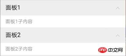
面板1子内容
面板2子内容
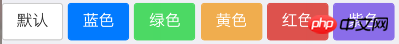
2.buttons(buttons)
Normal buttons
Add the .mui-btn class to the button node to generate the default button; if you need buttons of other colors, then Just continue to add the corresponding class. For example, .mui-btn-blue can become a blue button
The effect after running is as follows:
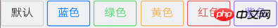
If If you want buttons with no background color and borders, you only need to add the .mui-btn-outlined class. The code is as follows:
The running results are as follows:
3.gallery(picture carousel)
The picture carousel inherits from the slide plug-in, so its DOM structure and events are the same as the slide plug-in;
Loop playback is not supported by default, and the DOM structure As follows:
Assume that there are four pictures 1, 2, 3, and 4 in the current picture carousel. Starting from the 1st picture, slide left to switch pictures. When switching to the 4th picture, Continue to slide left, and there will be two effects:
Supports looping: slide left to switch directly to the first picture;
Looping is not supported: swipe left, no response, continue to display the 4th picture. If the user wants to display the 1st picture, he must continuously swipe right to switch to the 1st picture;
When the first picture is displayed, it is the same problem to continue to slide right to display the fourth picture; the implementation of this problem needs to be controlled through the .mui-slider-loop class and DOM nodes;
To To support looping, you need to add the .mui-slider-loop class to the .mui-slider-group node. At the same time, you need to repeatedly add 2 pictures. The order of the pictures becomes: 4, 1, 2, 3, 4, 1. Code example As follows:
The mui framework has a built-in image carousel plug-in. Through the JS API encapsulated by this plug-in, users can set whether to automatically carousel and the carousel cycle. The following is a code example:
//获得slider插件对象
var gallery = mui('.mui-slider');
gallery.slider({
  interval:3000//自动轮播周期,若为0则不自动播放,默认为0;
});
So if you want the picture carousel not to play automatically, but to be switched by the user's manual sliding, you only need to set the interval parameter to 0 through the above method.
If you want to jump to the xth picture, you can use the gotoItem method of the picture carousel plug-in, for example:
//mui自带的on事件绑定,只能用事件委派方式
mui(".mui-content").on("tap","#btn",function(){
    gallery.slider().gotoItem(2);//调到第三张图片,index从0开始
});
4.input (input form)
All Elements such as input and textarea wrapped in the .mui-input-row class will have the width attribute set to width: 100%; by default. Wrapping the label element and the above controls in a .mui-input-group provides the best arrangement.
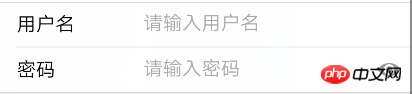
(There is also an eye icon on the right side of the password input box, which I find particularly useful)
The code is as follows:
mui currently also provides several input enhancement functions: quick deletion, voice input *5+ only and password box display hidden password.
1) Quick deletion: Just add the .mui-input-clear class to the input control. When there is content in the input control, there will be a delete icon on the right. Clicking it will clear the current input content
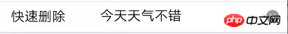
The code is as follows:
2) Search box: Add the .mui-input-search class at the same level as .mui-input-row and you can use it search control
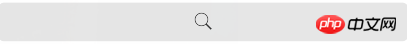
The code is as follows:
3) Voice input*5+ only: In order to facilitate quick input, mui integrates HTML5+ voice input, only You need to add the .mui-input-speech class to the corresponding input control to use voice input in the 5+ environment
4)密码框:给input元素添加.mui-input-password类即可使用
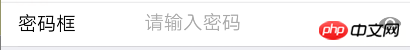
代码如下:
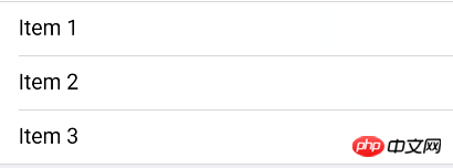
5.list(列表)
mui封装的列表组件是比较简单也很好用的。只需要在ul节点上添加.mui-table-view类、在li节点上添加.mui-table-view-cell类即可
运行结果如下图:
自定义列表高亮颜色
点击列表,对应列表项显示灰色高亮,若想自定义高亮颜色,只需要重写.mui-table-view-cell.mui-active即可,如下:
/*点击变灰色高亮*/
.mui-table-view-cell.mui-active{
    background-color: gray;
}
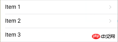
右侧添加导航箭头
若右侧需要增加导航箭头,变成导航链接,则只需在li节点下增加a子节点,并为该a节点增加.mui-navigate-right类即可,如下:
运行结果如下:
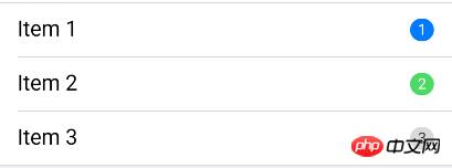
右侧添加数字角标等控件
mui支持将数字角标、按钮、开关等控件放在列表中;mui默认将数字角标放在列表右侧显示,代码如下:
运行结果如下:
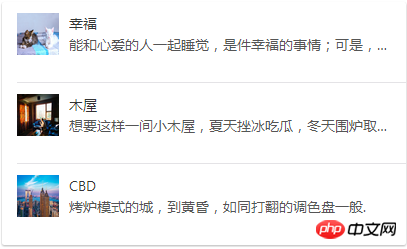
(图文列表)
图文列表继承自列表组件,主要添加了.mui-media、.mui-media-object、.mui-media-body、.mui-pull-left/right几个类,如下为示例代码
运行结果如下:
结束语:mui框架使用起来确实很方便,它还有很多控件供我们使用,具体可在mui官网查看。
相关推荐:
The above is the detailed content of How to use the MUI framework in mobile HTML5. For more information, please follow other related articles on the PHP Chinese website!


