
Home > Article > Web Front-end > HTML5 practice-detailed explanation of how to use css3 to enrich image styles (1)

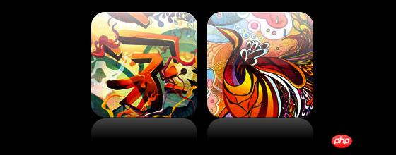
In CSS3, if box-shadow and border-radius are used directly on images, the browser cannot render them well. But if you use the image as background-image, the added style browser can render it well. I will introduce how to use box-shadow, border-radius and transition to create different image style effects.
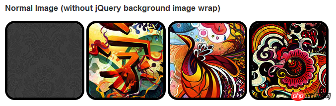
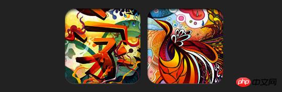
By looking at the demo, we can notice that we set border-radius and inline box-shadow for the first row of images. Firefox renders the border-radius of the image, but does not render the inline box-shadow. Both effects are not rendering in chrome and Safari.
.normal img {
border: solid 5px #000;
-webkit-border-radius: 20px;
-moz-border-radius: 20px;  border-radius: 20px;
-webkit-box-shadow: inset 0 1px 5px rgba(0,0,0,.5);
-moz-box-shadow: inset 0 1px 5px rgba(0,0,0,.5);
box-shadow: inset 0 1px 5px rgba(0,0,0,.5);
}
firefox effect:
chrome/safari
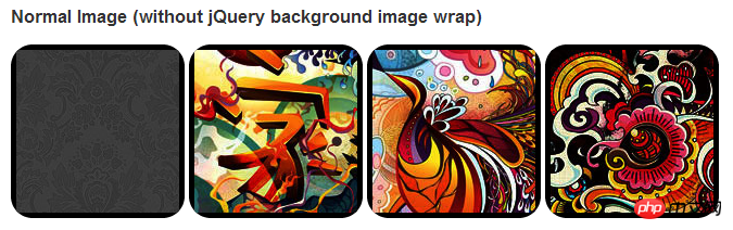
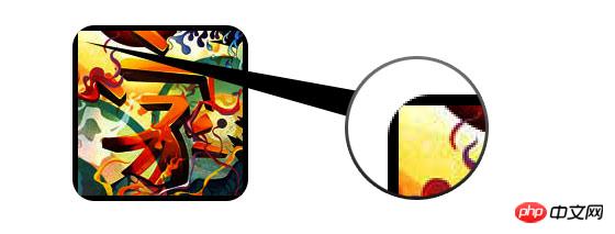
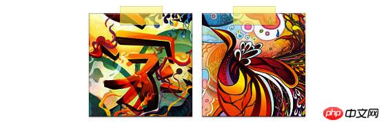
In order for border-radius and inline box-shadow to work properly, we need to convert the image into background-image.
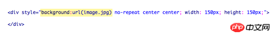
In order to complete this work dynamically, we need to use jquery for each image Add a background image to the wrapper. The following js code adds a span package to each image. The background image path of span is the path of the image.
The code is relatively simple, I think there is no need to explain it. If you are not sure, you can directly check the jquery API.
The above code will output the following results:

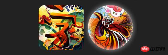
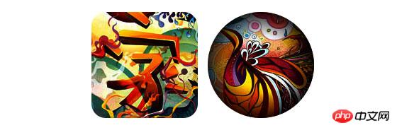
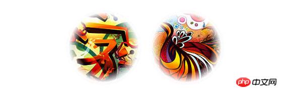
Add that we use border-radius to realize the circular image The effect is as follows:
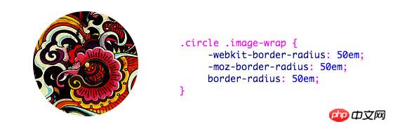
css:
.circle .image-wrap {
    -webkit-border-radius: 50em;
    -moz-border-radius: 50em;
    border-radius: 50em;
}The following is a card style picture, using multiple inline box-shadow.
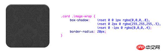
css:
.card .image-wrap {
    -webkit-box-shadow: inset 0 0 1px rgba(0,0,0,.8), inset 0 2px 0 rgba(255,255,255,.5), inset 0 -1px 0 rgba(0,0,0,.4);
    -moz-box-shadow: inset 0 0 1px rgba(0,0,0,.8), inset 0 2px 0 rgba(255,255,255,.5), inset 0 -1px 0 rgba(0,0,0,.4);
    box-shadow: inset 0 0 1px rgba(0,0,0,.8), inset 0 2px 0 rgba(255,255,255,.5), inset 0 -1px 0 rgba(0,0,0,.4);

    -webkit-border-radius: 20px;
    -moz-border-radius: 20px;
    border-radius: 20px;
}
The following is the relief effect.
css:
.embossed .image-wrap {
    -webkit-box-shadow: inset 0 0 2px rgba(0,0,0,.8),
    inset 0 2px 0 rgba(255,255,255,.5),
    inset 0 -7px 0 rgba(0,0,0,.6),
    inset 0 -9px 0 rgba(255,255,255,.3);
    -moz-box-shadow: inset 0 0 2px rgba(0,0,0,.8),
    inset 0 2px 0 rgba(255,255,255,.5), inset 0 -7px 0 rgba(0,0,0,.6),
    inset 0 -9px 0 rgba(255,255,255,.3);
    box-shadow: inset 0 0 2px rgba(0,0,0,.8),
    inset 0 2px 0 rgba(255,255,255,.5),
    inset 0 -7px 0 rgba(0,0,0,.6), inset 0 -9px 0 rgba(255,255,255,.3);

    -webkit-border-radius: 20px;
    -moz-border-radius: 20px;
    border-radius: 20px;
}Compared with the relief style, the new style adds a 1px blur attribute.
css:
.soft-embossed .image-wrap {
    -webkit-box-shadow: inset 0 0 4px rgba(0,0,0,1),
    inset 0 2px 1px rgba(255,255,255,.5),
    inset 0 -9px 2px rgba(0,0,0,.6),
    inset 0 -12px 2px rgba(255,255,255,.3);
    -moz-box-shadow: inset 0 0 4px rgba(0,0,0,1),
    inset 0 2px 1px rgba(255,255,255,.5),
    inset 0 -9px 2px rgba(0,0,0,.6),
    inset 0 -12px 2px rgba(255,255,255,.3);
    box-shadow: inset 0 0 4px rgba(0,0,0,1),
    inset 0 2px 1px rgba(255,255,255,.5),
    inset 0 -9px 2px rgba(0,0,0,.6),
    inset 0 -12px 2px rgba(255,255,255,.3);

    -webkit-border-radius: 20px;
    -moz-border-radius: 20px;
    border-radius: 20px;
}Use embedded box-shadow to achieve the cutout effect.
css:
.cut-out .image-wrap {
    -webkit-box-shadow: 0 1px 0 rgba(255,255,255,.2),
    inset 0 4px 5px rgba(0,0,0,.6),
    inset 0 1px 0 rgba(0,0,0,.6);
    -moz-box-shadow: 0 1px 0 rgba(255,255,255,.2),
    inset 0 4px 5px rgba(0,0,0,.6),
    inset 0 1px 0 rgba(0,0,0,.6);
    box-shadow: 0 1px 0 rgba(255,255,255,.2),
    inset 0 4px 5px rgba(0,0,0,.6),
    inset 0 1px 0 rgba(0,0,0,.6);

    -webkit-border-radius: 20px;
    -moz-border-radius: 20px;
    border-radius: 20px;
}In this example, we add the transition attribute to the image packaging, when the mouse slides over , it will change from rounded corners to rounded corners. Then we use multiple box-shadows to achieve the glow effect.
css:
.morphing-glowing .image-wrap {
    -webkit-transition: 1s;
    -moz-transition: 1s;
    transition: 1s;

    -webkit-border-radius: 20px;
    -moz-border-radius: 20px;
    border-radius: 20px;
}.morphing-glowing .image-wrap:hover {
    -webkit-box-shadow: 0 0 20px rgba(255,255,255,.6),
    inset 0 0 20px rgba(255,255,255,1);
    -moz-box-shadow: 0 0 20px rgba(255,255,255,.6),
    inset 0 0 20px rgba(255,255,255,1);
    box-shadow: 0 0 20px rgba(255,255,255,.6),
    inset 0 0 20px rgba(255,255,255,1);

    -webkit-border-radius: 60em;
    -moz-border-radius: 60em;
    border-radius: 60em;
}The highlight effect is achieved by adding the :after pseudo-class to the element.
css:
.glossy .image-wrap {
    -webkit-box-shadow: inset 0 -1px 0 rgba(0,0,0,.5);
    -moz-box-shadow: inset 0 -1px 0 rgba(0,0,0,.5);
    box-shadow: inset 0 -1px 0 rgba(0,0,0,.5);

    -webkit-border-radius: 20px;
    -moz-border-radius: 20px;
    border-radius: 20px;
}.glossy .image-wrap:after {
    position: absolute;
    content: ' ';
    width: 100%;
    height: 50%;
    top: 0;
    left: 0;

    -webkit-border-radius: 20px;
    -moz-border-radius: 20px;
    border-radius: 20px;

    background: -moz-linear-gradient(top, rgba(255,255,255,0.7) 0%, rgba(255,255,255,.1) 100%);
    background: -webkit-gradient(linear, left top, left bottom, color-stop(0%,rgba(255,255,255,0.7)), color-stop(100%,rgba(255,255,255,.1)));
    background: linear-gradient(top, rgba(255,255,255,0.7) 0%,rgba(255,255,255,.1) 100%);
}In this example, we move the highlight effect to the bottom to achieve the reflection effect.
css:
.reflection .image-wrap:after {
    position: absolute;
    content: ' ';
    width: 100%;
    height: 30px;
    bottom: -31px;
    left: 0;

    -webkit-border-top-left-radius: 20px;
    -webkit-border-top-right-radius: 20px;
    -moz-border-radius-topleft: 20px;
    -moz-border-radius-topright: 20px;
    border-top-left-radius: 20px;
    border-top-right-radius: 20px;

    background: -moz-linear-gradient(top, rgba(0,0,0,.3) 0%, rgba(255,255,255,0) 100%);
    background: -webkit-gradient(linear, left top, left bottom, color-stop(0%,rgba(0,0,0,.3)),
    color-stop(100%,rgba(255,255,255,0)));
    background: linear-gradient(top, rgba(0,0,0,.3) 0%,rgba(255,255,255,0) 100%);
}.reflection .image-wrap:hover {
    position: relative;
    top: -8px;
}In this example, we use :before and :after to combine the highlight and reflection effects.
css:
.glossy-reflection .image-wrap {
    -webkit-box-shadow: inset 0 -1px 0 rgba(0,0,0,.5), inset 0 1px 0 rgba(255,255,255,.6);
    -moz-box-shadow: inset 0 -1px 0 rgba(0,0,0,.5), inset 0 1px 0 rgba(255,255,255,.6);
    box-shadow: inset 0 -1px 0 rgba(0,0,0,.5), inset 0 1px 0 rgba(255,255,255,.6);

    -webkit-transition: 1s;
    -moz-transition: 1s;
    transition: 1s;

    -webkit-border-radius: 20px;
    -moz-border-radius: 20px;
    border-radius: 20px;
}.glossy-reflection .image-wrap:before {
    position: absolute;
    content: ' ';
    width: 100%;
    height: 50%;
    top: 0;
    left: 0;

    -webkit-border-radius: 20px;
    -moz-border-radius: 20px;
    border-radius: 20px;

    background: -moz-linear-gradient(top, rgba(255,255,255,0.7) 0%, rgba(255,255,255,.1) 100%);
    background: -webkit-gradient(linear, left top, left bottom, color-stop(0%,rgba(255,255,255,0.7)), color-stop(100%,rgba(255,255,255,.1)));
    background: linear-gradient(top, rgba(255,255,255,0.7) 0%,rgba(255,255,255,.1) 100%);
}.glossy-reflection .image-wrap:after {
    position: absolute;
    content: ' ';
    width: 100%;
    height: 30px;
    bottom: -31px;
    left: 0;

    -webkit-border-top-left-radius: 20px;
    -webkit-border-top-right-radius: 20px;
    -moz-border-radius-topleft: 20px;
    -moz-border-radius-topright: 20px;
    border-top-left-radius: 20px;
    border-top-right-radius: 20px;

    background: -moz-linear-gradient(top, rgba(230,230,230,.3) 0%, rgba(230,230,230,0) 100%);
    background: -webkit-gradient(linear, left top, left bottom, color-stop(0%,rgba(230,230,230,.3)), color-stop(100%,rgba(230,230,230,0)));
    background: linear-gradient(top, rgba(230,230,230,.3) 0%,rgba(230,230,230,0) 100%);
}In this example, we use: after to achieve the effect of tape.
css:
.tape .image-wrap {
    -webkit-box-shadow: inset 0 0 2px rgba(0,0,0,.7),
    inset 0 2px 0 rgba(255,255,255,.3), inset 0 -1px 0 rgba(0,0,0,.5), 0 1px 3px rgba(0,0,0,.4);
    -moz-box-shadow: inset 0 0 2px rgba(0,0,0,.7),
    inset 0 2px 0 rgba(255,255,255,.3),
    inset 0 -1px 0 rgba(0,0,0,.5), 0 1px 3px rgba(0,0,0,.4);
    box-shadow: inset 0 0 2px rgba(0,0,0,.7), inset 0 2px 0 rgba(255,255,255,.3),
    inset 0 -1px 0 rgba(0,0,0,.5), 0 1px 3px rgba(0,0,0,.4);
}.tape .image-wrap:after {
    position: absolute;
    content: ' ';
    width: 60px;
    height: 25px;
    top: -10px;
    left: 50%;
    margin-left: -30px;
    border: solid 1px rgba(137,130,48,.2);

    background: -moz-linear-gradient(top, rgba(254,243,127,.6) 0%, rgba(240,224,54,.6) 100%);
    background: -webkit-gradient(linear, left top, left bottom, color-stop(0%,rgba(254,243,127,.6)), color-stop(100%,rgba(240,224,54,.6)));
    background: linear-gradient(top, rgba(254,243,127,.6) 0%,rgba(240,224,54,.6) 100%);
    -webkit-box-shadow: inset 0 1px 0 rgba(255,255,255,.3), 0 1px 0 rgba(0,0,0,.2);
}In this example, we use: after on the element. When the mouse enters When achieving radial gradient effect.
css:
.morphing-tinting .image-wrap {
    position: relative;

    -webkit-transition: 1s;
    -moz-transition: 1s;
    transition: 1s;

    -webkit-border-radius: 20px;
    -moz-border-radius: 20px;
    border-radius: 20px;
}.morphing-tinting .image-wrap:hover {
    -webkit-border-radius: 30em;
    -moz-border-radius: 30em;
    border-radius: 30em;
}.morphing-tinting .image-wrap:after {
    position: absolute;
    content: ' ';
    width: 100%;
    height: 100%;
    top: 0;
    left: 0;

    -webkit-transition: 1s;
    -moz-transition: 1s;
    transition: 1s;

    -webkit-border-radius: 30em;
    -moz-border-radius: 30em;
    border-radius: 30em;
}.morphing-tinting .image-wrap:hover:after  {
    background: -webkit-gradient(radial, 50% 50%, 40, 50% 50%, 80, from(rgba(0,0,0,0)), to(rgba(0,0,0,1)));
    background: -moz-radial-gradient(50% 50%, circle, rgba(0,0,0,0) 40px, rgba(0,0,0,1) 80px);
}We can also use radial gradient to generate a mask to achieve feathering Effect.
css:
.feather .image-wrap {
    position: relative;

    -webkit-border-radius: 30em;
    -moz-border-radius: 30em;
    border-radius: 30em;
}.feather .image-wrap:after  {
    position: absolute;
    content: ' ';
    width: 100%;
    height: 100%;
    top: 0;
    left: 0;

    background: -webkit-gradient(radial, 50% 50%, 50, 50% 50%, 70, from(rgba(255,255,255,0)), to(rgba(255,255,255,1)));
    background: -moz-radial-gradient(50% 50%, circle, rgba(255,255,255,0) 50px, rgba(255,255,255,1) 70px);
}这种实现方式在大多数支持border-radius, box-shadow, :before and :after特性的浏览器中(例如Chrome, Firefox 和 Safari),都能很好的工作。在不支持新特性的浏览器中,只会显示原始图片。
借助:before 和:after伪类能为图片创造很多种样式,你可以自己尝试创建出新的效果。
The above is the detailed content of HTML5 practice-detailed explanation of how to use css3 to enrich image styles (1). For more information, please follow other related articles on the PHP Chinese website!