
Home > Article > Web Front-end > 2D transformation of elements using CSS3

2D transformations are used to re-change the structure of elements, such as translation, rotation, scaling and skew.
Here are some 2D transformation functions-
| Sr.No. | Values and Description |
|---|---|
| 1 | matrix(n,n,n,n,n,n) Used to define a matrix transformation with six values |
| 2 | translate(x,y) Used to transform elements along the x-axis and y-axis |
| 3 | translateX(n) Used to transform elements along the x-axis |
| 4 | translateY(n) Used to transform elements along the y-axis |
| 5 | scale(x,y) Used to change the width and height of elements
|
| 6 | scaleX(n ) For changing the width of an element |
The following is the code for 2D transformation of an element using CSS3-
Real-time demonstration
<!DOCTYPE html>
<html>
<head>
<style>
body {
   font-family: "Segoe UI", Tahoma, Geneva, Verdana, sans-serif;
}
div {
   width: 100px;
   height: 100px;
   background-color: rgb(255, 17, 0);
   border:2px solid black;
   margin: 20px;
   display: inline-block;
   color: white;
}
.rotate {
   transform: rotate(20deg);
}
.translate {
   transform: translate(30px, 20px);
}
.scale {
   transform: scale(2, 1);
   margin-left:70px;
}
.skew {
   transform: skew(20deg);
}
</style>
</head>
<body>
<h1>2D transformation of elements </h1>
<div class="rotate">ROTATE</div>
<div class="skew">SKEW</div>
<div class="scale">SCALE</div>
<div class="translate">TRANSLATE</div>
</body>
</html>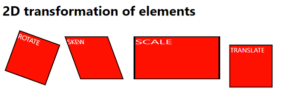
The above is the detailed content of 2D transformation of elements using CSS3. For more information, please follow other related articles on the PHP Chinese website!