Home >Web Front-end >JS Tutorial >JS realizes the beautiful special effect of Valentine's Day hearts falling all over the screen (complete code attached)
214 Valentine’s Day is approaching, and programmers with romantic instincts can’t wait to dress up their webpages~ I am no exception, so today I will teach you step by step how to create a romantic background full of love hearts. Flying dynamic effect. PS: Technical experts are very welcome to leave messages for discussion and help me make optimization suggestions!
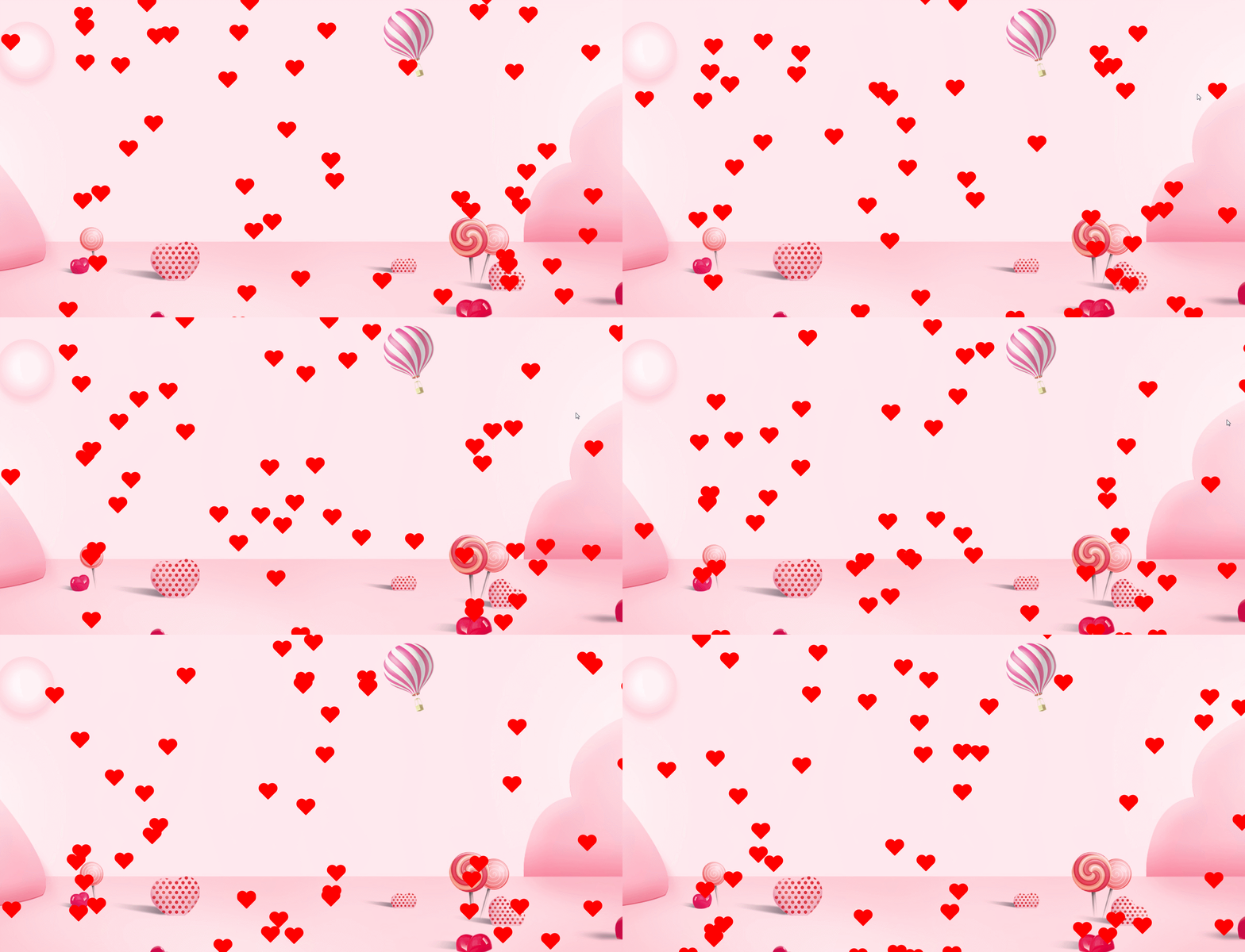
Let’s look at the final effect first↓↓↓

##Foreword:
The effect in the article is the use of snowfall To implement .jquery.js, jquery and snowfall.jquery.js need to be introduced first. [Recommended:javascript video tutorial]
snowfall.jquery.js下载地址:https://www.npmjs.com/package/jquery-snowfall
Step one:
Use pseudo elementsbefore and :afterDraw two overlapping rectangles, as shown in the picture:

<!DOCTYPE html>
<html>
<head>
    <meta charset="utf-8">
    <title></title>
    <style media="screen">
        body {
            overflow-y: hidden;
        }
        .heart-body {
            width: 500px;
            margin: 100px auto;
            position: relative;
        }
        .snowfall-flakes:before,
        .snowfall-flakes:after {
            content: "";
            position: absolute;
            left: 0px;
            top: 0px;
            display: block;
            width: 30px;
            height: 46px;
            background: red;
            border-radius: 50px 50px 0 0;
        }
    </style>
</head>
<body>
    <div class="heart-body">
        <div class="snowfall-flakes"></div>
    </div>
</body>
</html>
Second step:
Use thetransform attribute to rotate the two pseudo elements by negative 45 degrees and 45 degrees respectively, as shown in the figure:

      .snowfall-flakes:before {
            -webkit-transform: rotate(-45deg);
            /* Safari 和 Chrome */
            -moz-transform: rotate(-45deg);
            /* Firefox */
            -ms-transform: rotate(-45deg);
            /* IE 9 */
            -o-transform: rotate(-45deg);
            /* Opera */
            transform: rotate(-45deg);
        }
        .snowfall-flakes:after {
            -webkit-transform: rotate(45deg);
            /* Safari 和 Chrome */
            -moz-transform: rotate(45deg);
            /* Firefox */
            -ms-transform: rotate(45deg);
            /* IE 9 */
            -o-transform: rotate(45deg);
            /* Opera */
            transform: rotate(45deg);
        }
Step 3:
Use theleft attribute to offset the pseudo element after by a certain pixel to the left, so that the two micro elements partially overlap to form a heart It looks like, as shown in the picture:

      .snowfall-flakes:after {
            left: 13px;
            -webkit-transform: rotate(45deg);
            /* Safari 和 Chrome */
            -moz-transform: rotate(45deg);
            /* Firefox */
            -ms-transform: rotate(45deg);
            /* IE 9 */
            -o-transform: rotate(45deg);
            /* Opera */
            transform: rotate(45deg);
        }
We have finished drawing the love, so how to make the love fly all over the screen? In fact, we only need to call jquery.js and snowfall.jquery. js can be achieved, and the rendering is as follows:

The complete code is as follows:
<!DOCTYPE html>
<html>

<head>
    <meta charset="utf-8">
    <title></title>
    <style media="screen">
        body {
            overflow: hidden;
        }

        .heart-body {
            width: 500px;
            margin: 100px auto;
            position: relative;
        }

        .snowfall-flakes:before,
        .snowfall-flakes:after {
            content: "";
            position: absolute;
            left: 0px;
            top: 0px;
            display: block;
            width: 30px;
            height: 46px;
            background: red;
            border-radius: 50px 50px 0 0;
        }

        .snowfall-flakes:before {
            -webkit-transform: rotate(-45deg);
            /* Safari 和 Chrome */
            -moz-transform: rotate(-45deg);
            /* Firefox */
            -ms-transform: rotate(-45deg);
            /* IE 9 */
            -o-transform: rotate(-45deg);
            /* Opera */
            transform: rotate(-45deg);
        }

        .snowfall-flakes:after {
            left: 13px;
            -webkit-transform: rotate(45deg);
            /* Safari 和 Chrome */
            -moz-transform: rotate(45deg);
            /* Firefox */
            -ms-transform: rotate(45deg);
            /* IE 9 */
            -o-transform: rotate(45deg);
            /* Opera */
            transform: rotate(45deg);
        }
            .bgimg{
            position:fixed;
            top: 0;
            left: 0;
            width:100%;
            height:100%;
            min-width: 1000px;
            z-index:-10;
            zoom: 1;
            background-color: #fff;
            background: url(bgimg.jpg) no-repeat;
            background-size: cover;
            -webkit-background-size: cover;
            -o-background-size: cover;
            background-position: center 0;
    }
    </style>
</head>

<body>
  <script src="http://libs.baidu.com/jquery/1.9.0/jquery.js" type="text/javascript"></script>
  <script src="snowfall.jquery.js"></script>
  <script>
      //调用飘落函数 实现飘落效果
      $(document).snowfall({
          flakeCount: 50 //爱心的个数
      });
      $(window).resize(function () {
        //当浏览器大小变化时
        location.reload(true);
      });
  </script>
  <div class="bgimg"></div>
</body>

</html>
In fact, I personally think that smaller love paintings look better , the purpose of drawing it so big above is to make it easier for everyone to see the love more clearly. The rendering after drawing the love smaller is as follows:

        .snowfall-flakes:before,
        .snowfall-flakes:after {
            width: 10px;
            height: 16px;
            border-radius: 10px 10px 0 0;
        }
        .snowfall-flakes:after {
            left: 4px;
        }
The pink love scene picture is below, everyone is welcome to take it for yourself:

The above is the detailed content of JS realizes the beautiful special effect of Valentine's Day hearts falling all over the screen (complete code attached). For more information, please follow other related articles on the PHP Chinese website!