


When CSS3 was not popular, creating a website header was a scary and difficult task?. At that time, Flexbox was still new and we had to use old methods, such as float and clearfix techniques. Today, the situation is completely different. Flexbox has received widespread support, which greatly reduces our development work and provides us with more possibilities.
Some people may say that now that CSS3 is so popular, isn’t it easy to create a website header? Not so, because there are some interesting challenges to solve, several of which we will introduce in this article.
Introduction
First of all, the website mentioned here Header is one of the first things that users see when they visit the website. Typically, it contains a logo or website name and navigation links, like this:

Regardless of the visual design of the header, the key elements are logo and navigation.
Flexbox
When flexbox is applied to the Header element, it will keep all child items in the same row. Then, all you need to do is apply justify-content to distribute the spacing between them.
html
<header>
  <a>Brand</a>
  <nav></nav>
</header>
css
.site-header {
  display: flex;
  justify-content: space-between;
  align-items: center;
}
Pretty simple, right? For a use case like this, yes, probably It's more complicated than that.
Header Wrapper
does not contain a layer of wrapper outside the above lago and nav, which is possible on a large screen Problems will arise.

You can see from above that the first Header is too wide because it has no inner wrapper compared to the first one , the second one looks much better. So, we can make the following adjustments to the HTML.
<header>
  <div>
    <a><img  src="/static/imghwm/default1.png" data-src="logo.svg" class="lazy" alt="Build website headers using CSS Flexbox" ></a>
    <nav></nav>
  </div>
</header>
flexbox should be moved into the .site-header__wrapper element.
.site-header__wrapper {
  display: flex;
  justify-content: space-between;
  align-items: center;
}
Use flex-wrap
When the screen is small, you can scroll horizontally. See the picture below

If flex-wrap: wrap is not set, horizontal scrolling will occur when the screen is too small. If you don’t want this, you can Add flex-wrap: wrap`?.
Many forms of Header
The reason I like using flexbox is that it can easily handle many variations in header design. Based on the previous header design, I expanded the header element with some options, such as adding buttons, search inputs, and changing the order of sub-items.
Header Change 1
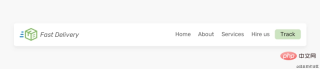
Suppose I want to add a button next to the navigation link. How should this be handled? Should we add it as a link in the navigation bar? Or should it be separate from the navigation? I prefer this.
<header>
  <div>
    <a><img  src="/static/imghwm/default1.png" data-src="logo.svg" class="lazy" alt="Build website headers using CSS Flexbox" ></a>
    <nav></nav>
    <a>Track</a>
  </div>
</header>
In this case, we cannot use justify-content: space-between to handle the gap. Instead, I will use ## on the nav element #margin-left: auto,


flex property.
html
<header>
  <div>
    <a><img  src="/static/imghwm/default1.png" data-src="logo.svg" class="lazy" alt="Build website headers using CSS Flexbox" ></a>
    <div></div>
    <nav></nav>
    <a>Track</a>
  </div>
</header>
css
.search {
  flex: 1;
}
Now the search input will be populated with brand and ## The free space between #nav. However, this has some limitations. On smaller viewports, the header will look like this:
 #Search input width should not be smaller than this as it makes it difficult to type and view the full text. There are two solutions below:
 # I prefer the second solution because it doesn't hide the navigation prematurely. Generally speaking, I try to avoid hiding an element if it doesn't affect the layout.
Header Change 3
对于这个示例,HTML标记是相同的,但是 header 里的元素顺序是不同的。我们如何才能做到这一点? 你可能想到用 order 属性来解决这个问题 ?
html
<header>
  <div>
    <a><img  src="/static/imghwm/default1.png" data-src="logo.svg" class="lazy" alt="Build website headers using CSS Flexbox" ></a>
    <nav></nav>
    <a>Track</a>
  </div>
</header>
css
.site-header {
  display: flex;
  justify-content: space-between;
}

.nav {
  order: -1;
}

这样有个问题,间隔空间不会使 logo 居中,它只是分散项目之间的空间。
解决方案是给每个子项一个flex: 1,这将在它们之间分配可用空间。
.brand,
.nav,
.button {
  flex: 1;
}

这样,由于flex: 1,按钮元素变宽了, 解决此问题的唯一方法是将其包裹到另一个元素中。
HTML
<header>
  <div>
    <a><img  src="/static/imghwm/default1.png" data-src="logo.svg" class="lazy" alt="Build website headers using CSS Flexbox" ></a>
    <nav></nav>
    <div>
      <a>Track</a>
    </div>
  </div>
</header>
这样,我们就可以将下面的logo和按钮居中。
.logo {
  text-align: center;
}

/* 不要介意这里的命名,这只是出于演示*/
.button-wrapper {
  text-align: end; /* end 等同于LTR语言中的right */
}

但是,如果添加了更多导航链接,这种方法很容易失败。我们需要确保导航链接的数量不会超过特定的限制。下面一个logo偏离中心的例子 ?:

正如在上图中看到的,logo没有居中。所以要记住这一点,以避免这种意想不到的问题 ?。
使用 Flexbox 构建 Header 的有用技巧
flex-basis
如果某个元素需要在移动设备上占据整个宽度(不能隐藏的重要导航),我会使用flex-basis: 100% ?。

从上面的模型看,做起来可能很简单。 实际上不是。 通常,header 可能有一个内部间距(padding),当我们强制某项占据全部宽度时,除非清除padding ,否则它不会生效。 但是,删除padding不切实际,因为它将影响设计中的其他元素 ?。
下面解决此问题的一种解决方法 ?:
将
flex: 1 0 100%添加到导航元素。如有需要,请更改其
order。 有时,可能还有其他元素,我们想确保导航是最后一个。加上一个等于宽度等于
padding的负margin,这也会让导航占据整个宽度。在导航中添加 padding,这会增加一些适当的空间。
最后,使用了
justify-content: center将导航项居中(不重要)
.nav {
  flex: 1 0 100%; /* [1] */
  order: 2; /* [2] */
  margin: 1rem -1rem -1rem -1rem; /* [3] */
  padding: 1rem; /* [4] */
  display: flex; /* [5] */
  justify-content: center; /* [5] */
}

间距
着 Chrome 和 Firefox 支持flex gap属性,现在在flex项目之间添加间距比以往任何时候都容易。考虑以下标题

要做到上图的高亮间距,只需将gap: 1rem添加到flex父节点。没有了gap,我们还是需要用旧的方式来间隔 ?。
/* 老的方式 */
.brand {
  margin-right: 1rem;
}

.sign-in {
  margin-right: 1rem;
}

/* 新的方式 */
.site-header {
  /* Other flexbox styles */
  gap: 1rem;
}
英文原文地址:https://ishadeed.com/article/website-headers-flexbox/
作者:Shadeed
更多编程相关知识,请访问:编程入门!!
The above is the detailed content of Build website headers using CSS Flexbox. For more information, please follow other related articles on the PHP Chinese website!

 How to create a hover effect on a table row in CSSAug 26, 2025 am 07:29 AM
To create a hover effect for table rows, you need to use the CSS :hover pseudo-class. It is recommended to set background color, text color and other styles for cells in the row through tr:hovertd to ensure compatibility. You can combine transitions to achieve smooth transitions and cursor:pointer prompts interactivity. You can also distinguish between processing table headers and data rows through class names to avoid style conflicts, and ultimately achieve a simple and efficient hover effect.
 How to use box-sizing: border-box in CSSAug 26, 2025 am 07:18 AM
Usingbox-sizing:border-boxensuresanelement’sdeclaredwidthincludesitscontent,padding,andborder,preventingunexpectedlayoutoverflow;applyingitgloballyvia,::before,*::after{box-sizing:border-box;}standardizessizingacrossallelementsandpseudo-elements,maki
 How to style a horizontal rule (hr) with CSSAug 26, 2025 am 07:11 AM
To completely customize the horizontal line style, you must first remove the default style, and then use the background, border and other properties of CSS to redefine the appearance. The specific method is to first set border:none to clear the browser's default style. Then you can create custom lines through background-color or border-top. It is recommended to use background-color to obtain higher control. If you need a dotted line or dotted line effect, use border-top and match dashed, dotted and other values. By setting width and margin:auto, you can control the line width and achieve horizontal centering. Use linear-gradient to create gradient effects on the background.
 How to style a file input button with CSSAug 26, 2025 am 06:48 AM
To customize the style of the file upload button, you need to hide the native input box and replace it with a label. By setting the input box to be transparent and absolutely positioned, it is overlaid on the styleable label, thus achieving a fully customizable appearance while retaining functionality and accessibility. This method is compatible with all browsers and supports displaying file names, hover status and keyboard navigation, and ultimately creating a file upload button that is both beautiful and practical.
 How to use CSS scroll-behavior for smooth scrolling?Aug 26, 2025 am 06:15 AM
To achieve smooth scrolling on web pages, you need to use the scroll-behavior attribute of CSS; 1. Apply scroll-behavior:smooth to the html element to enable global smooth scrolling; 2. When clicking an anchor link (such as #section), animated scrolling is triggered instead of instant jumps; 3. It is recommended to set it on html instead of body to ensure compatibility; 4. This property can be applied separately in a custom scroll container to achieve local smooth scrolling; 5. Note that JavaScript scrolling operations can override this effect through behavior:'auto'; this method is compatible with modern mainstream browsers and significantly improves the user experience, which can be easily implemented with one sentence of CSS.
 How to create a modal window in CSSAug 26, 2025 am 06:04 AM
Use hidden check boxes as status switches to control the display and hiding of modal boxes through the checked selector of CSS; 2. Use label's for attribute to associate check boxes to achieve opening and closing operations; 3. Use adjacent brother selectors ( ) to display modal boxes when the check box is selected; 4. Add appropriate styles to achieve visual effects such as centering, masking, rounding corners, shadows, etc.; 5. Ensure accessibility, add aria-hidden and role attributes, and ensure that the keyboard is operable. This method can create a modal window with complete functionality, clear structure and easy to maintain without JavaScript, suitable for simple prompts or information display scenarios.
 How to use the @supports rule in CSSAug 26, 2025 am 05:53 AM
@supports rules are used to implement progressive enhancement based on whether the browser supports specific CSS attributes or values. 1. The basic syntax is @supports(property:value){...}. If display:grid is supported, the grid layout is applied. 2. The conditions can be combined using and, or, and not logical operators, such as supporting multiple features at the same time or providing a fallback scheme. 3. Support grouping complex conditions in brackets and can be nested with other at rules such as @media. 4. In actual applications, it is recommended to set basic styles and gradually enhance them to avoid excessive use, ensure that browsers that do not support new features can still display content normally, and ultimately achieve the effect of safely adopting modern CSS.
 How to style form inputs with CSSAug 26, 2025 am 12:02 AM
To effectively and consistently beautify form input across browsers, the following steps must be followed: 1. Use standard CSS properties to customize the appearance of text input, password, mailbox, etc., set width, margins, borders, rounded corners and fonts, and add interactive feedback through the:focus pseudo-class; 2. Use the ::placeholder pseudo-element to adjust the color and style of the placeholder text to ensure it is clear and readable; 3. Make the input box responsive and maintain the layout stable by setting box-sizing:border-box and using relative units; 4. Use native controls to hide native controls and combine pseudo-elements and labels to achieve custom visual effects; 5. Always pay attention to accessibility and provide visible focus indicators


Hot AI Tools

Undress AI Tool
Undress images for free

Undresser.AI Undress
AI-powered app for creating realistic nude photos

AI Clothes Remover
Online AI tool for removing clothes from photos.

Clothoff.io
AI clothes remover

Video Face Swap
Swap faces in any video effortlessly with our completely free AI face swap tool!

Hot Article
Hot Tools

EditPlus Chinese cracked version
Small size, syntax highlighting, does not support code prompt function

Dreamweaver CS6
Visual web development tools

MinGW - Minimalist GNU for Windows
This project is in the process of being migrated to osdn.net/projects/mingw, you can continue to follow us there. MinGW: A native Windows port of the GNU Compiler Collection (GCC), freely distributable import libraries and header files for building native Windows applications; includes extensions to the MSVC runtime to support C99 functionality. All MinGW software can run on 64-bit Windows platforms.

DVWA
Damn Vulnerable Web App (DVWA) is a PHP/MySQL web application that is very vulnerable. Its main goals are to be an aid for security professionals to test their skills and tools in a legal environment, to help web developers better understand the process of securing web applications, and to help teachers/students teach/learn in a classroom environment Web application security. The goal of DVWA is to practice some of the most common web vulnerabilities through a simple and straightforward interface, with varying degrees of difficulty. Please note that this software

SublimeText3 Linux new version
SublimeText3 Linux latest version

