Home > Article > Web Front-end > Teach you step by step how to achieve the frosted glass effect with CSS

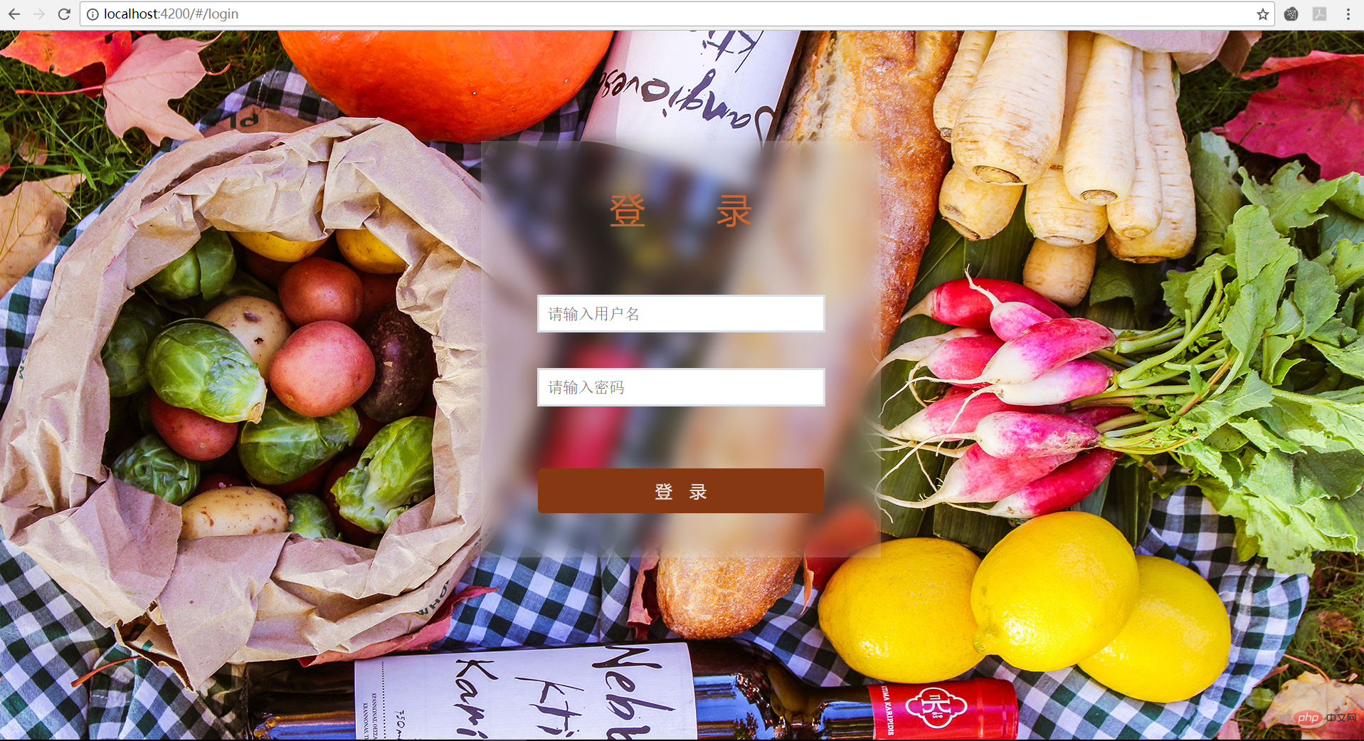
When I was making a login interface today, because the background image of the page given by Vision was too bright and eye-catching, the login form box in the middle of the page was very inconspicuous and the effect was very poor. . I thought of the effect of making frosted glass, and now I’m sharing it for everyone to take a look at.
The page structure is as follows:
<p class="wrap-box"><!--最外层包裹框,背景图片很鲜艳亮眼position:fixed-->
<p class='login-box'><!--登录表单框部分position:fixed-->
</p>
</p>Since the CSS filter attribute has been used before, in Using the blur(f82c6b5ef946c659ca1213c2ec449c8c) function in the attribute value can produce a frosted glass effect, so I have two ideas to achieve the effect of highlighting the login form box:
Exciting! This method seems to work, but the effect is not what is expected, login-box is also blurred! The reason is as follows:
All descendant elements of the element to which filter:blur(f82c6b5ef946c659ca1213c2ec449c8c); is applied will be blurred (not because of inheritance), even if the descendant elements are detached The document flow without this element cannot be avoided.
.login-box::before{
	content:'';
	position:absolute;
	top:0;
	left:0;
	right:0;
	bottom:0;
	filter:blur(10px) contrast(.8);
	z-index:-1;
}
And set the following background style:
.wrap-box ,.login-box::before{
	background:url('/assets/login_bg.jpg') 0 / cover fixed;
}
The effect is as follows:

Thank you everyone for reading, I hope you will benefit a lot.
This article is reproduced from: https://blog.csdn.net/buttonChan/article/details/79889372
Recommended tutorial: "CSS Tutorial"
The above is the detailed content of Teach you step by step how to achieve the frosted glass effect with CSS. For more information, please follow other related articles on the PHP Chinese website!