Home >Web Front-end >JS Tutorial >Pure js to implement 3D photo album (source code attached)

Pure JavaScript to implement carousel/3d album special effects (mouse drag and rotate)
Let’s take a look at the effect first Picture
Let’s talk about the implementation idea
The carousel relies on a box with a depth of field (perspective) attribute ( The box id here starts with: perspective) creates a sense of extension into the interior of the web page, and allows the box (here named wrap) containing the image to be translated along the z-axis (translateZ(Xpx)) in the box with the depth of field attribute ( The 3D effect generated by the transform attribute in the perspective) is realized by rotating along the y-axis of the box (wrap).
【Related course recommendations: JavaScript video tutorial】
##3d implementation Process
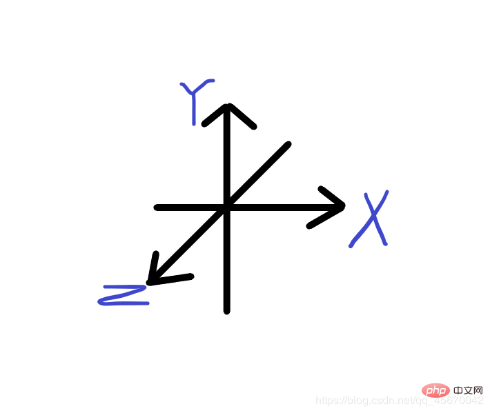
First you need to know the meaning of the xyz axis in transform in js
/* 场景景深 */
#perspective{
perspective: 700px;/*此属性是实现旋转木马的要点,能产生空间上的距离/延伸感。
在此盒子中放置图片的盒子便可以实现向网页内部延伸的感觉*/
}
2. Secondly, set the container wrap containing the picture box to display it in the center, and add the position: relative attribute to make it image positioning. Add the transform attribute, which will be used later. #wrap{
position: relative;
width: 200px;
height: 200px;
margin: 150px auto;
border: 1px solid black;
transform-style: preserve-3d; /*实现3d效果的关键步骤,与boxshadow配合使用可以忽略层级问题,之后会说到*/
transform: rotateX(0deg) rotateY(0deg) ;//为盒子的3d效果和旋转效果做准备。
}Add pictures, set styles, and use position:absolute; to make them overlap. Get it in the form of an array, and calculate the rotation angle of the image based on its array length length. #wrap img{
position: absolute;
width: 200px;
}
<script>
var oImg = document.getElementsByTagName('img');
var Deg = 360/oImg.length;
oWrap = document.getElementById('wrap'); /*顺便拿一下容器*/
</script>Traverse the array to rotate it along the y-axis by Deg degrees. A prototype is used here, and the foreach method is used to traverse the array, so that each picture in it executes function (el, index). Use the index subscript to distinguish the different degrees that each picture in the array needs to rotate (the first picture 0° (Deg * 0) the second picture Deg degree (Deg * 1) the third picture (Deg * 2) degree...)/*oImg表示数组对象,function(el,index)表示数组内每个对象要执行的函数,index为其下标。*/
Array.prototype.forEach.call(oImg,function(el,index){
el.style.transform = "rotateY("+Deg*index+"deg)";
})The Array.prototype property represents the prototype of the Array constructor and allows us to add new properties and methods to all Array objects. The forEach() method executes the provided function once for each element of the array. It is worth noting here that xxx.xx.transform = “rotateY(” Deg*index “deg)”;The deg unit needs to be added, and the brackets must be enclosed in double quotes , that is to say, the result after coming out is transform:rotateY(degree deg); degree represents a number and should be avoided from being converted into a string. After completing the previous step, let the picture in the box translate along the Z axis with the translateZ(350px) attribute to initially see the 3D effect, but at this time you will find that there is a hierarchical problem with the picture array in the container (Zindex ) causes the pictures that should be displayed at the back. Here is a way to ignore this effect and avoid hierarchical problems: /*加上沿z扩散*/
<script>
Array.prototype.forEach.call(oImg,function(el,index){
el.style.transform = "rotateY("+Deg*index+"deg)translateZ(350px)"; //沿z轴扩散350px
})
</script>
-------执行完毕后--------加上属性观察效果---------
#wrap{
width: 200px;
height: 200px;
position: relative;
margin:150px auto;
transform-style: preserve-3d; /*实现3d效果的关键步骤,与boxshadow配合使用可以忽略层级问题*/
}
#wrap img{
position: absolute;
width: 200px;
box-shadow: 0px 0px 1px #000000; /* 用box-shadow配合transform-style: preserve-3d;可以忽略层级问题 */
}At this time, add transform:rotateX(-15deg); to the box containing the image and you will see A more complete 3D effect is achieved. At this time, the carousel effect can be achieved by rotating the box around the y-axis.
Realizing the motion process
A carousel can be realized by simply rotating the box. You can use setinterval to continuously rotate it. If you want to use mouse dragging to implement a carousel, you need to add some code so that the container (wrap) containing the box can rotate around the y-axis of the container (wrap) itself according to the mouse coordinate changes.var nowX ,nowY,//当前鼠标坐标
lastX ,lastY ,//上一次鼠标坐标
minusX,minusY ,//距离差
roX = -10,roY = 0;//总旋转度数
window.onmousedown = function(ev){
var ev = ev;//获得事件源
//鼠标移动后当前坐标会变为旧坐标,此处先保存,在算鼠标位移距离差的时候会用到。
lastX = ev.clientX;
lastY = ev.clientY;
this.onmousemove = function(ev){
var ev = ev;//获得事件源
nowX = ev.clientX;nowY = ev.clientY;//获得移动时的当前坐标
minusX = nowX - lastX;//坐标差
minusY = nowY - lastY;//坐标差
//累计差值,如果不累计的话转轮在每次点击-->移动后都会从第一张开始。
roY += minusX;
roX -= minusY;//累计差值
//转动容器的x轴和y轴,使其转动度数(数值,不带单位)等于鼠标坐标差。
oWrap.style.transform = "rotateX("+roX+"deg)"
+"rotateY("+roY+"deg)";
lastX = nowX;lastY = nowY;//移动末期现坐标变为旧坐标
}
this.onmouseup = function(){
this.onmousemove = null;//取消鼠标移动的影响
// this.onmousedown = null;
}
}
}
Complete code
<!DOCTYPE html>
<html>
<head>
<meta charset="utf-8">
<title></title>
<style type="text/css">
*{
margin: 0;
padding: 0;
}
body{overflow: hidden;
background: #000000;
}
/* 场景景深 */
#perspective{
perspective: 700px;
}
#wrap{
position: relative;
width: 200px;
height: 200px;
margin: 150px auto;
border: 1px solid black;
transform-style: preserve-3d;
transform: rotateX(-15deg) rotateY(0deg) ;/*景深可以简写在此属性里*/
}
#wrap img{
position: absolute;
width: 200px;
transform: rotateX(0deg) rotateY(0deg);
box-shadow: 0px 0px 1px #000000;
/* 用box-shadow可以忽略层级问题 */
}
</style>
</head>
<body>
<div id="perspective">
<div id="wrap">
<img src="img3/preview1.jpg" alt="Pure js to implement 3D photo album (source code attached)" >
<img src="img3/preview2.jpg" alt="Pure js to implement 3D photo album (source code attached)" >
<img src="img3/preview3.jpg" alt="Pure js to implement 3D photo album (source code attached)" >
<img src="img3/preview4.jpg" alt="Pure js to implement 3D photo album (source code attached)" >
<img src="img3/preview5.jpg" alt="Pure js to implement 3D photo album (source code attached)" >
<img src="img3/preview6.jpg" alt="Pure js to implement 3D photo album (source code attached)" >
<img src="img3/preview7.jpg" alt="Pure js to implement 3D photo album (source code attached)" >
<img src="img3/preview8.jpg" alt="Pure js to implement 3D photo album (source code attached)" >
<img src="img3/preview9.jpg" alt="Pure js to implement 3D photo album (source code attached)" >
<img src="img3/preview10.jpg" alt="Pure js to implement 3D photo album (source code attached)" >
<img src="img3/preview11.jpg" alt="Pure js to implement 3D photo album (source code attached)" >
</div>
</div>
<script type="text/javascript">
window.onload=function(){
var oImg = document.getElementsByTagName('img'),
oWrap = document.getElementById('wrap');
var Deg = 360/(oImg.length);
Array.prototype.forEach.call(oImg,function(el,index){
el.style.transform = "rotateY("+Deg*index+"deg)translateZ(350px)";
// el.style.zIndex = -index;
el.style.transition = "transform 1s "+ index*0.1 +"s";
});
var nowX ,nowY,//当前鼠标坐标
lastX ,lastY ,//上一次鼠标坐标
minusX,minusY ,//距离差
roX = -10,roY = 0;//总旋转度数
window.onmousedown = function(ev){
var ev = ev;//获得事件源
lastX = ev.clientX;lastY = ev.clientY;
this.onmousemove = function(ev){
var ev = ev;//获得事件源
nowX = ev.clientX;nowY = ev.clientY;//获得当前坐标
minusX = nowX - lastX;minusY = nowY - lastY;//坐标差
roY += minusX;//累计差值
roX -= minusY;//累计差值
oWrap.style.transform = "rotateX("+roX+"deg)"
+"rotateY("+roY+"deg)";
lastX = nowX;lastY = nowY;//移动末期现坐标变为旧坐标
}
this.onmouseup = function(){
this.onmousemove = null;//取消鼠标移动的影响
// this.onmousedown = null;
}
}
}
</script>
</body>
</html>This article comes from the js tutorial column, welcome to learn!
The above is the detailed content of Pure js to implement 3D photo album (source code attached). For more information, please follow other related articles on the PHP Chinese website!