Home > Article > Web Front-end > Responsive layout under different screen sizes on PC and mobile terminals
This article will introduce to you the responsive layout of different screen sizes on the PC and mobile terminals. It has certain reference value. Friends in need can refer to it. I hope it will be helpful to you.
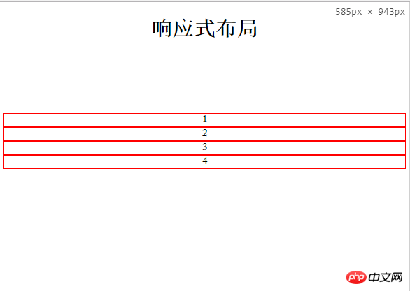
First the renderings:
PC side effects: 
Mobile side effects:

Code As follows:
<!DOCTYPE html>
<html>
	<head>
		<meta charset="UTF-8">
		<meta name="viewport" content="width=device-width, initial-scale=1.0, user-scalable=0, minimum-scale=1.0, maximum-scale=1.0">
		<title></title>		<link rel="stylesheet" href="pc.css" media="screen and (min-width:700px)" />
		<link rel="stylesheet" href="mobile.css" media="screen and (max-width:699px)" />
	</head>
	<body>
		<h1 style="margin-top:20px;text-align:center;">响应式布局</h1>
		<ul>
			<li>1</li>
			<li>2</li>
			<li>3</li>
			<li>4</li>
		</ul>
	</body>
</html>
pc.css Style code:
*{margin:0;padding:0;}
ul{width:calc(100% - 20px);padding:0 10px;margin:100px auto;height:auto;overflow:hidden;}
ul li{list-style:none;border:1px solid blue;width:calc(25% - 2px);height;100px;float:left;text-align:center;}
mobile.css Style code:
*{margin:0;padding:0;}
ul{margin:100px auto;padding:0 5px;height:auto;overflow:hidden;}
ul li{list-style:none;border:1px solid red;width:calc(100% - 2px);height;100px;float:left;text-align:center;}
The critical point I set is 699px. In the actual project, you can adjust it according to the project To set more accurate css for different screens, generally consider PC, Pad, and mobile phones!
Summary: The above is the entire content of this article, I hope it will be helpful to everyone's study. For more related tutorials, please visit CSS Video Tutorial!
The above is the detailed content of Responsive layout under different screen sizes on PC and mobile terminals. For more information, please follow other related articles on the PHP Chinese website!