


The following brings you a simple implementation of CSS3 drawing hexagons. The content is quite good, so I will share it with you now and give it as a reference.
Because it is very simple, let’s summarize it first: using CSS3 to draw hexagons mainly uses pseudo-classes: before and :after to draw before and after the source element. Two elements, and use the border style of css3 to turn these two elements into triangles and place them at both ends of the source element.
(Because I have worked in a biological company before, I feel that hexagons are closer to concepts such as biomolecules and genes. Including when we search for pictures of biomolecules, genes, etc. on the Internet, many of them also have hexagonal styles, so At that time, if you do some functional navigation or tags on the page, you will feel that the hexagon is closer).
The complete page effect is as shown below: (In fact, multiple hexagons are positioned like this. Of course, you can also set the colors of different hexagons, so that you can better distinguish different module functions. ).

We can propose a separate hexagon for analysis, as shown below:
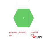
After knowing the analysis idea, we You can first learn how to draw triangles. There are many examples on the Internet, but you don’t have to look for unused children’s shoes. The code and examples are also given below, as follows:
Rendering:
CSS code:
.arrow{
display: inline-block;
width:0px;
height: 0px;
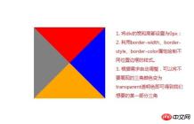
border-style: solid;
border-width: 100px; //与padding、margin属性类似,顺序为上、右、下、左
border-color: red blue orange gray; //顺序为上、右、下、左}HTML code:
<p class="arrow"></p>
As shown in the picture above , use the border attribute to fill the color we don’t want with a transparent color, and then we can get a certain part of the triangle. The code and picture effects are as follows.
Rendering: (The triangle on the left is what we need, the others are set to transparent colors)

CSS code:
.arrow{
              display: inline-block;
              width:0px;
              height: 0px;
              border-bottom: 100px solid transparent;  //设置透明色
              border-top: 100px solid transparent;   //设置透明色
              border-right: 100px solid transparent;  //设置透明色
              border-left: 100px solid gray;
          }
HTML code:
<p class="arrow"></p>
Okay. Now that we know how to draw a triangle, we can use the CSS pseudo-classes :before and :after to complete the hexagon we want to draw.
: before is to insert content in front of the element
: after is to insert content after the element
If we want to insert some textual content, we can enter the text that needs to be displayed in its content attribute, such as content: "HELLO WORLD", but our example does not need to display additional information. We just need to turn the two pseudo-elements before and after into triangles and place them in fixed positions.
The complete code is given as follows:
<!DOCTYPE html>
<html>
<head lang="en">
    <meta charset="UTF-8">
    <title></title>
    <style type="text/css">
     .sharp:before{
         content:"";  //不需要展现文字等内容,所以设置为空字符
         width:0px;
         border-bottom:80px solid transparent;
         border-top:80px solid transparent;
         border-right:40px solid #6c6;
         position:absolute;
         left:-40px;
         top:0px;
     }
     .sharp{
         min-width:100px;
         height:160px;
         background:#6c6;
         display: inline-block;
         position: absolute;
         line-height: 160px;
         color:#FFFFFF;
         font-size: 20px;
         text-align: center;
     }
     .sharp:after{
         content:"";  //不需要展现文字等内容,所以设置为空字符
         width:0px;
         border-bottom:80px solid transparent;
         border-top:80px solid transparent;
         border-left-width:40px;
         border-left-style: solid;
         border-left-color:#6c6;
         position:absolute;
         right:-40px;
         top:0px;
     }
        #sharpContainer{
            width:100%;
            height: 600px;
        }
        #sharpContainer .center{
            top:200px;
            left:300px;
        }
         #sharpContainer .top{
             top:20px;
             left:300px;
         }
         #sharpContainer .top-left{
             top:110px;
             left:140px;
         }
         #sharpContainer .top-right{
             top:110px;
             left:460px;
         }
         #sharpContainer .bottom{
             top:380px;
             left:300px;
         }
         #sharpContainer .bottom-left{
             top:290px;
             left:140px;
         }
         #sharpContainer .bottom-right{
             top:290px;
             left:460px;
         }
    </style>
</head>
<body>
<p id="sharpContainer">
    <p class="sharp center">
    </p>
    <p class="sharp top">
    </p>
    <p class="sharp top-left">
    </p>
    <p class="sharp top-right">
    </p>
    <p class="sharp bottom">
    </p>
    <p class="sharp bottom-left">
    </p>
    <p class="sharp bottom-right">
    </p>
</p>
</body>
</html>
Hexagon drawing is actually a very simple effect, as long as we understand how to draw triangles and use:before,:after Pseudo-class style is enough. In the future, we can add more irregular graphics to the project
The above is the entire content of this article. I hope it will be helpful to everyone's learning. For more related content, please pay attention to the PHP Chinese website !
Related recommendations:
How to implement the animation effect of tilting and rotating at the same time in CSS3
Using the border-radius of CSS3 Realize the drawing of Tai Chi and love patterns
CSS3 realizes the extended content display on mouse hover
The above is the detailed content of About how to draw hexagons in CSS3. For more information, please follow other related articles on the PHP Chinese website!

 Iterating a React Design with Styled ComponentsApr 21, 2025 am 11:29 AM
In a perfect world, our projects would have unlimited resources and time. Our teams would begin coding with well thought out and highly refined UX designs.
 Oh, the Many Ways to Make Triangular Breadcrumb Ribbons!Apr 21, 2025 am 11:26 AM
Oh, the Many Ways to Make Triangular Breadcrumb Ribbons
 SVG Properties in CSS GuideApr 21, 2025 am 11:21 AM
SVG has its own set of elements, attributes and properties to the extent that inline SVG code can get long and complex. By leveraging CSS and some of the forthcoming features of the SVG 2 specification, we can reduce that code for cleaner markup.
 A Few Functional Uses for Intersection Observer to Know When an Element is in ViewApr 21, 2025 am 11:19 AM
You might not know this, but JavaScript has stealthily accumulated quite a number of observers in recent times, and Intersection Observer is a part of that
 Revisting prefers-reduced-motionApr 21, 2025 am 11:18 AM
We may not need to throw out all CSS animations. Remember, it’s prefers-reduced-motion, not prefers-no-motion.
 How to Get a Progressive Web App into the Google Play StoreApr 21, 2025 am 11:10 AM
PWA (Progressive Web Apps) have been with us for some time now. Yet, each time I try explaining it to clients, the same question pops up: "Will my users be
 The Simplest Ways to Handle HTML IncludesApr 21, 2025 am 11:09 AM
It's extremely surprising to me that HTML has never had any way to include other HTML files within it. Nor does there seem to be anything on the horizon that
 Change Color of SVG on HoverApr 21, 2025 am 11:04 AM
There are a lot of different ways to use SVG. Depending on which way, the tactic for recoloring that SVG in different states or conditions — :hover,


Hot AI Tools

Undresser.AI Undress
AI-powered app for creating realistic nude photos

AI Clothes Remover
Online AI tool for removing clothes from photos.

Undress AI Tool
Undress images for free

Clothoff.io
AI clothes remover

Video Face Swap
Swap faces in any video effortlessly with our completely free AI face swap tool!

Hot Article
Hot Tools

WebStorm Mac version
Useful JavaScript development tools

Notepad++7.3.1
Easy-to-use and free code editor

SublimeText3 Chinese version
Chinese version, very easy to use

MantisBT
Mantis is an easy-to-deploy web-based defect tracking tool designed to aid in product defect tracking. It requires PHP, MySQL and a web server. Check out our demo and hosting services.

Dreamweaver Mac version
Visual web development tools

