
Home > Article > Web Front-end > Detailed explanation of the navigation usage of react-navigation
This article mainly introduces the detailed explanation of the use of React Native react-navigation navigation. It has a certain reference value. Those who are interested can learn more
1. Introduction to open source libraries
In January this year, the new open source react-natvigation library attracted much attention. In less than 3 months, the number of stars on github has reached 4,000. Fb recommends using the library, and Navigator will be deleted in the latest version of React Native 0.44. react-navigation is said to have a native-like performance experience. It may become the mainstream of React Native navigation components in the future. This article is based on the [^1.0.0-beta.9] version to introduce the use and practical skills of this library. As you can see, although it is a beta version, it is basically stable and you can feel free to use it in your projects. Here is the react-navigation official document
This library contains three types of components:
(1)StackNavigator: used to jump pages and pass parameters
(2)TabNavigator: Similar to the bottom navigation bar, used to switch between different interfaces on the same screen
(3) DrawerNavigator: Side-sliding menu navigation bar, used to easily set up a screen with drawer navigation
2 , react-navigation usage
The specific content is roughly divided into the following:
(1)React-navigation library attribute introduction
(2)StackNavigator, TabNavigator implements jumping between interfaces, Tab switching
(3) Jumping, passing values, and taking values between StackNavigator interfaces
(4) DrawerNavigator implements drawer navigation menu
(5) DrawerNavigator extended functions
( 6) Customize react-navigation
1. Introduction to StackNavigator properties
navigationOptions: Configure some properties of StackNavigator.
title: title. If the title of this navigation bar and the tab bar is set, it will become the same. It is not recommended to use
header : You can set some navigation properties. If you want to hide the top navigation bar, just set this property to null
headerTitle: Set the navigation bar title, recommended
headerBackTitle: Set the text behind the return arrow on the left side of the jump page. The default is the title of the previous page. Can be customized or set to null
headerTruncatedBackTitle: Set when the title of the previous page does not match the text after the return arrow, the default is changed to "return"
headerRight: Set the right side of the navigation bar. It can be a button or other view control
headerLeft: Set the left side of the navigation bar. It can be a button or other view control
headerStyle: Set the style of the navigation bar. Background color, width and height, etc.
headerTitleStyle: Set the navigation bar text style
headerBackTitleStyle: Set the navigation bar 'return' text style
headerTintColor: Set navigation bar color
headerPressColorAndroid: Set color texture unique to Android, requires Android version greater than 5.0
gesturesEnabled: Whether to support the sliding return gesture, iOS supports it by default, Android turns it off by default
screen: Corresponding interface name, you need to fill in the page after import
mode : Define jump style
card: Use the default style of iOS and Android
modal: Unique to iOS, the screen is drawn from the bottom. Similar to iOS present effect
headerMode: Animation effect when returning to the upper page
float: iOS default effect
screen: During the sliding process, the entire page will return
none: No animation
cardStyle: Customized setting jump effect
transitionConfig: Customized setting sliding return configuration
onTransitionStart: The function that will be called when the transition animation is about to start
onTransitionEnd: The function that will be called when the transition animation is completed
path: Override mapping configuration of the path set in routing
initialRouteName: Set the default page component, which must be the page component registered above
initialRouteParams: Initial routing parameters
Note: You may not understand path very well. The path attribute is suitable for other apps or browsers to use the URL to open this app and enter the specified page. The path attribute is used to declare an interface path, for example: [/pages/Home]. At this time, we can enter: app name://pages/Home in the mobile browser to start the App and enter the Home interface.
2. Introduction to TabNavigator properties
screen: The function is the same as navigation. Corresponding to the interface name, you can pass values and jump through this screen in other pages.
navigationOptions: configure some properties of TabNavigator
title: title, which will set the title of the navigation bar and tab bar at the same time
tabBarVisible: whether to hide the tab bar. Not hidden by default (true)
tabBarIcon: Set the icon of the tab bar. You need to set each one
tabBarLabel: Set the title of the tab bar. Recommended
Navigation bar configuration
tabBarPosition: Set the position of the tabbar. iOS defaults to the bottom and Android defaults to the top. (Attribute value: 'top', 'bottom')
swipeEnabled: Whether to allow sliding between labels
animationEnabled: Whether to display animation when changing labels
lazy : Whether to lazily render labels as needed instead of in advance, which means loading all the bottom label bar when the app is opened. The default is false and the recommendation is true
trueinitialRouteName: Set the default page component
backBehavior: Press the back key to jump to the first Tab (home page), none means no jump
tabBarOptions: Configure some properties of the tab bar iOS properties
activeTintColor: label and icon When the foreground color is active
activeBackgroundColor: When the background color of label and icon is active
inactiveTintColor: When the foreground color of label and icon is inactive
inactiveBackgroundColor: label When the background color of the icon is inactive
showLabel: Whether to display label, default enabled style: tabbar style
labelStyle: label style Android attribute
activeTintColor: label When the foreground color of label and icon is active
inactiveTintColor: When the foreground color of label and icon is inactive
showIcon: whether to display the icon, closed by default
showLabel: whether to display label, default enabled style: tabbar style
labelStyle: label style upperCaseLabel: whether to capitalize the label, the default is true
pressColor: the color of the material ripple effect (the Android version needs to be greater than 5.0)
pressOpacity: the transparency change of the pressed label (Android version needs to be less than 5.0)
scrollEnabled: whether to enable scrollable tabs tabStyle: tab style
indicatorStyle: tab indicator style object (the row at the bottom of the tab). There will be an extra line at the bottom of Android. You can set the height to 0 to temporarily solve this problem
labelStyle: label style
iconStyle: icon style
3 , Introduction to DrawerNavigator properties
DrawerNavigatorConfig
drawerWidth - the width of the drawer
drawerPosition - the option is left or right . Defaults to left position
#contentComponent - the component used to render drawer content, such as navigation items. Receive the drawer's navigation. The default is DrawerItems
contentOptions - configure drawer content
initialRouteName - routeName of the initial route
order - define the order of drawer items The routeNames array.
Path - Provides a mapping of routeName to path configuration, which overrides the path set in routeConfigs.
backBehavior - Will the back button switch to the initial route? If so, set to initialRoute, otherwise none. The default is the initialRoute behavior
The contentOptions property of DrawerItems
activeTintColor - the label and icon color of the active label
activeBackgroundColor - the activity The background color of the label
inactiveTintColor - the label and icon color of the inactive label
Get a rough idea from the above We have learned some basic properties of the three components of react-navigation, so we rolled up our sleeves and rolled up the code to witness the miracle.
4. Use StackNavigator TabNavigator to implement Tab interface switching and navigation between interfaces
API definition: StackNavigator(RouteConfigs, StackNavigatorConfig), TabNavigator(RouteConfigs, TabNavigatorConfig)(1) Integrate react-navigation: Execute in the terminal [ npm install react-navigation --save ] (2) Import necessary components into the interface:
import {StackNavigator,TabNavigator,TabBarBottom} from 'react-navigation';
import HomeScreen from './pages/HomePage';
import MineScreen from './pages/MinePage';
(3) Definition TabNavigator: const Tab = TabNavigator(
{
Home:{
screen:HomeScreen,
navigationOptions:({navigation}) => ({
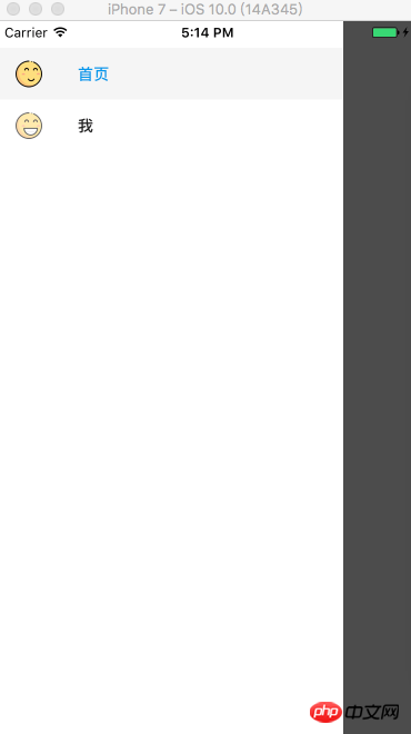
tabBarLabel:'首页',
tabBarIcon:({focused,tintColor}) => (
<TabBarItem
tintColor={tintColor}
focused={focused}
normalImage={require('./imgs/nav_fav@2x.png')}
selectedImage={require('./imgs/nav_fav_actived@3x.png')}
/>
)
}),
},
Mine:{
screen:MineScreen,
navigationOptions:({navigation}) => ({
tabBarLabel:'我',
tabBarIcon:({focused,tintColor}) => (
<TabBarItem
tintColor={tintColor}
focused={focused}
normalImage={require('./imgs/tab_me_nor@3x.png')}
selectedImage={require('./imgs/tab_me_selected@2x.png')}
/>
)
}),
},
},
{
tabBarComponent:TabBarBottom,
tabBarPosition:'bottom',
swipeEnabled:false,
animationEnabled:false,
lazy:true,
tabBarOptions:{
activeTintColor:'#06c1ae',
inactiveTintColor:'#979797',
style:{backgroundColor:'#ffffff',},
labelStyle: {
fontSize: 20, // 文字大小
},
}
}
);TabBarItem is an encapsulated component: import React,{Component} from 'react';
import {Image} from 'react-native';
export default class TabBarItem extends Component {
render() {
return(
<Image source={ this.props.focused ? this.props.selectedImage : this.props.normalImage }
style={ { tintColor:this.props.tintColor,width:25,height:25 } }
/>
)
}
}As you can see, we have defined a TabNavigator navigation component named [Tab]. In the component, it is divided into two layers of parameters: (1) The first layer of parameters defines the interface to be switched, that is, the two interface components [Home] and [Me], which are specified through the screen attribute. And set relevant attribute parameters through the navigationOptions attribute. (2) Set the attribute parameters of the navigation bar. After the TabNavigator is defined, you need to use StackNavigator. As the name suggests, StackNavigator stores the entire interface in a stack, and
TabNavigator是作为一个界面内不同子界面之间切换。所以还需要我们定义StackNavigator:
const Navigator = StackNavigator(

 {
  Tab:{screen:Tab},
  Product:{screen:ProductScreen}
 },

 {
  navigationOptions:{
   headerBackTitle:null,
   headerTintColor:'#333333',
   showIcon:true,
   swipeEnabled:false,
   animationEnabled:false,
  },

  mode:'card',
 });
看起来和TabNavigator很相似,同样是指定了两个参数:
(1)指定要跳转的界面组件。同样是screen属性标识界面组件,不多赘述。
(2)定义跳转属性参数,即顶部导航栏的一些参数设置和跳转方式。
可以看到,我们将Tab作为一个界面设置到了StackNavigator。这样就可以实现Tab导航和界面间跳转的效果了。
最后就是在render中引用StackNavigator:
export default class Demo extends Component {

 render() {
    return (
     <Navigator />
    );
 }
}
StackNavigator还提供了onNavigationStateChange回调方法,用来监听导航状态的改变。具体不再赘述。实现了界面跳转和切换,那么就该来增加下界面之间的感情了,来看看如何实现界面之间的传值和取值。
5、界面间跳转、传值、取值
在界面组件注入到StackNavigator中时,界面组件就被赋予了navigation属性,即在界面组件中可以通过【this.props.navigation】获取并进行一些操作。
navigation属性中提供了很多的函数简化界面间操作,简单列举几点:
(1)通过navigate函数实现界面之间跳转:
this.props.navigation.navigate('Mine');
参数为我们在StackNavigator注册界面组件时的名称。同样也可以从当前页面返回到上一页:
// 返回上一页
this.props.navigation.goBack();
(2)跳转时传值:
this.props.navigation.navigate('Mine',{info:'传值过去'});第一个参数同样为要跳转的界面组件名称,第二个参数为要传递的参数,info可以理解为key,后面即传递的参数。
(3)获取值:
{this.props.navigation.state.params.info}通过state.params来获取传来的参数,后面为key值。此处为info。
以上实现完成,我们就可以愉快的玩耍啦~~ 什么?忽然发现在Android上的效果和IOS效果不一样。老板要界面一致哇~ 怎么办?那就需要我们进行简单的适配了。
三、DrawerNavigator实现抽屉导航
1、导航实现
API定义:DrawerNavigator(RouteConfigs,DrawerNavigatorConfig)
(1)界面中定义DrawerNavigator:
import {StackNavigator,TabNavigator,DrawerNavigator} from 'react-navigation';
import HomeScreen from './pages/HomePage';
import MineScreen from './pages/MinePage';

export default class Demo extends Component {

 render() {
    return (
     <Navigator />
    );
 }
}

const Navigator = DrawerNavigator({

  Home:{screen:HomeScreen},
  Mine:{screen:MineScreen},
});

const styles = StyleSheet.create({

  container: {
    flex: 1,
  },
});

AppRegistry.registerComponent('Demo', () => Demo);
定义方式和StackNavigator基本类似,不再赘述。
(2)HomeScreen界面和MineScreen界面:
export default class HomePage extends Component {
static navigationOptions = {
drawerLabel: '首页',
drawerIcon:({tintColor}) => (
<Image
source={require('./../imgs/ic_happy.png')}
style={[styles.icon, {tintColor: tintColor}]}/>
),
};
render() {
return(
<View style={{flex:1}}>
<Text onPress={this._skip.bind(this)}>点击跳转</Text>
</View>
);
}
_skip() {
this.props.navigation.navigate("Mine");
}
}
export default class MinePage extends Component {
static navigationOptions = {
drawerLabel:'我',
drawerIcon: ({ tintColor }) => (
<Image
source={require('./../imgs/ic_h.png')}
style={[styles.icon, {tintColor: tintColor}]}
/>
),
};
render() {
return(
<View style={{flex:1}}>
<Text onPress={this._skip.bind(this)}>返回上一界面</Text>
</View>
);
}
/**
* 跳转
*/
_skip() {
this.props.navigation.goBack();
}
}代码很简单,实现了界面之间的跳转。
2、扩展功能
(1)默认DrawerView不可滚动。要实现可滚动视图,必须使用contentComponent自定义容器,如下所示:
{
 drawerWidth:200,
 抽屉位置:“对”
 contentComponent:props => <ScrollView> <DrawerItems {... props} /> </ ScrollView>
}
(2)可以覆盖导航使用的默认组件,使用DrawerItems自定义导航组件:
import {DrawerItems} from 'react-navigation';

const CustomDrawerContentComponent = (props) => (
 <View style = {style.container}>
  <DrawerItems {... props} />
 </View>
);
(3)嵌套抽屉导航
如果您嵌套DrawerNavigation,抽屉将显示在父导航下方。
四、自定义react-navigation
(1)适配顶部导航栏标题:
测试中发现,在iphone上标题栏的标题为居中状态,而在Android上则是居左对齐。所以需要我们修改源码,进行适配。
【node_modules -- react-navigation -- src -- views -- Header.js】的326行代码处,修改为如下:
title: {
  bottom: 0,
  left: TITLE_OFFSET,
  right: TITLE_OFFSET,
  top: 0,
  position: 'absolute',
  alignItems: 'center',
 }
上面方法通过修改源码的方式其实略有弊端,毕竟扩展性不好。还有另外一种方式就是,在navigationOptions中设置headerTitleStyle的alignSelf为 ' center '即可解决。
(2)去除返回键文字显示:
【node_modules -- react-navigation -- src -- views -- HeaderBackButton.js】的91行代码处,修改为如下即可。
{Platform.OS === 'ios' &&
   title &&
   <Text
    onLayout={this._onTextLayout}
    style={[styles.title, { color: tintColor }]}
    numberOfLines={1}
   >
    {backButtonTitle}
   </Text>}
将上述代码删除即可。
(3)动态设置头部按钮事件:
当我们在头部设置左右按钮时,肯定避免不了要设置按钮的单击事件,但是此时会有一个问题,navigationOptions是被修饰为static类型的,所以我们在按钮的onPress的方法中不能直接通过this来调用Component中的方法。如何解决呢?在官方文档中,作者给出利用设置params的思想来动态设置头部标题。那么我们可以利用这种方式,将单击回调函数以参数的方式传递到params,然后在navigationOption中利用navigation来取出设置到onPress即可:
componentDidMount () {
  /**
   * 将单击回调函数作为参数传递
   */
  this.props.navigation.setParams({
      switch: () => this.switchView()
  });
}
/**
* 切换视图
*/
switchView() {
alert('切换')
}static navigationOptions = ({navigation,screenProps}) => ({
headerTitle: '企业服务',
headerTitleStyle: CommonStyles.headerTitleStyle,
headerRight: (
<NavigatorItem icon={ Images.ic_navigator } onPress={ ()=> navigation.state.params.switch() }/>
),
headerStyle: CommonStyles.headerStyle
});(4)结合BackHandler处理返回和点击返回键两次退出App效果
点击返回键两次退出App效果的需求屡见不鲜。相信很多人在react-navigation下实现该功能都遇到了很多问题,例如,其他界面不能返回。也就是手机本身返回事件在react-navigation之前拦截了。如何结合react-natigation实现呢?和大家分享两种实现方式:
(1)在注册StackNavigator的界面中,注册BackHandler:
componentWillMount(){
BackHandler.addEventListener('hardwareBackPress', this._onBackAndroid );
}
componentUnWillMount(){
BackHandler.addEventListener('hardwareBackPress', this._onBackAndroid);
}
_onBackAndroid=()=>{
let now = new Date().getTime();
if(now - lastBackPressed < 2500) {
return false;
}
lastBackPressed = now;
ToastAndroid.show('再点击一次退出应用',ToastAndroid.SHORT);
return true;
}(2)监听react-navigation的Router
/**
 * 处理安卓返回键
 */
const defaultStateAction = AppNavigator.router.getStateForAction;
AppNavigator.router.getStateForAction = (action,state) => {
  if(state && action.type === NavigationActions.BACK && state.routes.length === 1) {
    if (lastBackPressed + 2000 < Date.now()) {
      ToastAndroid.show(Constant.hint_exit,ToastAndroid.SHORT);
      lastBackPressed = Date.now();
      const routes = [...state.routes];
      return {
        ...state,
        ...state.routes,
        index: routes.length - 1,
      };
    }
  }
  return defaultStateAction(action,state);
};
(5)实现Android中界面跳转左右切换动画
react-navigation在Android中默认的界面切换动画是上下。如何实现左右切换呢?很简单的配置即可:
import CardStackStyleInterpolator from 'react-navigation/src/views/CardStackStyleInterpolator';
然后在StackNavigator的配置下添加如下代码:
transitionConfig:()=>({
  screenInterpolator: CardStackStyleInterpolator.forHorizontal,
})
(6)解决快速点击多次跳转
当我们快速点击跳转时,会开启多个重复的界面,如何解决呢。其实在官方git中也有提示,解决这个问题需要修改react-navigation源码:
找到scr文件夹中的addNavigationHelpers.js文件,替换为如下文本即可:
export default function<S: *>(navigation: NavigationProp<S, NavigationAction>) {
 // 添加点击判断
 let debounce = true;
 return {
   ...navigation,
   goBack: (key?: ?string): boolean =>
     navigation.dispatch(
       NavigationActions.back({
         key: key === undefined ? navigation.state.key : key,
       }),
     ),
   navigate: (routeName: string,
         params?: NavigationParams,
         action?: NavigationAction,): boolean => {
     if (debounce) {
       debounce = false;
       navigation.dispatch(
         NavigationActions.navigate({
           routeName,
           params,
           action,
         }),
       );
       setTimeout(
         () => {
           debounce = true;
         },
       500,
       );
       return true;
     }
     return false;
   },
  /**
   * For updating current route params. For example the nav bar title and
   * buttons are based on the route params.
   * This means `setParams` can be used to update nav bar for example.
   */
  setParams: (params: NavigationParams): boolean =>
   navigation.dispatch(
    NavigationActions.setParams({
     params,
     key: navigation.state.key,
    }),
   ),
 };
}
五、效果图
抽屉导航:
上面是我整理给大家的,希望今后会对大家有帮助。
相关文章:
The above is the detailed content of Detailed explanation of the navigation usage of react-navigation. For more information, please follow other related articles on the PHP Chinese website!