Home >Backend Development >PHP Tutorial >How to use CSS3 to create a cool 3D animation with direction sensing when the mouse slides over an image
This article mainly introduces in detail CSS3 to create cool 3D animation of mouse over pictures with direction sensing. It has certain reference value and is compatible with the latest mainstream browsers. For those who are interested, You can refer to
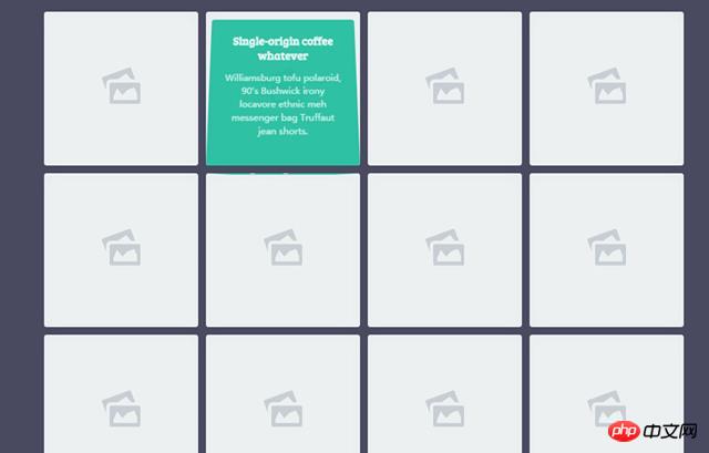
This is a cool 3D animation special effect with direction sensing that the mouse slides over the picture using CSS3 and a little JS. In the special effects, when the user's mouse slides over the picture in the grid, a 3D flip animation will appear on the content mask layer in the grid, and it has direction sensing and can start flipping from the direction of the mouse entry. The effect is very cool. .

Usage
HTML structure The HTML structure of the direction-sensitive mouse-over animation uses the HTML structure of an unordered list to create a grid layout. Each 25edfb22a4f469ecb59f1190150159c6 element is a grid. Each grid uses an 486d7a50595533609bc98d44595dc670 element as a placeholder, which is actually a small icon of a picture. In addition, p.info is the mask layer to be flipped in 3D.<p class='container'>
<ul>
<li>
<a class='normal' href='#'>
<svg viewBox='0 0 80 76' x='0px' y='0px'>
<g>
<path d='M 68.9708 24.8623 L 60.4554 2.3018 ...... 68.0625 Z'></path>
</g>
</svg>
</a>
<p class='info'>
<h3>...</h3>
<p>....</p>
</p>
</li>
......
</ul>
</p>CSS styleul {
padding: 0;
margin: 0 0 50px;
}
ul:after {
content: "";
display: table;
clear: both;
}
li {
position: relative;
float: left;
width: 200px;
height: 200px;
margin: 5px;
padding: 0;
list-style: none;
}
li a {
display: inline-block;
vertical-align: top;
text-decoration: none;
border-radius: 4px;
}At the same time, in order to create a 3D effect, add perspective attributes to each li element.
li {
  -webkit-perspective: 400px;
          perspective: 400px;
}
The mask layer p.info used to make 3D flips is set to 100% width and 100% height by default, using absolute positioning, starting at the upper left corner. Then use the rotate3d() function to rotate it 90 degrees clockwise along the X-axis, making it invisible.
.info {
  -webkit-transform: rotate3d(1, 0, 0, 90deg);
          transform: rotate3d(1, 0, 0, 90deg);
  width: 100%;
  height: 100%;
  padding: 20px;
  position: absolute;
  top: 0;
  left: 0;
  border-radius: 4px;
  pointer-events: none;
  background-color: rgba(26, 188, 156, 0.9);
}
Finally, in the CSS style, classes are preset for when the mouse enters and leaves from the four directions of up, down, left, and right. These classes are detected using JavaScript when the mouse enters the grid. The entry direction of the mouse, and then add the corresponding class to it. .in-top .info {
-webkit-transform-origin: 50% 0%;
transform-origin: 50% 0%;
-webkit-animation: in-top 300ms ease 0ms 1 forwards;
animation: in-top 300ms ease 0ms 1 forwards;
}
.in-rightright .info {
-webkit-transform-origin: 100% 0%;
transform-origin: 100% 0%;
-webkit-animation: in-rightright 300ms ease 0ms 1 forwards;
animation: in-rightright 300ms ease 0ms 1 forwards;
}
.in-bottombottom .info {
-webkit-transform-origin: 50% 100%;
transform-origin: 50% 100%;
-webkit-animation: in-bottombottom 300ms ease 0ms 1 forwards;
animation: in-bottombottom 300ms ease 0ms 1 forwards;
}
.in-left .info {
-webkit-transform-origin: 0% 0%;
transform-origin: 0% 0%;
-webkit-animation: in-left 300ms ease 0ms 1 forwards;
animation: in-left 300ms ease 0ms 1 forwards;
}
.out-top .info {
-webkit-transform-origin: 50% 0%;
transform-origin: 50% 0%;
-webkit-animation: out-top 300ms ease 0ms 1 forwards;
animation: out-top 300ms ease 0ms 1 forwards;
}
.out-rightright .info {
-webkit-transform-origin: 100% 50%;
transform-origin: 100% 50%;
-webkit-animation: out-rightright 300ms ease 0ms 1 forwards;
animation: out-rightright 300ms ease 0ms 1 forwards;
}
.out-bottombottom .info {
-webkit-transform-origin: 50% 100%;
transform-origin: 50% 100%;
-webkit-animation: out-bottombottom 300ms ease 0ms 1 forwards;
animation: out-bottombottom 300ms ease 0ms 1 forwards;
}
.out-left .info {
-webkit-transform-origin: 0% 0%;
transform-origin: 0% 0%;
-webkit-animation: out-left 300ms ease 0ms 1 forwards;
animation: out-left 300ms ease 0ms 1 forwards;
}
JavaScript
var getDirection = function (ev, obj) {
    var w = obj.offsetWidth,
        h = obj.offsetHeight,
        x = ev.pageX - obj.offsetLeft - w / 2 * (w > h ? h / w : 1),
        y = ev.pageY - obj.offsetTop - h / 2 * (h > w ? w / h : 1),
        d = Math.round(Math.atan2(y, x) / 1.57079633 + 5) % 4;
    return d;
};
Then traverse all li elements and add the corresponding class in the direction in which the mouse enters.
var nodes = document.querySelectorAll('li'),
    _nodes = [].slice.call(nodes, 0);
var addClass = function (ev, obj, state) {
    var direction = getDirection(ev, obj), class_suffix = '';
    obj.className = '';
    switch (direction) {
    case 0:
        class_suffix = '-top';
        break;
    case 1:
        class_suffix = '-right';
        break;
    case 2:
        class_suffix = '-bottom';
        break;
    case 3:
        class_suffix = '-left';
        break;
    }
    obj.classList.add(state + class_suffix);
};
_nodes.forEach(function (el) {
    el.addEventListener('mouseover', function (ev) {
        addClass(ev, this, 'in');
    }, false);
    el.addEventListener('mouseout', function (ev) {
        addClass(ev, this, 'out');
    }, false);
});
The above is the entire content of this article. I hope it will be helpful to everyone's study. For more related content, please pay attention to the PHP Chinese website! Related recommendations:
Use CSS3 to realize the super cool Black Cat Sheriff homepage
How to use CSS3 to make a simple 3d translucent cube picture
The above is the detailed content of How to use CSS3 to create a cool 3D animation with direction sensing when the mouse slides over an image. For more information, please follow other related articles on the PHP Chinese website!