


Flexible layout
In 2009, W3C proposed a new solution - Flex layout (elastic layout), which can be simple, complete and responsive. to implement various page layouts.
Traditional box model:
For general layout, we use the box model, which is laid out through floating positioning.
Line elements and inline block elements do not wrap, and block elements occupy an exclusive line. Floats can be used to align block elements horizontally.
But some special layouts are difficult to implement. Such as vertical centering.
After setting the flexible box, the elements inside the box are not divided into row elements and block elements, and float will be invalid.
Elements that use flex layout are called flex containers, or containers for short.
All sub-elements in the container are called flex items, or items for short.
flex compatibility
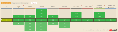
In addition to IE, other browsers are relatively compatible
Container properties:
flex-direction: The direction of the main axis
row (default value): The main axis is horizontal and the starting point is at the left end.
row-reverse: The main axis is horizontal and the starting point is at the right end.
column: The main axis is vertical, and the starting point is on the upper edge.
column-reverse: The main axis is vertical, and the starting point is at the lower edge.
flex-wrap: If one axis cannot be arranged, how to wrap it.
nowrap (default): Do not wrap.
wrap: Wrap, with the first line at the top.
wrap-reverse: Wrap, first line below.
justify-content: The alignment of the item on the main axis.
flex-start (default): left-aligned
flex-end: right-aligned
center: centered
space-between: aligned at both ends, with equal spacing between items.
space-around: Each item is equally spaced on both sides. Therefore, the space between items is twice as large as the space between items and the border.
align-items: Define how items are aligned on the cross axis.
flex-start: Align the starting point of the cross axis.
flex-end: The end point alignment of the cross axis.
center: Align the midpoint of the cross axis.
baseline: The baseline alignment of the first line of text of the item.
stretch (default value): If the item does not set a height or is set to auto, it will occupy the entire height of the container.
align-content: Defines the alignment of multiple axes. This property has no effect if the project has only one axis.
flex-start: Align with the starting point of the cross axis.
flex-end: Aligned with the end point of the cross axis.
center: Aligned with the midpoint of the cross axis.
space-between: Align with both ends of the cross axis, and the intervals between the axes are evenly distributed.
space-around: The spacing on both sides of each axis is equal. Therefore, the distance between the axes is twice as large as the distance between the axes and the frame.
stretch (default value): The axis occupies the entire cross axis.
Properties of items:
order: Define the order of items. The smaller the value, the higher the ranking. The default is 0.
flex-grow: Define the magnification ratio of the item, the default is 0, that is, if there is remaining space, it will not be enlarged.
If all items have a flex-grow property of 1, they will equally divide the remaining space (if there is any). If one item's flex-grow property is 2 and the other items are all 1, the former will occupy twice as much remaining space as the other items.
flex-shrink: Defines the shrink ratio of the item, the default is 1, that is, if there is insufficient space, the item will shrink.
flex-basis: The main axis space occupied by the item before excess space is allocated. It can be set to the same value as the width or height properties (such as 350px), and the item will occupy a fixed space.
align-self: Allows a single item to be aligned differently from other items by overriding the align-items attribute. The default value is auto, which means inheriting the align-items attribute of the parent element. If there is no parent element, it is equivalent to stretch. This attribute may take 6 values. Except for auto, the others are exactly the same as the align-items attribute.
flex:0 1 auto; flex:0 0 auto;
Abbreviation of neither enlarging nor reducing flex:none;
flex:auto;can enlarge or reduce flex: 1 1 auto;
The above is the detailed content of Flexible box model flex method summary. For more information, please follow other related articles on the PHP Chinese website!

 Draggin' and Droppin' in ReactApr 17, 2025 am 11:52 AM
The React ecosystem offers us a lot of libraries that all are focused on the interaction of drag and drop. We have react-dnd, react-beautiful-dnd,
 Fast SoftwareApr 17, 2025 am 11:49 AM
There have been some wonderfully interconnected things about fast software lately.
 Nested Gradients with background-clipApr 17, 2025 am 11:47 AM
I can't say I use background-clip all that often. I'd wager it's hardly ever used in day-to-day CSS work. But I was reminded of it in a post by Stefan Judis,
 Using requestAnimationFrame with React HooksApr 17, 2025 am 11:46 AM
Animating with requestAnimationFrame should be easy, but if you haven’t read React’s documentation thoroughly then you will probably run into a few things
 Need to scroll to the top of the page?Apr 17, 2025 am 11:45 AM
Perhaps the easiest way to offer that to the user is a link that targets an ID on the element. So like...
 The Best (GraphQL) API is One You WriteApr 17, 2025 am 11:36 AM
Listen, I am no GraphQL expert but I do enjoy working with it. The way it exposes data to me as a front-end developer is pretty cool. It's like a menu of
 Weekly Platform News: Text Spacing Bookmarklet, Top-Level Await, New AMP Loading IndicatorApr 17, 2025 am 11:26 AM
In this week's roundup, a handy bookmarklet for inspecting typography, using await to tinker with how JavaScript modules import one another, plus Facebook's
 Various Methods for Expanding a Box While Preserving the Border RadiusApr 17, 2025 am 11:19 AM
I've recently noticed an interesting change on CodePen: on hovering the pens on the homepage, there's a rectangle with rounded corners expanding in the back.


Hot AI Tools

Undresser.AI Undress
AI-powered app for creating realistic nude photos

AI Clothes Remover
Online AI tool for removing clothes from photos.

Undress AI Tool
Undress images for free

Clothoff.io
AI clothes remover

AI Hentai Generator
Generate AI Hentai for free.

Hot Article
Hot Tools

Notepad++7.3.1
Easy-to-use and free code editor

SecLists
SecLists is the ultimate security tester's companion. It is a collection of various types of lists that are frequently used during security assessments, all in one place. SecLists helps make security testing more efficient and productive by conveniently providing all the lists a security tester might need. List types include usernames, passwords, URLs, fuzzing payloads, sensitive data patterns, web shells, and more. The tester can simply pull this repository onto a new test machine and he will have access to every type of list he needs.

Zend Studio 13.0.1
Powerful PHP integrated development environment

DVWA
Damn Vulnerable Web App (DVWA) is a PHP/MySQL web application that is very vulnerable. Its main goals are to be an aid for security professionals to test their skills and tools in a legal environment, to help web developers better understand the process of securing web applications, and to help teachers/students teach/learn in a classroom environment Web application security. The goal of DVWA is to practice some of the most common web vulnerabilities through a simple and straightforward interface, with varying degrees of difficulty. Please note that this software

ZendStudio 13.5.1 Mac
Powerful PHP integrated development environment

