Home >Web Front-end >CSS Tutorial >Detailed syntax of CSS linear-gradient()
CSS linear-gradient() function creates an
A linear gradient is defined by an axis (the gradient line) on which each point has a different color. A vertical line to a gradient line has a single color at a point on the gradient line.

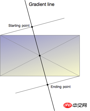
The gradient line is defined by the center point of the container containing the gradient shape and an angle. The color value on the gradient line is defined by different points, including the starting point, the end point, and an optional intermediate point between the two (there can be multiple intermediate points).
The starting point is the point on the gradient line that represents the starting color value. The starting point is defined by the intersection between the gradient line and the vertical line passing through the container's vertices. (The vertical line and the gradient line are in the same quadrant)
Similarly, the end point is the point on the gradient line that represents the final color value. The end point is also defined by the intersection between the gradient line and the vertical line emanating from the nearest vertex, however it is easier to understand to define the end point from the symmetry point of the starting point, since the end point is the center point of the starting point with respect to the container reflection point.
The slightly complicated definition of the starting point and the end point leads to an interesting property, sometimes called the incredible vertex effect: points near the starting point have the same color value as the starting point, and points near the end point have the same color value as the starting point. The same color value at the end point.
Not only the starting and ending color values can be specified. Providing additional color intermediate points, web developers can create customized and stronger transition effects between the starting color value and the end color value, and can also provide gradient lines with multiple color values.
Linear gradient syntax does not allow repeated gradients, but the same effect can be achieved by using color intermediate values. Realistic repeating gradient effects can be achieved using CSSproperties.
When the position of a color midpoint is implicitly defined, it is placed halfway between the point before it and the point after it. A position can be explicitly defined using the
Gradient is defined as the
Syntax
Formal grammar: linear-gradient(  [ <angle> | to <side-or-corner> ,]? <color-stop> [, <color-stop>]+ )
                                  \---------------------------------/ \----------------------------/
                                    Definition of the gradient line         List of color stops
                      where <side-or-corner> = [left | right] || [top | bottom]
                        and <color-stop>     = <color> [ <percentage> | <length> ]?
linear-gradient( 45deg, blue, red ); /* A gradient on 45deg axis starting blue and finishing red */
linear-gradient( to left top, blue, red); /* A gradient going from the bottom right to the top left starting blue and
finishing red */
linear-gradient( 0deg, blue, green 40%, red ); /* A gradient going from the bottom to top, starting blue, being green after 40%
and finishing red */Value
Describes the starting point position of the gradient line. It contains two keywords: the first indicates the vertical position left or right, and the second indicates the horizontal position top or bottom. The order of keywords has no effect and they are all optional.
The values to top, to bottom, to left and to right will be converted into angles of 0 degrees, 180 degrees, 270 degrees and 90 degrees. The remaining values are converted into an angle clockwise from the top center. The end point of the gradient line is symmetrical to the center of its starting point.
Use the angle value to specify the direction (or angle) of the gradient. See
consists of a
CSS gradient color rendering adopts the same rules as SVG.
Grammar History
The linear-gradient grammar was developed from the first Apple proposal implemented in 2008.
-webkit-gradient(<type>, <point> [, <radius>]?, <point> [, <radius>]? [, <stop>]*)
在最初语法中,使用同样的语法实现线性渐变和径向渐变。但这两种渐变所需要的参数有所不同,导致了需要增加第一个参数来区分两种渐变。如果再增加渐变类型,这样的处理方式会变得更加复杂。比如锥形渐变,需要用到函数和不规范的CSS值。W3C并未收到相关草案。
一个替代语法在2009年由Mozilla提出并实现。这个语法需要两个CSS函数,一个用来做线性渐变,另一个用于径向渐变。然而,这个语法并没有被发布产品实现。有人提出了第三种语法,它将线性渐变的语法简化为:
-moz-linear-gradient([ [ [top | bottom] || [left | right] ],]? <color-stop>[, <color-stop>]+);
新的语法不需要to()、from()和color-stop()函数,所以这些函数被丢弃。而top/bottom与left/right的顺序也被标记为不重要,所以Mozilla移除了必需首先定义top/bottom的限制。
新的语法仍然有一个缺点:它只允许水平和垂直渐变。在多次变更解决了方向限制的问题之后,它被增加到CSS Images Values and Content Replacement Level 3 draft in 2011-02-17。
原生支持
定义magic corner算法,允许使用简便的方式定义端点的颜色,从而简化了开发者的工作
在预乘颜色空间里定义过渡色,从而可以防止在使用不同透明度颜色的情况下出现违和的灰色。在未舍弃原生语法的情况下,带前缀的版本被Webkit和Trident(IE)实现。
linear-gradient( [ [ <angle> | [top | bottom] || [left | right] ],]? <color-stop>[, <color-stop>]+);
linear-gradient([ [ [ <angle> | to [top | bottom] || [left | right] ],]? <color-stop>[, <color-stop>]+);
以上应当是最终语法。
【相关推荐】
1. CSS3免费视频教程
3. 详解CSS3中lineaer-gradient使用方法
4. 深入详解CSS3中斜向线性渐变lineaer-gradient
5. 关于CSS3中linear-gradient参数的详解
The above is the detailed content of Detailed syntax of CSS linear-gradient(). For more information, please follow other related articles on the PHP Chinese website!