


1)背景颜色
background-color : transparent | color
常用值:①英文单词,②十六进制,③RGB或RGBA
另外,还有一种是 渐变色彩
渐变色彩(gradient)分为线性渐变(linear)和径向渐变(radial)
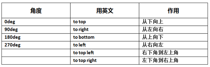
线性渐变:background: linear-gradient(direction, color1, color2, ...);
第一个参数省略时,默认为“180deg”,等同于“to bottom”。
第二个和第三个参数,表示颜色的起始点和结束点,可以有多个颜色值。(颜色值后面可以追加百分比,表示这个颜色要占总背景颜色面积的百分比)
例子 源代码:
/* CSS代码 */
.linear{
    width:200px;
    height:100px;
    background:linear-gradient(to right,red 30%,yellow);
}
body>
    div class="linear">div>
body>
效果:
径向渐变:background: radial-gradient(center, shape, size, color, color, ...);
可以指定渐变的中心、形状(原型或椭圆形)、大小。
默认情况下,渐变的中心是 center(表示在中心点),渐变的形状是 ellipse(表示椭圆形),渐变的大小是 farthest-corner(表示到最远的角落)。
例子 源代码:
/* CSS代码 */
.radial{
    width:100px;
    height:100px;
    background:radial-gradient(circle, red, yellow, green);
}
body>
    div class="radial">div>
body>
效果:
2)背景图片
background-image : none | url(url)
例子 源代码:
/* CSS代码 */
.image{
    width:142px;
    height:55px;
    background-image:url(http://www.cnblogs.com/images/logo_small.gif);
}
body>
    div class="image">后面的是背景div>
body>
效果:
3)背景平铺方式
background-repeat : repeat | no-repeat | repeat-x | repeat-y
例子1(repeat-x) 源代码:
/* CSS代码 */
.x{
    width:300px;
    height:200px;
    border:1px solid #000;
    background-image:url(http://www.cnblogs.com/images/logo_small.gif);
    background-repeat:repeat-x;
}
body>
    div class="x">div>
body>
效果:
例子2(repeat-y) 源代码:
/* CSS代码 */
.y{
    width:300px;
    height:200px;
    border:1px solid #000;
    background-image:url(http://www.cnblogs.com/images/logo_small.gif);
    background-repeat:repeat-y;
}
body>
    div class="y">div>
body>
效果:
4)背景定位
background-position : 左对齐方式 上对齐方式
①background-position:left bottom;
②background-position:50% 50px;
例子 源代码:
/* CSS代码 */
.position{
    width:300px;
    height:200px;
    border:1px solid #000;
    background-image:url(http://www.cnblogs.com/images/logo_small.gif);
    background-repeat:no-repeat;
    background-position:left bottom;
}
body>
    div class="position">div>
body>
效果:
6)背景原点
设置元素背景图片的原始起始位置。必须保证背景是background-repeat为no-repeat,此属性才会生效。
background-origin : border-box | padding-box | content-box;

7)背景的显示区域
设定背景图像向外裁剪的区域。
background-clip : border-box | padding-box | content-box;

8)背景尺寸
设置背景图片的大小,以长度值或百分比显示,还可以通过cover和contain来对图片进行伸缩。
background-size : length | percentage | cover | contain;
length : 设置背景图像的高度和宽度。
percentage : 以父元素的百分比来设置背景图像的宽度和高度。
cover : 把背景图像扩展至足够大,以使背景图像完全覆盖背景区域;但是背景图像的某些部分也许无法显示在背景定位区域中。
contain : 把图像图像扩展至最大尺寸,以使其宽度和高度完全适应内容区域。
例子 源代码:
/* CSS代码 */
.size1{
    width:142px;
    height:55px;
    border:1px solid #000;
    background-image:url(http://www.cnblogs.com/images/logo_small.gif);
    background-repeat:no-repeat;
}
.size2{
    width:142px;
    height:55px;
    border:1px solid #000;
    background-image:url(http://www.cnblogs.com/images/logo_small.gif);
    background-repeat:no-repeat;
    background-size:100px 30px;
}
body>
    原大小:
    div class="size1">div>
    改变大小后:
    div class="size2">div>
body>
效果:
原大小:
改变大小后:
9)背景样式缩写
background : 背景色 背景图片 背景平铺方式 背景定位
例子 源代码:
/* CSS代码 */
.bg{
    width:200px;
    height:100px;
    border:1px solid #000;
    background:#ccc url(http://www.cnblogs.com/images/logo_small.gif) no-repeat center center;
}
body>
    div class="bg">div>
body>
效果:
10)多重背景
一个元素可以设置多重背景图像,每组属性间使用逗号分隔。
多重背景图之间存在着重叠关系,前面的背景图会覆盖在后面的背景图之上。
background : background-image background-repeat background-attachment background-position/background-size
background-origin background-clip background-color
background-image:指定对象的背景图像。可以是真实图片路径或使用渐变创建的“背景图像”。
background-repeat:指定对象的背景图像如何铺排填充。
background-attachment:指定对象的背景图像是随对象内容滚动还是固定的。
background-position:指定对象的背景图像位置。
background-size:指定对象的背景图像的尺寸大小。
background-origin:指定对象的背景图像显示的原点。
background-clip:指定对象的背景图像向外裁剪的区域。
background-color:指定对象的背景颜色。
*注意:background-color只能设置一次,且由于写在前面的背景会叠在之后的背景之上,所以背景色通常都定义在最后一组上,避免背景色将图像盖住。
例子 源代码:
/* CSS代码 */
.bg2{
    width:200px;
    height:200px;
    border:1px solid #000;
    background:url(http://www.cnblogs.com/images/logo_small.gif) no-repeat scroll 10px 20px/115px 52px content-box padding-box,
        url(http://www.cnblogs.com/images/logo_small.gif)  no-repeat scroll 30px 40px/115px 52px content-box padding-box,
        url(http://www.cnblogs.com/images/logo_small.gif)  no-repeat scroll 50px 60px/115px 52px content-box padding-box #ccc;
}
body>
    div class="bg2">div>
body>
效果:
