
Home > Article > Web Front-end > Draw graphics with css
Preface: Finally my freshman year is over, and the happy summer vacation is ushering in. Everyone has started their own busy work. I have been busy with some projects, and finally decided to update a blog today to briefly summarize the learning in the previous stage.
This time I mainly summarize the techniques of drawing various shapes with CSS, and at the same time, combine before, after pseudo-elements and positioning to create some effects.

1 #triangle-up{2 width: 0;3 height:0;4 border-left:50px solid transparent;5 border-right: 50px solid transparent;6 border-bottom: 70px solid #81cfa2;7 }

1 #triangle-down {2 width: 0;3 height: 0;4 border-left: 50px solid transparent;5 border-right: 50px solid transparent;6 border-top: 70px solid #81cfa2;7 }

#triangle-left{
       width: 0;
       height:0;
       border-right: 70px solid #81cfa2;
       border-top: 50px solid transparent;
       border-bottom:50px solid transparent;
}
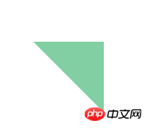
#triangle-topright {
      width: 0;
      height: 0;
      border-top: 100px solid #81cfa2;
      border-left: 100px solid transparent;
}


1 .search:before { 2 border-bottom-color: #000 !important; 3 top: -11px; 4 } 5 .search:after, .search:before { 6 width: 0; 7 height: 0; 8 content: ''; 9 border-style: dashed dashed solid;10 border-color: transparent transparent #fff;11 border-width: 0 10px 10px;12 overflow: hidden;13 position: absolute;14 top: -10px;15 right: 10px;16 }
okaychen
But one thing worth noting is that IE6 does not support the transparent attribute, but we can set the corresponding transparent border The border-style attribute is dotted or dashed to solve this problem.
Next, I am summarizing several commonly used shapes drawn with Css (combined with before and after pseudo-elements): Talk Bubble (chat box)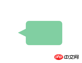
1 #talkBubble{ 2 width: 120px; 3 height: 80px; 4 background: #81cfa2; 5 position: relative; 6 border-radius: 10px; 7 -webkit-border-radius: 10px; 8 -moz-border-radius: 10px; 9 }10 #talkBubble:before{11 content: "";12 position: absolute;13 right: 100%;14 top: 26px;15 width: 0;16 height: 0;17 border-top: 13px solid transparent;18 border-right: 26px solid #81cfa2;19 border-bottom: 13px solid transparent;20 }
Heart (heart shape)
 ##
##
1 #Heart { 2 position: relative; 3 width: 100%; 4 height: 90px; 5 } 6 7 #Heart:before, 8 #Heart:after { 9 content: "";10 position: absolute;11 left: 50px;12 top: 0;13 width: 50px;14 height: 80px;15 background: #FE4C40;16 -moz-border-radius: 50px 50px 0 0;17 border-radius: 50px 50px 0 0;18 -webkit-transform: rotate(-45deg);19 -moz-transform: rotate(-45deg);20 transform: rotate(-45deg);21 -webkit-transform-origin: 0 100%;22 -moz-transform-origin: 0 100%;23 transform-origin: 0 100%;24 }25 26 #Heart:after {27 left: 0;28 -webkit-transform: rotate(45deg);29 -moz-transform: rotate(45deg);30 transform: rotate(45deg);31 -webkit-transform-origin: 100% 100%;32 -moz-transform-origin: 100% 100%;33 transform-origin: 100% 100%;34 }
CSS can draw many shapes that you can’t think of. Mastering some commonly used CSS graphics drawing techniques will allow you to work with ease in the project.
In the next stage, I will still focus on learning node, and I will not be impatient: I hope I will be able to summarize a node blog this summer, instead of just a large piece of notes on makedown.

The above is the detailed content of Draw graphics with css. For more information, please follow other related articles on the PHP Chinese website!