
Home > Article > Web Front-end > loading animation collection

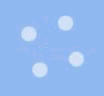
The four small balls are contained in four square divs respectively, and the small balls are relative to Square positioning (top: 0; left: 0), rotate the square div so that the balls are located at the four corners, and then use keyframe animation to control the ball to move back and forth between the current position and a position close to the center point
{animation: flor_move 1s 0s ease infinite;}
@keyframes flor_move {      50%{
        top: 25px;
        left: 25px;
      }
    }
There is still a rotation effect left, which is given to the parent element of the square div
{animation: flor_rote 2s 0s ease infinite;}@keyframes flor_rote {  25%{
        transform: rotateZ(90deg);
      }  50%{transform: rotateZ(180deg);
      }  75%{transform: rotateZ(270deg);
      }  100%{transform: rotateZ(360deg);
      }}
@keyframes mar_ligt {  50%{
        opacity: 0.4;
      }}

@keyframes mar_ligts {  50%{
        transform: scale(.5);opacity: 0.4;
      }}
{animation: poolball_l 1s .5s linear infinite;}   //左边的小球
{animation: poolball_r 1s 0s linear infinite;}    //右边的小球@keyframes poolball_l {  25%{
        transform: translateX(-100%);
      }  50%{transform: translateX(0);
      }}
    @keyframes poolball_r {  25%{
        transform: translateX(100%);
      }  50%{transform: translateX(0);
      }}
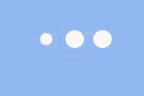
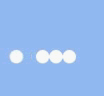
##This is a very common effect , also in order to prevent page layout confusion due to changes in the size of the ball, a layer of fixed width and height div is added outside the ball.
An animation delay must also be set for each ball
{animation: size_change 1.2s linear infinite;}@keyframes size_change {  20%{
        width: 0;height: 0;
      }  40%{width: 0;height: 0;
      }  50%{width: 20px;height: 20px;
      }}
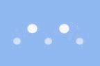
Five small balls, just center them horizontally, use margins to expand the distance between the balls, and change the translateY, width, height, and transparency of the balls through keyframe animation.
The initial width and height of the ball are 15px, and the transparency is .6.
{animation: flip_ballP 1.2s ease infinite,flip_ballS 1.2s ease infinite;}@keyframes flip_ballP {  50%{
        transform: translateY(60px);
      }}
    @keyframes flip_ballS {  50%{
        height: 15px;width: 15px;opacity: 0.6;
      }  75%{height: 20px;width: 20px;opacity: 1;
      }}
The above is the detailed content of loading animation collection. For more information, please follow other related articles on the PHP Chinese website!