
Home > Article > Web Front-end > Introduction and application skills of css3 rounded corners

*The following techniques are all derived from "CSS Secrets" written by Lea Verou
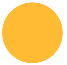
To construct a circle on CSS, you only need to set the border-radius attribute value to half the side length.
<!DOCTYPE html><html lang="en"><head><meta charset="UTF-8"><title>border-radiustitle>
<style>
.borderRadius{
display: inline-block;
background: #fb3;
min-width: 200px;
height: 200px;
line-height: 200px;
border-radius: 100px;
/* 边长的一半 */box-sizing: border-box;
padding:0 5px;
}<style>
<head>
<body>
<p class="borderRadius">
<p class="innerTxt">p>p>body>html>
The display effect is as follows:
The above layout When we add too much content in innerTxt, we will get the following effect:

If we want an adaptive ellipse If so, then the border-radius should not be a fixed value. When we set the border-radius to 50%, the display effect is as follows:

This becomes an adaptive ellipse.
Here we give a comprehensive introduction to the properties of border-radius. Border-radius is an abbreviated property. Its expansion formula is border-top-left-radius, border-top-right-radius, border-bottom-right-radius, border-bottom-left-radius.
It also has a little-known feature: border-radius can specify horizontal and vertical radii separately, just use a slash ( / ) to separate the two values ( Circle fillets have equal horizontal and vertical radii and can be merged).
Combining these characteristics, the detailed expansion of border-radius:50%; should be border-radius:50% 50% 50% 50%/50% 50% 50% 50%. Next, we use our imagination to construct various graphics based on the known fillet characteristics. border-radius: 50% / 100% 100% 0 0 (when the corner radius is less than 4, css will automatically repeat it for you)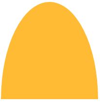

border-radius:

.borderRadius{display: inline-block;background: rgba(255,160,220,.8);
box-shadow: hsl(0, 0%, 60%) 0 3px 3px;min-width: 200px;height: 100px;line-height: 200px;
border-radius: 50% 10% / 100% 10%;
        }

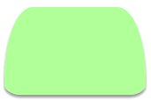
.borderRadius{display: inline-block;background: rgba(157, 255, 127, 0.8);
box-shadow: hsl(0, 0%, 60%) 0 3px 3px;min-width: 160px;height: 100px;
line-height: 200px;border-radius: 20% 20% 12% 12%/ 80% 80% 12% 12%;
        }
.borderRadius{display: inline-block;background: rgba(167, 255, 250, 0.8);
box-shadow: hsl(0, 0%, 60%) 0 3px 3px;min-width: 160px;height: 100px;
line-height: 200px;border-radius: 20% / 50%;
        }
