
Home > Article > Web Front-end > Brief discussion and examples of flex layout

Archimedes once said that if you give me a fulcrum, I can move the earth, and with flex, you can basically move all layouts.
1.Basic introduction and effect display of flex layout
If you want to do your job well, you must first sharpen your tools. Come on, let’s take a look at the basic knowledge first (ha~, it’s corny, but it’s useful).
**flex-direction
Direction (direction), layout direction, as the name implies, is to set the order of elements. Queuing up is nothing more than lining up horizontally or vertically, you guessed it. (praising you)
Imagine that there is now a class teacher (parent element) who wants to organize students (child elements) to dance the third set of radio gymnastics for primary and secondary school students.
We set the direction from low to high by default.
Okay, get in line. The class teacher said to stand in a horizontal row from low to high: felx-direction: row
Like this:

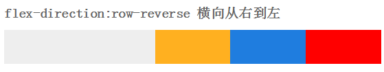
The one-meter-two class teacher standing at the end of the line felt that the pear was very big, so he had an idea: row from high to lowfelx-direction: row-reverse
You guessed it, it’s the opposite order from the beginning (as smart as you)
The head teacher likes the youngest Lu child in the class, but if we sit horizontally, we can’t see her...
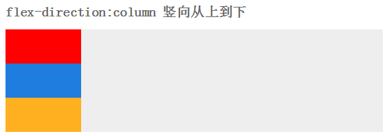
So he ordered everyone to arrange them vertically from low to high: flex-direction:column
Well, that’s probably it, but the girl in the first row said that the sun was so hot that she wanted to go to the back
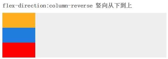
The class teacher then asked the students to line up vertically from high to low: flex-direction: column-reverse
After lining up, we started to do aerobics and walk in unison. . .
**flex-wrap
After finally finishing the dance, the class teacher noticed that a boy was wearing slippers. How could this be possible? It was like a red flag in the class flow
"Take the slippers and throw them away", the slipper boy had no choice but to leave the team. The nearest trash can is two kilometers outside the school (exaggeration, meaning very far)
With the slipper man gone, the team is not neat and orderly. The leader wants to check it out
Yes, it’s a fill-in (as smart as me).
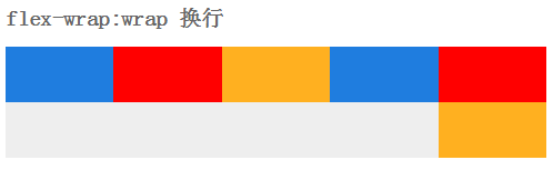
The class teacher has limited the maximum number of people in a row, and those who exceed it will be moved to the next row, and the line will be changed flex-wrap:wrap
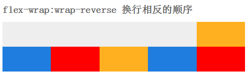
This is the message from the principal: We must be united, it is shameful to change careers. so, everyone had to huddle together flex-wrap: no-wrap

Everyone has stood up again. Basically, you can listen to the principal’s brief words and then go back to the classroom. At this time a strong wind came.
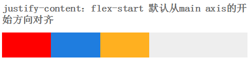
The wind is blowing, justify-content:flex-start
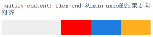
Yeah, the wind is blowing in the opposite direction againjustify-content:flex-end
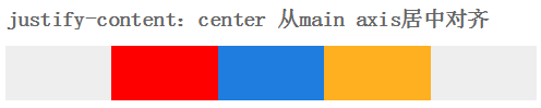
It’s scary, the wind blows from both sides justify-content:center
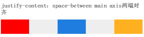
Finally, the wind blows from top to bottom, justify-content:space-between
Originally, there is another way to blow the wind, justify-content:space-around.
But the students were too tired to stand still, so we imagined by ourselves
Same as vertical.
This gust of wind also blew away the principal's speech. The principal said wittily: It's that simple. Let's call it a day. .
The students went back to the classroom.
2.felx app
2.1 Vertical Centering
Before we do vertical centering, we can use margin: 50vh auto 0; transform: translateY (-50%); of course, we can also use positioning.
But with flex, hahahahahahahahahahahahahahahaha (actually I can’t laugh for so long, exaggeration)
Guess, how to achieve it?
I guess you can’t guess. Because I wrote the answer. As witty as you
We add display: flex;align-items:center; justify-content:center;
to the parent elementAdd display: inline-flex;
to the child elementsThe effect is like this:
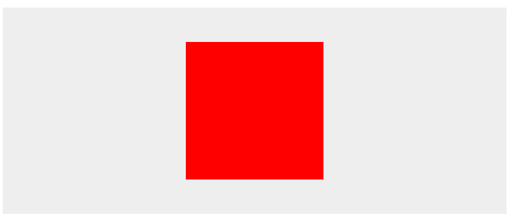
Yes, you read that right, it’s so simple (stealing the principal’s lines, it’s a sin)
2.2 Layout application
Take the page below as an example
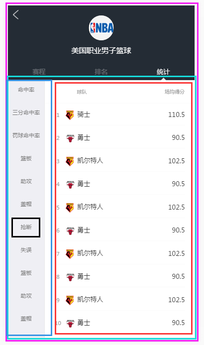
This page needs to keep the head fixed when the content in the sky blue box slides;
The content in the dark blue box on the left and the red box on the right can be slid independently.
Let’s think about it together. The elements inside the red one on the outside should be lined up vertically. What do you think? If you think so, praise you
.l-flex-column{ display:-webkit-box; -webkit-box-orient: vertical; display:flex; flex-flow: column;height: 100% }
Then pinch, the dark blue and bright red sub-elements are lined up horizontally in the sky blue element. Right, you are right again
.l-flex-row{ display:-webkit-box; -webkit-box-orient: horizontal; display:flex; flex-flow: row; width: 100%}
Secondly, the sub-projects in dark blue and the sub-projects in bright red seem to be lined up vertically. They look really good.
Finally, the dark blue and bright red parts must slide freely inside, add a scroll, you guessed it again (I admire you)
.l-scroll-y{overflow: auto;-webkit-overflow-scrolling:touch;}
To view details, please click: I am detailed
Did you get a little bit of it? If so, I would like to praise you.
If not, then there is none. . O(∩_∩)O
******It’s over******