
Home > Article > Web Front-end > You can also easily achieve cool transition animations using CSS!

You can easily achieve cool transition animations using CSS! Just take advantage of the latest CSS @scroll-timeline specification. The following article will use two cases to see how to use @scroll-timeline to achieve super cool transition animations. I hope it will be helpful to everyone!
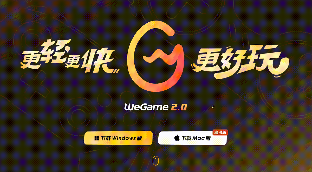
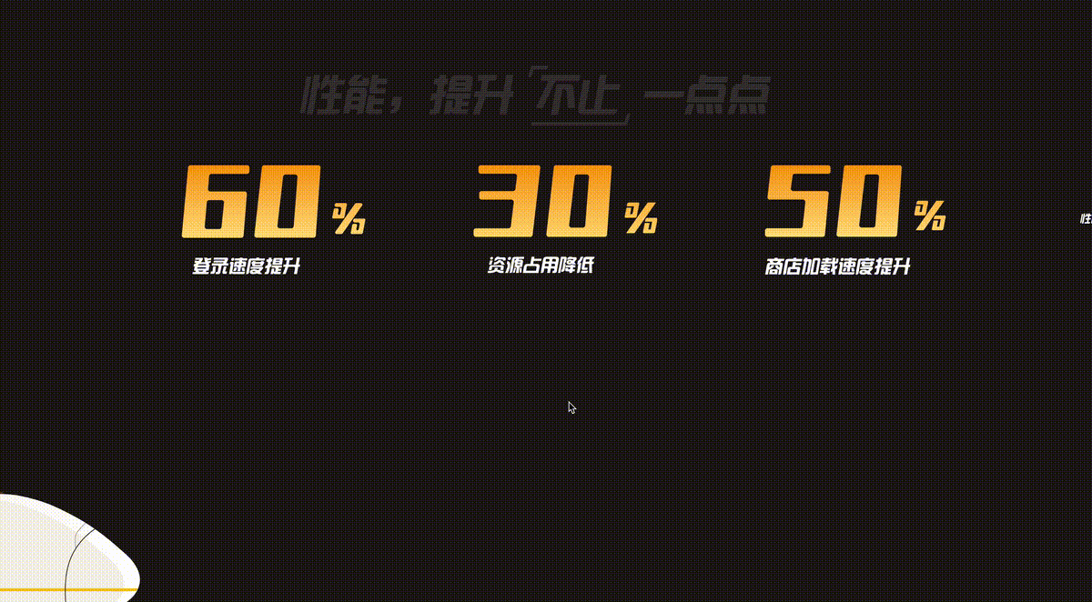
On the homepage of WeGame’s PC official website, there are many well-made scrolling based animation effects.
Here I simply intercept two of the more interesting transition animations for everyone to experience. Transition animation 1:
Transition animation 2:
Isn’t it quite interesting, the connection of the whole animation It is triggered based on scrolling of the wheel. My guess is that it is implemented using an animation library similar to TweenMaxJS.
Of course, these two cool and interesting transition animations can also be roughly realized based on the latest CSS @scroll-timeline specification. This article will try to use pure CSS to simulate the above two transition animations. [Recommended learning: css video tutorial]
Of course, regarding the latest CSS @scroll-timeline specification of CSS, if you haven’t learned about it in detail, you can read my article first Coming, coming, it’s finally here, the killer feature of animation@scroll-timeline
picture is not white, but needs to be transparent. Reveal the elements behind it.
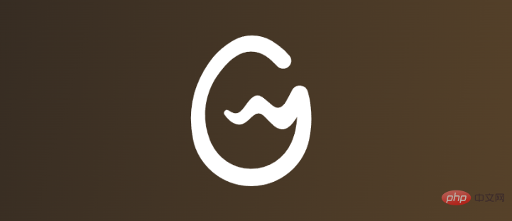
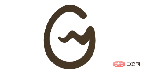
Of course, we can let the UI cut out such a picture, but it is too troublesome after all. Suppose we only have one LOGO element:
mask here. Let’s try it:
div {
    background: linear-gradient(-75deg, #715633, #2b2522);
}
Suppose we have a background like this:
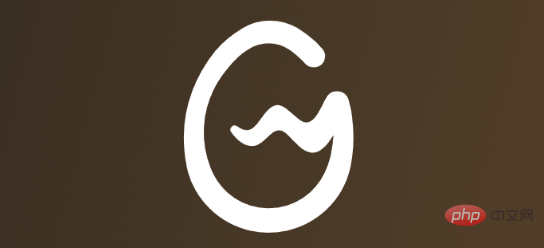
 ## We use the LOGO You can also easily achieve cool transition animations using CSS! as the MASK to cut the background:
div {
    background: linear-gradient(-75deg, #715633, #2b2522);
    mask: url(WeGame-LOGO图.png);
    mask-repeat: no-repeat;
    mask-position: center center;
}
We will get a picture like this:
 Oh No, this is exactly the opposite of what we imagined.
. How to do it? Don’t panic, you can use the
-webkit-mask-composite introduced in our previous article. If you don’t know much about it, you can click here to take a look: Advanced cutting skills! Any color conversion based on a single picture Let’s simply transform the code:
div {
    background: linear-gradient(-75deg, #715633, #2b2522);
    mask: url(//wegame.gtimg.com/g.55555-r.c4663/wegame-home/sc01-logo.52fe03c4.svg), linear-gradient(#fff, #fff);
    mask-repeat: no-repeat;
    mask-position: center center;
    -webkit-mask-composite: xor;
}
In this way, we can successfully get such a graphic:
 Of course, it should be noted that the white area is not white, but transparent, which can reveal the content behind it.
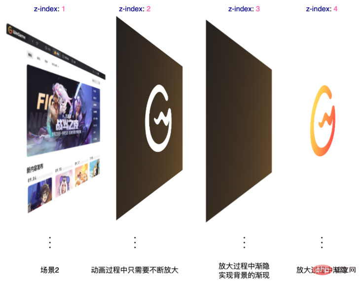
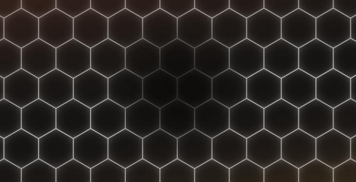
, we To simulate a most basic animation effect: 这里,想要看懂上述代码,你必须已经掌握了基本的 CSS @scroll-timeline 语法。其余的内容,简单解释下: 我们在 LOGO 后面的图层,用 好,此时,我们向下滚动动画,就会触发 有点那个意思了。但是,这里还缺少了一些细节。 首先我们需要有一个 LOGO,它的透明度从 1 逐渐渐隐到 0,这个比较简单,加完之后,我们看看效果: 离目标又近了一步,但是,仔细观察原效果,我们还少了一层: 在 LOGO 渐隐的过程中,背后的背景不是直接呈现的,而是有一个渐现的过程。所以,完整而言,在动画过程从,一共会有 4 层: 所以,完整的代码,大概是这样的: 这样,我们就基本能够还原原效果了: 完整的代码,你可以戳这里:CodePen Demo - WeGame Animation Demo 好,搞定了一个,我们继续来看下一个: 这里,我们也简单拆解下动画: 数字放大,逐渐带出场景 2 场景 2 有一个非常酷炫的光影收缩效果 这里的数字放大与第一个转场动画其实非常类似,就不详细讲了。 我们来看看,在场景 2 这里,光影的收缩效果如何实现。 这里看似负责,但是,其实非常的简单。这里,核心在于这两张图片: 图片素材 1: 注意,这里最为核心的在于,图片中的白色不是白色,是透明的,可以透出背景的内容。 这样,我们只需要在这张图片的背后,放置另外这样一张图片: 想到了吗?没错,就是让这张图片从一个较大的 什么意思呢?看看这张图你就懂了: 知道了解到这一点,整个动画也就比较简单了。当然,这里我们也同样借助了 CSS @scroll-timeline 完成整个动画: 整个动画需要看懂,其实还是要有一定的功底的。上效果: 完整的代码,你可以戳这里:CodePen Demo - WeGame Animation Demo 这样,借助强大的 CSS 以及一些有意思的技巧,我们利用纯 CSS 实现了这两个看似非常复杂的转场动画效果,并且,这在之前,是完全不可能使用纯 CSS 实现的。 原文地址:https://segmentfault.com/a/1190000042184211 作者:chokcoco (Learning video sharing: web front-end)
.g-scroll {
position: relative;
width: 100vw;
height: 500vh;
}
.g-wrap {
position: fixed;
top: 0;
left: 0;
width: 100vw;
height: 100vh;
overflow: hidden;
}
.g-container {
position: absolute;
top: 0;
left: 0;
width: 100vw;
height: 100vh;
animation-name: scale;
animation-duration: 10s;
animation-timeline: box-move;
}
.g-bg {
position: fixed;
width: 100vw;
height: 100vh;
background: url(LOGO背后的图层);
}
.g-wegame {
position: absolute;
width: 100vw;
height: 100vh;
background: linear-gradient(-75deg, #715633, #2b2522);
mask: url(//wegame.gtimg.com/g.55555-r.c4663/wegame-home/sc01-logo.52fe03c4.svg), linear-gradient(#fff, #fff);
mask-repeat: no-repeat;
mask-position: center center;
-webkit-mask-composite: xor;
}
@scroll-timeline box-move {
source: selector("#g-scroll");
orientation: "vertical";
}
@keyframes scale {
0% {
transform: scale(1);
}
100% {
transform: scale(60);
}
}
.g-bg 使用一张图片表示了场景 2#g-scroll 用于基于滚动条的滚动,实现滚动动画.g-wegame 里面就是上述使用 mask 和 mask-composite 实现的图层.g-container 的动画,也就是从 transform: scale(1) 到 transform: scale(60),我们来看看效果: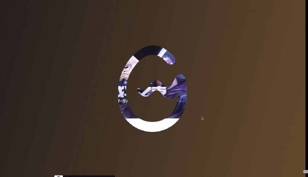

.g-scroll {
position: relative;
width: 100vw;
height: 500vh;
}
.g-wrap {
position: fixed;
top: 0;
left: 0;
width: 100vw;
height: 100vh;
overflow: hidden;
}
.g-container {
position: absolute;
top: 0;
left: 0;
width: 100vw;
height: 100vh;
animation-name: scale;
animation-duration: 10s;
animation-timeline: box-move;
}
.g-bg {
position: fixed;
width: 100vw;
height: 100vh;
background: url(//背景图片,场景2);
}
.g-wegame {
position: absolute;
width: 100vw;
height: 100vh;
background: linear-gradient(-75deg, #715633, #2b2522);
mask: url(//WeGame-Logo.png), linear-gradient(#fff, #fff);
mask-repeat: no-repeat;
mask-position: center center;
-webkit-mask-composite: xor;
z-index: 1;
}
.g-mask {
position: aboslute;
width: 100vw;
height: 100vh;
background: linear-gradient(-75deg, #715633, #2b2522);
z-index: 2;
animation-name: reOpacityChange;
animation-duration: 10s;
animation-timeline: box-move;
animation-function-timing: linear;
}
.g-logo {
position: absolute;
background: url(//WeGame-Logo.png);
background-repeat: no-repeat;
background-position: center center;
z-index: 3;
animation-name: reOpacityChange;
animation-duration: 10s;
animation-timeline: box-move;
}
@scroll-timeline box-move {
source: selector("#g-scroll");
orientation: "vertical";
}
@keyframes reOpacityChange {
0%,
50% {
opacity: 1;
}
100% {
opacity: 0;
}
}
@keyframes scale {
0% {
transform: scale(1);
}
100% {
transform: scale(60);
}
}

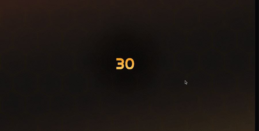
转场动画二

transform: scale() 值,变化到一个较小的 transform: scale() 值即可!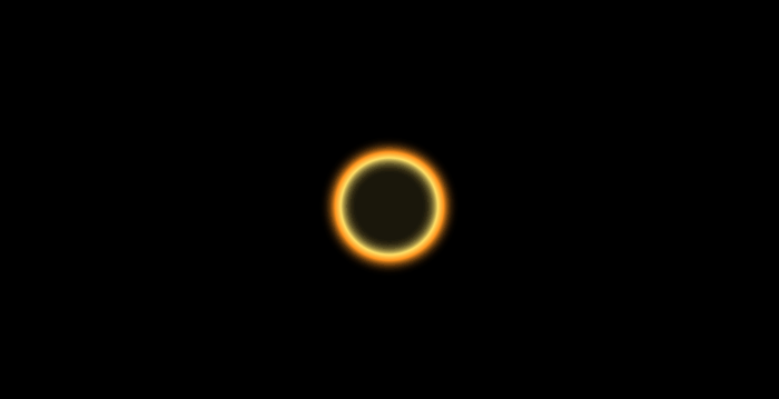
30
.g-scroll {
position: relative;
width: 100vw;
height: 500vh;
}
.g-container {
position: fixed;
top: 0;
left: 0;
width: 100vw;
height: 100vh;
overflow: hidden;
}
.g-bg {
position: absolute;
top: 0;
left: 0;
width: 100%;
height: 100%;
background: url(//蜂巢图片.png);
z-index: 1;
}
.g-circle {
position: absolute;
top: 50%;
left: 50%;
transform: translate(-50%, -50%) scale(.5);
width: 400px;
height: 400px;
background: url(//光圈图片.png);
animation-name: scale;
animation-duration: 10s;
animation-timeline: box-move;
}
.g-word {
position: absolute;
top: 50%;
left: 50%;
transform: translate(-50%, -50%);
font-size: 12vw;
z-index: 10;
color: transparent;
background: linear-gradient(#f8a011, #ffd973);
background-clip: text;
animation-name: scaleWord;
animation-duration: 10s;
animation-timeline: box-move;
}
@scroll-timeline box-move {
source: selector("#g-scroll");
orientation: "vertical";
}
@keyframes scale {
0% {
transform: translate(-50%, -50%) scale(10);
}
100% {
transform: translate(-50%, -50%) scale(.5);
}
}
@keyframes scaleWord {
0% {
transform: translate(-50%, -50%) scale(.5);
}
100% {
transform: translate(calc(-50% - 5000px), -50%) scale(100);
}
}
The above is the detailed content of You can also easily achieve cool transition animations using CSS!. For more information, please follow other related articles on the PHP Chinese website!