Home > Article > Web Front-end > Detailed explanation of CSS text properties (Text)

CSS Text (text) property is used to define the appearance of text, such as text color, aligned text, decorative text, text color, line spacing, etc. This article will take you through the CSS text attribute (Text). I hope it will be helpful to you!

| is used for | property name | CSS version | Browser support | Inheritance | Default value |
|---|---|---|---|---|---|
color | 1are supported. All versions of IE do not support the attribute value "inherit". | yes | not specified | ||
dir attribute of the label).
|
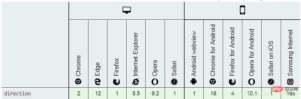
direction | 2Same as above. | yes | ltr | |
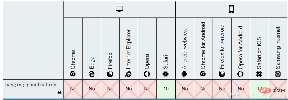
hanging-punctuation | 3Safari 10.1 supports, other | does not support. | yesnone | ||
letter-spacing | 1Same as above. | yes | normal | ||
line-height | 1Same as above. | yes | normal | ||
punctuation-trim | 3does not support . | yesnone | |||
text-align | 1are supported. IE all versions | yes | If the direction attribute is ltr, the default value is left; if direction is rtl, it is right. Property value 'inherit' is not supported. | ||
⑦ Horizontal alignment of the last line of text (with direction,text-align attributes). |
text-align-last |
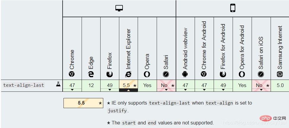
3 | IE11, edge14 are partially supported, FF52 chrome49 opera45 is supported, and safari is not supported. | yes | auto |
| ⑧ Text decoration (line). | text-decoration |
1 | Same as above, and IE, Chrome or Safari do not support the "blink" attribute value. | no | none.(Block element first line) Text indentation amount (blank length). |
| ⑨ Add text emphasis symbols (shape, color, position). | text-emphasis |
3 | IE, Edge does not support it, FF52 safari10.1 supports it, and chrome49 partially supports it. | no | none |
⑩ Space separation method that aligns both ends of the text (with the text-align attribute). |
text-justify |
3 | IE11, edge14 is partially supported, FF55 is supported, and others are not supported. | yes | auto |
⑪ The shadow of the text (affects the decorative line text-decoration). |
text-shadow |
2 | are supported. Only supported by IE 10 and above. | yes | none |
| Text case conversion. | text-transform |
1 | are supported. All versions of IE do not support the attribute value "inherit". | yes | none |
| ⑫ The outline of the text. | text-outline | 3 | does not support . | yes | none |
⑬ Hide the display when text overflows (matched with overflow,white-space,display properties). |
text-overflow |
3 | are supported, no prefix is required. | no | clip |
| ⑭ Add shadow to text. | text-shadow |
3 | are supported, IE10 supports | yes | none |
| ⑮ Line wrapping rules for text. | text-wrap | 3 | does not support . | yes | normal |
⑯ Rewriting/overwriting of bidirectional text (with direction attribute). |
unicode-bidi |
2 | |||
| ⑰ Blank and newline processing. | white-space |
1 | are supported. All versions of IE do not support the attribute value "inherit". | yes | normal |
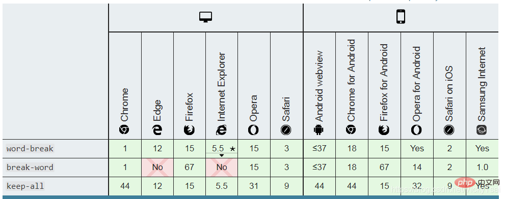
| ⑱ Word line break/line break position (can line break within the word). | word-break |
3 | are supported. IE6 support. | yes | normal |
| ⑲ Split long indivisible words and wrap them to the next line. The word line break position (sentence/line break method). | word-wrap |
3 | all supported, IE6 | yes | normal |
| ⑳ The distance between words/words. | word-spacing |
1 | Same as above | yes | normal |
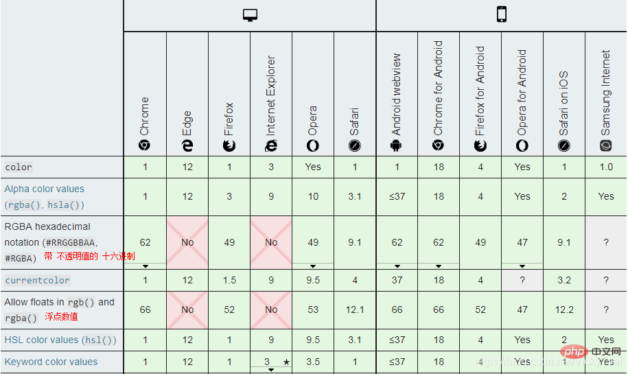
color PropertiescolorSet the ❶ text and ❷ text decoration# of the element The foreground color value of ## (text-decorationcurrentcolor. can be used as an indirect value for other properties, and is other color properties (such as ❹ border colorborder-color )'s default value.
The attribute sets the foreground color of an element will set the color of the border and text to green at the same time. .
), bitmap, pixel image, simply put,
color_name|hex_number|rgb_number|inherit;/* 关键字值 Keyword values */ color: currentcolor; /* 颜色名称values */ color: red; color: orange; color: tan; color: rebeccapurple; /* 十六进制颜色 values */ color: #090; color: #009900; color: #090a; color: #009900aa; /* values ,逗号 可以换成空格,但是目前 最好别这么做,兼容性还没那么好*/ color: rgb(34, 12, 64); /*rgb()中带不透明度值,浏览器支持度不好,用rgba()*/ color: rgb(34, 12, 64, 0.6); color: rgba(34, 12, 64, 0.6); color: rgb(34 12 64 / 0.6); color: rgba(34 12 64 / 0.3); color: rgb(34.0 12 64 / 60%); color: rgba(34.6 12 64 / 30%); /* values ,逗号 可以换成空格,但是目前 最好别这么做,兼容性还没那么好*/ color: hsl(30, 100%, 50%); /*hsl()中带 不透明度值,浏览器支持度不好,用 hsla()*/ color: hsl(30, 100%, 50%, 0.6); color: hsla(30, 100%, 50%, 0.6); color: hsl(30 100% 50% / 0.6); color: hsla(30 100% 50% / 0.6); color: hsl(30.0 100% 50% / 60%); color: hsla(30.2 100% 50% / 60%); /* Global values */ color: inherit; color: initial; color: unset;
Key points: Color name hexadecimal rgb code inheritancecurrentColor ,transparent
The rgba()
Inherits color from parent element. It cannot be a gradient valuecolor {
width: 600px;
border: 10px dashed;
padding: 10px;
/*把一段文字 设置成Detailed explanation of CSS text properties (Text)的 方法*/
color: red;
color: #f00;
color: #ff0000;
color: rgb(255,0,0);
color: rgb(100%,0%,0%);
color: hsl(0,100%,50%);
/*设置 半透明的Detailed explanation of CSS text properties (Text) = 不透明值 等于一半的 Detailed explanation of CSS text properties (Text)*/
color: #ff000080;
color: rgba(255,0,0,0.5);
color: hsla(0,100%,50%,0.5);
}
| Detailed explanation of CSS text properties (Text) | 半透明的Detailed explanation of CSS text properties (Text) |
|---|---|
") |
") |
direction属性 设置 文本、表列(table columns) 和 水平溢出 (horizontal overflow)的 方向。direction: ltr|rtl|inherit;/* 关键字值 Keyword values */ direction: ltr; direction: rtl; /* 全局通用的属性值 Global values */ direction: inherit; direction: initial; direction: unset;
direction方向的 属性值
ltr
rtl
Hebrew) 或 阿拉伯语(Arabic) 等)inherit
direction 属性的值。direction属性 和 html 标签的属性dir(标签中)
dir 属性 :dir属性),而不是 直接使用direction属性。direction属性:dir 属性 不同,direction 属性 不是从表列 继承到表单元格的,因为CSS 继承遵循 文档树,而 表单元格 位于行中,而 不是列中。direction属性 对 行内元素 有影响,必须 unicode-bidi 属性的值 设置为 embed, override.all 属性影响:direction 和 unicode-bidi 属性: 是唯独的两个 不受 all 属性 影响的属性。⑸ direction的 浏览器支持
.color {
    width: 450px;
    border: 10px dashed;
    padding: 10px;

    /*设置文本的方向*/
    direction: rtl;
}
| 默认的文本方向: ltr 从左到右 | 设置成 从右到左 direction: rtl; |
|---|---|
 |
 |
。的位置,可以看出direction: rtl; =
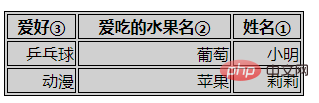
dir: direction 的简写..dirTest {
border: 1px solid;
width: 300px;
direction: rtl;
background-color: #d0d0d0;
}
.dirTest td, th {
border: 1px solid;
}
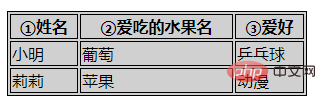
| ①姓名 | ②爱吃的水果名 | ③爱好 |
|---|---|---|
| 小明 | 葡萄 | 乒乓球 |
| 莉莉 | 苹果 | 动漫 |
| 默认方向: 从左到右 | 设置 从右到左 |
|---|---|
 |
 |
direction:rtl =
dir 属性中设置.hanging-punctuation 属性,美 /ˌpʌŋktʃuˈeɪʃn/hanging-punctuation: none|first|last|allow-end|force-end;/* 关键字值 Keyword values */ hanging-punctuation: none; hanging-punctuation: first; hanging-punctuation: last; hanging-punctuation: force-end; hanging-punctuation: allow-end; /* 两个值 Two keywords */ hanging-punctuation: first force-end; hanging-punctuation: first allow-end; hanging-punctuation: first last; hanging-punctuation: last force-end; hanging-punctuation: last allow-end; /* 三个值 Three keywords */ hanging-punctuation: first force-end last; hanging-punctuation: first allow-end last; /* 全局值 Global values */ hanging-punctuation: inherit; hanging-punctuation: initial; hanging-punctuation: unset;
none
first
last
allow-end
force-end
hanging-punctuation属性 可被指定 多个值,可以是 一个值,两个值,或者 三个值。first 搭配 last, allow-end, force-end 中的一个last 搭配 first,allow-end,force-end 中的一个first, allow-end, last
first,force-end, last
letter-spacing 属性letter-spacing: normal|length|inherit;/* 关键字值 Keyword value */ letter-spacing: normal; /* 长度值values */ letter-spacing: 0.3em; letter-spacing: 3px; letter-spacing: .3px; /* 全局值 Global values */ letter-spacing: inherit; letter-spacing: initial; letter-spacing: unset;
normal
normal≠ 0,需要时,浏览器可调整 字符间距:0不同,此关键字 允许用户代理 更改字符之间的 空格,以 调整/对齐 文本。length
inherit
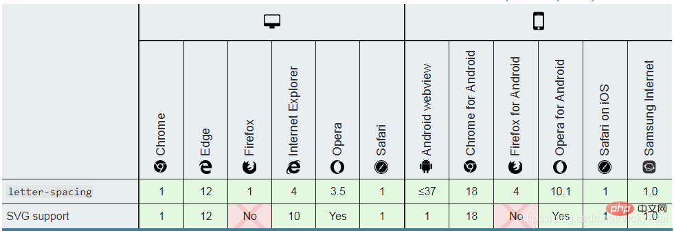
letter-spacing 属性的值。yes⑺ 字符间距letter-spacing 的 浏览器支持
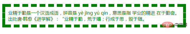
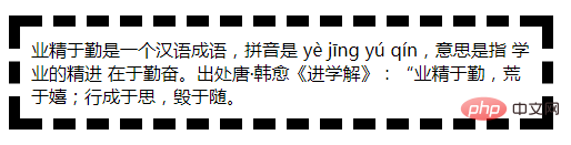
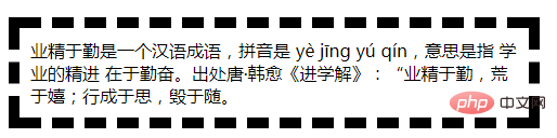
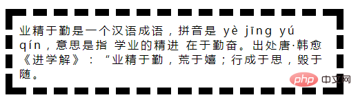
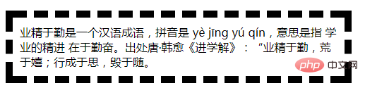
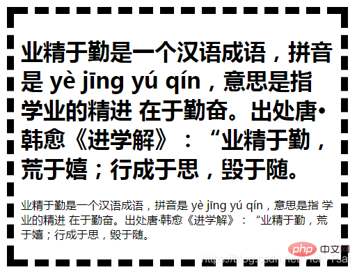
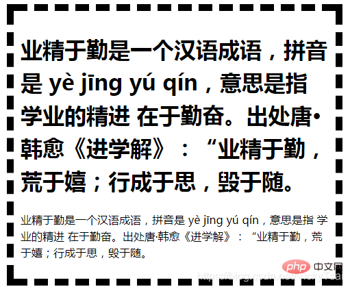
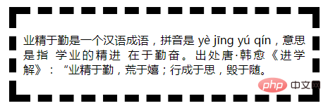
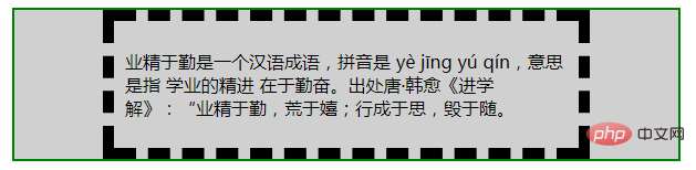
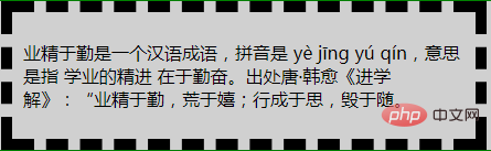
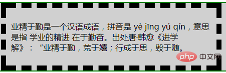
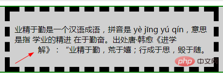
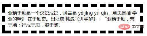
业精于勤是一个汉语成语,拼音是 yè jīng yú qín,意思是指 学业的精进 在于勤奋。出处唐·韩愈《进学解》:“业精于勤,荒于嬉;行成于思,毁于随。
.textTest {
    width: 450px;
    border: 10px dashed;
    padding: 10px;
    /*字符之间的间距*/
    letter-spacing: normal;
}
| 正常间距 (默认值) normal | 增加 0.2em的额外间距 letter-spacing: 0.2em; |
|---|---|
 |
 |
| 减少 0.2em的额外间距 letter-spacing: -0.2em; | 字符间距 不正常的字体(太大/太小) 2em, -0.9em |
 |
|
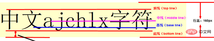
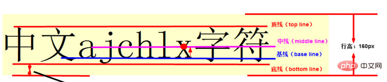
line-height 属性line-height- 字体大小font-size = 行高和字体大小的 差值⑵ 行高、基线、顶线、中线、底线 示例图
line-height:normal|number|length|%|inherit;/* 关键字值 Keyword value */ line-height: normal; /* 无单位值: 字体大小 font-size的倍数 Unitless values: use this number multiplied by the element's font size */ line-height: 3.5; /* 长度值values */ line-height: 3em; /* 百分比值 values */ line-height: 34%; /* 全局值 Global values */ line-height: inherit; line-height: initial; line-height: unset;
标准,数字,长度值,百分比,继承。
① 正常 行间距(默认): normal
1.2,这取决于 元素的 字体。② 一个数字(无单位),字体大小的 倍数: number(等同于 百分比值的简写)
font-size。h1不继承父元素 div的字体大小,段落 p却继承 父元素div的字体大小时font-size 不同时,能设置 相对于 子元素的 当前字体大小的行高.③ 长度值: length
④ 字体大小的 百分比值:%
font-size。font-size。⑤ 继承父亲: inherit
line-height 属性的值。不能负值: 行高 不允许 负值,负值会被视作 无效值.
默认行高/行间距:
110% ~ 120%。100% 的行间距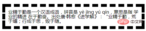
line-height font-size时, 将出现 行距为负数的情况,也就是两行文字 将部分重合。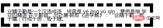
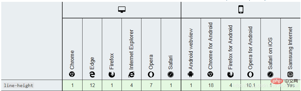
yes1.5。⑻ 行高 line-height的 浏览器支持
.textTest {
    width: 450px;
    border: 10px dashed;
    padding: 10px;

    font-size: 16px;
    line-height: 1.5em;
}
| 默认 文本行高 = normal 值 | 绝对长度值 行高 line-height: 40px; |
|---|---|
 |
 |
| 相对长度值 行高 1.5em = 150% | 不带单位 纯数字 line-height: 1.5; |
 |
 |
1.5 = 1.5em = 150%
font-size,都是相对于 当前字体大小的 倍数.em,%相对长度值的区别div,进行 行高设置,内部的两个子元素 h1,p 都不设置行高,看下内部元素的行高变化div > h1 | p
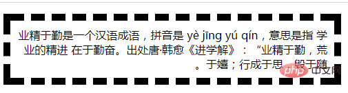
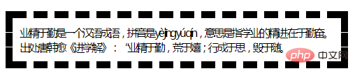
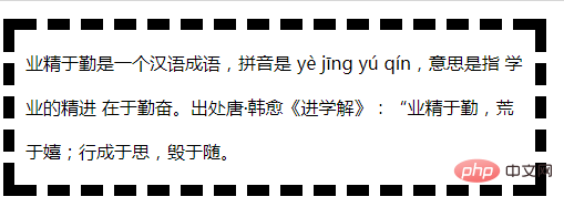
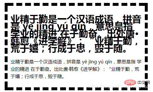
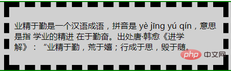
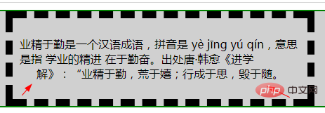
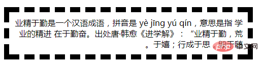
业精于勤是一个汉语成语,拼音是 yè jīng yú qín,意思是指 学业的精进 在于勤奋。出处唐·韩愈《进学解》:“业精于勤,荒于嬉;行成于思,毁于随。
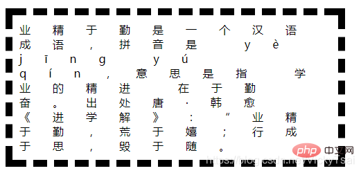
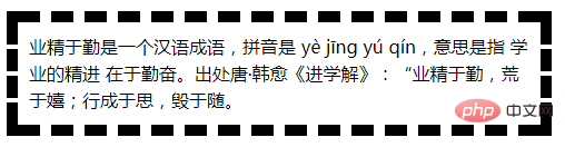
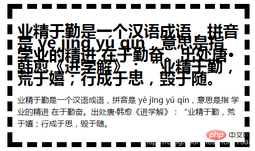
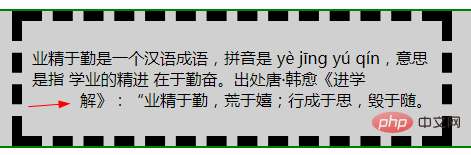
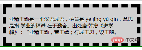
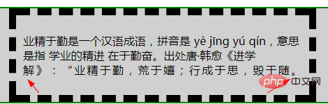
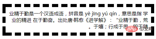
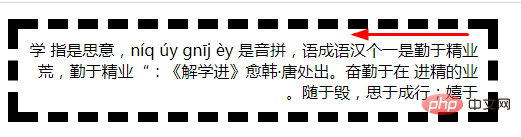
业精于勤是一个汉语成语,拼音是 yè jīng yú qín,意思是指 学业的精进 在于勤奋。出处唐·韩愈《进学解》:“业精于勤,荒于嬉;行成于思,毁于随。
.textTest {
    width: 450px;
    border: 10px dashed;
    padding: 10px;

    font-size: 16px;
}
| 默认 文本行高 = normal 值 | 设置成 绝对长度值时: 25px (h1 的文本 行高太挤) |
|---|---|
 |
 |
| 设置成 相对长度值: 1.5em = 150% | 设置成 纯数字 不带单位: line-height: 1.5; |
 |
 |
25px,1.5em= 150%=1.5 x 16px = 24px
div, even if their font sizes are differenth1 and p relative to the font size of the sub-element itself = font size of h1 x line height of 1.5p x 1.5If the punctuation is at the beginning or end of the line, Do not trim open or close punctuation marks. Trim the punctuation at the end of each line. ⑤ adjacentdoes not control the alignment of the block element itself, but only controls the alignment of the inline content (text) of the
block element:Because this line is often of different lengths from other lines, it is not suitable to be controlled together? yestext-align的 语法
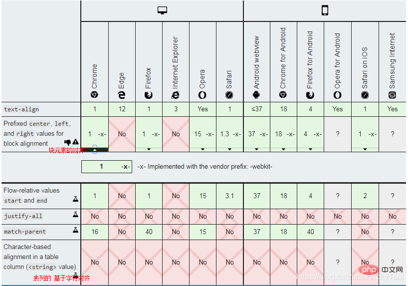
text-align:left|right|center|justify|inherit;/* 关键字值 Keyword values */ text-align: left; text-align: right; text-align: center; text-align: justify; /*下方的属性值 支持度还不好 暂时不用少用*/ text-align: justify-all; text-align: start; text-align: end; text-align: match-parent; /* 表列中 基于字符的对齐 Character-based alignment in a table column */ text-align: "."; text-align: "." center; /* 块对齐值 Block alignment values (非标准语法 Non-standard syntax) */ text-align: -moz-center; text-align: -webkit-center; /* 全局值 Global values */ text-align: inherit; text-align: initial; text-align: unset;
left
direction:rlt时 的默认值.right
direction:rlt时 的默认值.center
justify
inherit
text-align 属性的值。direction属性 相关联direction 属性是 ltr,则默认值是left;direction 是 rtl,则为 right。text-align 和 direction属性的 关联影响
text-align的时direction 属性,文本的流向 会影响 水平对齐的默认值.direction:ltr,文本会 左对齐direction:rtl,文本会 右对齐direction 只会改变 文本的流向,不会再影响 对齐方式.⑹ 文本水平对齐 text-align的 浏览器支持
示例1: 设置一段文本的 水平对齐方式
.textTest {
    width: 400px;
    border: 10px dashed;
    padding: 10px;

    font-size: 16px;
    margin: 10px;
}
| 左对齐 text-align:left; | 右对齐 text-align:right; |
|---|---|
 |
 |
| 居中对齐 text-align:center; | 两端对齐 text-align:justify; |
 |
 |
auto (下方 3 种设置方式,效果等同)margin: auto; = ❷ margin: 0 auto;
margin-left: auto; margin-right: auto;
margin: 0 auto;
text-align-last
vertical-align 只对 行内元素、表格单元格元素 生效,不能用于 垂直对齐 块级元素。text-align-last的 语法
text-align-last: auto | start | end | left | right | center | justify;
/* 关键字值 Keyword values */ vertical-align: baseline; vertical-align: sub; vertical-align: super; vertical-align: text-top; vertical-align: text-bottom; vertical-align: middle; vertical-align: top; vertical-align: bottom; /* 长度值values */ vertical-align: 10em; vertical-align: 4px; /* 百分比值 values */ vertical-align: 20%; /* 全局值 Global values */ vertical-align: inherit; vertical-align: initial; vertical-align: unset;
text-align-last的 属性值
text-align关联: auto
text-align的值 对齐,text-align: justify
text-align-last: start是一样的,根据文本的方向 来决定.direction 关联,参考起点: start
direction的设置有关。direction :ltr,则 起点在左侧,则是左对齐;direction :rtl,则 起点在右侧,则是右对齐。direction,则按照 浏览器文本的 默认显示方向 来确定。direction 关联,参考终点: end
start 值的 结果相反,是以 终点为参考的.left
right
center
justify
text-align-last 的 浏览器支持
需要使用 浏览器前缀
.textTest {
    width: 400px;
    border: 10px dashed;
    padding: 10px;
    margin: 0 auto;
    font-size: 16px;
    /*文本水平对齐*/
    text-align: left;

    /*文本最后一行 水平对齐*/
    text-align-last: auto;
}
| ① 默认显示 | ② text-align-last: auto; |
|---|---|
 |
 |
| ③ 起点对齐 text-align-last: start; | ④ 终点对齐 text-align-last: end; |
 |
 |
| ⑤ 左对齐 text-align-last: left; | ⑥ 右对齐 text-align-last: right; |
 |
 |
| ⑦ 居中对齐 text-align-last: center; | ⑧ 两端对齐 text-align-last: justify; |
 |
 |
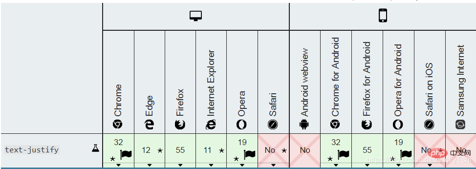
text-justify
text-align: justify 时text-justify: auto|inter-word|inter-character|distribute;text-justify: none; text-justify: auto; text-justify: inter-word; text-justify: inter-character; text-justify: distribute; /* 已废弃的属性值 Deprecated value */
auto
none
text-align 一样text-align 的元素上 禁用 两端对齐效果的时候,可以使用.inter-word
word-spacing 的值)inter-character
letter-spacing 的值)distribute (已废弃 属性值)inter-wrod一致,不提倡使用 这个属性,现在这个属性 或许还能有效果,但那完全是为了 向后兼容而被保留着。实验中属性,行为可能会发生变化
示例1:给一段文本设置 两端对齐的水平对齐,并设置 两端对齐时 空间的分隔方式
css
.textjustify{
    width: 30%;
    background-color: #d0d0d0;
    padding: 10px;
    border: solid black 2px;
    font-size: 1.2em;

    /*text-align: justify;*/
    /*text-justify:auto;*/
    /*text-justify:none;*/
    /*text-justify:inter-word;*/
    /*text-justify:inter-character;*/
    /*text-justify:distribute;*/

}
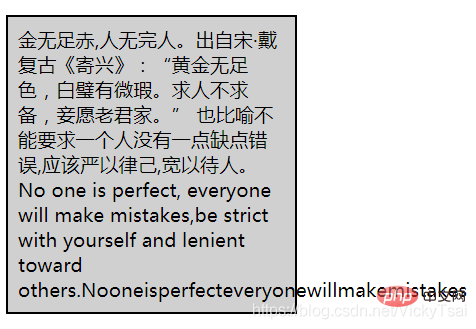
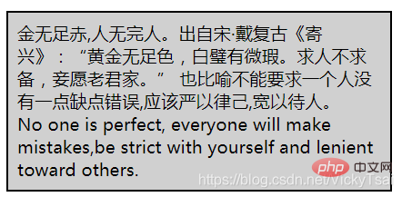
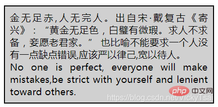
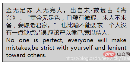
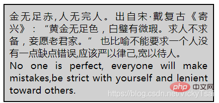
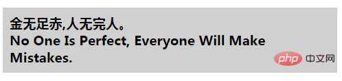
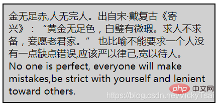
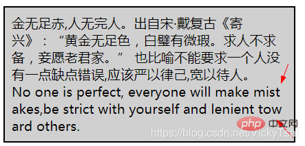
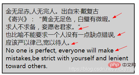
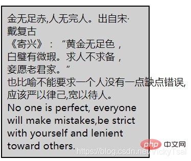
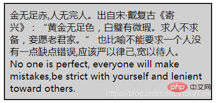
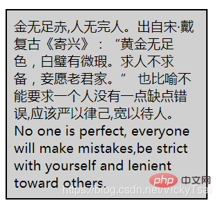
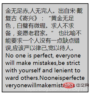
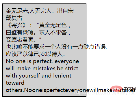
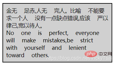
    金无足赤,人无完人。出自宋·戴复古《寄兴》:“黄金无足色,白璧有微瑕。求人不求备,妾愿老君家。” 也比喻不能要求一个人没有一点缺点错误,应该严以律己,宽以待人。
No one is perfect, everyone will make mistakes,be strict with yourself and lenient toward others.
| 默认 水平对齐 | 水平 两端对齐 text-align: justify; ( 默认= text-justify:auto;) |
|---|---|
 |
 |
| 禁用 两端对齐 text-justify:none; | 调整 单词间距离 inter-word |
 |
 |
| 调整 字符间距离 inter-character | 分散 distribute (已废弃属性值) |
 |
 |
auto ,会根据语言 自行进行空间分隔vertical-align,美 ['vɝtɪkl]inline)或 表格单元格(table-cell)元素的 垂直对齐方式。vertical-align.line-height = height
vertical-align 只对 ❶ 行内级的元素(inline-level elements)、❷ 表格单元格元素 生效:不能用它 垂直对齐 块级元素inline-level elements):display =inline
inline-block
inline-table
![Detailed explanation of CSS text properties (Text)]()
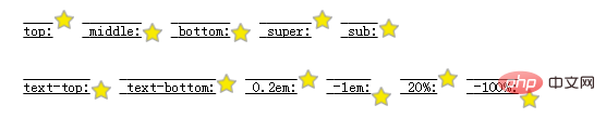
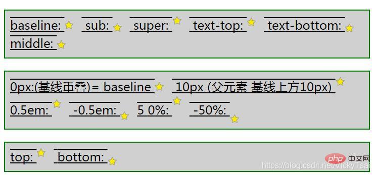
vertical-align: baseline | sub | super | top | text-top | middle | bottom| text-bottom | length | % |inherit;/* Keyword values */ vertical-align: baseline; vertical-align: sub; vertical-align: super; vertical-align: text-top; vertical-align: text-bottom; vertical-align: middle; vertical-align: top; vertical-align: bottom; /*values */ vertical-align: 10em; vertical-align: 4px; /* values */ vertical-align: 20%; /* Global values */ vertical-align: inherit; vertical-align: initial; vertical-align: unset;
① 相对父元素 的值
baseline
sub
super
text-top
text-bottom
❻ 父元素的 中线: middle
使 元素的中部 与 [父元素的基线 + 父元素x-height(x的高度)的一半] 对齐。
length
%
line-height” 属性的百分比值 来排列此元素。line-height属性的 百分比。② 相对行的 值
top
bottom
③ 属性值 的正负
baseline (以及 sub, super, text-top, text-bottom, top
middle
bottom
x的下边缘)上一样,baseline)是super
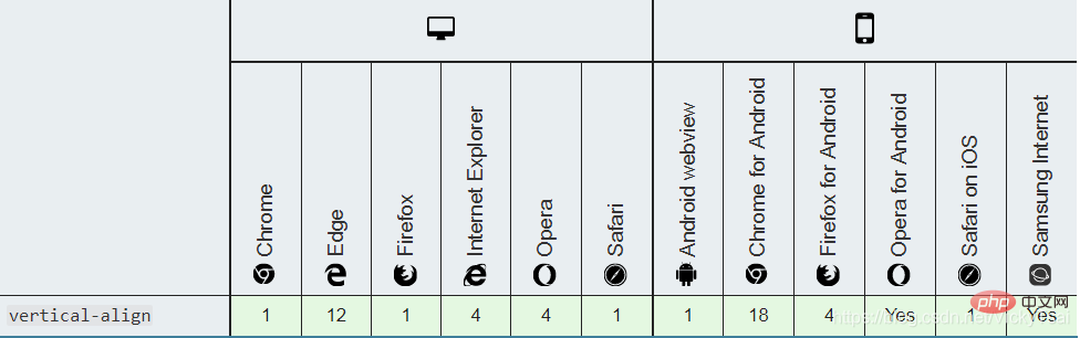
⑹ 垂直对齐 vertical-align的 浏览器支持
.verticalTest{
	width: 700px;
	text-decoration: underline overline;
	font-size: 1.5em;
	/*line-height = font-size x 1.5 = 1.5em x 1.5 = 1.5 x 16 x 1.5*/
	line-height: 1.5em;
	background-color: #d0d0d0;
	padding: 10px;

	border: 2px solid green;


}
.verticalTest img{
	/* 10px/16px = 0.625 */
	margin-right: 0.625em;

}
baseline:
sub:
super:
text-top:
text-bottom:
middle:
![Detailed explanation of CSS text properties (Text)]()
0px:(基线重叠)= baseline
10px (父元素 基线上方10px)
0.5em:
-0.5em:
5 0%:
-50%:
![Detailed explanation of CSS text properties (Text)]()
top:
bottom:
![Detailed explanation of CSS text properties (Text)]()
.verticalTable{
	width: 50%;
}
table.verticalTable ,.verticalTable th,.verticalTable td{
	border: 1px solid green;
}
.verticalTable td{
	padding: 10px;
	background-color: #d0d0d0;
}
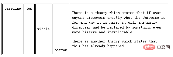
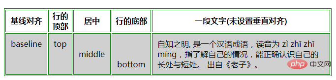
| 基线对齐 | 行的顶部 | 居中 | 行的底部 | 一段文字(未设置垂直对齐) |
|---|---|---|---|---|
| baseline | top | middle | bottom | 自知之明, 是一个汉语成语,读音为 zì zhī zhī míng,指了解自己的情况,能正确认识自己的 长处与短处。 出自《老子》。 |
使用 text-decoration 属性, 文本装饰 属性
① 文本修饰的颜色
color" 属性设置。② 后代元素会继承 装饰线: 如果后代元素 没有自己的装饰,祖先元素上 设置的装饰会 “延伸”到 后代元素中。
③ 简写属性: text-decoration属性是一种 简写属性,并且可以使用 普通属性三个值中的任何一个。
text-decoration-line
underline,删除线line-through
text-decoration-color
text-decoration-style
wavy ,实线 solid ,虚线 dashed
text-decoration:none|underline|overline|line-through|blink|inherit;|| ||
text-decoration的 属性值 (不做简写属性时,只表示 装饰线的位置)none
underline
overline
line-through
blink
inherit
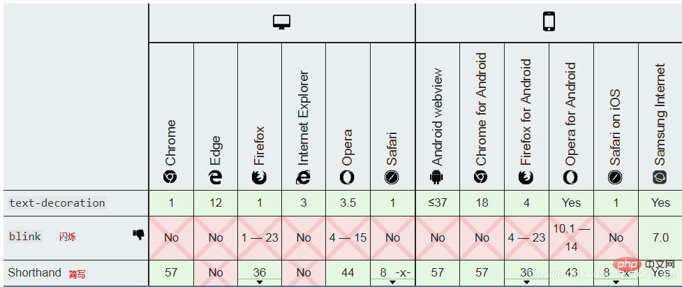
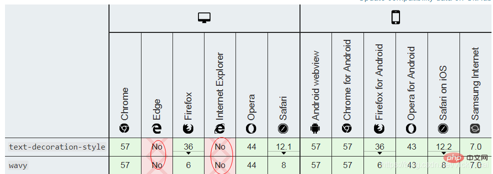
text-decoration 属性的 值。text-decoration 可以同时设置 装饰线的位置,样式 和 颜色.text-decoration的 浏览器支持
IE ,Edge,不支持 text-decoration 为简写
.textdec {
	/*给文本 添加下划线*/
    text-decoration: underline;
    width: 30%;
    background-color: #d0d0d0;
    padding: 10px;
    line-height: 1.5em;
}
.textdec strong {
	/*取消强调文本的下划线*/
    text-decoration: none;
    color: green;
}
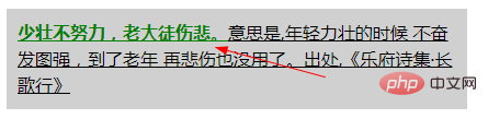
少壮不努力,老大徒伤悲。意思是,年轻力壮的时候 不奋发图强,到了老年 再悲伤也没用了。出处,《乐府诗集·长歌行》
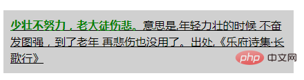
strong 设置了 无下划线strong这里 仍然 显示下划线,不能取消 从父元素继承的 装饰线,并且装饰线 都是黑色的.strong {text-decoration: overline;} 将导致第二次装饰 出现在“一些强调词”上,而且上划线颜色 是子元素 单独设置的字体颜色.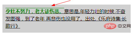
.decline{
    background-color: #d0d0d0;
    text-decoration:underline wavy #008000;

/*	text-decoration-line: underline;
	text-decoration-style:wavy;
	text-decoration-color: green;*/


}
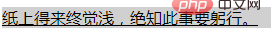
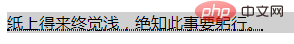
纸上得来终觉浅,绝知此事要躬行。
text-decoration:underline wavy #008000;属性值 前后顺序 不影响.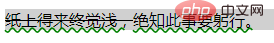
text-decorator-line 设置用于元素中的文本的 装饰类型(即 文本装饰线类型 )。text-decorator-line属性 被指定为 none、一个或多个 空格 分隔的 值。text-decoration-line: none | [ underline || overline || line-through || blink ]
/* 单个 关键字值 Single keyword */
text-decoration-line: none;
text-decoration-line: underline;
text-decoration-line: overline;
text-decoration-line: line-through;
text-decoration-line: blink;

/* 多个 关键字值,同时指定几条装饰线 Multiple keywords */
text-decoration-line: underline overline;               /* Two decoration lines */
text-decoration-line: overline underline line-through;  /* Multiple decoration lines */

/* 全局值  Global values */
text-decoration-line: inherit;
text-decoration-line: initial;
text-decoration-line: unset;
none
underline
overline
line-through
blink(已弃用的 属性值)blink的属性值需要使用 浏览器前缀
.decline{
    background-color: #d0d0d0;
	text-decoration-line: overline;
	/*text-decoration-line: line-through;*/
	/*text-decoration-line: underline;*/
	/*text-decoration-line: blink;*/

}
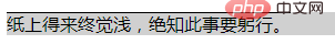
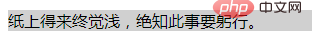
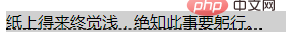
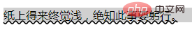
纸上得来终觉浅,绝知此事要躬行。
| 上划线 overline | 删除线(贯穿线) line-through |
|---|---|
 |
 |
| 下划线 underline | 闪烁 (无任何效果,blink 属性值浏览器不支持) |
 |
 |
text-decoration-style
text-decoration-line设定的 线的样式。text-decoration-line 设定的线,不能为 其中的每条线 设置 不同的样式。text-decoration 简写属性 会比分别写多个属性 更方便。text-decoration-style: solid | double | dotted | dashed | wavy
/* 关键字值 Keyword values */
text-decoration-style: solid;
text-decoration-style: double;
text-decoration-style: dotted;
text-decoration-style: dashed;
text-decoration-style: wavy;

/* 全局值 Global values */
text-decoration-style: inherit;
text-decoration-style: initial;
text-decoration-style: unset;
solid
double
dotted
dashed
wavy, 美 /ˈweɪvi/-moz-none(尚未标准化)text-decoration-line: none 替代。IE 不支持, 其他浏览器 需要 浏览器前缀
.decline{
    background-color: #d0d0d0;
	text-decoration-line: underline;
	text-decoration-style:double;
	/*text-decoration-style:dotted;*/
	/*text-decoration-style:dashed;*/
	/*text-decoration-style:wavy;*/

}
| 双实线 double | 点虚线 dotted |
|---|---|
 |
 |
| 直虚线 dashed | 波浪线 wavy |
 |
 |
text-decoration-color
text-decoration-line 属性 为每个元素 应用一种线型,再用 text-decoration-color 指定线的颜色。text-decoration-color : | | | | | | currentcolor | .decline{
background-color: #d0d0d0;
text-decoration-line: underline;
text-decoration-style:wavy;
text-decoration-color: green;
}
.decline del{
text-decoration-line: line-through;
text-decoration-color:red;
}
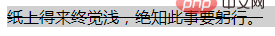
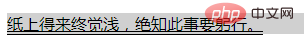
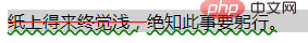
纸上得来终觉浅,绝知此事要躬行。
text-emphasis 美 ['ɛmfəsɪs] , 强调将强调标记 应用于文本(空格 和 控制字符除外)。
简写属性 text-emphasis:
text-emphasis-style 和 text-emphasis-color。text-emphasis 不会重置 text-emphasis-position位置 的值50%.text-emphasis 可能会 影响行高。Kenten Generic OpenType Font” 是一个适合 强调标记的字体text-emphasis: || ;/* 初始值 Initial value */ text-emphasis: none; /* No emphasis marks */ /* 字符串值value */ text-emphasis: 'x'; text-emphasis: '点'; text-emphasis: '\25B2'; text-emphasis: '*' #555; text-emphasis: 'foo'; /* 不应使用。它可以仅被计算为“f” 或呈现为“f” Should NOT use. It may be computed to or rendered as 'f' only */ /* 关键字值 Keywords value */ text-emphasis: filled; text-emphasis: open; text-emphasis: filled sesame; text-emphasis: open sesame; /* 关键词值 与 颜色 相结合 Keywords value combined with a color */ text-emphasis: filled sesame #555; /* 全局值 Global values */ text-emphasis: inherit; text-emphasis: initial; text-emphasis: unset;
text-emphasis 的属性值
none
filled
filled,也没有 open时,这是默认值.open
dot
filled dot: •(U+2022)◦(U+25E6).circle
● (U+25CF)○ (U+25CB).double-circle
◉ (U+25C9),◎ (U+25CE).triangle
▲ (U+25B2)△ (U+25B3).sesame
﹅(U+FE45),﹆ (U+FE46).currentColor。text-emphasis 和 文本装饰线 text-decoration的区别
text-decoration 文本装饰线 属性 不会继承,并且指定的装饰线 将应用于整个元素。text-emphasis 文本强调 会继承,这意味着 可以为后代 更改强调标记。需要浏览器前缀
示例 1: 给一段文字 添加文本强调符号
css
.textemphasis{
    width: 35%;
    /*background-color: #d0d0d0;*/
    padding: 10px;
    border: solid black 2px;
    font-size: 1.2em;
}
.textemphasis strong{
	-webkit-text-emphasis-position:under;
	-webkit-text-emphasis:dot;
	-webkit-text-emphasis:open dot;
	/*-webkit-text-emphasis:circle;*/
	/*-webkit-text-emphasis:open circle;*/
	/*-webkit-text-emphasis:double-circle;*/
	/*-webkit-text-emphasis:open double-circle;*/
	/*-webkit-text-emphasis:triangle;*/
	/*-webkit-text-emphasis:open triangle;*/
	/*-webkit-text-emphasis:sesame;*/
	/*-webkit-text-emphasis:open sesame;*/

	/*指定字符串 作为文本强调的符号*/
	/*-webkit-text-emphasis:"z";*/
	/*-webkit-text-emphasis:"x";*/
	/*-webkit-text-emphasis:"大";*/

    /*同时设置 空心/实心/强调符号/颜色*/
	/*-webkit-text-emphasis: circle open;*/
	/*-webkit-text-emphasis: circle open red;*/


}
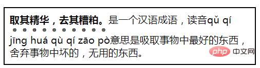
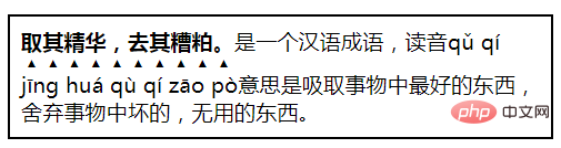
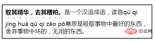
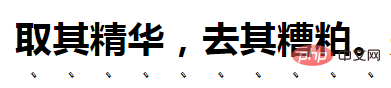
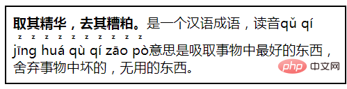
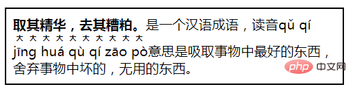
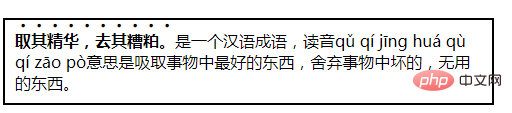
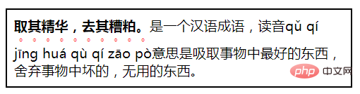
取其精华,去其糟粕。是一个汉语成语,读音qǔ qí jīng huá qù qí zāo pò意思是吸取事物中最好的东西,舍弃事物中坏的,无用的东西。
| 小点: dot = filled dot | 小圆圈: open dot |
|---|---|
 |
 |
| 大点: circle | 大圆圈: open circle |
 |
 |
| 实心 双圆圈: double-circle | 空心 双圆圈: open double-circle |
 |
 |
| 实心 三角形: triangle | 空心 三角形: open triangle |
 |
 |
| 实心 芝麻符: sesame | 空心 芝麻符: open sesame |
 |
 |
| 指定为 英文字符: "z" | 指定为 汉字: "大" |
 |
 |
| 默认 颜色/位置:circle | 指定 颜色/位置: circle open red |
 |
 |
① 默认的位置: 汉语中,不指定位置,文本强调符号的位置 默认 在上方
② 默认: 实心的.
③ 指定字符 不能指定空心/实心:
-webkit-text-emphasis:open "z";,会直接跳过.视觉效果的 区别: 文本小的时候,有些 相同 文本强调符号 区别看起来不明显.
text-emphasis-style
text-emphasis来 设置和重置。text-emphasis-style:none | [ [ filled | open ] || [ dot | circle | double-circle | triangle | sesame ] ] | ;/* 初始值 Initial value */ text-emphasis-style: none; /* 没有强调符号 No emphasis marks */ /* 值 value */ text-emphasis-style: 'x'; text-emphasis-style: '点'; text-emphasis-style: '\25B2'; text-emphasis-style: '*'; text-emphasis-style: 'foo'; /* 不应使用。它可以仅被计算为“f”或呈现为“f” Should NOT use. It may be computed to or rendered as 'f' only */ /* 关键字值 Keywords value */ text-emphasis-style: filled; text-emphasis-style: open; text-emphasis-style: filled sesame; text-emphasis-style: open sesame; /* 全局值 Global values */ text-emphasis-style: inherit; text-emphasis-style: initial; text-emphasis-style: unset;
⑶ 文本强调 形状样式的 属性值**
filled
filled,也没有 open时,这是默认值.open
dot
filled dot: •(U+2022)◦(U+25E6).circle
● (U+25CF)○ (U+25CB).double-circle
◉ (U+25C9),◎ (U+25CE).triangle
▲ (U+25B2)△ (U+25B3).sesame
﹅(U+FE45),﹆ (U+FE46).需要使用 浏览器前缀
text-emphasis-color
text-emphasis 设置此值。text-emphasis-color: | | | | | | currentcolor | ; /* 初始值 Initial value */ text-emphasis-color: currentColor; /* 合法颜色值*/ text-emphasis-color: #555; text-emphasis-color: blue; text-emphasis-color: rgba(90, 200, 160, 0.8); text-emphasis-color: transparent; /* 全局值 Global values */ text-emphasis-color: inherit; text-emphasis-color: initial; text-emphasis-color: unset;
需要 浏览器前缀
text-emphasis-position
text-emphasis-position: [ over | under ] && [ right | left ];/* 初始值 Initial value */ text-emphasis-position: over right; /* 关键字值 Keywords value */ text-emphasis-position: over left; text-emphasis-position: under right; text-emphasis-position: under left; text-emphasis-position: left over; text-emphasis-position: right under; text-emphasis-position: left under; /* 全局值 Global values */ text-emphasis-position: inherit; text-emphasis-position: initial; text-emphasis-position: unset;
over
under
right
left
| 语言 | 文本强调符号的首选位置 | ||||
|---|---|---|---|---|---|
| 水平 书写模式 | 垂直 书写模式 | ||||
| ① 日语 | 上方 over |  |
右边 right |  |
|
| ② 韩语 | |||||
| ③ 蒙古语 | |||||
| ④ 汉语 | 下方 under |  |
右边 right | ||
需要 浏览器前缀
text-indent , 美 /ɪn’dɛnt/text-indent:length|%|inherit;/* 长度值values */ text-indent: 3mm; text-indent: 40px; /* 百分比值 相对于 包含自身的元素的 宽度 value relative to the containing block width */ text-indent: 15%; /* 关键字值 目前尚未标准化 不要使用 Keyword values */ text-indent: 5em each-line; text-indent: 5em hanging; text-indent: 5em hanging each-line; /* 全局值 Global values */ text-indent: inherit; text-indent: initial; text-indent: unset;
length
0。%
inherit
text-indent 属性的值。each-line(实验中属性,尚未标准化)
hanging(实验中属性,尚未标准化)⑸ 文本缩进的 浏览器支持
.textindent {
    width: 40%;
    background-color: #d0d0d0;
    padding: 10px;

    /*设置文本缩进*/
    text-indent: 50px;
/*  text-indent: 3em;
    text-indent: -2em;
    text-indent: 10%;*/

}
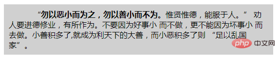
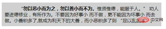
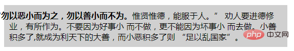
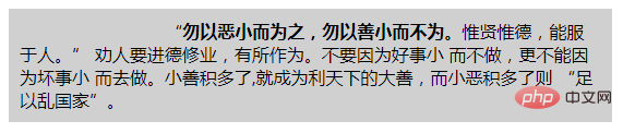
“勿以恶小而为之,勿以善小而不为。惟贤惟德,能服于人。” 劝人要进德修业,有所作为。不要因为好事小 而不做,更不能因为坏事小 而去做。小善积多了,就成为利天下的大善,而小恶积多了则 “足以乱国家”。
文本不设置缩进时的 默认样式
| 绝对值缩进 50px | 相对值缩进 3em |
|---|---|
 |
 |
| 负值缩进 (悬挂缩进) -2em | 百分比缩进 10% |
 |
 |
text-outline attribute. text-outline Properties;
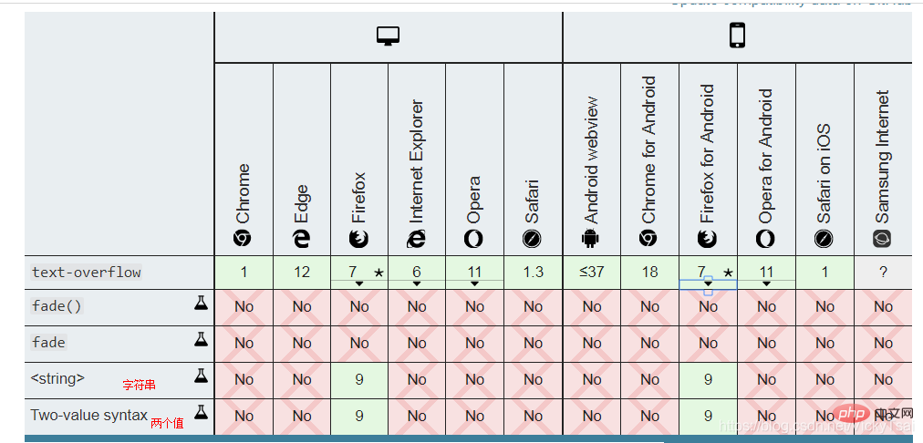
text-overflow 属性的适用对象
text-overflow 和 文本溢出 的关系
overflow,white-space,如 ↓overflow: hidden;white-space: nowrap;
white-space:nowrap)text-overflow: [ clip | ellipsis | ]{1,2}; /* 行尾的 溢出行为 Overflow behavior at line end Right end if ltr, left end if rtl */ text-overflow: clip; text-overflow: ellipsis; text-overflow: "…"; text-overflow: fade; text-overflow: fade(10px); text-overflow: fade(5%); /* 溢出 在左端|在右端的行为 ,方向性 没有影响 Overflow behavior at left end | at right end Directionality has no influence */ text-overflow: clip ellipsis; text-overflow: "…" "…"; text-overflow: fade clip; text-overflow: fade(10px) fade(10px); text-overflow: fade(5%) fade(5%); /* 全局值 Global values */ text-overflow: inherit; text-overflow: initial; text-overflow: unset;
clip
'')ellipsis
…’, U+2026 HORIZONTAL ELLIPSIS)来表示 被截断的文本”。string
'').clip,ellipsis, fade
. fade()函数overflow 和 text-overflow 的区别
overflow
hidden 隐藏scroll 滚动条显示visible溢出显示text-overflow
overflow:hidden,只有这样text-overflow才有效text-overflow的属性值 是建立在 有隐藏的溢出内容 的基础上width: 100%; /*也可以是固定值、min-width这些*/ white-space: nowrap; /*强制文本不能换行*/ overflow: hidden; /*隐藏溢出内容*/ text-overflow: ellipsis;
-ms-text-overflow,和text-overflow作用相同。但是并不推荐这样使用。-o-text-overflow。倒数四个 都是实验中属性,支持度也很差
.textjoverflow{
    width: 30%;
    background-color: #d0d0d0;
    padding: 10px;
    border: solid black 2px;
    font-size: 1.2em;

    /*设置不换行,才会有文本溢出*/
    white-space: nowrap;
    /*设置 overflow 溢出隐藏,文本溢出显示 才有效*/
    overflow: hidden;
    text-overflow: clip;
    /*text-overflow: ellipsis;*/
    /*目前不支持 指定字符串 所以此值无效*/
    /*text-overflow: "";*/

    /*direction: rtl;*/
}
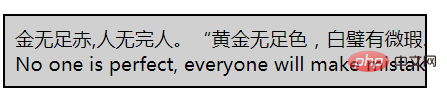
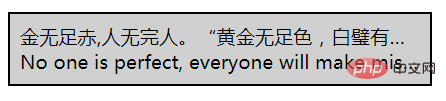
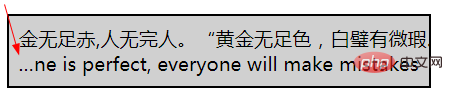
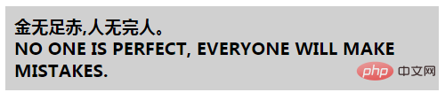
    金无足赤,人无完人。“黄金无足色,白璧有微瑕。求人不求备,妾愿老君家。”
No one is perfect, everyone will make mistakes.
| 默认显示 | 不允许换行时的 默认溢出显示 |
|---|---|
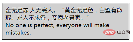 |
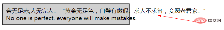 |
| 溢出文本 被隐藏 overflow: hidden; | 隐藏的溢出文本 被裁剪 (默认值) text-overflow: clip; |
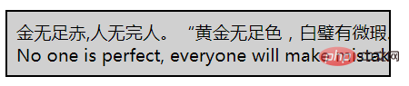 |
 |
| 隐藏的溢出文本 = 省略号 text-overflow: ellipsis; | 文本流向 从右向左 direction: rtl; (行尾溢出) |
 |
 |
text-overflow 有效的 前提
display: block,行内元素不可以white-space: nowrap;
overflow: hidden;
text-overflow 才会有效.text-transform, 美 /trænsˈfɔːrm/text-transform 属性考虑到 特定于语言的 案例映射规则,如以下所示:i: Turkish (tr), Azerbaijani (az), Crimean Tatar (crh), Volga Tatar (tt), and Bashkir (ba),有两种 i,带点和不带点,两个大小写配对i/İ和ı/I.
ß 的大写 变成SS
ij 变成 IJ,即使只设置 首字母大写 text-transform: capitalize
ά/Α, (ή/Ή 除外).άι/ΑΪ
σ and ς
ς 仅在西格玛 终止一个单词时使用Σ 转化成 小写西格玛时 text-transform: lowercase,浏览器 需要根据上下文 选择正确的小写形式。text-transform:none|capitalize|uppercase|lowercase|inherit;/* 关键字值 Keyword values */ text-transform: none; text-transform: capitalize; text-transform: uppercase; text-transform: lowercase; text-transform: full-width; text-transform: full-size-kana; /* 全局值 Global values */ text-transform: inherit; text-transform: initial; text-transform: unset;
none
capitalize
uppercase
lowercase
inherit
text-transform 属性的值。w3-school” 可以用两种方式显示:W3-school” 和 “W3-School”。.texttransform{
width: 35%;
background-color: #d0d0d0;
padding: 10px;
font-weight: bold;
font-size: 1.2em;
/*改变文本的大小写*/
/*text-transform:capitalize;*/
/*text-transform:uppercase;*/
/*text-transform:lowercase;*/
}
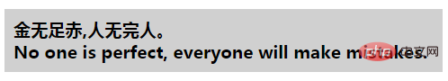
    金无足赤,人无完人。
No one is perfect, everyone will make mistakes.
| 默认样式 | 首字母大写 capitalize |
|---|---|
 |
 |
| 全大写 uppercase | 全小写 lowercase |
 |
 |
text-shadow
text-decoration 添加阴影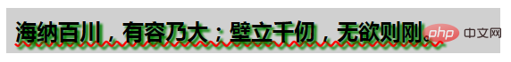
text-shadow: h-shadow v-shadow blur color;
/* x 偏移量 offset-x | y 偏移量 offset-y | 模糊半径 blur-radius | 颜色 color */
text-shadow: 1px 1px 2px black;

/* color | offset-x | offset-y | blur-radius */
text-shadow: #fc0 1px 0 10px;

/* offset-x | offset-y | color */
text-shadow: 5px 5px #558abb;

/* color | offset-x | offset-y */
text-shadow: white 2px 5px;

/* offset-x | offset-y
/* 使用默认的 颜色和模糊半径 */
text-shadow: 5px 10px;

/* 全局值 Global values */
text-shadow: inherit;
text-shadow: initial;
text-shadow: unset;
正值:右下方,负值:左上方
① 水平阴影 偏移量(必需): h-shadow
② 垂直阴影 偏移量( 必需): v-shadow
0,则 阴影位于文字 正后方
③ 模糊距离: blur
0。④ 阴影颜色: color
UA(用户代理)自行选择的颜色。,分隔 的 阴影列表0。⑸ 阴影 应用顺序: 当所给的阴影 大于 1 个时,阴影应用的顺序 为 从前到后
⑹ 文本阴影 适用的伪元素:
::first-line 以及::first-letter 伪元素.6-9 个文本阴影。模糊半径 限制为 100px。color 属性值。IE 10 才开始支持
.textshadow{
    width: 40%;
    background-color: #d0d0d0;
    padding: 10px;
    font-weight: bold;
    font-size: 1.5em;

    text-shadow:3px 3px green ;
}
海纳百川,有容乃大;壁立千仞,无欲则刚。
| 设置 水平和垂直阴影 text-shadow:3px 3px; | 设置指定颜色的 水平和垂直阴影 |
|---|---|
 |
 |
| 设置 带模糊距离的 x,y 阴影偏移量 text-shadow:3px 3px 1px green; | 加大模糊半径 text-shadow:3px 3px 10px green; |
 |
 |
| x 阴影偏移量 负值 (向左偏移) | y 阴影偏移量 负值 (向上偏移) |
 |
 |
text-shadow:3px green;
text-shadow:3px 3px green;
text-wrap 属性。text-wrap 属性text-wrap: normal|none|unrestricted|suppress;unicode-bidi 属性和direction 属性搭配, 决定 如何处理文档中 的 双向文本 (双向文本 处理)。Unicode统一码算法 来决定 如何显示文本。unicode-bidi 属性 覆盖了 这个 Unicode统一码算法,允许开发人员 控制文本嵌入。all属性影响: unicode-bidi 与 direction 是仅有的两个 不受 all 属性 影响的属性。unicode-bidi:normal | embed | isolate | bidi-override | isolate-override | plaintext;/* 关键字值 Keyword values */ unicode-bidi: normal; unicode-bidi: embed; unicode-bidi: isolate; unicode-bidi: bidi-override; unicode-bidi: isolate-override; unicode-bidi: plaintext; /* 全局值 Global values */ unicode-bidi: inherit; unicode-bidi: initial; unicode-bidi: unset;
unicode-bidi的 属性值
normal
embed
direction 属性给出。direction 属性的值 指定嵌入层的方向,在对象内部 进行 隐式 重排序
bidi-override
direction属性 严格 按顺序 重新排序;direction attributeisolate
isolate-override
isolation keyword's isolation behavior to surrounding content
bidi-override keyword's override Behavior applies to internal content
plaintext
direction attribute. P2 and P3 rules of the Unicode bidirectional algorithm. Unicodebidirectional algorithm. unicode-bidi browser support
The support for the latest 3 attribute values is not good, so use the prefix
attribute, set the normal, embed, bidi-override attribute value for a piece of text respectively. When the text flow direction is from left to right: | When the text flows from right to left: direction: rtl; (with normal value) | ||||||||||||||||||||||||||||||||||||||||||||||||||||||||||||||||||||
|---|---|---|---|---|---|---|---|---|---|---|---|---|---|---|---|---|---|---|---|---|---|---|---|---|---|---|---|---|---|---|---|---|---|---|---|---|---|---|---|---|---|---|---|---|---|---|---|---|---|---|---|---|---|---|---|---|---|---|---|---|---|---|---|---|---|---|---|---|
 |
 | ##Embed, do not rewrite/override unicode-bidi: embed;|||||||||||||||||||||||||||||||||||||||||||||||||||||||||||||||||||
 |
 |
| 默认显示 = word-break: normal; | 任意处断行(可单词内断行) word-break: break-all; |
|---|---|
 |
 |
| 不能单词内断行 (中日韩 不断行) word-break: keep-all; | 单词处断行 = = word-break: normal; |
|
|
⑴ 单词 断行时的 断行方式 : word-wrap 属性
⑵ 重命名和别名:
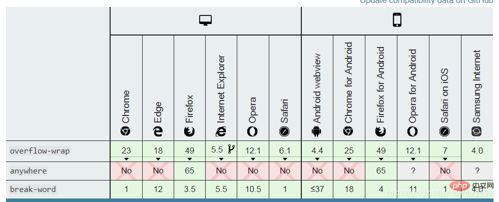
word-wrap 属性 原本属于微软的 一个私有属性overflow-wrap。word-wrap 现在被当作 overflow-wrap 的 “别名”。word-wrap 属性名,目前 浏览器支持度更好些.word-wrap: normal | break-word | anywhere;/* 关键字值 Keyword values */ overflow-wrap: normal; overflow-wrap: break-word; overflow-wrap: anywhere; /* 全局值 Global values */ overflow-wrap: inherit; overflow-wrap: initial; overflow-wrap: unset;
normal
break-word
anywhere (浏览器支持度 很差,不要使用)word-break 和 word-wrap的 区别 .word 单词 的概念word-break强调的是: 能否 单词内的断句,范围是 全部文本.word-wrap 强调的是: 单词内 断句方式,范围是 需要断句的文本.word-wrap:break-word 与 word-break:break-all 共同点:word-wrap:break-word : 会 先起一个新行 来放置长单词,新的行 还是放不下这个长单词 则会对长单词 进行强制断句;word-break:break-all: 不会 把长单词 放在一个新行里,当这一行 放不下的时候 就直接 强制断句了。word-wrap名称, 比 overflow-wrap属性名 浏览器支持度更好anywhere 属性值 不要使用,支持度很差
.wordbreak{
width: 20%;
background-color: #d0d0d0;
padding: 10px;
border: solid black 2px;
font-size: 1.2em;
/*单词换行处 设置*/
/*word-break: normal;*/
/*word-break: break-all;*/
/*word-break: keep-all;*/
/*word-break: break-word;*/
}
.wordwrap{
/*单词 断行位置*/
/*word-wrap: normal;*/
/*word-wrap: break-word;*/
}
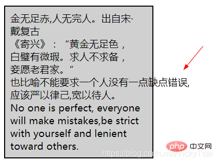
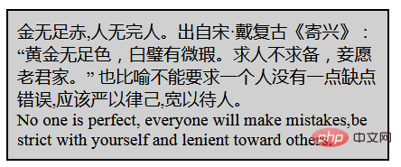
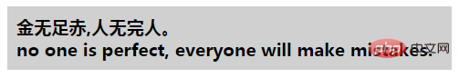
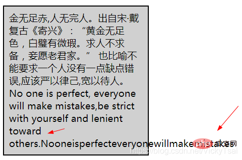
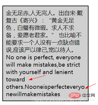
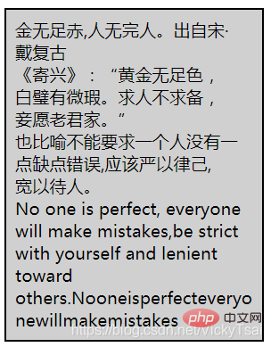
    金无足赤,人无完人。出自宋·戴复古《寄兴》:“黄金无足色,白璧有微瑕。求人不求备,妾愿老君家。” 也比喻不能要求一个人没有一点缺点错误,应该严以律己,宽以待人。
No one is perfect, everyone will make mistakes,be strict with yourself and lenient toward others.Nooneisperfecteveryonewillmakemistakes
word-break: normal; = word-wrap: normal;
| 可词内断行 word-break: break-all; | 长单词 强制断行 word-wrap: break-word; |
|---|---|
 |
 |
| 不允许 词内断行 word-break: keep-all; | 同时设置 不允许 词内断行 word-break: keep-all; 和 强制长单词 断行 word-wrap: break-word; |
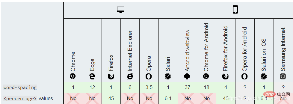
 |
 |
word-break: break-all; 和 长单词 强制断行 word-wrap: break-word;
word-break: keep-all; 和 强制长单词 断行 word-wrap: break-word;
word-spacing 属性word-spacing:normal| | |inherit; /* 关键字值 Keyword value */ word-spacing: normal; /* 长度值values */ word-spacing: 3px; word-spacing: 0.3em; /* 百分比值 values */ word-spacing: 50%; word-spacing: 200%; /* 全局值 Global values */ word-spacing: inherit; word-spacing: initial; word-spacing: unset;
normal
word-spacing: 0;
length
inherit
word-spacing 属性的值。⑷ 单词/字间距的 浏览器支持
.wordspace {
    width: 25%;
    background-color: #d0d0d0;
    padding: 10px;
    border: solid black 2px;
    font-size: 1.1em;

    /*设置单词/字 之间的距离*/
    word-spacing: normal;
    /*word-spacing:4px;*/
    /*word-spacing:-4px;*/
    /*word-spacing:1em;*/
    /*word-spacing:-1em;*/
    /*百分比值 目前各大主流浏览器 不支持*/
    /*word-spacing:10%;*/
}
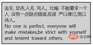
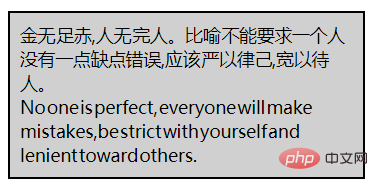
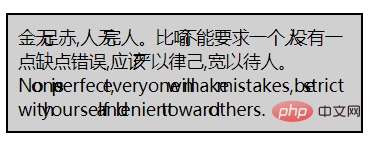
    金无 足赤,人无 完人。比喻 不能要求一个人 没有一点缺点错误,应该 严以律己,宽以待人。

No one is perfect, everyone will make mistakes,be strict with yourself and lenient toward others.
word-spacing: normal;
word-spacing 的影响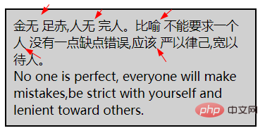
| 单词/字间距 增加 word-spacing:4px; | 单词/字间距 减少 word-spacing:-4px; |
|---|---|
 |
 |
| 单词/字间距 增加 word-spacing:1em; | 单词/字间距 减少 word-spacing:-1em; |
 |
 |
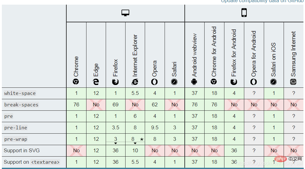
white-space 属性pre-wrap 和 pre-line 是 CSS 2.1 中新增的。white-space:normal|nowrap |pre|pre-line||pre-wrap| inherit;/* 关键字值 Keyword values */ white-space: normal; white-space: nowrap; white-space: pre; white-space: pre-wrap; white-space: pre-line; white-space: break-spaces; /* 全局值 Global values */ white-space: inherit; white-space: initial; white-space: unset;
normal
nowrap
pre
pre-wrap
pre-line
break-spaces
pre-wrap的行为 相同,除了:inherit
white-space 属性的值。white-space 属性值 之间的区别
| 属性值 | 换行 | 空格和制表符 | 自动换行 | 行尾空格 |
|---|---|---|---|---|
normal |
合并 | 合并 | 自动换行 | 删除 |
nowrap |
合并 | 合并 | 不自动换行 | 删除 |
pre |
保留 | 保留 | 不自动换行 | 保留 |
pre-wrap |
保留 | 保留 | 自动换行 | Hang |
pre-line |
保留 | 合并 | 自动换行 | 删除 |
break-spaces |
保留 | 保留 | 自动换行 | Wrap 保留的空格字符后 都存在换行机会 |
① 默认值 normal 和 nowrap 的区别
normal还可以 在文本需要换行时,自动换行, nowrap 则不可以自动换行,没有
② pre 和 pre-wrap的 区别
pre-wrap 增加了 自动换行, 可以 在文本需要换行时,自动换行, pre 则不可以.③ pre 和 pre-line的 区别
pre-line 不保留空格,且增加了 自动换行④ 不换行 nowrap 和 预格式 pre的共同点
⑸ 空白/换行处理的 浏览器支持
.whitespace{
	width: 25%;
    background-color: #d0d0d0;
    padding: 10px;
    border: solid black 2px;
    font-size: 1.1em;

    white-space:normal;
    white-space:nowrap;
    white-space:pre;
    white-space:pre-wrap;
    white-space:pre-line;
    /*white-space:break-space;*/

}
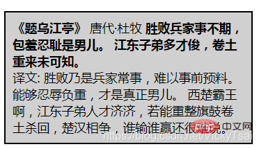
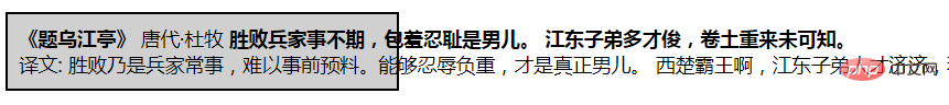
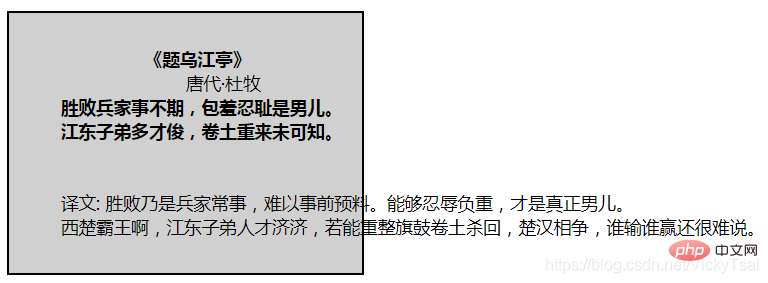
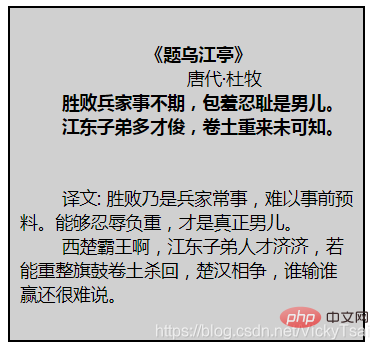
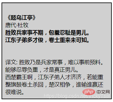
                        《题乌江亭》
                                唐代·杜牧
        胜败兵家事不期,包羞忍耻是男儿。
        江东子弟多才俊,卷土重来未可知。


        译文: 胜败乃是兵家常事,难以事前预料。能够忍辱负重,才是真正男儿。
        西楚霸王啊,江东子弟人才济济,若能重整旗鼓卷土杀回,楚汉相争,谁输谁赢还很难说。
white-space:normal;
| 不换行 white-space:nowrap; | 预格式 保留空格和换行 white-space:pre; |
|---|---|
 |
 |
| 预格式+自动换行 white-space:pre-wrap; | 只保留换行+自动换行 white-space:pre-line; |
 |
 |
(学习视频分享:web前端入门)
The above is the detailed content of Detailed explanation of CSS text properties (Text). For more information, please follow other related articles on the PHP Chinese website!
 ##
##