Home > Article > Web Front-end > How to achieve check mark effect with css

To achieve the check mark effect, one idea is to use ready-made symbols, directly search for √ on the Internet, and insert it into the page. Another idea is to use CSS to introduce this article. The idea is:
(Related recommendations: css video tutorial)
Set the width and height of block-level elements
Set two adjacent borders of elements
Rotate elements
HTML
Analysis:
You need to use block level here Element
does not need to set the element content
CSS
.check-style-unequal-width {

    width: 8px;

    height: 16px;

    border-color: #009933;

    border-style: solid;

    border-width: 0 3px 5px 0;

    transform: rotate(45deg);

}
Analysis:
Set the width and height to get a rectangular effect, and there is no content in the rectangle
Set the style of the adjacent border and get the general outline of the check mark
Use the rotation attribute to successfully get the check mark
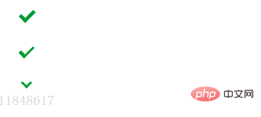
The running effect

Analysis:
As shown in the picture above, the first is the checkmark effect of two lines with equal width, the second is the checkmark effect of two lines with unequal width; the third is A check mark effect with two lines of equal width and length. For detailed implementation, please refer to check source code.
Note:
It is useless to directly set the width and height of row-level elements. You need to set its display to make it a block-level element. For example: span needs to set the display to inline-block to be suitable for this example
You can adjust the element width and height according to actual needs
You can set different borders and adjacent borders according to actual needs The width of
can be simply modified for this effect, acting on the pseudo-elements ::before and ::after. You can refer to ::before & ::after
Recommended tutorial: CSS tutorial
The above is the detailed content of How to achieve check mark effect with css. For more information, please follow other related articles on the PHP Chinese website!