
Home > Article > Web Front-end > How to implement CSS button? Introduction to several methods of CSS button implementation

In order to make the web page beautiful, sometimes we may need to implement button effects, so in this article we will introduce several implementation methods of CSS buttons. Friends in need can refer to them.
#The structure of all these buttons in this article only requires one anchor tag, since we will use the ::before pseudo-class to create the other elements.
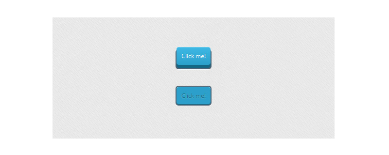
Example 1:
First, we will give the general style of the button, including its active state. It is important to pay attention to relative positioning as it will help us position the ::before element later:
CSS
.a_demo_one {
	background-color:#ba2323;
	padding:10px;
	position:relative;
	font-family: 'Open Sans', sans-serif;
	font-size:12px;
	text-decoration:none;
	color:#fff;
	border: solid 1px #831212;
	background-image: linear-gradient(bottom, rgb(171,27,27) 0%, rgb(212,51,51) 100%);
	border-radius: 5px;
}

.a_demo_one:active {
	padding-bottom:9px;
	padding-left:10px;
	padding-right:10px;
	padding-top:11px;
	top:1px;
	background-image: linear-gradient(bottom, rgb(171,27,27) 100%, rgb(212,51,51) 0%);
}
Then, we create the gray container using the ::before pseudo-element. Use absolute positioning to position our elements:
CSS
.a_demo_one::before {
	background-color:#ccd0d5;
	content:"";
	display:block;
	position:absolute;
	width:100%;
	height:100%;
	padding:8px;
	left:-8px;
	top:-8px;
	z-index:-1;
	border-radius: 5px;
	box-shadow: inset 0px 1px 1px #909193, 0px 1px 0px #fff;
}
Example 2:
CSS
.a_demo_two {
	background-color:#6fba26;
	padding:10px;
	position:relative;
	font-family: 'Open Sans', sans-serif;
	font-size:12px;
	text-decoration:none;
	color:#fff;
	background-image: linear-gradient(bottom, rgb(100,170,30) 0%, rgb(129,212,51) 100%);
	box-shadow: inset 0px 1px 0px #b2f17f, 0px 6px 0px #3d6f0d;
	border-radius: 5px;
}

.a_demo_two:active {
	top:7px;
	background-image: linear-gradient(bottom, rgb(100,170,30) 100%, rgb(129,212,51) 0%);
	box-shadow: inset 0px 1px 0px #b2f17f, inset 0px -1px 0px #3d6f0d;
	color: #156785;
	text-shadow: 0px 1px 1px rgba(255,255,255,0.3);
	background: rgb(44,160,202);
}
Due to pseudo elements The position of the element depends on its parent element, so once the parent element is moved down a few pixels, the pseudo element with the same number of pixels must be moved up.
CSS
.a_demo_two::before {
	background-color:#072239;
	content:"";
	display:block;
	position:absolute;
	width:100%;
	height:100%;
	padding-left:2px;
	padding-right:2px;
	padding-bottom:4px;
	left:-2px;
	top:5px;
	z-index:-1;
	border-radius: 6px;
	box-shadow: 0px 1px 0px #fff;
}

.a_demo_two:active::before {
	top:-2px;
}
Example 3:
The first thing we need to do is create the simple part. Here you'll notice a right margin, this is to compensate for the width of the pseudo element if you want the button to be centered.
.a_demo_three {
	background-color:#3bb3e0;
	font-family: 'Open Sans', sans-serif;
	font-size:12px;
	text-decoration:none;
	color:#fff;
	position:relative;
	padding:10px 20px;
	border-left:solid 1px #2ab7ec;
	margin-left:35px;
	background-image: linear-gradient(bottom, rgb(44,160,202) 0%, rgb(62,184,229) 100%);
	border-top-right-radius: 5px;
	border-bottom-right-radius: 5px;
	box-shadow: inset 0px 1px 0px #2ab7ec, 0px 5px 0px 0px #156785, 0px 10px 5px #999;
}

.a_demo_three:active {
	top:3px;
	background-image: linear-gradient(bottom, rgb(62,184,229) 0%, rgb(44,160,202) 100%);
	box-shadow: inset 0px 1px 0px #2ab7ec, 0px 2px 0px 0px #156785, 0px 5px 3px #999;
}
Then there are pseudo elements:
.a_demo_three::before {
	content:"·";
	width:35px;
	max-height:29px;
	height:100%;
	position:absolute;
	display:block;
	padding-top:8px;
	top:0px;
	left:-36px;
	font-size:16px;
	font-weight:bold;
	color:#8fd1ea;
	text-shadow:1px 1px 0px #07526e;
	border-right:solid 1px #07526e;
	background-image: linear-gradient(bottom, rgb(10,94,125) 0%, rgb(14,139,184) 100%);
	border-top-left-radius: 5px;
	border-bottom-left-radius: 5px;
	box-shadow:inset 0px 1px 0px #2ab7ec, 0px 5px 0px 0px #032b3a, 0px 10px 5px #999 ;
}

.a_demo_three:active::before {
	top:-3px;
	box-shadow:inset 0px 1px 0px #2ab7ec, 0px 5px 0px 0px #032b3a, 1px 1px 0px 0px #044a64, 2px 2px 0px 0px #044a64, 2px 5px 0px 0px #044a64, 6px 4px 2px #0b698b, 0px 10px 5px #999 ;
}
This article is all over here. For more exciting content, you can pay attention to the CSS video tutorial on the PHP Chinese website. Column! ! !
The above is the detailed content of How to implement CSS button? Introduction to several methods of CSS button implementation. For more information, please follow other related articles on the PHP Chinese website!