
Home > Article > Web Front-end > 4 functions implemented by the transform attribute in CSS3 (rotation, scaling, tilting, and moving)

What this article brings to you is about the four functions (rotation, scaling, tilt, and movement) implemented by the transform attribute in CSS3. It has certain reference value. Friends in need can refer to it. Hope it helps.
In CSS3, you can use the transform function to achieve four types of deformation: rotation, scaling, tilting, and movement of text or images. deal with.
(1) Browser support
So far: Safari3.1 or above, Chrome8 or above, Firefox4 or above, Opera10 or above browsers support this attribute.
Use the rotate method and add the angle value to the parameter. The angle value is followed by the "deg" text indicating the angle unit. Rotate The direction is clockwise.
transform:rotate(45deg);
Use the scale method to implement scaling of text or images, and specify the scaling ratio in the parameters.
transform:scale(0.5);//缩小一半
(1) You can specify the horizontal magnification and vertical magnification of the element respectively
transform:scale(0.5,2);//水平方向缩小一半,垂直方向放大一倍。
Use the skew method To implement tilt processing of text or images, specify the tilt angle in the horizontal direction and the tilt angle in the vertical direction in the parameters.
transform:skew(30deg,30deg);//水平方向上倾斜30度,垂直方向上倾斜30度。
(1) Only use one parameter and omit the other parameter
In this case, it is regarded as tilting only in the horizontal direction and not in the vertical direction.
transform:skew(30deg);
Use the translate method to move text or images, and specify the moving distance in the horizontal direction and the moving distance in the vertical direction in the parameters.
transform:translate(50px,50px);// 水平方向上移动50px,垂直方向上移动50px
(1) Only use one parameter and omit the other parameter
In this case, it is regarded as moving only in the horizontal direction and not in the vertical direction.
transform:translate(50px);
transform:translate(150px,200px) rotate(45deg) scale(1.5);
When using When the transform method deforms text or images, it uses the center point of the element as the base point for deformation.
Use this attribute to change the base point of deformation.
transform:rotate(45deg);
transform-origin:left bottom;//把基准点修改为元素的左下角
(1) Specify the attribute value
The position of the reference point in the horizontal direction of the element: left, center, right
The position of the reference point in the vertical direction of the element: top, center, bottom
(1) Rotation
Use rotateX method, rotateY method, rotateZ method respectively to surround the element To rotate the X-axis, Y-axis, and Z-axis, add the angle value to the parameters. The angle value is followed by the deg text indicating the angle unit. The rotation direction is clockwise.
transform:rotateX(45deg);
transform:rotateY(45deg);
transform:rotateZ(45deg);
transform:rotateX(45deg) rotateY(45deg) rotateZ(45deg);
transform:scale(0.5) rotateY(45deg) rotateZ(45deg);
(2) Scaling
Use the scaleX method, scaleY method, and scaleZ method respectively to scale the element according to the X-axis, Y-axis, and Z-axis, and specify the scaling ratio in the parameters.
transform:scaleX(0.5);
transform:scaleY(1);
transform:scaleZ(2);
transform:scaleX(0.5)scaleY(1);
transform:scale(0.5) rotateY(45deg);
(3) Tilt
Use the skewX method and skewY method respectively to tilt the element clockwise on the X-axis and Y-axis (no skewZ method), and specify the tilt in the parameters Angle
transform:skewX(45deg);
transform:skewY(45deg);
(4) Movement
Use the translateX method, translateY method, and translateZ method respectively to move the element in the X-axis, Y-axis, and Z-axis directions, and add movement in the parameters distance.
transform:translateX(50px);
transform:translateY(50px);
transform:translateZ(50px);
There is a corresponding matrix behind each transformation method.
(1) Calculate 2D deformation (3 ,b,c,d,e,f), a~f all represent a number, used to decide how to perform deformation processing.
(2) Translation 2D matrix
//效果一致:右移150px,下移150px
transform:matrix(1,0,0,1,150,150);
transform:translate(150px,150px);
(3) Calculate 3D deformation
4X4 matrix used for 3D scaling deformation
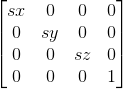
transform:matrix3d(sx,0,0,0,0,sy,0,0,0,0,sz,0,0,0,0,1);
//效果一致:X轴方向上缩小五分之一,Y轴方向上缩小一半。
transform:scale3d(0.8,0.5,1);
transform:matrix3d(0.8,0,0,0,0,0.5,0,0,0,0,1,0,0,0,0,1);
(4)可通过矩阵执行多重变形处理
将需要的变形矩阵相乘得到一个新的变形矩阵可实现该处理。
相关推荐:
CSS3的transform属性_html/css_WEB-ITnose
CSS3的属性transition、animation、transform
The above is the detailed content of 4 functions implemented by the transform attribute in CSS3 (rotation, scaling, tilting, and moving). For more information, please follow other related articles on the PHP Chinese website!