Home > Article > Web Front-end > One of the methods to develop CSS3 flexible box model
This article mainly shares CSS3 flexible box model development notes with everyone, and introduces compatibility and different attributes. Interested friends can refer to
Flexible Box Model (Flexible Box Moudle), a model used to decide how elements are distributed in a box and to deal with the available space in the box. This is similar to XUL (the user interaction language of the Firefox browser), and other languages use the same box model. Such as XAML, GladeXML, etc. The flexbox model makes it easy to create a fluid layout that adapts to the browser window or a flex layout that adapts to the font size.
Compatibility: The flexible box model specification was released by the W3C standardization organization in 2009. Currently, no mainstream browser supports it, but it uses Webkit and Mozilla rendering engine browsers have customized a set of private properties to support the flexible box model.
Browsers that use the Webkit rendering engine mainly include Safari and Chrome browsers. The engine supports private attributes prefixed with -webkit.
The browsers of Mozilla rendering engine mainly include Firefox browser, which supports private attributes prefixed with -moz.
Related attributes:
box-align: Define the space allocation method of child elements in the vertical direction of the box
box-direction: Define the display order of the box
box-flex: Define the adaptive size of sub-elements in the box
box-flex-group: Define adaptive sub-element groups
box-lines: Define sub-elements to be displayed in columns
box-ordinal-group: Define sub-elements The display position of the element in the box
box-orient: Defines the coordinate axis of the box division
box-pack: Defines the horizontal space allocation method of child elements in the box
box -orient attribute
This attribute can be used to define the flow layout direction inside the box element. When using the flexible box model, you need to first set the display attribute of the parent container to box or inline-box.
Grammar:
box-orient: horizontal | vertail | inline-axis | block-axis | inherit
Simple description of value:
horizontal: box element from Displays its child elements in a horizontal line from left to right.
vertail: The box element displays its child elements in a vertical line from top to bottom.
inline-axis: The box element displays its child elements along the inline axis.
block-axis: The box element displays its child elements along the block axis.
Practical experience: designing multi-column layout
html code:
CSS3 code:
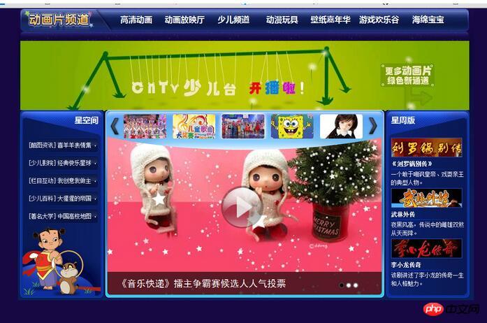
Demonstration effect:

box-direction attribute
The box-direction attribute can change the flow order of internal elements in the box element. The basic syntax of this attribute:
box -direction: normal | reverse | inherit
Simple description of the value:
normal: normal display order, that is, if the box-origent attribute value of the box element is horizontal, then the child elements it contains Displayed in order from left to right, that is, the left side of each child element is always close to the right side of the previous child element; if the box-origent attribute value of the box element is set to vertical, the child elements it contains are arranged in order from top to bottom. Displayed in sequence.
reverse: Reverse display, the display order of the sub-elements contained in the box will be reversed from normal.
inherit: Inherit the display order of superior elements.
Practical experience: Reverse layout web page (based on the above case):
CSS3 code:
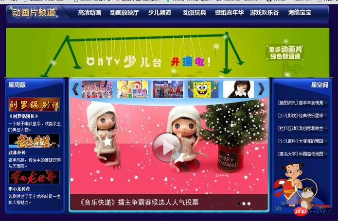
Demonstration effect:

box-ordinal-group attribute
The box-direction attribute can change the flow order of elements inside the box, and the box-ordinal-group attribute can set the position of each child element. The specific display position in the box, the syntax is as follows:
box-ordinal-group: 979e7f42ea08258251c39ffe96b911f2
Value description:
The attribute value is a natural number, starting from 1 Start, used to set the position symbol of the child element. The distribution of child elements will be arranged from small to large according to this attribute value. By default, child elements will be arranged based on the element's position.
Note: If there is no child element with a box-ordinal-group attribute value specified, its serial number defaults to 1, and elements with the same serial number will be arranged in the order in which they are loaded in the document.
Practical experience: vertical web page layout
HTML code:
CSS3 code:
Demonstration effect

The above is the entire content of this article. I hope it will be helpful to everyone's study. For more related content, please pay attention to the PHP Chinese website!
Related recommendations:
Use CSS3 to realize the cool Black Cat Sheriff homepage
Use CSS to realize pure English numbers Automatic line wrapping
The above is the detailed content of One of the methods to develop CSS3 flexible box model. For more information, please follow other related articles on the PHP Chinese website!