
Home > Article > Web Front-end > Pure CSS to achieve speech and voice bubble effects

This article mainly introduces the bubble effect of speech and voice using pure CSS. It has a certain reference value. Now I share it with you. Friends in need can refer to it.
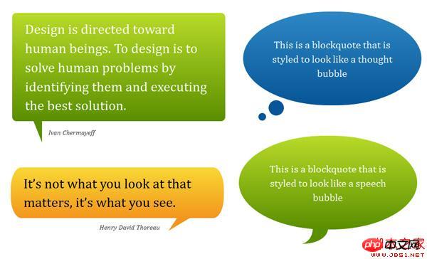
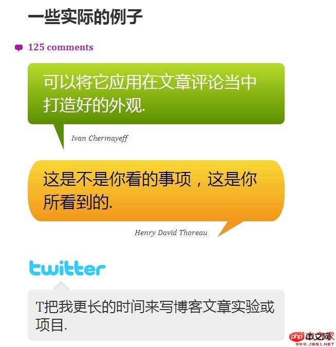
Speech bubbles are a very Popular effects, you can see comments on many social networking sites using this effect, which is very attractive to visitors; it is very troublesome to rely on HTML or JavaScript to achieve it; it is built purely with CSS3, without using images, without JavaScript , it can be applied to your existing HTML
Speech bubbles are a very popular effect. You can see comments using this effect on many social networking sites, which is very attractive to tourists. Powerful, but I find that many of these effects rely on HTML or JavaScript to achieve very troublesome. This tutorial covers various forms of progressively enhanced bubble effects created using CSS 2.1 and CSS3. Built with pure CSS3, no images, no JavaScript, it can be applied to your existing HTML.
Demo: Pure CSS Bubble
Supports: Firefox 3.5, Safari 4, Chrome 4, Opera 10, IE8..
Progressive Enhancement and Pseudo-Elements
With simple e388a4556c0f65e1904146cc1a846beeContent94b3e26ee717c64999d7867364b1b4a3 or e388a4556c0f65e1904146cc1a846beeContent94b3e26ee717c64999d7867364b1b4a3 code, you can produce a speech bubble effect, such as:
Add a child element, for example b8a712a75cab9a5aded02f74998372b4e388a4556c0f65e1904146cc1a846beeQuote94b3e26ee717c64999d7867364b1b4a31aee16100a65d522474e4de7ff568f4aYou can even create a speech bubble effect, such as:
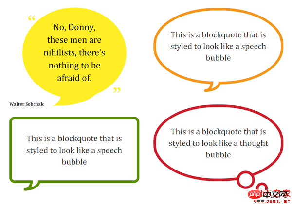
You can add the speech bubble effect according to your needs. Modify and create your own element code based on some examples. The key is to use the :before and :after pseudo-elements to generate basic shapes.
More complex shapes and orientations can be generated by applying CSS3 properties such as the border-radius property and transform.
Sample Code
This is an example of how to create a basic speech bubble shape. For further examples, you can view the demo page and CSS file,
/* Bubble with an isoceles triangle
------------------------------------------ */
.triangle-isosceles {
position:relative;
padding:15px;
margin:1em 0 3em;
color:#000;
background:#f3961c;
/* css3 */
-moz-border-radius:10px;
-webkit-border-radius:10px;
border-radius:10px;
background:-moz-linear-gradient(top, #f9d835, #f3961c);
background:linear-gradient(top, #f9d835, #f3961c);
}
/* creates triangle */
.triangle-isosceles:after {
content:"";
display:block; /* reduce the damage in FF3.0 */
position:absolute;
bottom:-15px;
left:50px;
width:0;
border-width:15px 15px 0;
border-style:solid;
border-color:#f3961c transparent;
}
Notes on gradual enhancement
This method is progressive enhancement. We see the style layer: "simple colored box, rounded rectangle or circle with gradient background. These browser styles, they are able to render.
IE6 and IE7 do not support CSS2.1 pseudo-elements, All :before and :after declarations will be ignored. They have no enhancements, but retain the basic usage habits...
Warning about Firefox 3.0
Although Firefox 3.0 supports CSS2.1 Pseudo elements but their positioning is not supported.
The above is the entire content of this article. I hope it will be helpful to everyone's learning. For more related content, please pay attention to the PHP Chinese website!
Related recommendations:
CSS3 Chinese text hollowing, transparency value and shadow effect settings
Use CSS3 click button to achieve the effect of background gradient animation
The above is the detailed content of Pure CSS to achieve speech and voice bubble effects. For more information, please follow other related articles on the PHP Chinese website!