
Home > Article > Web Front-end > CSS sets the style of the Checkbox checkbox
This time I will bring you the style of CSS setting Checkboxcheckbox, what are the notes of setting the style of Checkbox checkbox with CSS, the following is a practical case, let's take a look take a look.
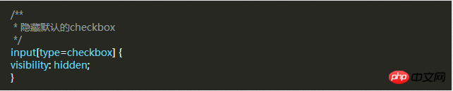
First, you need to add a piece of CSS to hide all Checkbox checkboxes. Next we will change its appearance. To do this you need to add a piece of code to your CSS file.
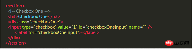
After hiding all the Checkbox check boxes, we need to add a label HTML element, we all know that when clicked there is a for attribute label, the corresponding Checkbox checkbox will be selected. This means that we can handle our Checkbox through the label's click event .
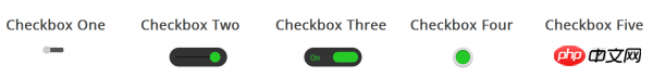
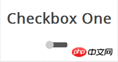
Style 1
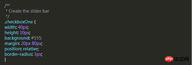
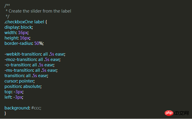
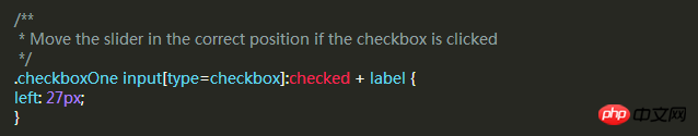
Style 2

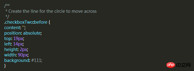
:before pseudo-class .
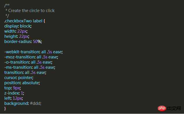
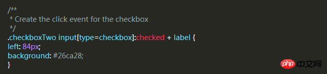
background attributes of the label when selected.
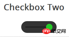
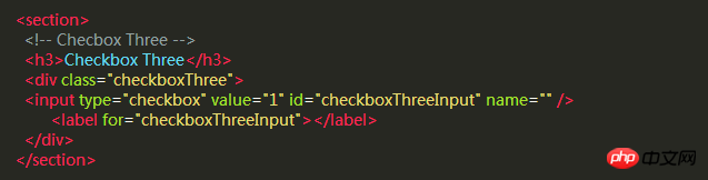
Style Three
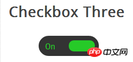
The style of this check box is more complex than style two. It will slide left and right like the previous example, and when changing the selected and unselected state, the slider slides to On the other side, the corresponding text is displayed in its original position.
First, we write the HTML code, which is the same as before.
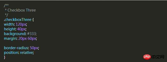
Then, we use p as the slider in the same way. The following code will create a black rounded strip where we can place the slider and text. in.
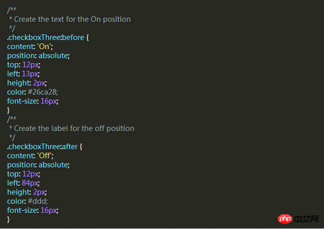
When the slider is unselected, the slider will be on the left and "OFF" is displayed on the right. When clicked, the slider moves to the right. "ON" is displayed on the left.
But the number of elements is not enough for us to implement these functions, so we have to use two pseudo-classes: before and :after to create two elements and place "ON" and "OFF" respectively.
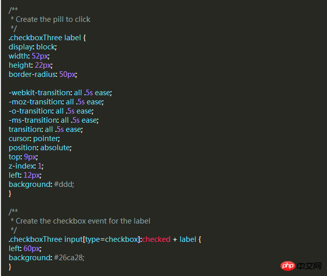
As before, let’s add a slider style that will move to the other side and change color when clicked.
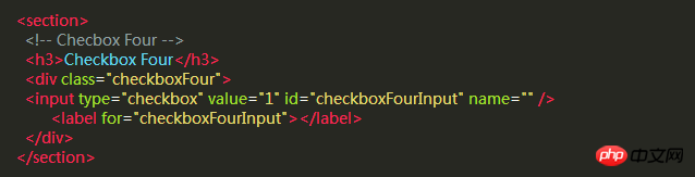
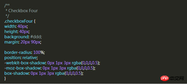
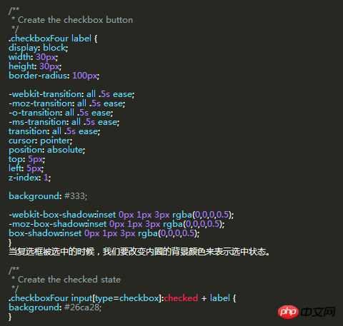
Style Four
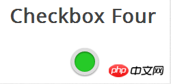
In this style, we Two circles will be created. When clicked, the color of the circle inside changes to indicate the selected or unselected state.
The same HTML code as before.
Next we need to create an outer circle for the checkbox, use the border-radius property of CSS, and set it to 100% to create a perfect circle.
Then we use the label element to create a smaller circle, which will change color according to the checkbox state.
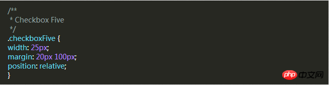
Style five
The style of this check box It is a little different. It only looks slightly better than the default checkbox style of the browser, but the difference is that we can define its style according to our own needs.
First of all, it’s still the same HTML code
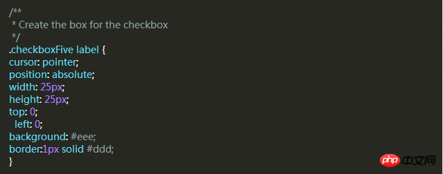
In the previous example, we used p as the sliding strip or outer circle of the checkbox, but this time we don’t need it. Use the p element to set the area of the checkbox.
The label label is used for the Click event and the box style of the check box we want to define.
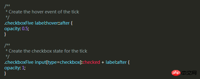
Next, we have to create the check mark in the box. For this, we can use the :after pseudo-class to create a new element. In order to achieve this style, We can create a 5px x 9px rectangle and add a border to it. At this time, after we remove the top and right borders, it will look like a letter L. Then we can use the CSS transform property to rotate it so it looks like a check mark.
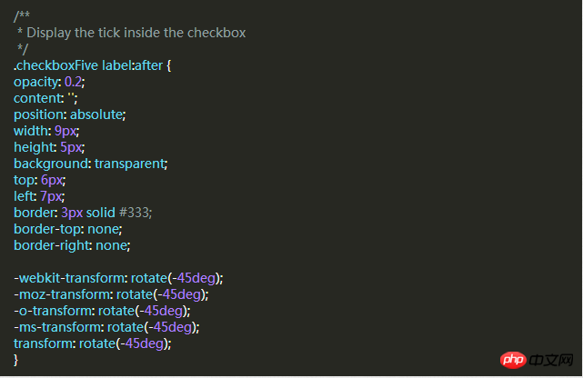
In the CSS above, we have set its transparency to 0.2, so you will see the checkbox has a semi-transparent tick. You can make it darker on hover and make it opaque when selected.
This will create a new checkbox style for you.
I believe you have mastered the method after reading the case in this article. For more exciting information, please pay attention to other related articles on the php Chinese website!
Recommended reading:
Detailed explanation of the use of Selector in CSS
Detailed explanation of the special usage skills of CSS margin
The above is the detailed content of CSS sets the style of the Checkbox checkbox. For more information, please follow other related articles on the PHP Chinese website!