
Home > Article > Web Front-end > Detailed example of how to draw 26 English letters using pure CSS3

Pure CSS3 drawing 26 English letters
# Here you see the 26 The standard English letters are not ordinary fonts. They are drawn on a blank page using CSS, pure CSS works. It mainly uses multiple new transformation functions in CSS3, and you need to use the latest browser to view it.
##Used in the web page code (a8707ebe89e7e685f3ced24770d361c4 360c5bc7a5fc231c5ecf7cb739ca2a68) and p margin setting and float (margin:20px 5px 10px 80px; float: left; ). The four pixels of the margin represent: top, right, bottom, and left.
The following is the CSS for drawing 26 letters in alphabetical order.

   .A{
      position:relative;
      margin:10px 30px 10px 5px;  /*上右下左 */
      float: left;
      left:30px;
      width:60px;
      height:91px;
      border-bottom:solid 14px #0feee2;
    }
    .A:before{
      transform:skew(-19deg,0);
      position:absolute;
      content:'';
      top:12.5px;
      left:0;
      width:16px;
      height:125px;
      background-color:#0feee2;
    }
    .A:after{
      transform:skew(19deg,0);
      position:absolute;
      content:'';
      top:12.5px;
      left:45px;
      width:16px;
      height:125px;
      background-color:#0feee2;
} 
  .B{
      position:relative;
      margin:10px 20px 10px 30px;
      float: left;
      top:12.5px;
      left:10px;
      width:60px;
      height:125px;
      border-left:solid 16px #2056cd;
    }
    .B:before{
      position:absolute;
      content:'';
      width:52px;
      height:39px;
      border-width:15px 15px 10px 0;
      border-color:#2056cd;
      border-style:solid;
      border-radius:0 240%180%0 /0 180%180%0;
   }
   .B:after{
      position:absolute;
      content:'';
      bottom:0;
      width:58px;
      height:43px;
      border-width:10px 15px 15px 0;
      border-color:#2056cd;
      border-style:solid;
      border-radius:0 180%220%0 /0 180%180%0;
} 
   .C{
       position:relative;
       margin:10px 5px 10px 10px;
       float: left;
       top:12.5px;
       left:10px;
       width:84px;
       height:95px;
       border-width:15px 12px 15px 16px;
       border-color:#87adef;
       border-style:solid;
       border-radius:50%;
     }
     .C:before{
       transform:rotate(45deg);
       position:absolute;
       content:'';
       top:2px;
       left:49px;
       width:90px;
       height:90px;
       background-color:#ffffff;
} 
  .D{
       position:relative;
       margin:10px 20px 10px 5px;
       float: left;
       top:12.5px;
       left:10px;
       border-left:solid 15px #ade081;
       height:125px;
     }
     .D:before{
       position:absolute;
       content:'';
       top:0;
       left:0;
       width:60px;
       height:95px;
       border-width:15px 15px 15px 0;
       border-color:#ade081;
       border-style:solid;
       border-radius:0 300%300%0 /0 180%180%0;
} 
   .E{
        position:relative;
        margin:10px 10px 10px 60px;
        float: left;
        top:12.5px;
        left:10px;
        width:63px;
        height:95px;
        border-width:15px 0 15px 16px;
        border-color:#cd2388;
        border-style:solid;
      }
      .E:before{
        position:absolute;
        content:'';
        top:38px;
        left:0px;
        width:53px;
        height:15px;
        background-color:#cd2388;
      }

   .F{
        position:relative;
        margin:10px 5px 10px 10px;
        float: left;
        top:12.5px;
        left:10px;
        width:63px;
        height:110px;
        border-width:15px 0 0 16px;
        border-color:#668899;
        border-style:solid;
       }
      .F:before{
        position:absolute;
        content:'';
        top:38px;
        left:0px;
        width:53px;
        height:15px;
        background-color:#668899;
      }

   .G{
        position:relative;
        margin:10px 5px 10px 5px;
        float: left;
        top:12.5px;
        left:10px;
        width:84px;
        height:95px;
        border-width:15px 12px 15px 16px;
        border-color:#f0af00;
        border-style:solid;
        border-radius:50%;
       }
       .G:before{
         transform:rotate(45deg);
         position:absolute;
         content:'';
         top:2px;
         left:48px;
         background-color:#ffffff;
         width:90px;
         height:90px;
       }
      .G:after{
        position:absolute;
        content:'';
        bottom:0.5px;
        right:7px;
        width:28px;
        height:36px;
        border-width:13px 14px 0 0;
        border-color:#f0af00;
        border-style:solid;
      }
.H{
position:relative;
margin:10px 10px 10px 5px;
float: left;
top:12.5px;
left:10px;
width:60px;
height:125px;
border-width:0 16px 0 16px;
border-color:#cde680;
border-style:solid;
}
.H:before{
position:absolute;
content:'';
top:53px;
left:0;
width:60px;
height:14px;
background-color:#cde680;
}
   .I{
        z-index:1;
        position:relative;
        margin:10px 10px 10px 10px;
        float: left;
        top:12.5px;
        left:20px;
        width:16px;
        height:125px;
        background-color:#020a0f;
       }
   .J{
         position:relative;
         margin:10px 5px 10px 5px;
         float: left;
         top:12.5px;
         left:-5px;
         width:75px;
         height:66px;
         border-right:solid 16px #b0c0d0;
      }
      .J:before{
         position:absolute;
         content:'';
         bottom:-60px;
         right:-16px;
         width:50px;
         height:60px;
         border-width:0 16px 15px 14px;
         border-color:#b0c0d0;
         border-style:solid;
         border-radius:0 0 75%75%;
       }
       .J:after{
         transform:rotate(-40deg);
         position:absolute;
         content:'';
         top:40px;
         left:-20px;
         width:60px;
         height:60px;
         background-color:#ffffff;
        }
  .V{
     position:relative;
     margin:10px 5px 10px 5px;
     float: left;
     top:12.5px;
     left:30px;
     width:59px;
    }
    .V:before{
     transform:skew(18deg,0);
     position:absolute;
     content:'';
     top:0;
     left:0;
     height:125px;
     border-left:solid 16px #008800;
   }
   .V:after{
     transform:skew(-18deg,0);
     position:absolute;
     content:'';
     top:0;
     right:0;
     height:125px;
     border-left:solid 16px #008800;
   }

   .W{
     position:relative;
     margin:10px 5px 10px 40px;
     float: left;
     top:12.5px;
     left:25px;
     width:100px;
    }
    .W:before{
     transform:skew(11deg,0);
     position:absolute;
     content:'';
     top:0;
     left:0;
     width:42px;
     height:125px;
     border-width:0 13px 0 15px;
     border-color:#000000;
     border-style:solid;
    }
    .W:after{
     transform:skew(-11deg,0);
     position:absolute;
     content:'';
     top:0;
     right:0;
     width:42px;
     height:125px;
     border-width:0 15px 0 13px;
     border-color:#000000;
     border-style:solid;
    }

  .X{
     position:relative;
     margin:10px 5px 10px 25px;
     float: left;
     top:12.5px;
     left:50px;
     width:16px;
     height:125px;
    }
    .X:before{
     transform:skew(32deg,0);
     position:absolute;
     content:'';
     top:0;
     left:0;
     width:16px;
     height:125px;
     background-color:#0066ff;
    }
    .X:after{
     transform:skew(-32deg,0);
     position:absolute;
     content:'';
     top:0;
     right:0;
     width:16px;
     height:125px;
     background-color:#0066ff;
} 
  .Y{
     position:relative;
     margin:10px 5px 10px 80px;
     float: left;
     top:92.5px;
     left:52px;
     width:16px;
     height:50px;
     background-color:#22ff55;
    }
    .Y:before{
     transform:skew(28deg,0);
     position:absolute;
     content:'';
     top:-80px;
     left:-21px;
     width:16px;
     height:80px;
     background-color:#22ff55;
    }
    .Y:after{
     transform:skew(-28deg,0);
     position:absolute;
     content:'';
     top:-80px;
     right:-21px;
     width:16px;
     height:80px;
     background-color:#22ff55;
} 
  .Z{
     position:relative;
     margin:20px 5px 10px 80px;
     float: left;
     top:12.5px;
     left:10px;
     width:90px;
     height:95px;
     border-width:15px 0 15px 0;
     border-color:#336699;
     border-style:solid;
    }
    .Z:before{
     transform:skew(-37deg,0);
     position:absolute;
     content:'';
     top:0;
     left:36px;
     width:18px;
     height:95px;
     background-color:#336699;
    }
完整的HTML5+CSS3版Demo。
效果截图:
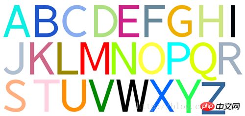
CSS3绘制26个字母
The above is the detailed content of Detailed example of how to draw 26 English letters using pure CSS3. For more information, please follow other related articles on the PHP Chinese website!