
Home > Article > Web Front-end > Detailed explanation of CSS3+jQuery to implement circular progress bar

The overall idea is: generate two semicircles through clipping to display a static progress bar, and then produce dynamic effects through rotation (rotate) angle changes.
(1) An uncommon attribute of css:
clip: rect(top, right, bottom, left);
This attribute specifies a cropped rectangle, where top The offset specified by bottom is calculated from the top edge of the element box, and the offset specified by right and left is calculated from the left edge of the element box (required here The important thing to note is the calculation method of bottom and right). Look at the super clear picture below (I moved the picture from w3cplus directly, it’s not illegal to have a watermark, right?):
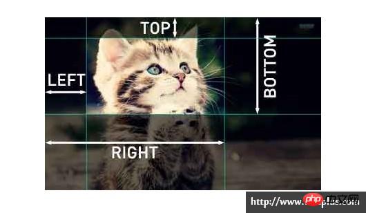
It should be noted that: The clip attribute can only work when the element is set with the "position:absolute" or "position:fixed" attribute. clip does not work on settings "position:relative" and "position:static".
About clip,
(2) Another property of CSS:
transform: rotate(deg);
Rotate a certain angle clockwise.
//html


    0%

//css
.pie-right {
    position: absolute;
    top: 0;
    left: 0;
    height: 200px;
    width: 200px;
    border-radius: 50%;
    background: red;//注意这是表示当前进度的颜色
}
.right {
    position: absolute;
    top: 0;
    left: 0;
    height: 200px;
    width: 200px;
    border-radius: 50%;
    background: blue;//注意这个才不是当前进度的颜色
}
.pie-right, .right {
    clip: rect(0, auto, auto, 100px);
}
.mask {//我是遮罩
    position: absolute;
    top: 25px;
    left: 25px;
    height: 150px;
    width: 150px;
    background: #fff;
    border-radius: 50%;
    text-align: center;
}
The effect is as follows:
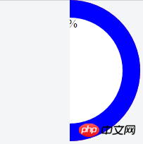
At this time, the element pie-right is completely obscured by the element right.
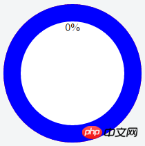
Then, let’s rotate it:
.right {
    transform: rotate(30deg);
}
The effect after rotation is as follows:

Now we can see When it is rotated 30 degrees, the red part exposed is the progress we want. This is the color of the pie-right element. The color of the right element in the blue part is the progress we have not yet reached.
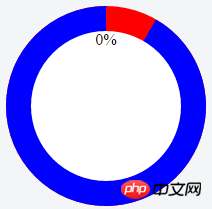
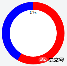
Realizing the circular progress bar means that we need two semicircles on the left and right, so the html structure needs to be changed:
//html


    0%


//css
.circle {//这个元素可以提供进度条的颜色
    position: absolute;
    height: 200px;
    width: 200px;
    border-radius: 50%;
    background: red;//注意这是表示当前进度的颜色
}
.pie-right, .pie-left { //这俩元素主要是为了分别生成两个半圆的,所以起作用的地方在于clip裁掉另一半
    position: absolute;
    top: 0;
    left: 0;
    height: 200px;
    width: 200px;
    border-radius: 50%;
}
.right, .left {
    position: absolute;
    top: 0;
    left: 0;
    height: 200px;
    width: 200px;
    border-radius: 50%;
    background: blue;//注意这个才不是当前进度的颜色
}
.pie-right, .right { //裁掉左边一半
    clip: rect(0, auto, auto, 100px);
}
.pie-left, .left { //裁掉右边一半
    clip: rect(0, 100px, auto, 0);
}
.mask {//我是遮罩 mask不用改 好欣慰
    position: absolute;
    top: 25px;
    left: 25px;
    height: 150px;
    width: 150px;
    background: #fff;
    border-radius: 50%;
    text-align: center;
}
The effect is similar:
The progress is 0 at this time, let’s rotate it, first rotate 30 degrees
.right{
    transform: rotate(30deg);
}
So it becomes like this:【 Always remember that the red part is the current progress. 】
Then rotate 210 degrees to see the effect [210 degrees means the right side is completely rotated, and the left side is rotated 30 degrees]:
.right{
    transform: rotate(180deg);
}
.left{
    transform: rotate(30deg);
}
looks like this:
Finally, when the progress value increases dynamically, the progress bar dynamics can be realized by changing the rotation angle through js Changed.
Every time the progress value increases by 1, the angle increases by 3.6 degrees. It should also be noted that when the progress is less than 50%, the left progress bar does not change. When it is greater than 50%, the left progress bar starts to change.
We can write a function:
function changeProcess(value) {
    var num = value * 3.6;
    if(num < 180) {
        $('.right').css('transform', 'rotate(' + num + 'deg)');
    } else {
        $('.right').css('transform', 'rotate(180deg)');
        $('.left').css('transform', 'rotate(' + (num-180) + 'deg)');
    }
}
When the progress value changes, just call this function.
The above is the detailed content of Detailed explanation of CSS3+jQuery to implement circular progress bar. For more information, please follow other related articles on the PHP Chinese website!