
Home > Article > Web Front-end > CSS3 depth of field and three-dimensional transformation properties and specific implementation methods of rotating three-dimensional cubes (pictures and texts)

Written briefly last week2D Transformation
Let’s write about it today3D Transformation
I think the three-dimensional effect is the most powerful in CSS3 Interesting part
I have to admire those great developers
allow us to get a cool visual experience through a few lines of CSS code
In Before talking about formal grammar, we first need to understand the browser coordinate system
This requires us to imagine the browser interface as a three-dimensional scene
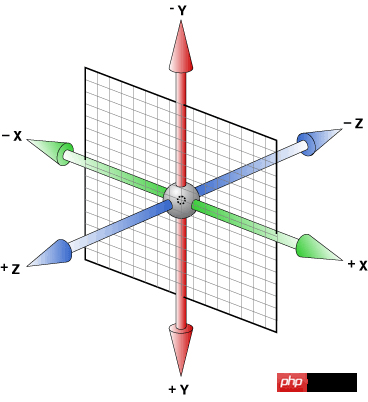
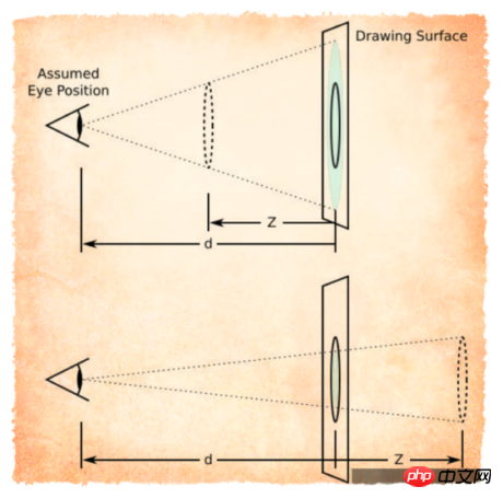
This is widely circulated on the Internet Browser coordinate systemPicture
The direction from left to right is the positive direction of the browser's x-axis
The direction from top to bottom is the positive direction of the browser's y-axis
And z The positive direction of the axis is facing our
It is important to understand this, because below we need to use it to rotate the element to understand
The rotation we use in the plane is just a simple Let the element rotate at a certain angle on the plane
It is a little more complicated in three-dimensional rotation
AttributeOf course we still use our transform
Three-dimensional rotation has the following three Each function corresponds to the rotation of three dimensions respectively
rotateX(xxdeg)
Similar to our horizontal bar movement
transform: rotateX(45deg);

Similar to the pole dance movement..
transform: rotateY(45deg);

This is our rotation on a two-dimensional plane, similar to a turntable
transform: rotateZ(45deg);

It’s not used a lot, I’ll just say it briefly
The parameters are not the three angle values as we thought
but three numbers and one angle value
The first three The numbers respectively represent the vector values of rotation around the x, y, and z axes
The last one represents the rotation angle in space. The equivalent relationship is as follows
rotate3d(1,0,0,xxdeg) <==> rotateX(xxdeg)
rotate3d(0,1,0,xxdeg) <==> rotateY(xxdeg)
rotate3d(0,0,1,xxdeg) <==> rotateZ(xxdeg)
3D displacement and 3D scalingWe use translateX() and translateY() in 2D to move in the plane
In 3D, we have more translateZ() that allows us to translate along the z-axis
You can also use the synthetic function translate3d(x, y, z )
Note that the first two values can be in percentage form, but the value of translation along the z-axis can only be in length value
scaleX(num), scaleY(num) , scaleZ(num), scale3d(num,num,num)
As for their usage, let’s use examples below
(The skew attribute of 3D does not exist, in other words, there is no skew3d function)
Depth of field (English: Depth of field, DOF) Depth of field refers to the camera A relatively clear imaging range before and after the focus point. In optics, especially video or photography, it is a description of the distance range in space that can be clearly imaged. Although the lens can only focus the light to a certain fixed distance, and it will gradually blur away from this point, within a certain distance, the degree of image blur is invisible to the naked eye. This distance is called the depth of field. When the focus is set at the hyperfocal distance, the depth of field extends from half the hyperfocal distance to infinity, which is the maximum depth of field for a fixed aperture value.(Seeing this, I silently left the keyboard with my hands, looked up to the sky and sighed, thinking, what kind of academic qualifications do I need to understand this)
We can understand it this way
Depth of field is the distance between our naked eyes and the display
The greater the depth of field, the farther away the elements are from us, and the effect will be bad
In our CSS3, perspective is used to activate a 3D space
The attribute value is the depth of field Size (default none, no depth of field)
There are two usages
.stage { perspective: 500px;}The element to which depth of field is applied is called the "stage element" All descendant elements of the stage element will be affected
(If the descendant element The perspective attribute has also been added, the effect will be superimposed instead of overwritten)
.stage
{
width: 200px;
height: 200px;
border: 1px solid black;
margin: 100px auto;}
.stage
.demo
{
width: 200px;
height: 200px;
background-color: orangered;
transform: rotateX(45deg);}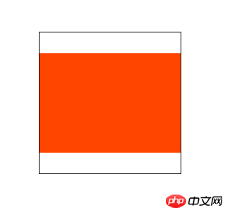
在这个例子中,我们把内部元素绕x轴旋转了45°后
由于他只是在二次元旋转,所以我们根本看不出来它旋转
但是我们现在加个景深
.stage {
width: 200px;
height: 200px;
border: 1px solid black;
margin: 100px auto;
perspective: 500px; /*增*/}.stage
.demo {
width: 200px;
height: 200px;
background-color: orangered;
transform: rotateX(45deg);}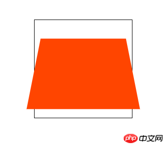
这就相当于我们在舞台元素的中心位置往里看,这个子元素距离我们肉眼有500px
由于子元素的顺时针旋转,
元素上半部分离我们远,所以看起来很小
元素下半部分离我们近,所以看起来稍大
这样就会产生很强的立体感
刚才我说道我们的肉眼相当于在舞台元素中心的位置
其实这个“眼睛”的位置是可以调整的
这用到了perspective-origin属性
默认的属性值就是 50% 50%
也就是舞台元素的中心位置
我们可以尝试调整视角
.stage {
width: 200px;
height: 200px;
border: 1px solid black;
margin: 100px auto;
perspective: 500px;
perspective-origin: 10px 10px; /*增*/}.stage
.demo {
width: 200px;
height: 200px;
background-color: orangered;
transform: rotateX(45deg);}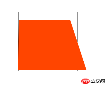
这就相当于在舞台元素的距离原点(左上)10px,10px的位置往里看
理解这个需要我们一定的空间立体感
注意:景深大小一定要比你的动画元素大(我们不可能看到眼睛后面的东西)
景深的另一种用法,是应用在动画元素(不是舞台元素)变形的函数中
和其他变形函数写在一起
.stage .demo {    ......
transform: rotateX(45deg) perspective(100px);}这个属性指定了子元素如何在空间中展示
只有两个属性值:flat(默认)和preserve-3d
flat 表示所有子元素在2D平面呈现
preserve-3d 表示所有子元素在3D平面呈现
(prederve是保护、维持的意思,preserve-3d就是保持三维空间的意思)
当然如果我们想要3D的效果,就要使用 transform-style: preserve-3d;
这个属性只是针对设置属性元素的子元素如何展示
而对子元素的子元素无效
而且对于设置了overflow: hidden;的元素,设置3D效果会失效
道理很简单,跳出了父元素平面的子元素无法显示了,结果自然还是2D效果
应用于这个属性的元素我们称作“容器”
这个属性我们下面通过一个例子再来体会
通过这个元素我们可以指定当元素背对我们时是否可见
只有两个属性值visibility(默认)和hidden
如果我们希望元素背对我们不可见
就这样设置
.demo {    ...
    backface-visibility: hidden;
}
下面我通过一个例子来把上面讲到的属性全部实践一下
ul { /*调整ul标签的样式,取消内边距、外边距,和“点”样式*/
padding: 0; margin: 0; list-style-type: none;}.stage { /*设置舞台元素在屏幕居中,设置合适的景深大小*/
position: relative; width: 800px; height: 800px; margin: 100px auto; perspective: 800px;}@keyframes move { /*设置动画关键帧*/
0% { transform: rotateX(0deg); }
25% { transform: rotateX(180deg); }
50% { transform: rotateX(360deg) rotateY(0deg); }
75% { transform: rotateX(360deg) rotateY(180deg); }
100% { transform: rotateX(360deg) rotateY(360deg); }}.stage .three-d-box { /*动画容器居中在舞台元素中间*/
width: 200px; height: 200px; position: absolute; left: 50%; top: 50%; margin: -100px 0 0 -100px; transform-style: preserve-3d; /*设置3D属性让子元素三维空间呈现*/
animation: move 3s linear infinite; /*设置动画*/}.stage .three-d-box>li { /*设置动画子元素公共属性*/
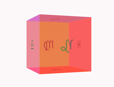
position: absolute; width: 200px; height: 200px; left: 0; top: 0; font-size: 50px; line-height: 200px; text-align: center; opacity: 0.5;}/*为了保证我们对立方体位置的控制,我们需要让动画容器在立方体的中间位置*/.stage .three-d-box>li:nth-child(1) { background-color: red; transform: translateZ(-100px);}.stage .three-d-box>li:nth-child(2) { background-color: greenyellow; transform: translateZ(100px);}.stage .three-d-box>li:nth-child(3) { background-color: cornflowerblue; transform: rotateX(90deg) translateZ(100px);}.stage .three-d-box>li:nth-child(4) { background-color: orangered; transform: rotateX(-90deg) translateZ(100px);}.stage .three-d-box>li:nth-child(5) { background-color: deeppink; transform: rotateY(90deg) translateZ(100px);}.stage .three-d-box>li:nth-child(6) { background-color: lightcoral; transform: rotateY(-90deg) translateZ(100px);}大功告成
这样我们就会得到如下酷炫的三维立方体
注意在3D变换transform中,旋转与位移函数的顺序不同,元素展现的位置是不同的
这是因为元素的坐标轴是随着我们变换而变化的
上面的代码如果有不明白的地方,可以拷贝到浏览器进行调试
整体的思路就是
设置舞台元素(perspective:xxxpx)
设置动画容器(transform-style:preserve-3d)
通过旋转、位移调整动画子元素的位置
对动画容器应用动画效果
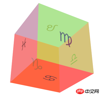
最后我们通过这个正方体来加深三维变换相关属性的理解
backface-visibility
添加样式前的正方体
现在我们来添加样式
.stage .three-d-box>li {    ......
    backface-visibility: hidden;}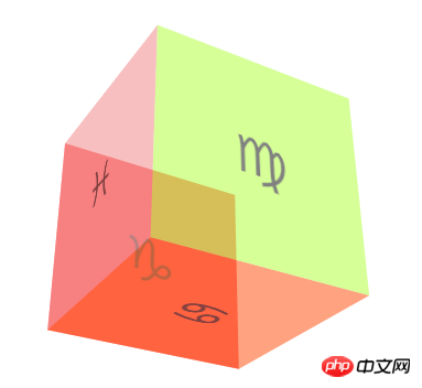
大家来找茬
可以看到背对我们的元素全部看不见了
这就是backface-visibility: hidden;的作用
还有一些旋转、缩放、平移的属性这里我就不再测试了
大家可以打开控制台自己体会一下,和2D中的用法是类似的
The above is the detailed content of CSS3 depth of field and three-dimensional transformation properties and specific implementation methods of rotating three-dimensional cubes (pictures and texts). For more information, please follow other related articles on the PHP Chinese website!