
Home > Article > Web Front-end > Share an example code of CSS3 rounded corners and gradient functions

This article mainly introduces relevant information on the detailed explanation of two commonly used functions of CSS3 rounded corners and gradients. Friends in need can refer to the following
Css3 rounded corners explanation: I believe everyone is familiar with pictures and background rounded corners. You are familiar with it,
Fillet syntax: border-radius: fillet value;
Advantages of CSS3 rounded corners
The traditional rounded corner generation scheme must use multiple pictures as background patterns. The emergence of CSS3 means that we no longer have to waste time creating these images, and there are many other advantages:
* Reduce the workload of maintenance. The work of generating, updating image files, and writing web page code is no longer necessary.
* Improve web page performance. Web pages will load faster because there are no more unnecessary HTTP requests.
* Increase visual reliability. Under certain circumstances (network congestion, server error, slow network speed, etc.), the background image may fail to download, resulting in poor visual effects. This doesn't happen with CSS3.
This value can be used: em, ex, pt, px, percentage;
Border-radius is similar to margin and padding
Border-radius: lefttop, righttop, rightbottom, leftbottom.
The code is as follows:
.box1{width:200px;height:100px;border-radius:30px 5px;background:#f66f17;margin-top:30px;}

.box2{width:200px;height:100px;border-radius:30px 20px 10px 0px;background:#f66f17;margin-top:30px;}
It should be easy to understand the rounded corners. .
For percentages: The safest approach at present is to set the style and width of each rounded border to the same value and avoid using percentage values.
IE9 and below do not support this attribute
Linear gradient: background: linear-gradient (set the gradient form, the first color starting point, the position of the middle color point, the end point color) ;
Linear: Type of gradient (linear gradient);
Form of gradient: There are two ways to select optional parameters - 1. Set the rotation angle, 0 degrees means horizontally from left to right, 90 degrees means from top to bottom Come on, start from 0 degrees and change counterclockwise.
2. Use keywords, left means from left to right, top means from top to bottom, similarly right means from right to left, lefttop - from sitting up to right bottom, and similarly leftbottom, righttop, rightbottom.
The middle color and middle color position are optional parameters.
But we need to consider browser compatibility, let’s write it like this:
-webkit-gradient(linear,0 0,0 100%,from(起始颜色,to(结束颜色)); /*for Safari4+,Chrome 2+*/
-webkit-linear-gradient(起始颜色, 结束颜色); /*for Safari 5.1+,Chrome 10+*/
-moz-linear-gradient(起始颜色, 结束颜色); /*for firefox*/
-o-linear-gradient(起始颜色, 结束颜色); /*Opera*/
linear-gradient(起始颜色, 结束颜色); /*标准属性*/
对于IE来说是个麻烦事,老办法
Filter:progid:DXImageTransform.Microsoft.gradient(startColorstr=’ 起始颜色’,endColorstr=” 结束颜色”); /*IE6,IE 7*/
-ms-linear-gradient(起始颜色, 结束颜色); /*IE8*/
.content1{width:500px;height:
300
px;border-radius:10%;background:#ade691;
background:-webkit-linear-gradient(left,#88cfc3,#329e8c 30%,#096e5d);background:-moz-linear-gradient(left,#88cfc3,#329e8c 30%,#096e5d);background:filter: progid:DXImageTransform.Microsoft.gradient(startColorstr='#88cfc3', endColorstr='#096e5d'); /* IE6,IE7 */-ms-filter: "progid:DXImageTransform.Microsoft.gradient(startColorstr='#88cfc3', endColorstr='#096e5d')";background:linear-gradient(lleft,#88cfc3,#329e8c 30%,#096e5d;
float
:left;}
.tit1{
font-size
:3em;
font-weight
: bold;color:#f00;}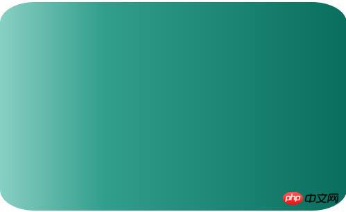
Repeating linear gradient: repeating-linear-gradient attribute instead Linear gradient linear-gradient;
.content2{width:500px;height:200px;
background-image
: -webkit-repeating-linear-gradient(red,green 40px, o
range
 80px);
background-image: repeating-linear-gradient(red,green 40px, orange 80px);}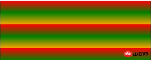
Radial gradient: radial-gradient (set the center of the gradient, gradient shape gradient size, starting color value , middle color value, middle color position, end color)
Gradient center, optional parameters, such as 30px 20px refers to 30px from the left and 20px from the top. It can be pixels, percentages, or keywords. The default is Central location.
Gradient shape, optional parameter, can take the value circle or eclipse[Default]
Gradient size, can loop Parameter, can take the value
closest-side :
Specify the radius length of the radial gradient from the center of the circle to the side closest to the center
closest-corner:
Specify the radius length of the radial gradient from the center of the circle to the corner closest to the center
farthest -side:
Specify the radius length of the radial gradient from the center of the circle to the farthest side from the center
farthest-corner:
Specify the radius length of the radial gradient from the center of the circle to the farthest corner from the center
contain:
Contains, specifying the radius length of the radial gradient from the center of the circle to the point closest to the center of the circle. Similar to closest-side
cover:
Cover, specifying the radius length of the radial gradient from the center of the circle to the point farthest from the center of the circle. Similar to farthest-corner
circle farthest-corner circular gradient, ellipse farthest-corner elliptical gradient
.content3{width:500px;height:200px;
background-image: -webkit-radial-gradient(circle,hsla(120,70%,60%,.9),hsla(360,60%,60%,.9));
background-image: radial-gradient(circle,hsla(120,70%,60%,.9),hsla(360,60%,60%,.9));margin-top:20px;}
[Related recommendations]
1. Free css online video tutorial
3. php.cnDugujiujian( 2)-css video tutorial
The above is the detailed content of Share an example code of CSS3 rounded corners and gradient functions. For more information, please follow other related articles on the PHP Chinese website!