
Home > Article > Web Front-end > Detailed introduction to using CSS3 3D planetary rotation and browser rendering principles

I recently got into Web Animation, so I will record my learning process and share it with everyone.
CSS3 3D planetary rotation demo page please click: Demo. (It is recommended to use Chrome to open)
The complete code of this article, as well as more CSS3 effects, can be seen on my Github, and I hope everyone can give it a star.
Well, some people may not be able to open the demo or the page is messed up. Here are some renderings: (The pictures are a bit big, please wait patiently for a while)
CSS3 3D planetary motion effect Picture

Randomly took another screenshot:

I strongly recommend that you click on the Demo page to experience it. The charm of CSS3 3D, what pictures can show is limited after all.
Then, the production process of this CSS3 3D planetary motion animation will not be described in detail. The focus of this article is on the introduction of Web animation and Performance Optimization. For detailed CSS3 3D, you can review the previous blog: [CSS3 Advanced] Cool 3D rotating perspective. Simple idea:
1. Use the 3D photo wall produced in the previous article as a prototype and modify it;
2. I thought of many ways to make each sphere, and finally used In this compromise, each sphere is itself a CSS3 3D shape. Then using Sass to write CSS during the production process can reduce a lot of the tedious process of writing CSS animations;
3. In the Demo, Javascript was used to write a mouse follow listening event, remove this event, the entire planetary motion animation itself is implemented in pure CSS.
The following will enter the focus of this article. From the perspective of performance optimization, we will talk about the principles of browser rendering and display, browser redrawing and rearrangement, animation performance detection optimization, etc.:
The subtitle is a bit big. We know that the cores (rendering engines) of different browsers are different, such as the most mainstream chrome browser now. The kernel is the Blink kernel (used in Chrome (version 28 and later), Opera (version 15 and later) and Yandex browser), Firefox is Gecko, and IE is Trident. The browser kernel is responsible for interpreting web page syntax and interpreting it. When rendering (displaying) web pages, the working principles of different browser kernels are not completely consistent.
So in fact, what we will mainly discuss below is the rendering principle under the chrome browser. Because there is a lot of verifiable information on chrome kernel rendering, we dare not draw conclusions about browsers with other kernels, so the discussion below is by default for the chrome browser.
First of all, I want to throw out some conclusions:
Here we talk about GPU acceleration. Why can GPU accelerate 3D transformation? All this must start with the underlying rendering of the browser. The process of rendering and displaying web pages in the browser is a cliché and must be asked in interviews. It can be roughly divided into:
1. Parsing HTML (HTML Parser)
2. Build DOM Tree
3. Build Render Tree
4. Draw Render Tree(Painting)
Found one A very classic picture:

# This rendering process is regarded as a basic knowledge, so continue to delve deeper.
When the page is loaded and parsed, it represents a very familiar structure in the browser: DOM (Document Object Model, Document Object Model). When the browser renders a page, it uses many intermediate representations that are not exposed to developers, the most important structure of which is the layer.
This layer is the focus of this article:
In Chrome, there are different types of layers: RenderLayer (responsible for the DOM subtree), GraphicsLayer (responsible for the RenderLayer subtree) . Next we will discuss the GraphicsLayer layer.
GraphicsLayer layer is uploaded to the GPU as a texture.
This texture is very important here. So,
Texture here refers to a GPU term: think of it as a bitmap image that is moved from main memory (such as RAM) to image memory (such as VRAM in the GPU). Once it's moved to the GPU, you can match it into a mesh geometry and use textures in Chrome to get large chunks of page content off the GPU. It's easy to match different positions and transformations by applying textures to a very simple rectangular grid, which is how 3D CSS works. It’s hard to understand. Just look at the example. In chrome, we can see the concept of GraphicsLayer — layer mentioned above. In the developer tools, we make the following selection to bring up the show layer borders option:
 In a very simple page, we can see as follows, this page only One layer. The blue grid represents tiles. You can think of them as units of a layer (not layers). Chrome can upload them to the GPU as part of a large layer:
 Creation of the element's own layer
Pay attention to the orange border, which draws the outline of the layer in the view:
 When is the creation of a layer triggered?
The significance of this is that the time spent on redrawing can be used to do other things, such as running JavaScript. If the drawing time is very long, it will also cause animation failures and delays.
So when does an element trigger the creation of a layer? For now, layers will be created if any of the following conditions are met:
lower sibling element that contains a composite layer (in other words, the element is in the composite layer Rendering on top of the layer)
The powerful chrome developer tools provide tools that allow us to see what content has been redrawn when the animated page is running:
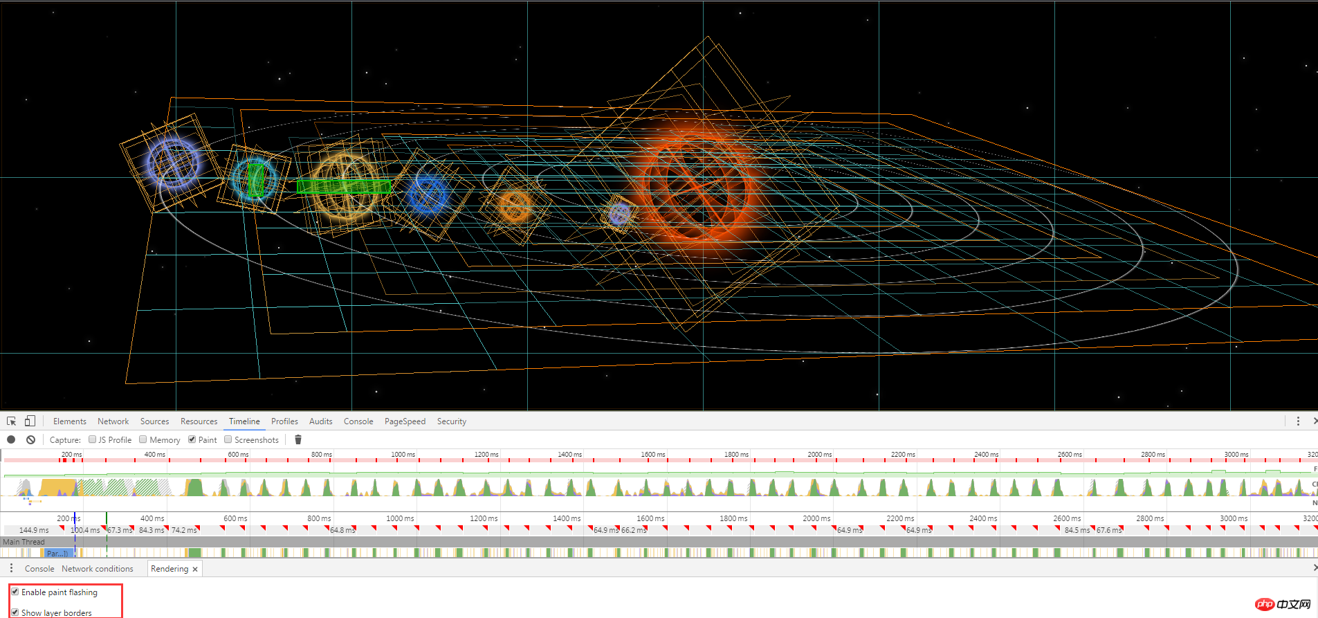 In the old version In chrome, there is an option show paint rects. You can see which layers of the page have been redrawn and marked with a red border.
But the new version of chrome seems to have removed this option. The current option is enable paint flashing. Its function is also to identify the place where the website changes dynamically, and it is marked with a green border.
Looking at the diagram above, you can see several green boxes on the page, indicating that redrawing has occurred. Note that Chrome will not always redraw the entire layer, it will try to intelligently redraw the invalid parts of the DOM.
Logically speaking, with so many animations happening on the page, redrawing should be very frequent. However, in my planet animation in the picture above, I only see a few green redrawing boxes. My personal understanding is that one is the GPU. Optimization, the second is that if the entire animation page has only one layer, then if transform is used for transformation, the page will inevitably need to be redrawn, but using layering (GraphicsLayer) technology, that is, the elements that meet the situation are created separately. The created layer uses transform, such as rotate. At this time, the rotation transformation of the layer does not affect other layers, so the layer does not necessarily need to be redrawn. (Personal opinions, please make corrections).
Understanding layer redrawing is critical to optimizing the performance of web animations.
What causes invalidation and forced redrawing? This question is difficult to answer exhaustively because there are a large number of situations that lead to boundary failure. The most common situation is to modify the DOM or cause reflow by manipulating CSS styles.
The best way to find the root cause of repaints and reflows is to use the timeline of the developer tools and the enable paint flashing tool, and then try to find the place where the DOM was modified just before the repaint/reflow .
So how does the browser display from DOM elements to the final animation?
The browser parses the HTML, obtains the DOM and splits it into multiple layers (GraphicsLayer)
Calculate the style results for the nodes of each layer (Recalculate style–style recalculation)
Generate graphics and positions for each node (Layout–reflow and relayout)
Replace each node The nodes are drawn and filled into the layer bitmap (Paint Setup and Paint-Redraw)
The layer is uploaded to the GPU as a texture
Conform multiple layers to the page to generate the final screen image (Composite Layers-layer reorganization)
A large part of the cost of Web animation lies in the redrawing of the layer, with the layer as the The underlying composite model has a profound impact on rendering performance. When no drawing is required, the overhead of composite operations is negligible, so when trying to debug rendering performance issues, the first goal is to avoid layer redraws. Then this provides a direction for animation performance optimization and reduces the redrawing and reflow of elements.
Here we must first distinguish between two concepts, redraw and reflow.
When part (or all) of the render tree (render Tree) needs to be rebuilt due to changes in the size, layout, hiding, etc. of the elements. This is called reflow, which is relayout.
Every page needs to be reflowed at least once, which is when the page is loaded for the first time. During reflow, the browser will invalidate the affected part of the rendering tree and reconstruct this part of the rendering tree. After completing the reflow, the browser will redraw the affected part to the screen. This process is called redrawing.
When some elements in the render tree need to update attributes, these attributes only affect the appearance and style of the elements, but will not affect the layout, such as background-color . It is called redrawing.
It is worth noting that reflow will definitely cause redrawing, but redrawing will not necessarily cause reflow.
Obviously, the cost of reflow is greater. Simply put, when operating an element will cause the element to modify its size or position, then reflow will occur.
Resizing the window
Changing the font)
Adding or removing a stylesheet
Content changes, such as when the user inputs Enter text in the box (Content changes, such as a user typing text in
an input box)
Activate CSS Pseudo class , such as :hover (Activation of CSS pseudo classes such as :hover (in IE the activation of the pseudo class) class of a sibling))
Manipulating the class attribute
A script manipulating the DOM
Calculating offsetWidth and offsetHeight Properties (Calculating offsetWidth and offsetHeight)
Set style The value of the attribute (Setting a property of the style attribute)
So for the page, our purpose is to minimize the reflow and redraw of the page. A simple chestnut:
// 下面这种方式将会导致回流reflow两次
var newWidth = ap.offsetWidth + 10; // Read
ap.style.width = newWidth + 'px'; // Write
var newHeight = ap.offsetHeight + 10; // Read
ap.style.height = newHeight + 'px'; // Write

// 下面这种方式更好,只会回流reflow一次
var newWidth = ap.offsetWidth + 10; // Read
var newHeight = ap.offsetHeight + 10; // Read
ap.style.width = newWidth + 'px'; // Write
ap.style.height = newHeight + 'px'; // Write
The above four sentences, because the offsetHeight operation is involved, the browser forces reflow twice, while the following four sentences combine the offset operation, so one page reflow is reduced.
Reducing reflow and redrawing actually means reducing the operations on the rendering tree (merging multiple DOM and style modifications), reducing requests for some style information, and making full use of the browser's optimization strategy.
In fact, the browser itself has an optimization strategy. If every Javascript sentence operates on the DOM, it will be reflowed and redrawn. If so, the browser may not be able to handle it. Therefore, many browsers will optimize these operations. The browser will maintain a queue and put all operations that will cause reflow and redrawing into this queue. When the operations in the queue reach a certain number or a certain time interval, the browser The queue will be flushed and a batch will be processed. This will turn multiple reflows and redraws into one reflow and redraw.
But there are exceptions, because sometimes we need to accurately obtain certain style information, as follows:
offsetTop, offsetLeft, offsetWidth, offsetHeight
At this time, in order to feedback the most accurate information, the browser needs to immediately reflow and redraw to ensure that the information given to us is accurate, so the flush queue may be executed in advance.
display
:none and##display:none Once display:none is applied to the parent node element, the parent node and its descendant node elements are all invisible, and regardless of Its descendant elements cannot be displayed no matter how the display value is set;
visibility:hidden Once visibility:hidden is applied to the parent node element, all its descendants will also be invisible. However, there are hidden "failures". When visibility:visible is applied to its descendant element, the descendant element will appear again.
Performance detection and optimization of animation
Different styles have different performance consumption, for example Box-shadow is very performance-intensive from a rendering perspective because their drawing code takes too long to execute compared to other styles. This means that if a performance-intensive style needs to be redrawn frequently, you will run into performance issues. Secondly, you need to know that nothing is constant. A style that performs poorly today may be optimized tomorrow, and there are differences between browsers. So the key is to use your development tools to identify performance bottlenecks and then find ways to reduce the workload of the browser.
Fortunately, the chrome browser provides many powerful functions that allow us to detect our animation performance. In addition to the above mentioned, we can also display the FPS information of the page by checking the show FPS meter below. And GPU usage:
Use will-change to improve page scrolling, animation and other rendering performance
The official document says that this is still an experimental feature, so the syntax and behavior of this feature may change in future versions of the browser. 使用方法示例:(具体每个取值的意义,去翻翻文档) will-change 为 web 开发者提供了一种告知浏览器该元素会有哪些变化的方法,这样浏览器可以在元素属性真正发生变化之前提前做好对应的优化准备工作。 这种优化可以将一部分复杂的计算工作提前准备好,使页面的反应更为快速灵敏。 值得注意的是,用好这个属性并不是很容易: 不要将 will-change 应用到太多元素上:浏览器已经尽力尝试去优化一切可以优化的东西了。有一些更强力的优化,如果与 will-change 结合在一起的话,有可能会消耗很多机器资源,如果过度使用的话,可能导致页面响应缓慢或者消耗非常多的资源。 有节制地使用:通常,当元素恢复到初始状态时,浏览器会丢弃掉之前做的优化工作。但是如果直接在样式表中显式声明了 will-change 属性,则表示目标元素可能会经常变化,浏览器会将优化工作保存得比之前更久。所以最佳实践是当元素变化之前和之后通过脚本来切换 will-change 的值。 不要过早应用 will-change 优化:如果你的页面在性能方面没什么问题,则不要添加 will-change 属性来榨取一丁点的速度。 will-change 的设计初衷是作为最后的优化手段,用来尝试解决现有的性能问题。它不应该被用来预防性能问题。过度使用 will-change 会导致大量的内存占用,并会导致更复杂的渲染过程,因为浏览器会试图准备可能存在的变化过程。这会导致更严重的性能问题。 给它足够的工作时间:这个属性是用来让页面开发者告知浏览器哪些属性可能会变化的。然后浏览器可以选择在变化发生前提前去做一些优化工作。所以给浏览器一点时间去真正做这些优化工作是非常重要的。使用时需要尝试去找到一些方法提前一定时间获知元素可能发生的变化,然后为它加上 will-change 属性。 使用 transform3d api 代替 transform api,强制开始 GPU 加速 GPU 能够加速 Web 动画,这个上文已经反复提到了。 3D transform 会启用GPU加速,例如 translate3D, scaleZ 之类,当然我们的页面可能并没有 3D 变换,但是不代表我们不能启用 GPU 加速,在非 3D 变换的页面也使用 3D transform 来操作,算是一种 hack 加速法。我们实际上不需要z轴的变化,但是还是假模假样地声明了,去欺骗浏览器。

will-change: auto
will-change: scroll-position
will-change: contents
will-change: transform // Example of
The above is the detailed content of Detailed introduction to using CSS3 3D planetary rotation and browser rendering principles. For more information, please follow other related articles on the PHP Chinese website!